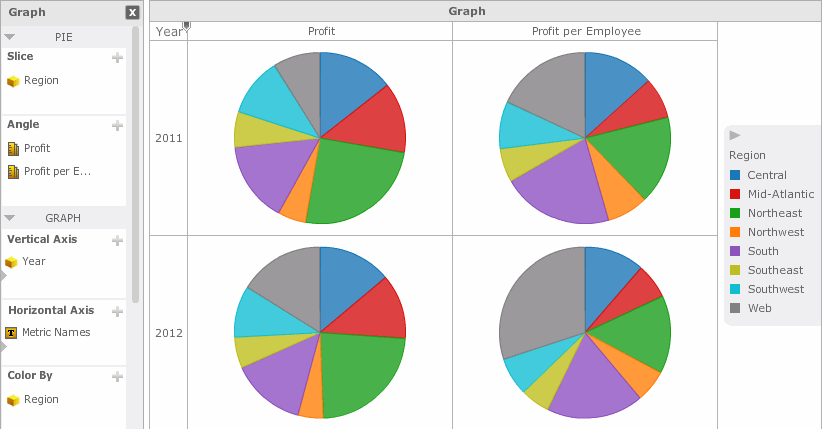
You can add a Graph visualization to a Visual Insight (VI) dashboard, to allow analysts to quickly explore data in a polished graphical display. Steps are provided below to add pie or ring graphs to a VI dashboard. For steps to create a dual-axis or combination graph, see Creating a Graph visualization with a dual-axis or combination graph. For general steps to create all other types of graphs, including bar, area, and line graphs, see Creating a Graph visualization.

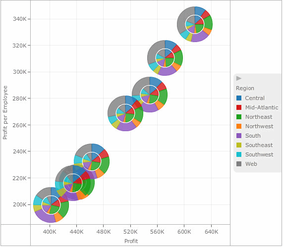
You can take advantage of a variety of display styles to display pie or ring graphs. For example, you can display pie graphs in a scatter layout, or display ring graphs in a grid. For a list of available display styles, see the table below. If your Graph visualization contains pies or rings displayed in the same position in the visualization, the graphs are overlaid on top of each other, as shown in the image below. A white circle is displayed around pie graphs that have been overlaid on top of other pie graphs to distinguish them as separate graphs.

The procedure below assumes that you have the Edit Dashboard and Run Dashboard privileges.
You should be familiar with the Metric Names object and how it can be used to display data in a Graph visualization. For details, see Displaying metric data in a visualization using the Metric Names object.
To create and add a pie or ring graph to a VI dashboard:
Click the name of the VI dashboard to run it.
From the toolbar, click the arrow to the right of the Insert Visualization icon ![]() , then select Graph. A blank visualization is added to the dashboard and displayed with an icon representing the visualization's type.
, then select Graph. A blank visualization is added to the dashboard and displayed with an icon representing the visualization's type.
From the Show menu, select Properties. In the Properties panel, from the Shape drop-down list, select Pie or Ring, then click X in the top right of the Properties panel to close it.
To add data to the visualization, from the Dataset Objects panel, click and drag attributes or metrics to the Graph panel, as described in the steps below. If the Dataset Objects panel is not displayed, from the Show menu, select Dataset Objects.
To determine the size of wedges in the pie or ring graph, place at least one metric on the Angle area. Wedges that represent larger metric values are displayed as larger than wedges that represent smaller metric values. If you add multiple metrics to the Angle area, each metric in the Angle area is used to display a separate pie or ring graph in the visualization.
To determine the number of wedges in the pie or ring graph, choose from the following:
To display a wedge for each element of an attribute, place at least one attribute on the Slice area.
To display a wedge for each metric in the Angle area, place the Metric Names object on the Slice area.
You can determine the attributes and metrics to display along the X-axis and Y-axis. Depending on the data you select, you can also show data in the visualization using a specific display layout. For example, you can display pie graphs in a scatter chart or grid. For a list of display styles, example images, and the data requirements to use each style, see the table below. Perform the following steps:
To display data on the X-axis of the graph, place attributes or metrics on the Horizontal Axis area, as follows:
To display attribute elements on the X-axis, place at least one attribute on the Horizontal Axis area.
To display metric values on the X-axis, place at least one metric on the Horizontal Axis area.
To display data on the Y-axis of the graph, place attributes or metrics on the Vertical Axis area, as follows:
To display attribute elements on the Y-axis, place at least one attribute on the Vertical Axis area.
To display metric values on the Y-axis, place at least one metric on the Vertical Axis area.
If the Horizontal Axis area contains only attributes, an arrow icon is displayed in the list of attributes. All attributes displayed below the arrow icon are shown in the X-axis of the graph. Click and drag the arrow icon to place the arrow above all report objects in the Horizontal Axis area. Repeat this step for the Vertical Axis area.
Determine color, break by, and sizing options
To color the wedges in a visualization, choose from the following:
To color the wedges based on the attribute element each wedge represents, place at least one attribute on the Color By area. Each element in the attribute is displayed using a different color.
To color the wedges based on the value of a metric, place one metric on the Color By area. Wedges corresponding to smaller metric values are displayed as lighter in color than wedges corresponding to larger metric values.
To color the wedges based on the metric each wedge represents, place the Metric Names object on the Color By area. Each metric in the Angle area is displayed using a different color.
You can display a separate ring or pie graph for each element in an attribute, each metric in the Angle area, or both. For example, you can display the revenue data for each Region as a separate pie graph. This option is available if the Slice area is empty and there are no attributes or metrics displayed on the X-axis or Y-axis, or if there is an attribute in the Slice area and at least one metric on either the X-axis or Y-axis of the graph.
To display a separate graph for each element in an attribute, place at least one attribute in the Break By area. If you add more than one attribute to the Break By area, a graph is displayed for each combination of the attribute elements.
To display a separate graph for each metric in the Angle area, click and drag the Metric Names object onto the Break By area.
To have the pie or ring graphs automatically sized based on the value of a metric, place one metric in the Size By area. Pie or ring graphs corresponding to large metric values are automatically displayed as larger in size, while pie or ring graphs for small metric values are displayed as smaller in size.
Slice the data into rows and columns
Once you have added data to the visualization, you can choose to slice the data into rows and columns of separate graphs, based on attributes. If you slice the data into both rows and columns, a table of graphs is displayed, with a graph for each combination of the attribute elements. Choose from the following:
To display a row of graphs in the visualization, click and drag at least one attribute to the top of the Vertical Axis area. If an arrow icon is displayed in the Vertical Axis area, the attribute should be placed above the arrow. Each graph is displayed in a separate row, one for each element in the attribute.
To display a column of graphs in the visualization, click and drag at least one attribute to the top of the Horizontal Axis area. If an arrow icon is displayed in the Horizontal Axis area, the attribute should be placed above the arrow. Each graph is displayed in a separate column, one for each element in the attribute.
To display additional metrics in a tooltip when a user hovers the cursor over a graph element, place the metrics you want to display on the Tooltip area.
To save the VI dashboard, click the Save icon ![]() .
.
If you are working on a VI dashboard that has already been saved, a confirmation message appears. If desired, select the Do not ask me again check box to avoid showing this message in the future. Click OK to save your changes and return to the VI dashboard.
If you are saving a new VI dashboard, the Save As dialog box opens. Navigate to the location in which you want to save the VI dashboard, then type a name and description for the VI dashboard in the Name and Description fields. Click OK to save the VI dashboard.
You can display the pie or ring graphs in a visualization using a variety of different display layouts. For example, you can display pie graphs in a scatter graph, or arrange ring graphs in a grid, with a ring graph for each combination of attribute elements displayed on the X-axis and Y-axis. The table below displays a list of possible layouts you can choose from when designing pie or ring graphs and the data requirements to display each layout type, as well as example images.
|
Goal |
Minimum Data Requirements |
Example |
|
Display the pie or ring graphs in a vertical layout |
|
|
|
Display the pie or ring graphs in a horizontal layout |
|
|
|
Display the pie or ring graphs in a scatter graph layout
|
|
|
|
Display the pie or ring graphs in a bubble graph layout |
|
|
|
Display the pie or ring graphs in a grid layout |
|
|
Creating a Graph visualization
Creating a Graph visualization with a dual-axis or combination graph
Formatting a Graph visualization
_____________________________
Copyright © 2019, Oracle and/or its affiliates. All rights reserved.
Legal Notices