A Heat Map visualization is a combination of colored rectangles, each representing an attribute element. You can add a Heat Map visualization to a dashboard to allow users to quickly grasp the state and impact of a large number of variables at one time. Heat Maps are often used in the financial services industry to review the status of a portfolio.
The rectangles contain a wide variety and many shadings of colors, which emphasize the weight of the various components. In a Heat Map visualization:
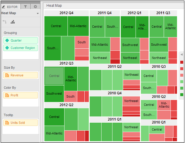
The size of each rectangle represents its relative weight.
The color of each rectangle represents its relative value. For example, in the image below, larger values are green and smaller values are red.
The large areas, such as the 22 Q4 and 2011 Q4 areas of rectangles in the image below, represent different groups of data.
The small rectangles, such as Central and Mid-Atlantic in the image below, represent individual attribute elements.
You must have Edit Dashboard and Run Dashboard privileges.
You must have already created the dashboard to add the visualization to. For steps, see Creating a dashboard.
To create and add a Heat Map visualization to a dashboard:
Click the name of the dashboard to run it.
From the toolbar, click the Insert Visualization icon  . A new blank visualization
is added to the dashboard and displayed.
. A new blank visualization
is added to the dashboard and displayed.
From the Visualization Gallery, click the Heat Map icon.
If the Datasets panel is not displayed, from the View menu, select Datasets Panel.
From the Datasets panel, click and drag attributes to the appropriate area in the Editor panel, as follows. You can also drag objects from the Datasets panel directly onto the visualization.
Drag at least one attribute to the Grouping area. The elements of the attribute are displayed in the visualization. For example, if the attribute is Year, a rectangle for each year is displayed in the visualization.
You can drag additional attributes to the Grouping area to group the rectangles in the visualization in a larger area. For example, the Region attribute contains the element South and the Call Center attribute contains the elements New Orleans and Memphis. If Region is placed above Call Center in the Grouping area, an area called South is displayed in the visualization, with the rectangles New Orleans and Memphis inside. You can add additional attributes to further group the rectangles in the Heat Map.
To select the metric that determines the size of each rectangle, drag the metric to the Size By area. Rectangles for large metric values are displayed as larger than rectangles for small metric values.
To have the rectangles colored automatically based on the value of a metric or based on the elements in an attribute, drag the attribute or metric to the Color By area.
If other graphs and heat maps are colored based on the same attribute, each attribute value will display in the same color across all the graphs and heat maps. the application automatically selects the colors based on the color palette, but you can select a color for each attribute value. For steps, see Dashboard Editor: Heat Map: Properties.
For each attribute in the Editor panel, you can select which attribute forms are displayed in the visualization. An attribute form is a descriptive category for an attribute. For a more detailed description, including how to select what attribute information to display in the headers, see Selecting which attribute forms to display in a visualization.
To select the attribute forms, in the Editor panel, right-click the attribute and point to Display Attribute Form. Select one of the following:
To display an attribute form in the visualization, select the check box next to its name.
To hide an attribute form in the visualization, clear the check box next to its name.
To display additional metrics in a tooltip when a user hovers the cursor over a rectangle, place the metrics you want to display on the Tooltip area.
Click the Save
icon  to save your changes.
Dashboard Editor: Heat Map: Properties
_____________________________
Copyright © 2019, Oracle and/or its affiliates. All rights reserved.
Legal Notices