Analysis Report Examples
The following analysis reports provide examples of how you can leverage and implement analysis reports to solve business information needs.
Chief Operating Officer
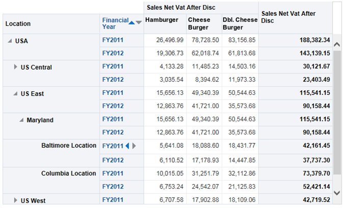
The Chief Operating Officer wants to view a comparison of sales for three signature hamburgers in different regions, and wants to view a comparison of sales at the district and location levels. You can create a report that allows the user to drill down the organizational levels, and to view yearly sales and revenue data that account for VAT and discounts, as shown in the following image:
Figure 2-1 Example Sales Comparison Report

Store Manager
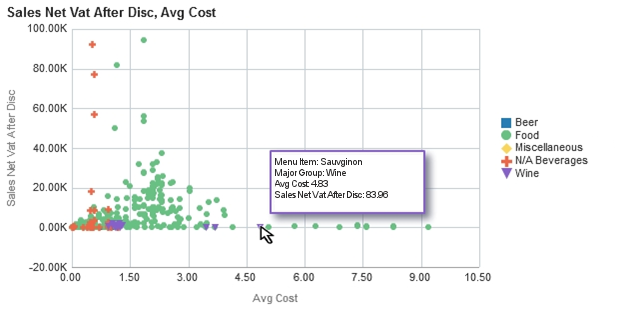
The Store Manager wants to identify the most and least profitable menu items, and to identify positive and negative sales and cost outliers. You can create a report that outputs a scatter plot graph to identify positive and negative data outliers. In the following example, the scatter chart plots the sales and costs of individual menu items to help you identify the items that sold well with low costs and items that sold poorly with high costs. The scatter chart also allows you to mouse over data points to identify specific menu items, as shown in the following image:
Figure 2-2 Example Scatter Chart Report for Data Outliers

Loss Prevention Manager
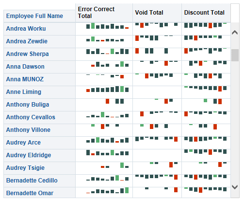
The Loss Prevention Manager wants to identify employees with increasing error correction totals due to it being a potential sign of fraud. You can create a report that lists the employees and shows a histogram of their total error corrections, discount totals, and void totals per week for the previous nine weeks, as shown in the following image:
Figure 2-3 Example Employee Histogram

Business Analyst
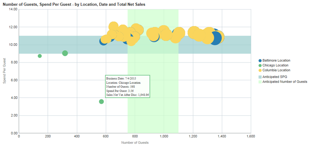
The Business Analyst wants to determine which locations are most profitable with the guests they attract, which locations are upselling, which locations could profit by upselling more items, and which locations have trouble attracting customers. You can create a report that shows a bubble graph to indicate the number of guests and the amount spent per guest (SPG), along with scale markers (the blue and green areas) to identify indicate a target range, as shown in the following image:
Figure 2-4 Example Bubble Graph Report for Number of Guests and Amount Spend Per Guest

Parent topic: Analysis Reports