Report Walkthrough: Revenue and Cost Comparisons
This topic provides an example walkthrough of how a store manager can design and create an analysis report to address a business need.
Identify the Data Shown by the Report
-
The total revenue at a location for each business hour.
-
A historical comparison of total revenue for a selected day and a previous day.
-
The percentage of revenue consumed by food costs, and the percentage of revenue consumed by labor costs.
-
A historical comparison of the percent of revenue consumed by the respective costs.
Add Data Columns to the Report
-
Business Date/Business Date
-
Fixed Period/Business Hour
-
Operations Measures/Food Cost %
-
Operations Measures/Labor Cost%
-
Operations Measures/Total Revenue
-
Operations Measures/Food Cost % (Last Financial Week): AGO("Operations Measures"."Food Cost %", "Business Date"."Financial Year Hierarchy"."Financial Week",1)
-
Operations Measures/Food Cost % (Last Financial Quarter): AGO("Operations Measures"."Food Cost %", "Business Date"."Financial Year Hierarchy"."Financial Quarter",1)
-
Operations Measures/Labor Cost % (Last Financial Week): AGO("Operations Measures"."Labor Cost %", "Business Date"."Financial Year Hierarchy"."Financial Week",1)
-
Operations Measures/Labor Cost % (Last Financial Quarter): AGO("Operations Measures"."Labor Cost %", "Business Date"."Financial Year Hierarchy"."Financial Quarter",1)
-
Operations Measures/Total Revenue(Last Financial Week): AGO("Operations Measures"."Total Revenue", "Business Date"."Financial Year Hierarchy"."Financial Week",1)
-
Operations Measures/Total Revenue (Last Financial Quarter): AGO("Operations Measures"."Total Revenue", "Business Date"."Financial Year Hierarchy"."Financial Quarter",1)
Figure 2-5 Total Revenue (Last Financial Quarter) Column Customization

Add Visualizations to the Report
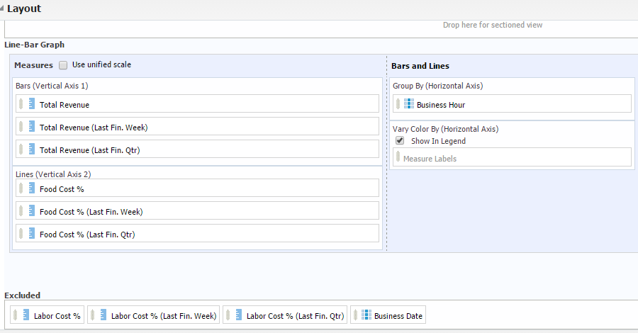
Figure 2-6 Total Revenue Comparison by Hour and Food Cost % Graph Customization

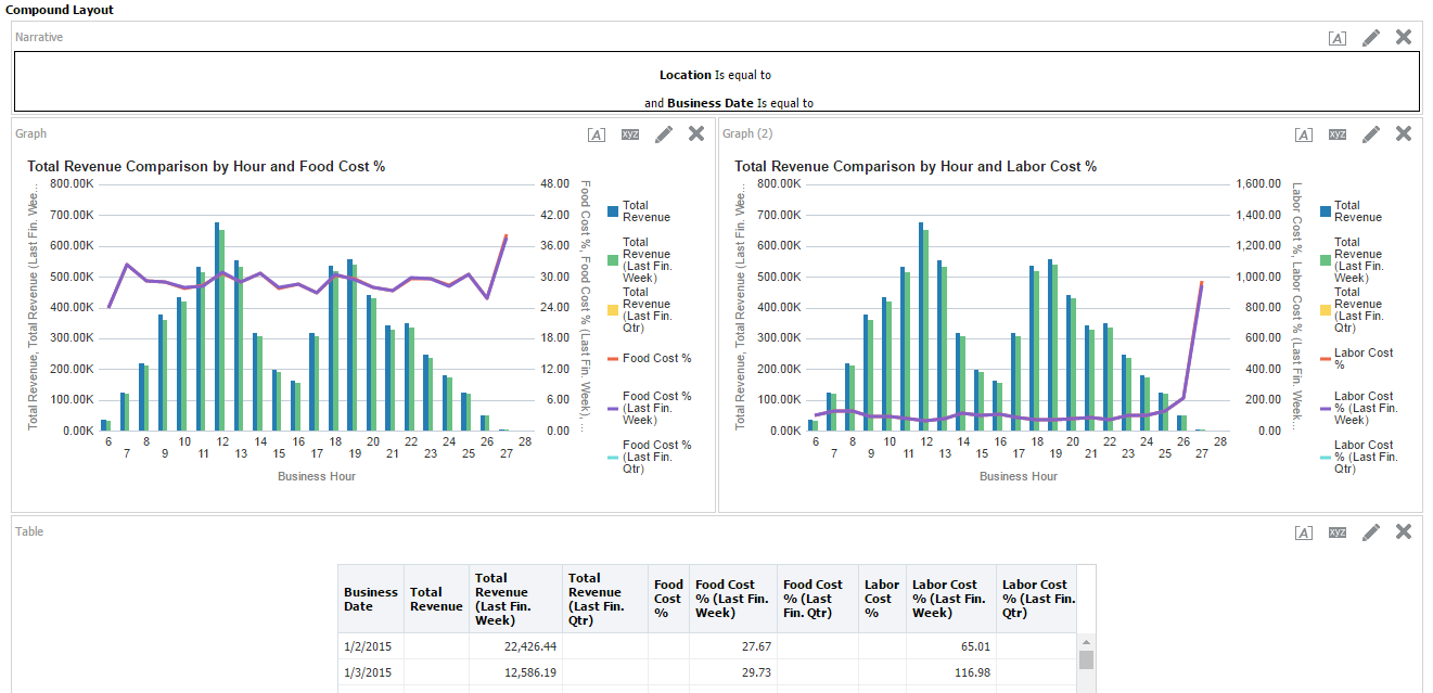
Figure 2-7 Sales Comparison Report

Parent topic: Analysis Reports