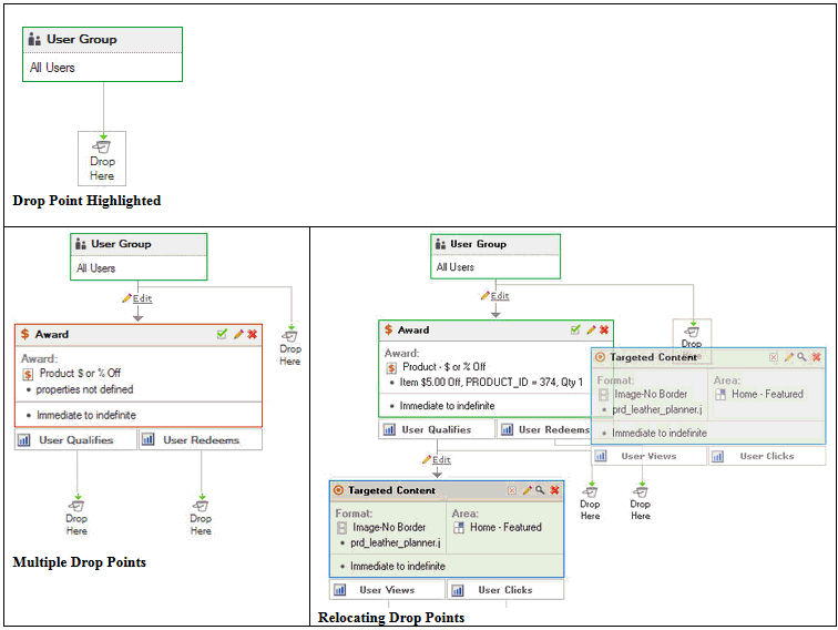
Experiences are created by selecting components from the left stacking pane and dragging them into the right hand work pane. Places where the component may be dropped are indicated by a display of drop points. Once dropped, the component is then customized by making modifications for it in the properties pane.
Each new experience begins with a default component that represents the group of all visitors to a site. New components are added beneath the default one as they are dragged into place. Each type of component has specific ways that additional components may be added to it. These ways are illustrated with small boxes at the bottom of the component, with each box labeled according to what a connection to it would represent. Experiences are built top to bottom, since that is how a visitor to a site would progress through the experience.
Drop points are displayed in the body around each component of an experience when a new component is dragged in. When a user hovers their mouse over a drop point, it will be outlined. Once a drop point is outlined, the component may be dropped onto it and placed in that position in the experience. Drop points are displayed for every connection point of each component in the experience.
You can relocate a component in an experience and move it to another position. Select the header of the component and begin to drag it. Drop points will appear, indicating where you can relocate the component to. Continue to drag the component until a drop point is drawn with and outline, and then drop the component there in the same way you would if you had dragged it in from the left stacked panes.
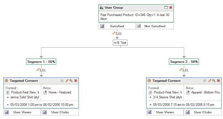
Connectors are the lines that are drawn between components in an experience. They represent the flow from one component to another. Connectors are automatically added as each new component is dragged onto a drop point in the body of the experience. Connectors can be edited by selecting the “Edit” icon on them and can be changed to segment users to conduct A/B tests. When segmenting users in this way, each segment of the connector can be given a name and a percentage to indicate what percentage of visitors should follow that connection through the experience.
|
Single Connector
|
Multiple Connector
|
|
User Segmentation Connector
|
|
Most of the components that are used for experiences have three different states: incomplete, complete, and active. Incomplete components are drawn with a red outline and usually represent newly dragged in components that have not had their properties customized for the experience. Incomplete components can be completed by customizing the contents of their property panes and saving them. Completed components will be drawn with a blue outline, which indicates they have been customized but are not yet active. Completed components are activated through a selection in their properties pane. Once activated, a component is drawn with a green outline.
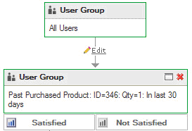
User groups are the only components that do not have a separate completed state. After an incomplete user group is customized and the customization is saved, the user group immediately becomes active and is drawn with a green outline.
User groups define the audience that any other component following the user group will apply to. User groups are made of one or more “conditions”, each of which describes various characteristics a member of the audience may have (e.g. users who are members, have $100 in the cart, have a certain product in their cart, etc.).
Conditions are grouped in the left User Group stacked pane according the characteristic they apply to. When a condition is dragged into an experience, it automatically creates a user group that contains it as the only condition. You can also create user groups that contain multiple conditions. To do that, you drag and drop each condition in separately, but drop the second condition and any additional ones inside the user group that contains the first condition. You then select an and or or relationship between the two conditions to define how the conditions should be evaluated together.
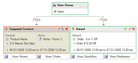
Targeted content is content that is scheduled to appear in a specific place on a specific page for the website. It is considered “targeted” because it only appears if all the conditions before it in the experience are met. Targeted content may only appear in areas that have been defined within Site Manager to support targeted content.
When scheduling targeted content, you drag either a content asset format or an area into the experience. You then set the properties for the content, including the specifics on where the content will appear and how long it will appear.
Awards are discounts or specials that a visitor to the website may qualify for based on their activities. Awards are grouped in the left stacking pane according to what they apply to.
Awards are dragged and dropped into experiences just as other components are. Once added to an experience, their various properties will need to be customized in the properties pane.
Email template components are used to represent emails that will be sent to visitors of the website. Emails will only be sent to users who have opted in to receive the email newsletter from the web site. Each template contains suggested text for both an HTML and a text version of the email. Email templates also may contain “tokens”, which are generic strings that are substituted for specific strings when the email is actually sent. For example, the token “${first.name}” would be substituted and the first name of the email recipient would appear in its place in the email. The text for the email may be customized once the template has been included in an experience. A schedule for when and how often the email may be sent is set up in the properties pane. New email templates may also be created from within Site Manager, using the buttons available on the bottom of the stacked pane.