| Oracle® Retail Merchandise Financial Planning Retail Cloud Service User Guide Release 18.0 F10757-01 |
|

 Previous |
 Next |
| Oracle® Retail Merchandise Financial Planning Retail Cloud Service User Guide Release 18.0 F10757-01 |
|
Previous |
Next |
The Dashboard is the workspace that is seen upon login. The dashboard gives you key statistics at your fingertips. You can use the dashboard to quickly analyze the health of the business.
The dashboard will need to be refreshed periodically as new products, and locations are added. This typically happens weekly, but depends on your administrator's settings. The measure data of existing products and locations in the dashboard can be refreshed at any time to view updated changes.
The dashboard is laid out in three sections:
Tiles are displayed across the top of the screen and contain the measures/metric data. The drop-down lists, displayed above the tiles, control the profile of tiles and segment of data represented in the tiles (and the chart below).
The arrow beneath a tile indicates which is displayed in the chart area in more detail. Clicking on a different tile will refresh the data in the chart area below and put the arrow under the clicked tile.
There are various styles of tiles-variance and informational.
Variance
A variance tile shows the variance between one quantity and two others.
Informational
An informational tile displays the existing measure data.
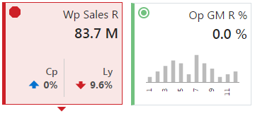
The color and icon of a tile give a visual indicator of the state or health of the metrics in the tile. In the figure above, WP Sales R is showing a red octagon (a problem) because the working plan sales value is 9.6% below Last Year sales. An informational tile is always green indicating no problem because it is simply showing data, not a comparison.
To add a new tile from a predefined pool, press the plus sign (+) button on the right-hand side of the tile carousel (some scrolling might be required). This brings up a dialog showing all the available metric tiles. Click the desired tile and then click Ok. The tile is added to your tile carousel.
To change the order in which tiles are displayed, click the Edit Dashboard button under the plus sign (+) icon to the far right of the tile carousel. Each tile now shows a drag bar at the bottom of the tile. Drag the tile to the place you want it on the carousel and drop it.
To remove a tile, click the Edit Dashboard button under the plus sign (+) icon to the far right of the tile carousel. Each tile now shows a delete icon in the upper right corner. Click the delete icon to remove the tile. The tile is removed and placed back into the list of available tiles.
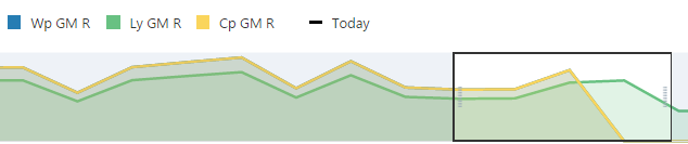
Selecting a tile displays detailed information in the chart area for the measures contained in the tile. The information is presented with time on the horizontal axis and the measure value on the vertical axis.
The drop-down lists, displayed above the tiles, control the profile of tiles and segment of data represented in the tiles and, therefore, the chart area.
The arrow beneath a tile indicates which is displayed in the chart area in more detail. Clicking a different tile refreshes the data in the chart area below and puts the arrow under the clicked tile.
The time horizon used to calculate the metric of each tile can be changed either in the drop-down list selection above the tiles, or by dragging the time horizon window at the bottom of the chart.
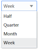
The scale of the horizontal axis (the calendar) can drastically change the shape of the data. You can change the scale of the chart to get more detail, or to smooth fluctuations and more easily spot trends. To do this, select the time scale from the drop-down list at the top right corner of the chart.
Recent Plans is a list of the most recently built plan segments. Choose a segment from the Recent Plan section in the top right of the screen to open the workspace without having to rebuild the segment using the selection wizards. Use the Refresh button to update the list with the most recent plans.
The dashboard also contains a list of dashboard profiles. A dashboard profile groups the metrics, or Key Performance Indicators (KPIs) specific to a business role and business purpose.
Administrator Dashboard
The administrator dashboard profile is common to all RPAS applications.
Planner Dashboards
There is a pre-season and in-season planner dashboard for reviewing the KPIs for the respective time periods.
Exception Dashboards
The exception dashboards show alert hit counts broken down by product and location. Charts are displayed below a chosen alert for the top five alerted products (either departments or subclasses). This helps you understand what your working priorities should be.
Using the Open in Workspace button to open a plan will start alert navigation mode within the workspace and bring you to the first alerted position and views associated with the alerted measure.