3 Defining Components
This chapter explains how to add and update components in the Component Tree. This chapter contains the following sections:
3.1 Overview
The Component Tree represents a library of defined components which can then be added to Component Sets or Flows that specify a test instance. A Component in the Component Tree contains a set of lines of code, which will perform a unique functional action at a given point of time. The lines of code are specified in the component using keywords and parameters that define how to test a particular component in the application under test. A Component should be a single entity. It cannot contain multiple complex dependent functionality.
Components have the following general types:
-
Functional Components: Components that perform application specific functionality. Validations may or may not be part of these components based on the developed component's requirement.
-
Validation Components: Components that perform comparison of expected and actual values. These types of components can also be referred to as check points. Validation components return a Boolean value after the validation is performed.
-
Generic Components: Components that perform application tasks regardless of the product family.
The Component Tree on the Components page has the following structure:
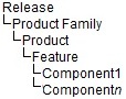
An administrator defines the Release, Product Family, Product, and Feature structure of the Component Tree. Users add Components to the tree and define the keywords and parameters that will be used to specify Component Sets and Flows that generate the OpenScript scripts used to test the application under test.
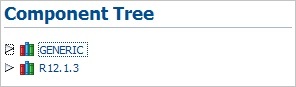
Clicking the Components link at the top of the main window shows the Component Tree and Search Component options. The default Component Tree includes two releases, Generic and R12.1.3, as follows:
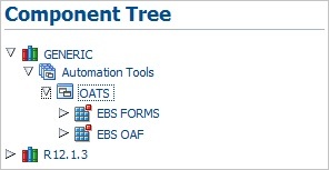
Generic components consist of those components that are functions that can be used across all product families. Expanding the Generic tree shows the list of products and features contained in the Generic tree:
Release and application specific components are listed below the Release(s) listed in the Components Tree. Expanding the tree shows the list of products and features in the release tree:
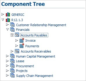
Note that the list of available product and features may vary based upon your specific installation.
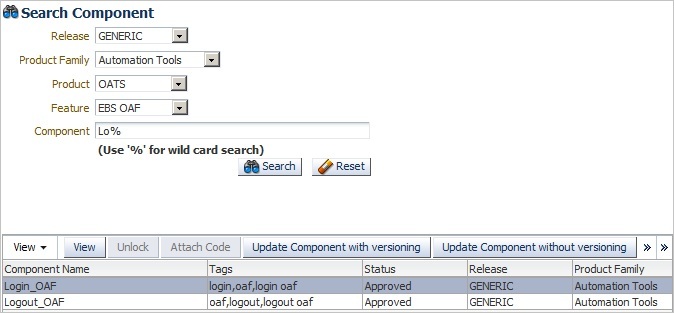
The Search pane of the Components page lets you search for specific components:
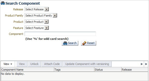
You can select the Release, Product Family, Product, Feature, and Component to narrow the search criteria. You can also use the % wildcard character in the Component field to narrow the search:
Figure 3-6 Search Component Options with Search Criteria
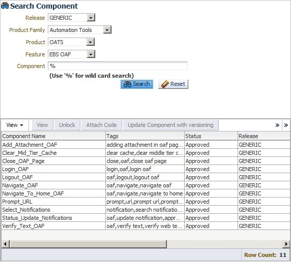
Description of "Figure 3-6 Search Component Options with Search Criteria"
3.2 Adding Components
This section explains the procedure for adding components to the Component Tree. Components can be added to the Component Tree in the following two ways:
-
Creating/uploading component one at a time under each feature. Components can be created directly in the application UI or uploaded from a pre-defined Excel file.
-
Using the bulk upload tool to add multiple components.
3.2.1 Adding Individual Components to the Component Tree
This section explains how to use the Component Tree to add an individual component to a product feature.
To add a component to the Component Tree using the application UI:
-
Expand the Component Tree to the product feature where you want to add the component.
-
Right-click the Feature name and select Create Component from the shortcut menu.
Figure 3-7 Create Component Option of the Feature Shortcut Menu
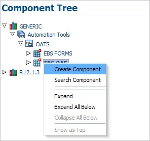
Description of "Figure 3-7 Create Component Option of the Feature Shortcut Menu"
-
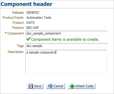
In the Component header pane, enter a Component name, Tags and Description.
The component name should be between 5 and 30 characters. The Component Name is available to create check mark appears if the name does not currently exist in the database.
-
Click Attach Code. The Component Code pane opens for specifying the keywords, objects, and attributes to use to test the component.
-
Define the component code by selecting keywords from the Keywords list and specifying any objects, attributes and parameters required for the each keyword added to the component code.
You can also download an Excel spreadsheet template file and specify the component code in the Excel spreadsheet. You can then upload the Excel spreadsheet to the component code pane. See Section 3.2.2, "Uploading Component Code from a Spreadsheet" for additional information about uploading component code from an Excel spreadsheet.
-
Click Save when finished. Any syntax errors will be highlighted.
-
Fix any errors and submit the component for approval by clicking on Submit or Submit for Approval. If your User Role privileges include Approve privileges, the Submit button is displayed instead of Submit for Approval.
The component submitted for approval should be approved by respective Product Family owner before it can be used in a flow.
-
Click Save and Unlock to save and exit the Component Code pane.
3.2.2 Uploading Component Code from a Spreadsheet
This section explains how to upload component code specified in an Excel spreadsheet. The Oracle Flow Builder includes a template Excel spreadsheet file that can be used to specify keywords, objects, and attributes to use to define a component. The Excel spreadsheet can be uploaded to the component code for a component defined in the Component Tree.
-
Expand the Component Tree to the product feature where you want to add the component.
-
Right-click the Feature name and select Create Component from the shortcut menu.
-
In the Component header pane, enter a Component name, Tags and Description.
The component name should be between 5 and 30 characters. The Component Name is available to create check mark appears if the name does not currently exist in the database.
-
Click Attach Code. The Component Code pane opens for specifying the keywords, objects, and attributes to use to test the component.
-
Click Download Template.
-
Specify a location and save the Excel file.
-
Open and edit the Excel file to define the product information, keywords, objects, attributes and parameters required for the each keyword added to the component code.
-
Save the Excel file as a new name.
-
In the Component Code pane, click Upload and Populate.
Figure 3-10 Upload Component Code Dialog Box
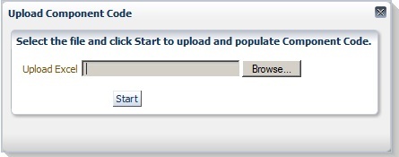
Description of "Figure 3-10 Upload Component Code Dialog Box"
-
Click Browse and select the Excel spreadsheet file.
-
Click Start.
-
Click Save. The system displays syntactical errors, if any.
-
Fix any errors and submit the component for approval by clicking on Submit or Submit for Approval. If your User Role privileges include Approve privileges, the Submit button is displayed instead of Submit for Approval.
-
Click Save and Unlock to save and exit the Component Code pane.
3.2.3 Copying Existing Components
You can copy an existing component to a new component with a new name.
To copy an existing component:
-
Expand the Component Tree to the component that you want to copy.
-
Right-click the component name and select Copy Component from the shortcut menu. The component is copied to the clipboard.
-
Expand the Component Tree to the product feature where you want to add the copied component.
-
Right-click the Feature name and select Paste Component from the shortcut menu.
-
If you are pasting to the same Product Feature tree or a component with the same name as the copied component exists, enter a new name for the new component and click Create.
The component is added to the tree with an In Progress status.
3.3 Updating Components
Existing components can be updated to add or remove keywords or change attributes.
To update an existing component:
-
Select the component to update using the Component Tree or the Search Component options.
-
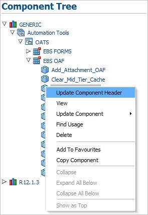
If using the Component Tree, right-click the component to open the shortcut menu:
Figure 3-11 Component Update Shortcut Menu
Description of "Figure 3-11 Component Update Shortcut Menu"
-
If using the Search Component options, the update options appear at the top of the search results pane:
Figure 3-12 Component Search with Update Options
Description of "Figure 3-12 Component Search with Update Options "
The update options are as follows:
Update Component Header: opens the Update Component pane for updating the component header details such as Component name, Tags, and Description.
View: opens the Component Code view in read-only format.
Update Code: opens the Component Code view for editing keywords and attributes. Component code can be updated in two ways:
-
Update code without versioning: only Attribute Value, Mandatory, Re-runnable and Display Name fields can be updated. The component modified with Update code without versioning option does not require approval.
-
Update code with versioning: allows full component updating for add, delete, modify, surround, and insert rows with various options. The component modified with Update code versioning, it must be submitted for approval.
Find Usage: lists all the flows in which the component has been used.
Delete: deletes the component from the Component Tree.
Add to Favourites: adds components that are frequently used in Flows to the Favourites Tree.
Copy Component: copies the component to a new component.
Detach: opens the table in a larger view.
-
-
Select the update option.
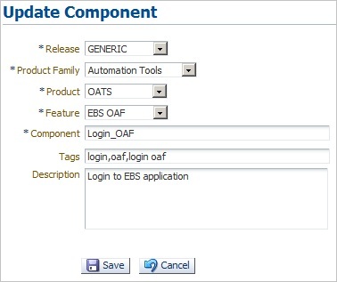
3.3.1 Updating Component Headers
To update the header information for an existing component:
-
Expand the Component Tree to the component to update.
-
Right-click the component and select Update Component Header from the shortcut menu.
-
Update the component header information as needed and click Save.
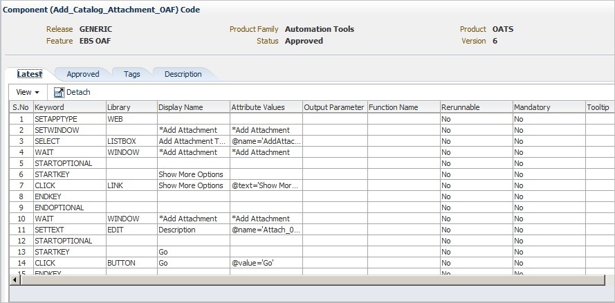
3.3.2 Viewing Component Code
To view component code for an existing component:
-
Expand the Component Tree or use the search options to select the component to view.
-
Select View from the Component Tree shortcut menu or the search pane.
-
Use the View menu options to re-order columns and select specific columns to view.
-
Click Detach to open the component code in a larger view.
-
Click the [X] button to close the component code view when finished.
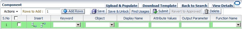
3.3.3 Updating Component Code without Versioning
To update component code without changing the component code version:
-
Expand the Component Tree or use the search options to select the component to update.
-
Select Update Code without Versioning from the Component Tree shortcut menu or the search pane.
Figure 3-15 Update Component Code without Versioning Pane
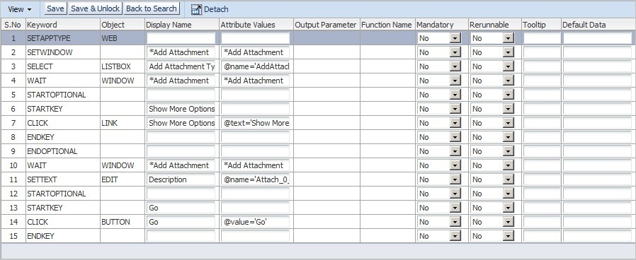
Description of "Figure 3-15 Update Component Code without Versioning Pane "
Only Attribute Value, Mandatory, Re-runnable and Display Name fields can be updated in this pane.
-
Click Save or Save & Unlock after necessary modifications are made. Click Back to Search to exit without saving changes.
3.3.4 Updating Component Code with Versioning
To update component code and change the component code version:
-
Expand the Component Tree or use the search options to select the component to update.
-
Select Update Code with Versioning from the Component Tree shortcut menu or the search pane.
Figure 3-16 Update Component Code with Versioning Pane
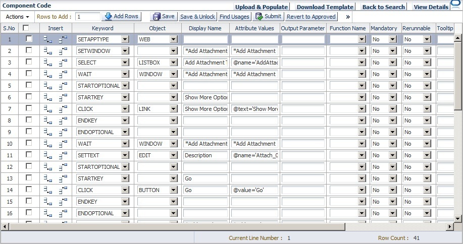
Description of "Figure 3-16 Update Component Code with Versioning Pane "
This pane allows full component updating for add, delete, modify, surround, and insert rows with various options.
Adding rows: specify the number of rows to add in Rows to Add and click Add Rows. The specified number of rows are added to the end of the table.
Deleting rows: select the checkbox for the row to delete and click Delete or click the Trash can icon at the end of the row.
Inserting rows: select the row where you want to insert a new row before or after. Click the Insert Before or Insert After icon in the Insert column of the row.
Inserting a structure before or after a row: select the row where you want to insert a new structure. From the View menu, select Insert Structure, select Above or Below, then select the type of structure: Start Optional, Start Group, Start Iterate.
Surrounding a row with a structure: select the row that you want to surround with a new structure. From the View menu, select Surround With, then select the type of structure: Start Optional, Start Group, Start Iterate.
-
Click Save or Save & Unlock after necessary modifications are made. Click Back to Search to exit without saving changes.
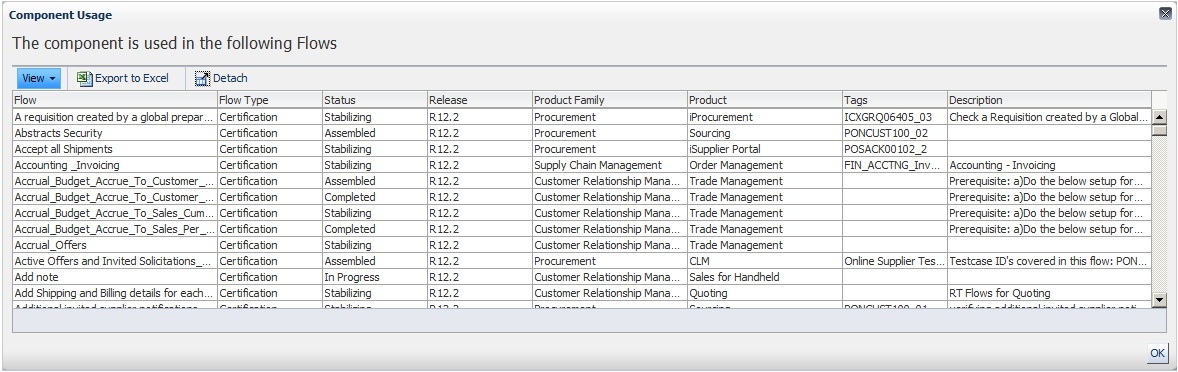
3.3.5 Finding Component Usage
To find the flows in which a component is used:
-
Expand the Component Tree or use the search options to select the component to find usage.
-
Select Find Usage from the Component Tree shortcut menu or the search pane.
Use the View menu options to show or hide columns, detach the report to a separate view, or reorder the columns.
Use the Export to Excel option to save the data to an Excel spreadsheet file.
-
Click the window close button when finished.
3.4 Component Development Guidelines
This section provides guidelines for developing component code.
-
The data sheet that is created in the flow will contain the columns which when populated will generate the code for execution for each component.
-
One component cannot be called from any other component.
-
Input and output parameters must be specified using GET and SET keywords.
-
Any looping construct must be created in generic functions and not in the components.
3.4.1 Component Code
The Component Code defines the keywords, objects, and attributes that define the test actions for the component.
3.4.1.1 Keywords
This section provides guidelines for using Keywords to specify component code.
Setting Application Type and Window
Component creation in the UI should begin with setting the Application Type and Window using the SETAPPTYPE and SETWINDOW keywords to specify the type of application and the window name. The following table shows an example of the component code steps:
Table 3-1 Keywords for Setting Application Type and Window
| Step # | Keyword | Object Type | Display Name | Attribute Values |
|---|---|---|---|---|
|
1 |
SETAPPTYPE |
Web |
||
|
2 |
SETWINDOW |
Login |
Login |
Step 1 sets the application type as a web application.
Step 2 sets the window to the window with the display name Login and attribute value Login.
Statements in component code must be defined within STARTGROUP and ENDGROUP keywords in the following scenario:
Statement 1
Statement a
Statement b
Statement c
If all statements a, b, c need to be executed only if input is provided to Statement 1. The following table shows an example of the component code steps:
Table 3-2 Keywords for Grouping Statements
| Step # | Keyword | Object Type | Display Name | Attribute Values |
|---|---|---|---|---|
|
1 |
SETAPPTYPE |
Web |
||
|
2 |
SETWINDOW |
Login |
Login |
|
|
3 |
STARTGROUP |
|||
|
4 |
SELECT |
List |
Actions |
Actions |
|
5 |
FUNCTIONCALL |
GENLIB |
Refresh List Box |
|
|
6 |
ENDGROUP |
Step 1 sets the application type as a web application.
Step 2 sets the window to the window with the display name Login and attribute value Login.
Step 3 defines the start of the statement group.
Step 4 specifies a SELECT action which requires test data to select a value in list box.
Step 5 specifies a FUNCTIONCALL. This step does not require any test data to be provided, but is a mandatory step or code to be generated if test data is provided for Step 4.
Step 6 defines the end of the statement group.
Components that have multiple tabs/pages in the application (a simple set of pages, for example, train) should be placed within STARTTAB and ENDTAB keywords in the following scenario:
Statement 1
Statement 2
Statement 3
Statement 4
If input is provided for any of Statements 2, 3, or 4, then only Statement 1 will be executed.
The STARTTAB and ENDTAB Keyword set can contain any other Keyword combinations. For example, in between STARTTAB and ENDTAB can have a STARTGROUP and ENDGROUP Keyword set or a STARTITERATE and ENDITERATE Keyword set.
The following table shows an example of the component code steps:
Table 3-3 Keywords for Setting Tab Pages
| Step # | Keyword | Object Type | Display Name | Attribute Values |
|---|---|---|---|---|
|
1 |
SETAPPTYPE |
FORMS |
||
|
2 |
SETWINDOW |
Purchase Order |
PO_HEADER |
|
|
3 |
STARTTAB |
Lines |
||
|
4 |
CLICK |
TAB |
Lines |
TAB_LINES |
|
5 |
SETTEXT |
EDIT |
Item Description |
Item_Description_0 |
|
6 |
SETTEXT |
EDIT |
Promise Date |
PROMISEDATE_0 |
|
7 |
ENDTAB |
Lines |
||
|
8 |
STARTTAB |
More |
||
|
9 |
CLICK |
TAB |
More |
TAB_MORE |
|
10 |
SETTEXT |
EDIT |
Amount |
AMOUNT_HEADER |
|
11 |
ENDTAB |
More |
Step 1 sets the application type as a FORMS application.
Step 2 sets the window to the window with the display name Purchase Order and attribute value PO_HEADER.
Step 3 defines the start of the Lines tab.
Step 4 clicks the Lines tab if a value is provided for either "Item Description" or "Promised Date". Otherwise it will be skipped.
Steps 5 and 6 set the text for the edit boxes "Item Description" and "Promise Date".
Step 7 defines the end of the Lines tab.
Step 8 defines the start of the More tab.
Step 9 clicks the More tab if a value is provided for "Amount". Otherwise it will be skipped.
Steps 10 sets the text for the edit box "Amount".
Step 11 defines the end of the More tab.
Components that have multi-page Next/Submit options for further navigation use the STARTOPTIONAL and ENDOPTIONAL Keyword set. Figure 3-18 shows an example of a component with Next/Submit options:
Figure 3-18 Component with Next/Submit Navigation
Description of "Figure 3-18 Component with Next/Submit Navigation"
The STARTKEY and ENDKEY Keywords are required within the STARTOPTIONAL and ENDOPTIONAL Keyword set. Only one statement is required within the STARTKEY and ENDKEY keyword set.
The following table shows an example of the component code steps:
Table 3-4 Keywords for Optional Navigation
| Step # | Keyword | Object Type | Display Name | Attribute Values |
|---|---|---|---|---|
|
1 |
SETAPPTYPE |
Web |
||
|
2 |
SETWINDOW |
Create Transaction |
||
|
3 |
SETTEXT |
EDIT |
Field 1 |
FIELD_1 |
|
4 |
SELECT |
LIST |
Field 2 |
FIELD_2 |
|
5 |
STARTOPTIONAL |
|||
|
6 |
STARTKEY |
|||
|
7 |
CLICK |
BUTTON |
ClickNext |
SUBMIT_NEXT |
|
8 |
ENDKEY |
|||
|
9 |
WAIT |
WINDOW |
Page 2 |
Login |
|
10 |
ENDOPTIONAL |
|||
|
11 |
STARTOPTIONAL |
|||
|
12 |
STARTKEY |
|||
|
13 |
CLICK |
BUTTON |
ClickSubmit |
SUBMIT |
|
14 |
ENDKEY |
|||
|
15 |
WAIT |
WINDOW |
Page 3 |
Page 3 |
|
16 |
ENDOPTIONAL |
Step 1 sets the application type as a web application.
Step 2 sets the window to the window with the attribute value "Create Transaction".
Step 3 sets the text for the edit box "Field 1".
Step 4 selects the list box "Field 2".
Step 5 through 10 define the STARTOPTIONAL and ENDOPTIONAL Keyword set for the Next button click.
Step 11 through 16 define the STARTOPTIONAL and ENDOPTIONAL Keyword set for the Submit button click.
Components that have UI with line items use the STARTITERATE and ENDITERATE Keyword set with the MAXVISIBLELINES and SETLINE Keywords. Figure 3-19 shows an example of a component with line items.
MAXVISIBLELINES and SETLINE are required within STARTITERATE and ENDITERATE.
-
The MAXVISIBLELINES keyword specifies the maximum number of rows visible in the form of the component. The value is set in the "Attribute Value" column. There is no input parameter for this keyword.
-
The SETLINE keyword specifies the current line using one input parameter as the "Display Name".
-
All lines item functionality UI components that have Attribute value changes such as _0, _1, etc. must be between the STARTITERATE & ENDITERATE Keywords.
The following table shows an example of the component code steps:
Table 3-5 Keywords for Setting Line Items
| Step # | Keyword | Object Type | Display Name | Attribute Values |
|---|---|---|---|---|
|
1 |
STARTITERATE |
|||
|
2 |
MAXVISIBLELINES |
4 |
||
|
3 |
SETLINE |
PO Line Number |
||
|
4 |
SETFOCUS |
EDIT |
Item Description |
ITEM_DESCRIPTION_0 |
|
5 |
SETTEXT |
EDIT |
Type |
ITEM_TYPE_0 |
|
6 |
SETTEXT |
EDIT |
Category |
ITEM_CATEGORY_0 |
|
7 |
ENDITERATE |
Step 1 starts the STARTITERATE/ENDITERATE Keyword set.
Step 2 sets the maximum visible lines in the form.
Step 3 sets the current line to the PO Line Number.
Step 4 set the focus to the Item Description.
Step 5 and 6 set the text in the fields.
Step 7 ends the STARTITERATE/ENDITERATE Keyword set.
Setting Line Items with Column Search
Components that have UI with line items where column are searched using the STARTITERATE and ENDITERATE Keyword set with the MAXVISIBLELINES and SEARCHCOLUMN Keywords. Figure 3-20 shows an example of a component with line items with searchable columns.
Figure 3-20 Component with Line Items and Columns
Description of "Figure 3-20 Component with Line Items and Columns"
The following table shows an example of the component code steps:
Table 3-6 Keywords for Setting Line Items with Column Search
| Step # | Keyword | Object Type | Display Name | Attribute Values |
|---|---|---|---|---|
|
1 |
STARTITERATE |
|||
|
2 |
MAXVISIBLELINES |
4 |
||
|
3 |
SEARCHCOLUMN |
Requisition |
REQUISTION_NUM_0 |
|
|
4 |
SEARCHCOLUMN |
Line |
REQ_LINE_0 |
|
|
5 |
CHECK |
CHECKBOX |
Select REQ Line |
SELECT_REQ_LINE_0 |
|
6 |
SETFOCUS |
EDIT |
Item |
REQ_ITEM_0 |
|
7 |
ENDITERATE |
Step 1 starts the STARTITERATE/ENDITERATE Keyword set.
Step 2 sets the maximum visible lines in the form.
Step 3 searches the Requisition column.
Step 4 searches the Line column.
Step 5 checks the check box.
Step 6 set the focus to the Item field.
Step 7 ends the STARTITERATE/ENDITERATE Keyword set.
Component code that causes a page navigation action (for example, clicking on a link, image, or button) should include a WAIT Keyword on the new page to provide better stability of the script.
The following table shows an example of the component code steps:
Table 3-7 Keywords for Setting Wait for Window
| Step # | Keyword | Object Type | Display Name | Attribute Values |
|---|---|---|---|---|
|
1 |
CLICK |
BUTTON |
Login |
Login |
|
2 |
SETWINDOW |
Oracle Applications Home page |
Oracle Applications Home page |
|
|
3 |
WAIT |
WINDOW |
Oracle Applications Home page |
Oracle Applications Home page |
Step 1 clicks the login button.
Step 2 sets the new window.
Step 3 waits for the new window.
Component code for form tabs uses the "Display Name" column to specify the visible text on the tab and the "Attribute Value" to specify the @name attribute of the tab.
The following table shows an example of the component code steps:
Table 3-8 Keywords for Setting Actions on Form Tabs
| Step # | Keyword | Object Type | Display Name | Attribute Values |
|---|---|---|---|---|
|
1 |
TAB |
Include Function |
REGIONS |
Step 1 clicks the Include Function tab.
Components that have UI with an HTML/OAF table are specified using the SETTABLENAME Keyword with the STARTITERATE/ENDITERATE Keywords set and the SETLINE Keyword. SETTABLENAME should specify the first row, first column value. If not available, any column in the table.
The HTML/OAF table should be a separate component. Figure 3-21 shows an example of a component with an HTML/OAF table.
Figure 3-21 Component with HTML/OAF Table
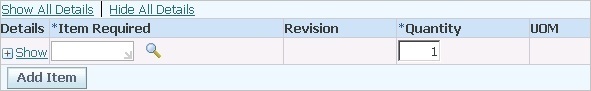
Description of "Figure 3-21 Component with HTML/OAF Table"
Display Name: should be the column name of the table.
Attribute Value: should be the column name of the table.
Note: if there is more than one table named "Details", specify the table attribute value as "Details", "Details;1" or "Details;2" depending on the sequence. By default "Details" is Details;0 (index starts from zero).
The following table shows an example of the component code steps:
Table 3-9 Keywords for Setting Table Name
| Step # | Keyword | Object Type | Display Name | Function Name | Attribute Values |
|---|---|---|---|---|---|
|
1 |
SETTABLENAME |
Details |
Details |
||
|
2 |
STARTITERATE |
||||
|
3 |
SETLINE |
Item Line Number |
|||
|
4 |
FUNCTIONCALL |
GENLIB |
*Item Description |
WEBSELECTLOV |
Search for Item Description |
|
5 |
SETTEXT |
EDIT |
*Quantity |
quantity |
|
|
7 |
ENDITERATE |
Step 1 sets the table name.
Step 2 starts the STARTITERATE/ENDITERATE Keyword set.
Step 3 sets line number.
Step 4 calls the WEBSELECTLOV function from the GENLIB function library.
Step 5 sets the quantity text.
Step 6 ends the STARTITERATE/ENDITERATE Keyword set.
Setting Table Name and Column Search
Components that have UI with an HTML/OAF table are specified using the SETTABLENAME Keyword with the STARTITERATE/ENDITERATE Keywords set and the SEARCHCOLUMN Keyword. SETTABLENAME should specify the first row, first column value. If not available, any column in the table.
If a combination of search columns is unique, 2 search columns can be specified, For example:
SETTABLENAME
STARTITERATE
SEARCHCOLUMN 1st column name as display name
SEARCHCOLUMN 2nd column name as display name
CLICK LINK
ENDITERATE
Figure 3-22 shows an example of a component with an HTML/OAF table with columns.
Figure 3-22 Component with HTML/OAF Table with Columns
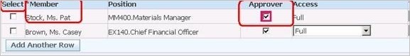
Description of "Figure 3-22 Component with HTML/OAF Table with Columns"
Display Name: should be the column name of the table.
Attribute Value: should be the column name of the table.
Note: if there is more than one table named "Select", specify the table attribute value as "Select", "Select;1" or "Select;2" depending on the sequence. By default "Select" is Select;0 (index starts from zero).
The following table shows an example of the component code steps:
Table 3-10 Keywords for Setting Table Name and Column Search
| Step # | Keyword | Object Type | Display Name | Function Name | Attribute Values |
|---|---|---|---|---|---|
|
1 |
SETTABLENAME |
Select |
Select |
||
|
2 |
STARTITERATE |
||||
|
3 |
SEARCHCOLUMN |
*Member |
|||
|
4 |
SEARCHCOLUMN |
Position |
|||
|
5 |
FUNCTIONCALL |
GENLIB |
*Item Description |
WEBSELECTLOV |
Search for Item Description |
|
6 |
SETTEXT |
EDIT |
*Quantity |
quantity |
|
|
7 |
CHECK |
CHECKBOX |
Approver |
approver |
|
|
8 |
ENDITERATE |
Step 1 sets the table name.
Step 2 starts the STARTITERATE/ENDITERATE Keyword set.
Step 3 search for *Member column.
Step 4 search for Position column.
Step 5 calls the WEBSELECTLOV function from the GENLIB function library.
Step 6 sets the Quantity text.
Step 7 sets the Approver checkbox.
Step 8 ends the STARTITERATE/ENDITERATE Keyword set.
Components that have UI with Form treelist objects are specified using the SELECT Keyword specifying the object as TREELIST. Figure 3-23 shows an example of a component with a Form Treelist.
Figure 3-23 Component with Forms Treelist
Description of "Figure 3-23 Component with Forms Treelist"
The following table shows an example of the component code steps:
Table 3-11 Keywords for Form Treelist
| Step # | Keyword | Object Type | Display Name | Attribute Values |
|---|---|---|---|---|
|
1 |
STARTITERATE |
|||
|
2 |
MAXVISIBLELINES |
4 |
||
|
3 |
SEARCHCOLUMN |
Requisition |
REQUISTION_NUM_0 |
|
|
4 |
SEARCHCOLUMN |
Line |
REQ_LINE_0 |
|
|
5 |
CHECK |
CHECKBOX |
Select REQ Line |
SELECT_REQ_LINE_0 |
|
6 |
SETFOCUS |
EDIT |
Item |
REQ_ITEM_0 |
|
7 |
ENDITERATE |
Step 1 starts the STARTITERATE/ENDITERATE Keyword set.
Step 2 sets the maximum visible lines in the form.
3.4.1.2 Objects
Objects specify the type of object on which to perform the keyword action. Specific keywords have specific object types. The list of object types for a keyword will appear in the Object list when the keyword is specified in the component code window. See Appendix A for additional information.
3.4.1.3 Display Name
The Display Name column specifies the text that displays in the UI of the component. The Display Name is mandatory for all action related statements. For example, SETTEXT, CLICK, etc.
3.4.1.4 Attribute Values
The Attribute Values column specifies attribute name-value pairs. For Form objects the default is its name attribute. For example, id=usernamefield, name=USERNAME_0 for web.
If name-value pairs are not provided, the following default attributes are used for each UI component.
Table 3-12 Default Attributes for Object Types
| Object | Attribute Defaults |
|---|---|
|
Web: id, Form: not required |
|
|
id |
|
|
id |
|
|
id |
|
|
name |
|
|
name |
|
|
alt |
|
|
text |
|
|
id |
|
|
id |
|
|
Web: alt attribute of the torch icon in the web page, Form: name attribute of the text field on which the List of Values needs to be invoked. |
|
|
id |
|
|
name (display name is mandatory with the visible tab value or you can record and get the text) |
|
|
all tables are handled through first cell value or first non blank header. |
|
|
id |
|
|
none |
|
|
Web: need to check, Form: name |
|
|
none |
|
|
none |
|
|
Web: title, Form: name |
3.4.1.6 Function Name
Specifies the name of the function to call when the Keyword FUNCTIONCALL is specified.
3.4.1.7 Mandatory
Specify Yes in this column for all mandatory fields. A No value is the default if this field is left empty.
3.4.1.8 Rerunable
Specify Yes for fields where the value entered should be unique. Specifying Yes for the Rerunnable column for any field appends a random variable to the data passed. The random variable will be preceeded with question mark. For example, fields such as Username or Item name, etc. should be unique. There cannot be two users or items with same name.