|
Self-Service Application Guide for Oracle Billing Insight > Overview of the Self-Service Application >
Common UI Elements
Pages in the Self-Service application share some common user interface elements for navigating and searching for information. These elements frame the main page area that displays user data. Common UI elements in the Self-Service application are:
- Masthead. The masthead displays at the top of each page and displays the application name, user name, and links for choosing a language and logging out. For details, see Masthead Element.
- Mailing Address module (Consumer users only, if Web Services are enabled). The Mailing Address module displays in all pages that a B2C User accesses and displays the user's address.
- Quick Links module (Not shown for prepay accounts). A list of quick links appears on the left side of each page for direct access to a few functional areas of the Self-Service application. Business and consumer users see a different set of quick links. For details, see Quick Links Module.
- Report Context module (Business users only). Report context information appears on the left side of each page, showing the name of the company, hierarchy, and position the user is assigned to, and which defines the scope of the report data displayed on the page. For details, see Report Context Module (Business Edition Only).
- Scheduled Payments module (Not shown for prepay accounts). In the payment-related use cases, a list of scheduled payments appears on the left side of each page in payment-related use cases, showing the payments scheduled by account number and date. For details, see Scheduled Payments Module.
- FAQ (If configured). Frequently asked question information that you configure for display. For details, see FAQ Module (If Configured).
- More Support Options (If configured). Live links to access assistance platforms on the Service Cloud, including Ask a Question, Live Chat, and Ask the Community. For details, see More Support Options Module (If Configured).
- Tab menus. Tab menus on each page provide subnavigation for individual functions. Business and consumer user roles see a different sets of tab menus.For details, see Tab Menus.
- Logical Paths. Logical paths show the navigation path to each page and provide live links for navigating back. For details, see Logical Paths.
- Footer module. The footer displays at the bottom of each screen and displays legal notices and provider contact links. For details, see Footer Element.
- Paging element. When needed, the paging element appears to let users navigate multiple report pages. For details, see Paging Element.
- Download and printer-friendly element. Where available, the download and printer-friendly features let users download and print reports. For details, see Download and Printer-Friendly Elements.
Masthead Element
The masthead appears at the top of each page in the Self-Service application, as shown in Figure 5.
Figure 5. Masthead Element
|
The individual masthead components are described in Table 2.
Table 2. Masthead Components
|
|
Text: ORACLE© Billing Insight Self-Service |
Standard Oracle company logo with copyright symbol, and the application name. |
Data: User Name |
Displays the name of the user logged into the current session. |
Text and link: Language |
Displays the Change Language use case. For details, see Use Case: Setting Personal Preferences. |
Text and link: Logout |
Displays the Logout use case. For details, see Use Case: Logging Out of the Self-Service Application. |
Quick Links Module
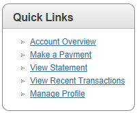
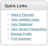
Quick Links provide access to frequently used functions in the Self-Service application. Quick links vary for business and consumer users, and do not appear on prepay screens. Quick Links for Business Users
Figure 6 shows the Quick Links module displayed to business users.
Figure 6. Quick Links Module for Business Users
|
Table 3. describes the quick links displayed to business users.
Quick Links for Consumer Users
Figure 7 shows the Quick Links module displayed to consumer users.
Figure 7. Quick Links Module for Consumer Users
|
Table 4. describes the quick links displayed to consumer users.
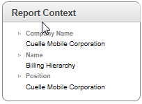
Report Context Module (Business Edition Only)
The Report Context module displays in all use cases in the Business Edition that present Self-Service report information. The report context displays the following information, which identifies the user's hierarchy position and defines the scope of the report:
- Text and data: Company Name Company name
- Text and data: Name Hierarchy name
- Text and data: Position Position
Figure 8 shows the Report Context module displayed to business users.
Figure 8. Report Context Module for Business Users
|
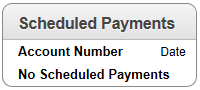
Scheduled Payments Module
The Scheduled Payments module displays in all payment-related use cases, showing all payments scheduled for the account. The Scheduled Payments module does not appear for consumer prepay accounts. The Scheduled Payments module contains the following elements:
- Text and data: Account Number Account number
- Text and data: Date Date
- Text (If applicable): No Scheduled Payments
Figure 9 shows the Scheduled Payments module.
Figure 9. Scheduled Payments Module
|
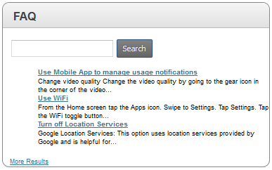
FAQ Module (If Configured)
You can configure the FAQ module to display with information from Oracle Service Cloud. The FAQ module contains the following elements:
- Text: FAQ
- Text: (Configurable)
Figure 10 shows the FAQ module.
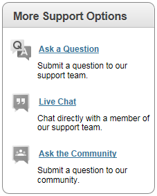
More Support Options Module (If Configured)
You can configure the More Support Options module to displays Live links for accessing platforms on the Service Cloud. The More Support Options module contains the following elements:
- Graphic and link: QA Graphic Ask a Question
Link target: Sends a question to the service team on the Service Cloud.
- Text: Submit a question to our support team.
- Graphic and link: QA Graphic Live Chat
Link target: Opens a live chat session with a support team member on the Service Cloud.
- Text: Chat directly with a member of our support team.
- Graphic and link: QA Graphic Ask the Community
Link target: Sends a question to a community board on the Service Cloud.
- Text: Submit a question to our community.
Figure 11 shows the More Support Options module.
Figure 11. More Support Options Module
|
Tab Menus
Tab menus appear across the top of all pages in the Self-Service application. Tab menus vary for the following:
Tab Menus for Business Users
Figure 12 shows the tab menus that display to business users in the Self-Service application.
Figure 12. Tab Menus for Business Users
|
Table 5 describes the tab menu options for business users.
Table 5. Tab Menu Options (Business Users)
|
|
|
Dashboard |
None |
Dashboard Overview |
Unbilled |
None |
Unbilled Usage |
Statements |
Billing Summary (Billing hierarchy only) Summary Account Service Usage Detail |
Billing Summary Statement Summary Account Summary Service Summary Usage Summary Usage Detail |
Analytics |
Billing (Billing hierarchy only) Business (Business hierarchy only) Find Calls Custom Reports |
Analytics Find Calls Custom Reports |
Payments |
One-Time Recurring Activity Accounts |
Make a One-Time Payment Recurring Payment Payment Activity Payment Accounts |
Hierarchy |
Manage Search Compare Admin submenu options:
- Create
- Copy
- Import
- Publish
- Download
- Expire
- Delete
|
Manage Hierarchies Search Hierarchy Compare Hierarchy Create Hierarchy Copy Hierarchy Import Hierarchy Publish Hierarchy Download Hierarchy Expire Hierarchy Delete Hierarchy |
My Account |
Personal submenu options:
- User Profile
- Notifications
- Contacts
- Preferences
Company submenu options:
- Profile
- Contacts
- User
- Settings
|
View Profile Notifications Contacts User Preferences Company Profile Company Contacts Users Administrative Settings |
Tab Menus for Consumer Users (Postpay Accounts)
Figure 13 shows the tab menus that display to consumer users with postpay accounts in the Self-Service application.
Figure 13. Tab Menus for Consumer Users (Postpay Accounts)
|
Table 6 shows the tab menu options for consumer users with postpay accounts.
Table 6. Tab Menu Options (Consumer Users, Postpay)
|
|
|
Dashboard |
None |
Dashboard |
Unbilled |
None |
Unbilled Usage |
Statements |
Summary Account Service Usage Detail |
Statement Summary Account Summary Service Summary Usage Summary Usage Detail |
Analytics |
Billing Find Calls Custom Reports |
Analytics Find Calls Custom Reports |
Payments |
One-Time Recurring Activity Accounts |
Make a One-Time Payment Recurring Payment Payment Activity Payment Accounts |
Personal |
User Profile Notifications Contacts Preferences |
View Profile Notifications Contacts User Preferences |
Tab Menus for Consumer Users (Prepay Accounts)
Figure 14 shows the tab menus that display to consumer users with prepay accounts in the Self-Service application.
Figure 14. Tab Menus for Consumer Users (Prepay Accounts)
|
Table 7 shows the tab menu options for consumer prepay accounts
Table 7. Tab Menu Options (Consumer Users, Prepay)
|
|
|
Dashboard |
None |
Dashboard |
Analytics |
Billing |
Analytics - Standard Reports (3) |
Payments |
Top Up Activity Accounts |
Prepay Top Up Payment Activity Payment Accounts |
Personal |
User Profile Notifications Preferences |
View Profile Notifications User Preferences |
Logical Paths
Logical paths appear beneath the tabs on each page and show the tab and options leading to the page, for example:
- Statements > Account Summary
- My Account > Personal > User Profile
- Analytics > Billing Reports > Account Billing Overview
Live links within the path let the user navigate back within the same functional tab area. Figure 15 shows an example of the logical path element.
Figure 15. Logical Path Element
|
Footer Element
The footer displays at the bottom of each screen and displays legal notices and provider contact links. Figure 16 shows the footer that appears on Self-Service application pages.
Figure 16. Footer Element
|
Table 8 describes the components of the footer element.
Table 8. Footer Components
|
|
Text: Copyright© 2007, 2016 Oracle. All Rights Reserved. |
The current Oracle copyright statement. |
Text and link: About Oracle |
Displays the Oracle Web site. |
Text and link: Contact Us |
Displays the Contact Oracle page on the Oracle Web site. |
Text and link: Legal Notices and Terms of Use |
Displays Oracle's Privacy Policy Overview on the Oracle Web site. |
Text and link: Privacy Statement |
Displays Oracle's Privacy Policy Overview on the Oracle Web site. |
Paging Element
The paging element displays on detail tables when the number of rows returned exceeds a configured value. Figure 17 shows an example of the Paging element.
Figure 17. Paging Element
|
Table 9 describes the components of the paging element.
Table 9. Paging Element Components
|
|
Paging Number of Total |
Text and data. |
Page field prompt |
Field where the user can enter a specific page number. |
Next and Prev buttons |
Navigation buttons appear when applicable. |
Download and Printer-Friendly Elements
Most reporting use cases provide file download and printer-friendly options in the Self-Service application. Figure 18 shows an example of the Download and Printer-Friendly elements.
Figure 18. Download and Printer-Friendly Elements
|
CSV and XML are standard download formats and are available in each use case where the Download element appears. PDF file format is also available in the following use cases:
Table 10 describes the components of the download and printer-friendly elements.
Table 10. Download and Printer-Friendly Components
|
|
Download |
This feature contains the following components:
- Text and drop-down list: Download List
- Button: Download
Action: Displays the File Download dialog for saving the report in the selected format.
|
Printer-Friendly |
This feature contains the following elements:
- Icon: Printer-friendly
- Text and link: Printer-Friendly
Link target: Displays the report in printer-friendly format and displays the Print dialog.
|
| 


