The Chart component displays a graphical chart based on the project data. It supports several sub-types and includes options for selecting the specific data to display.
The chart sub-types are:
| Chart Type | Description |
|---|---|
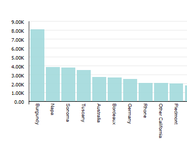
| Bar chart | Bar charts show one or more metric
values aggregated across a group dimension. They are useful for precise
comparisons of one or more values.
|
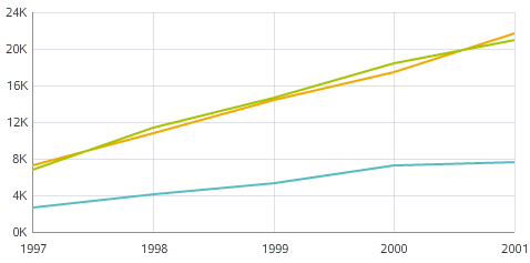
| Line / Area chart | Line charts show one or more metric
values aggregated across a group dimension. They are useful for showing changes
or trends.
|
| Pie / Sunburst chart | Pie charts show a single metric
aggregated across a group dimension. They are useful for showing how each value
contributes towards a total. Sunburst charts show concentric rings of metric
values, in order to display contribution towards a total while also showing
relationships between hierarchical data.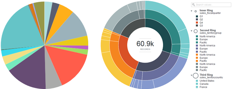 |
| Scatter chart | Scatter charts display data points,
with each point representing a dimension value. Points can also be aggregated
into bins in a binned scatterplot, or measured against a third metric and
displayed as scaled bubbles in a bubble chart. These charts are useful for
showing correlations between metrics.
 |
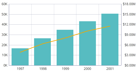
| Bar-Line chart | Bar-Line charts show two or more
metric values aggregated across a group dimension. They are useful for showing
quantity alongside changes in trends over time.
 |
| Thematic Map | The Thematic Map shows geographic
data.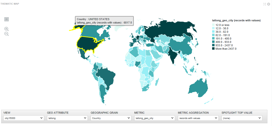 |
