| Oracle® Retail Advanced Inventory Planning Store and Warehouse Replenishment Planning User Guide for the RPAS Fusion Client Release 14.1 |
|

 Previous |
 Next |
| Oracle® Retail Advanced Inventory Planning Store and Warehouse Replenishment Planning User Guide for the RPAS Fusion Client Release 14.1 |
|
Previous |
Next |
This chapter provides a brief description of how to get started using SRP and WRP on the RPAS Fusion Client. It includes the following sections:
|
Note: Before you log on to the RPAS Fusion Client, ensure that your system meets the recommended configuration. For more information, see the Oracle Retail Predictive Application Server Installation Guide. |
Once you check the configuration, obtain the following information:
Uniform Resource Locator, URL – Enter the URL or the Web address of the application in the Web browser to access the application. For example:
User name, Password, and Profile Name – Based on the tasks you want to perform, obtain a user account (that includes user name and password) to log on to the application.
To log on to SRP and WRP using the RPAS Fusion Client, follow these steps:
Start a start a supported browser such as Microsoft IE, Mozilla Firefox or Google Chrome.
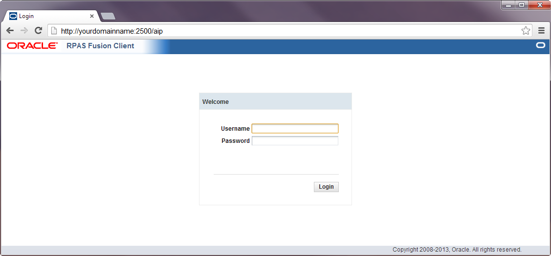
In the Address bar, enter the RPAS Fusion Client URL, and press Enter. The RPAS Fusion Client Login page opens as shown in Figure 1-1.
On the Login page, enter your Username and Password, and click Login.
|
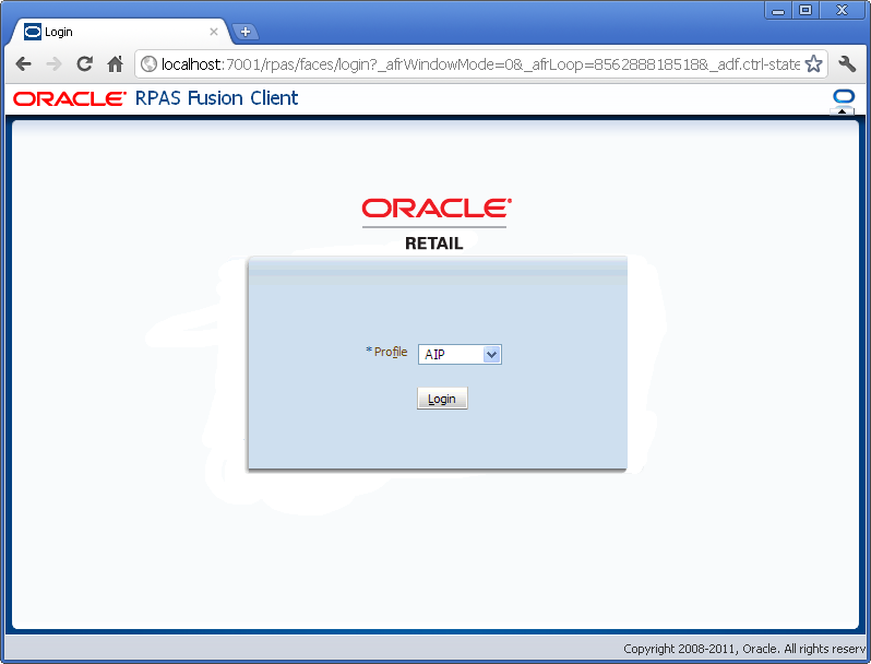
Note: If you have accessed the RPAS Fusion Client through a single sign-on environment such as the Oracle Retail Workspace portal, then only the profile field is available on the RPAS Fusion Client login page. Select your domain from the drop-down list as shown in Figure 1-2. |
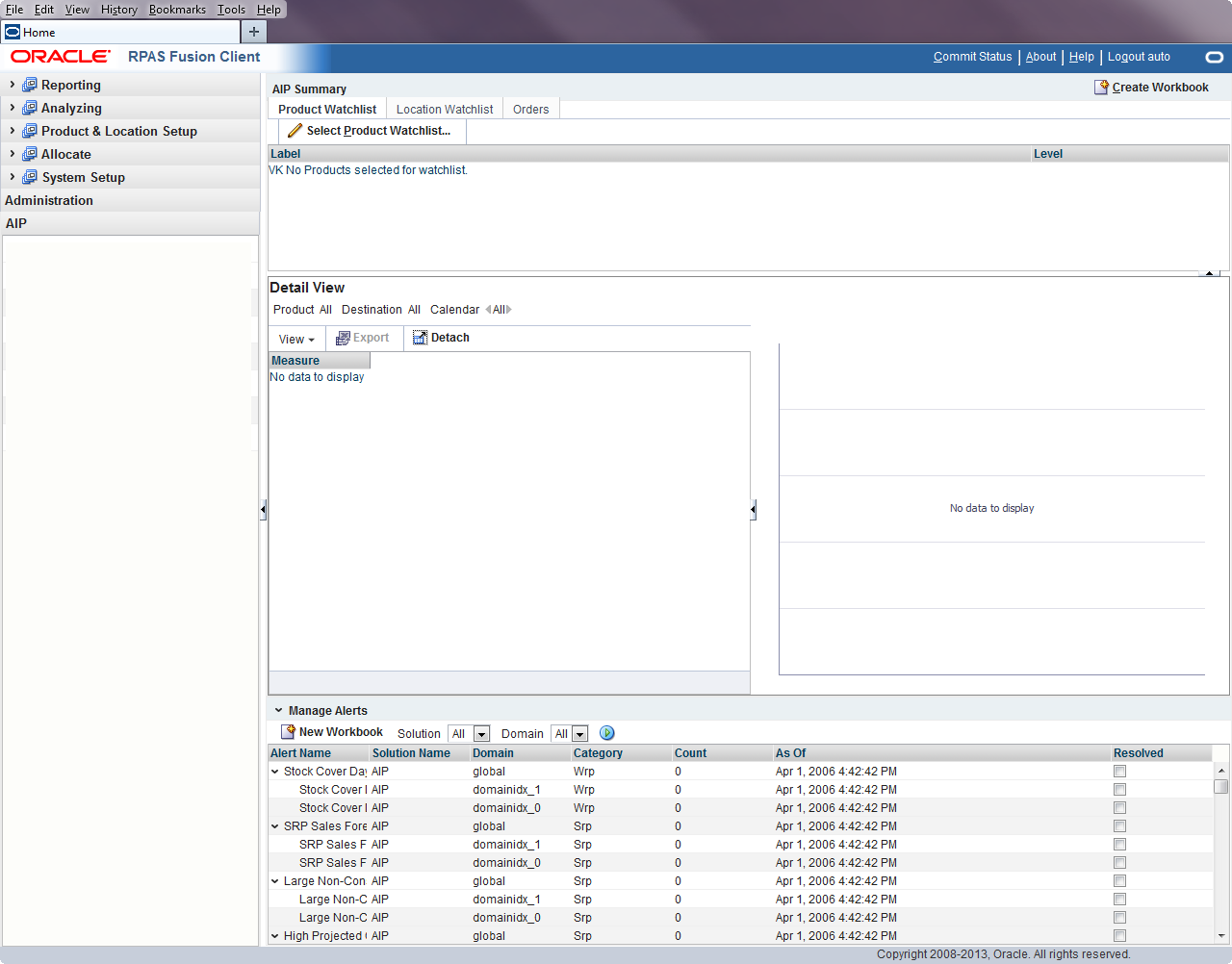
Select your domain from the Profile drop-down list and click Login. The window refreshes, and the home page of the RPAS Fusion Client opens as shown in Figure 1-3.
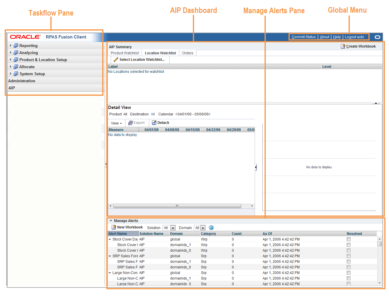
The RPAS Fusion Client Home Page has distinct areas with specific functionality as shown in Figure 1-4.
For detailed information about navigation and functionality of these areas, refer to these sections:
The Global Menu is located at the top right of the RPAS Fusion Client Home Page and includes the following functionality:
To view the commit status of any available views, click Commit Status in the global header.
|
Note: Commit Status shows the state of any workbooks that have been committed. The link is available in the Home Page and from within a workbook. |
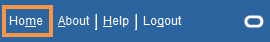
To exit a detailed workbook view and return to the full RPAS Fusion Client Home Page, click Home in the global header.
|
Note: Home is only available when working in the AIP Taskflow. |
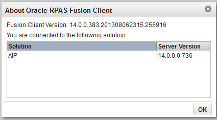
To view information about your RPAS Fusion Client Version and your connected solution, click About in the global header.
The About Oracle RPAS Fusion Client Window opens as shown in Figure 1-8.
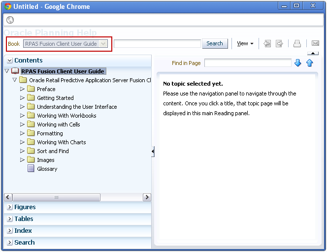
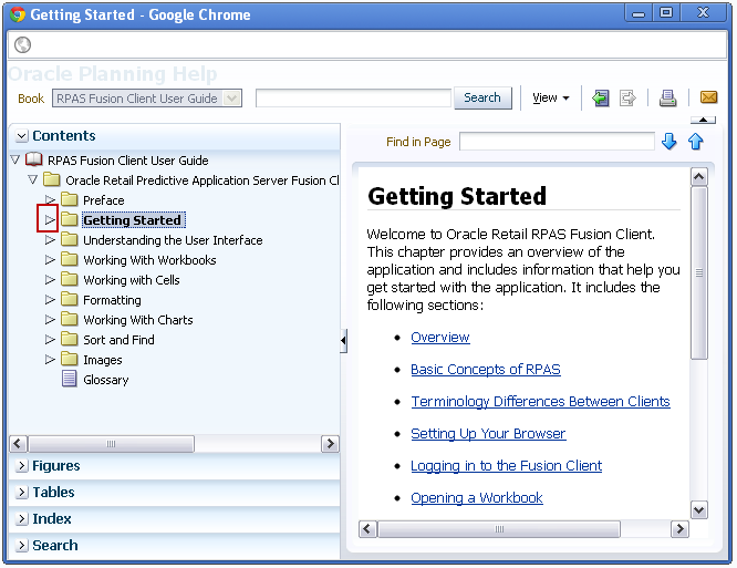
To access online help, click Help in the global header.
The online help opens in a new browser window. If more than one help set is available, you can choose which one to view by selecting it from the Book drop-down field. If there is only one help set, the field is shaded.
The contents of the online help set are shown in the Contents section of the navigation bar on the left. Click the Expand icon next to the folders to drill down to the help topics. Click the page you want to view. It opens in the content area.
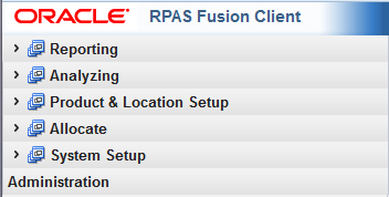
The taskflow pane is on the left of the RPAS Fusion Client Home Page and enables you to easily navigate through the activities in the application. It provides a pre-configured business workflow organized into expandable and collapsible activities, tasks, and steps.
Each activity consists of more than one task and each task may consist of one or more steps. In the RPAS Fusion Client, each solution (spanning across multiple workbooks) is represented as a set of activities, tasks, and steps.
|
Note: The taskflow is configured for your domain during implementation. For more information on this configuration, refer to the Oracle Retail Predictive Application Server Configuration Tools User Guide. |
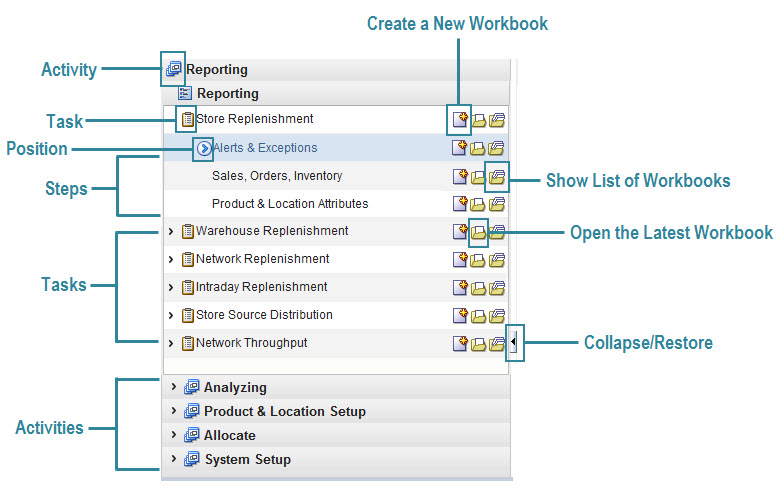
Figure 1-16 shows the workflow in the RPAS Fusion Client.
On the taskflow pane, you can click the Expand (>) icon next to any activity to view the associated tasks. When you are working with a specific step, the Position icon appears in the taskflow pane indicating the current step and your position in the workflow.
The Create New Workbook, Open Latest Workbook, and Show List of Workbooks icons that appear next to each task or step enable you to create new workbooks or open existing workbooks. You can find more information on creating new workbooks and opening existing workbooks in the section Opening Workbooks.
Figure 1-17 shows the icons that appear in the taskflow.
Table 1-1 describes the icons that appear with all the entries in the taskflow.
Table 1-1 Description of Icons in the Taskflow Pane
The activity and tasks that appear in the taskflow pane are access-based. Depending upon the security settings, you may not have access to some tasks or activities. Access to a task is defined by whether you have access to the workbook template that the task is assigned to.
The access to the workbook template is maintained in the Security Administration step. See the Oracle Retail Predictive Application Server Administration Guide for the RPAS Fusion Client for more information about the Administration activity. If you do not have access to a workbook template, then you are not able to build the workbooks for the associated tasks and steps.
Hiding specific tasks or activities based on user access is configurable. In the configuration, a task can be set to either hidden or unavailable. If it is hidden and the user does not have access to it, then the task is not displayed. If it is unavailable and the user does not have access, then the task is displayed but the links to access the workbooks are unavailable. For more information, refer to the Oracle Retail Predictive Application Server Configuration Tools User Guide.
When working within multiple steps or tasks, all changes you make in a specific step are maintained when you move to a step in the same task or a different task associated with the same workbook template. In this case, you do not need to save your work when you switch between tasks within the same workbook template.
If you switch to a task that is associated with a different workbook template, you are prompted to save or discard the changes before opening or building a new workbook. To save your changes, use the Save As dialog box.
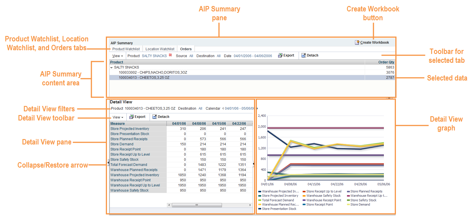
The AIP Dashboard is an optional feature that provides a high level information view without accessing a workbook first. The Detail View and Graph panes provides a view of SRP and WRP metrics over time for the products and destinations selected in the AIP Summary pane.
For installation instructions, refer to the Oracle Retail Advanced Inventory Planning Installation Guide.
The AIP Dashboard is located on the right of the RPAS Fusion Client Home Page beneath the Global Menu and contains three panes:
|
Note: When working in the AIP Dashboard, use the Collapse/Restore arrow to collapse the taskflow pane and allow a full view of the dashboard. |
The AIP Dashboard provides you with a detailed view of products and destinations over time. The Detail View provides a view of Warehouse Replenishment Planning (WRP) and Store Replenishment Planning (SRP) metrics over time for the products and destinations specified by you from selecting:
A product from the Product Watchlist
A location from the Location Watchlist or
An Order
These products and destinations can be further refined with filtering capabilities.
Figure 1-18 shows the components of the AIP Dashboard.
Located at the top of the AIP Dashboard, the AIP Summary has these three tabs:
These tabs allow you to select, refine, or remove data that can be displayed in the Detail View and Detail View Graph.
Depending on which tab of the AIP Summary is active, the content area displays different data that is relevant to its tab.
|
Note: Regardless of your security access level, AIP displays all available hierarchy positions as read-only data. |
Table 1-2 Data within the AIP Summary Content Area
| Tab | Content Area | Data |
|---|---|---|
|
|
Product Watchlist table |
Products at the Class, Subclass or SKU level and their level in the product hierarchy. |
|
|
Location Watchlist table |
Destination locations can be either warehouses or a selection of regions, districts, and stores from the location hierarchy. |
|
|
Orders table |
Products that have order quantities. These products can be changed using the View tool and filters on the Order tab. |
From the Product Watchlist tab, use the Select Product Watchlist... button to choose or change the products that can be displayed in the Detail View and Detail View Graph. Available products can be from varying levels in the product hierarchy at the Class, Subclass or SKU level.
|
Note: After logging out, your selected products are saved until you change them using the Select Product Watchlist... button |
|
Note: You can single select a Product from the Product Watchlist. The selected product from the watchlist becomes the Product filter in the Detail View. If the Product is a Class or a Subclass you can filter on the children of that Class or Subclass in the Detail View. If the product from the watchlist is a SKU, then you can not be change the Product filter in the Detail View. |
The following steps describe the functionality of the Product Watchlist tab:
To select or change products under the Product Watchlist tab, click Select Product Watchlist....
The wizard opens and lists all available products at the highest available level with the following functionality:
Use the Collapse/Expand arrows to display additional products at lower levels. The Selected Products panel lists the level of selected products.
Use the Find box to locate a specific product. Type a full or partial product name in the box and click either the Search Down or Search Up arrow. The number of matching products found displays next to the Search Up arrow (such as 1 of 5). Use the Search arrows to scroll up or down to the next found product)
Click the Detach icon to view the list in a full window. To return to the wizard view, click the Detach icon again.
In the Available Product panel, click a product to select it. Selected products are identified by a color bar. Use Ctrl + click or Shift + click functionality to select multiple products.
Click Add to move products to the Selected Products panel or Add All to move all products to the Selected Products panel.
Click Remove to move products from the Selected Products panel or Remove All to remove all products from the Selected Products panel.
To stop any updates and exit the wizard, click Cancel to return to the dashboard without changes.
After adding or removing products click OK to approve the selections. The wizard closes and your selections are listed under the Product Watchlist tab as shown in Figure 1-21
From the Location Watchlist tab, use the Select Location Watchlist... button to choose or change the locations that can be displayed in the Detail View and Detail View Graph. Locations can be regions, districts, or stores from the Location hierarchy or warehouses.
|
Note: After logging out, your selected locations are saved until you change them using the Select Location Watchlist... button |
The following steps describe the functionality of the Location Watchlist tab:
To select or change locations under the Location Watchlist tab, click Select Location Watchlist....
The wizard opens and lists all available locations at the highest available level with the following functionality:
Select either the Store or Warehouse option to display these locations in the Available Locations panel.
Use the Collapse/Expand arrows to display additional store locations at lower levels. The Selected Locations panel lists the level of selected locations.
Use the Find box to locate a specific location. Type a full or partial location name in the box and click either the Search Down or Search Up arrow. The number of matching locations found displays next to the Search Up arrow (such as 1 of 5). Use the Search arrows to scroll up or down to the next found location)
Click the Detach icon to view the list in a full window. To return to the wizard view, click the Detach icon again.
In the Available Location panel, click a location to select it. Selected locations are identified by a color bar. Use Ctrl + click or Shift + click functionality to select multiple locations.
Click Add to move locations to the Selected Locations panel or Add All to move all locations to the Selected Locations panel.
Click Remove to move locations from the Selected Locations panel or Remove All to remove all locations from the Selected Locations panel.
To stop any updates and exit the wizard, click Cancel to return to the dashboard without changes.
After adding or removing locations click OK to approve the selections. The wizard closes and your selections are listed under the Location Watchlist tab as shown in Figure 1-23
The Orders tab displays a table containing products that have order quantities within the filters specified. The Orders table contains two columns:
Product
Order Qty (Order Quantity)
The Orders table has the following functionality:
Only products with a positive order quantity are listed.
Products are presented at the Class level. Use the Collapse/Expand arrows to display additional products at lower levels of Subclass and SKU.
You can change the view or filter the Orders table as described in these sections:
Figure 1-24 shows the components of the Orders tab.
The View menu allows you to select whether to view Planned, Executed or both types of orders and whether to view by Release Date or Delivery Date. The default is to view Planned orders by Release Date.
|
Note: Executed Receipts are existing orders in the PO Management system sent to AIP and stored in a measure for Expected Receipts. The Delivery Date represents the day the receipts are received while the Release date is the date those receipts were shipped from the source. |
The following table lists the View option combinations.
| Planned or Executed | Release or Delivery Date |
|---|---|
| Planned | Release Date |
| Planned | Delivery Date |
| Executed | Delivery Date |
| Both | Delivery Date |
The following steps describe the functionality of the View Menu:
Click View to expand the View options. The selected options are indicated by a dot as shown in Figure 1-25.
To change the View options, use your pointer to highlight the option, and then click. If you are updating both orders and dates, repeat the action. The Orders table refreshes to show updated product and order quantity that match your selections.
The Product filter defaults to All.
The following steps describe how to change the Product filter selection
From the Orders tab, move your pointer to the Product filter selection and click to open the Select Product filter.
Use the Collapse/Expand arrows to display additional products at the Class, Subclass or SKU level.
Use the Find box to locate a specific product. Type a full or partial product name in the box and click either the Search Down or Search Up arrow. The number of matching products found displays next to the Search Up arrow (such as 1 of 13). Use the Search arrows to scroll up or down to the next found product)
Click the Detach icon to view the list in a full window. To return to the wizard view, click the Detach icon again.
To change the product, use your pointer to highlight the option, and then click OK.
The filter closes and your selection is listed in the Orders table as shown in Figure 1-27
To return the filter to its default setting, click the red X icon that appears next to the filter text.
The Source filter defaults to All and allows you to select a source of either:
A Warehouse
All Suppliers
All Warehouses
The following steps describe how to change the Source filter selection
From the Orders tab, move your pointer to the Source filter selection and click to open the Select Source filter.
Select either Warehouse or Supplier as your source option.
Use the Collapse/Expand arrows to display additional Sources at lower levels.
Use the Find box to locate a specific Source. Type a full or partial Source name in the box and click either the Search Down or Search Up arrow. The number of matching Sources found displays next to the Search Up arrow (such as 1 of 4). Use the Search arrows to scroll up or down to the next found Source)
Click the Detach icon to view the list in a full window. To return to the wizard view, click the Detach icon again.
To change the Source, use your pointer to highlight the option, and then click OK.
The filter closes and your selection is listed in the Orders table as shown in Figure 1-29
To return the filter to its default setting, click the red X icon that appears next to the filter text.
The Destination filter defaults to All and allows you to select a location by:
Region
District
A Store
All Stores
A Warehouse
All Warehouses
The following steps describe how to change the Destination filter selection
From the Orders tab, move your pointer to the Destination filter selection and click to open the Select Destination filter.
Select either Store or Warehouse as your Destination option.
Use the Collapse/Expand arrows to display additional Destinations at lower levels.
Use the Find box to locate a specific Destination. Type a full or partial Destination name in the box and click either the Search Down or Search Up arrow. The number of matching Destinations found displays next to the Search Up arrow (such as 1 of 2). Use the Search arrows to scroll up or down to the next found Destination)
Click the Detach icon to view the list in a full window. To return to the wizard view, click the Detach icon again.
To change the Destination, use your pointer to highlight the option, and then click OK.
The filter closes and your selection is listed in the Orders table as shown in Figure 1-31
To return the filter to its default setting, click the red X icon that appears next to the filter text.
The Date Range filter defaults to Today's date. The Date Range cannot include past dates and the end date is limited to the last day in the planning horizon.
|
Note: Dates must be in the mm/dd/yyyy format. |
The following steps describe how to change the Date Range.
From the Orders tab, move your pointer to the Date selection and click to open the Select Date Range filter.
To change the Date field, either use your pointer to:
Click in the date field and manually enter a date.
Click the calendar icon to select a date.
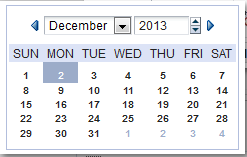
The calendar icon opens a monthly view that allows you select dates using its drop-down options or Next and Previous arrows. To select a specific day, click that day on the calendar.
Click OK to approve the date range. The Select Date Range filter closes and your selection is listed in the Orders table as shown in Figure 1-33
From the Orders tab and Detail View, you are able to export the table data to a Microsoft Office Excel spreadsheet. Start the export by clicking the Export icon. Depending on the browser you use, either open, save, or download the spreadsheet.
The spreadsheet displays the data from your selected table (either the Orders table or Detail View table).
|
Note: Collapsed rows in the Orders table are not shown in the exported Excel spreadsheet.Expanded rows in the Orders table are exported to the Excel spreadsheet, but there is no distinction shown between the levels. |
From the Orders tab, Detail View and tab wizards, you are able to view the data in a full window. Click the Detach icon to view the data. To return to the original view, either, click the Detach icon again or click the Close button.
|
Note: The Detach View window will have the same sort or find functionality that is available with the original view. |
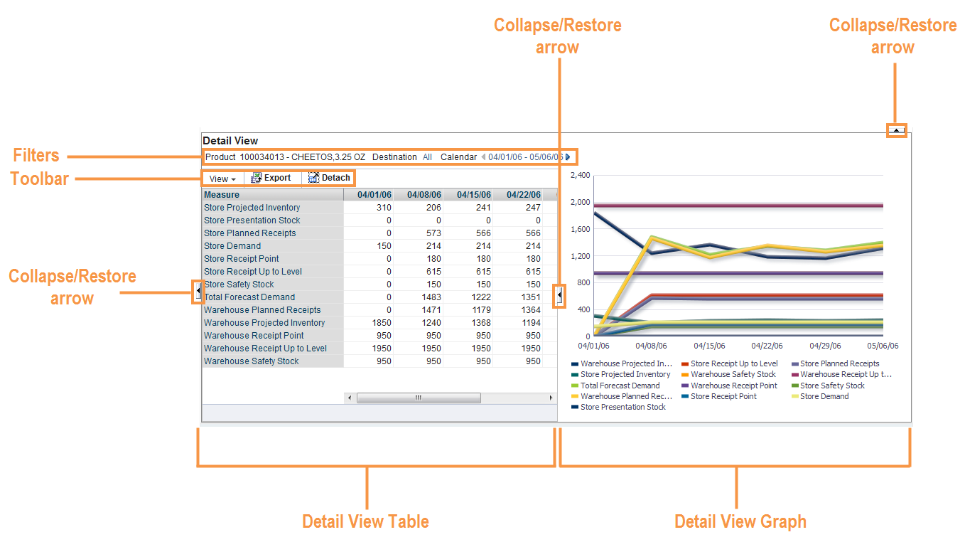
The Detail View pane consists of these areas as shown in Figure 1-37:
Graph view
Filters
Toolbar
Collapse/Restore arrows
The Detail View pane displays no data until data is selected from the AIP Summary Content Area. Use your pointer and click the desired data from the AIP Summary Content Area. Selected data is indicated by a color bar as shown in Figure 1-18.
The Detail View pane refreshes with the data selected from the AIP Summary Content Area. The Detail View table and Detail View graph are side-by-side and separated by a split bar that can be moved to resize the views. You can use the collapse/restore arrows to expand or compress the width of the views.
The Detail View table displays measures reflecting the data selected from the AIP Summary Content Area. These measures can not be customized. You are able to hide and show measures, but those settings are temporary for the duration of your login session.
The following measures are available in the Detail View:
Warehouse Replenishment Planning (WRP) Forecast Demand
WRP Projected Inventory
WRP Receipt Plan
WRP Safety Stock
WRP Receive Up to Level (RUTL)
WRP Receipt Point (RP)
Store Replenishment Planning (SRP) Forecast Demand
SRP Projected Inventory
SRP Receipt Plan
SRP Presentation Stock
SRP Safety Stock
SRP Receive Up to Level (RUTL)
SRP Receipt Point (RP)
The Detail View filters reflect the data from the selected product in the AIP Summary and its filters as shown in Figure 1-38.
As with the filters on the Orders tab, you can adjust the Detail View filters and the Detail View table and graph update to reflect the changes. The filter functionality is described in these sections:
The Product filter defaults to the Product Filter defaults to the product selected in Product Watchlist or Orders tab. In that case, the filter allows you to further drill into that selection, if the selection is Class or Subclass.
The following steps describe how to change the Detail View Product filter selection
From the Detail View, move your pointer to the Product filter selection and click to open the Select Product filter.
Use the Collapse/Expand arrows to display additional products at the Class, Subclass or SKU level.
Use the Find box to locate a specific product. Type a full or partial product name in the box and click either the Search Down or Search Up arrow. The number of matching products found displays next to the Search Up arrow (such as 1 of 13). Use the Search arrows to scroll up or down to the next found product)
Click the Detach icon to view the list in a full window. To return to the previous view, click the Detach icon again.
To change the product, use your pointer to highlight the option, and then click OK.
The filter closes and your selection is listed in the Detail View and shown in the Detail View graph.
To return the filter to its previous setting, click the red X icon that appears next to the filter text.
The Detail View Destination filter defaults to your selection in the AIP Summary pane and allows you to select a location by:
Region
District
A Store
All Stores
A Warehouse
All Warehouses
The following steps describe how to change the Detail View Destination filter selection
In the Detail View, move your pointer to the Destination filter selection and click to open the Select Destination filter.
Select either Store or Warehouse as your Destination option.
|
Note: When you select Stores in your destination filter, the WRP measures are display data for warehouses that serve those stores for the selected product and time period.When you select a warehouse, the SRP measures are showing data for the Stores served by the warehouse for the product and time period selected. |
Use the Collapse/Expand arrows to display additional Destinations at lower levels.
Use the Find box to locate a specific Destination. Type a full or partial Destination name in the box and click either the Search Down or Search Up arrow. The number of matching Destinations found displays next to the Search Up arrow (such as 1 of 2). Use the Search arrows to scroll up or down to the next found Destination)
Click the Detach icon to view the list in a full window. To return to the previous view, click the Detach icon again.
To change the Destination, use your pointer to highlight the option, and then click OK.
The filter closes and your selection is listed in the Detail View and shown in the Detail View graph.
To return the filter to its previous setting, click the red X icon that appears next to the filter text.
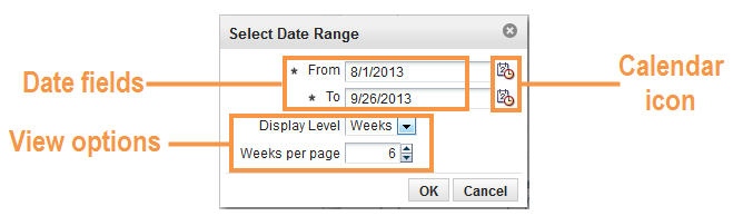
The Detail View Calendar filter defaults to your Date Range filter selection in the AIP Summary pane. The Date Range cannot include past dates and the end date is limited to the last day in the planning horizon.
|
Note: Dates must be in the mm/dd/yyyy format. |
The following steps describe how to change the Detail View Calendar Range.
In the Detail View, move your pointer to the Calendar selection and click to open the Select Date Range filter.
To change the Date field, either use your pointer to:
Click in the date field and manually enter a date.
Click the calendar icon to select a date.
The calendar icon opens a monthly view that allows you select dates using its drop-down options or Next and Previous arrows. To select a specific day, click that day on the calendar.
Select either Weeks or Days from the Display Level drop-down list.
Use the scroll arrows to increase or decrease the number (days or weeks) in the per page box.
Click OK to approve the date range. The Select Date Range filter closes and your selection is listed in the Detail View and shown in the Detail View graph.
The Detail View toolbar contains these tools:
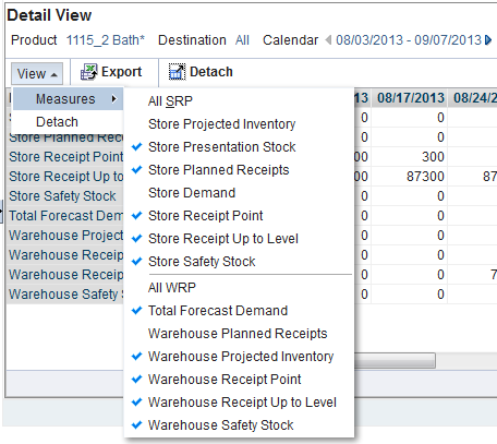
The View menu in the Detail View allows you to hide or show individual measures, all SRP measures, or all WRP measures.
The following steps describe the functionality of the View Menu:
Click View and then Measures to expand the measures list. Available measures are indicated by a check mark and unavailable measure are without a check mark as shown in Figure 1-42.
To remove individual measures that are viewed in the table and graph, use your pointer to highlight the option, and then click to remove the check mark. Repeat the action for every measure you wish to remove.
|
Note: To remove a full set of measures, use your pointer to highlight either the All SRP or All WRP option, and then click to remove. |
To restore SRP measures, use your pointer to highlight the All SRP option, and then click to restore. Repeat this action to restore WRP measures with the All WRP option.
|
Note: The Detail View table and graph refreshes and updates after any change. |
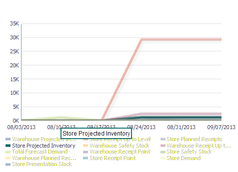
The Detail View Graph reflects the data listed in the Detail View Table. You can use the collapse/restore arrow to expand or compress the width of the graph.
Each measure in the Detail View is listed beneath the graph and represented by a different color bar on the graph.
To feature a specific measure on the graph, use your pointer to highlight the measure name. The other measure names are dimmed as well as the other color bars on the graph as shown in Figure 1-43.
Using the Create Workbook button on the dashboard, you can create an Interactive Evaluation workbooks for:
Store Replenishment
Warehouse Replenishment
Network Replenishment
For additional information, refer to Chapter 7, "Analyzing Activity."
Your tab selection in the AIP Summary and the selected filters in the Detail View determine which Interactive Evaluation workbook is created.
Table 1-3 provides a matrix for which tabs and filter to set to build your desired workbook.
Table 1-3 Dashboard Tabs and Filter Settings to Create Workbooks
| Workbook | AIP Summary Tab | AIP Summary Content Area | Detail View Product Filter | Detail View Destination Filter |
|---|---|---|---|---|
|
SRP Interactive Evaluation |
Product Watchlist |
Selected product from Product Watchlist |
Product at the Class, Subclass or SKU level |
Store |
|
Location Watchlist |
Selected store from the Location Watchlist |
Product at the Class, Subclass or SKU level |
Store |
|
|
Orders |
Selected order from the Order View |
Product Order at the Class, Subclass or SKU level |
Store |
|
|
WRP Interactive Evaluation |
Product Watchlist |
Selected product from Product Watchlist |
Product at the Class, Subclass or SKU level |
Warehouse |
|
Location Watchlist |
Selected warehouse from the Location Watchlist |
Product at the Class, Subclass or SKU level |
Warehouse |
|
|
Orders |
Selected order from the Order View |
Product Order at the Class, Subclass or SKU level |
Warehouse |
|
|
Network Interactive Evaluation |
Product Watchlist |
Selected product from Product Watchlist |
Product at the Class, Subclass or SKU level |
All |
|
Location Watchlist |
Selected store location from the Location Watchlist |
Product at the Class, Subclass or SKU level |
Warehouse |
|
|
Orders |
Selected order from the Order View |
Product Order at the Class, Subclass or SKU level |
All |
Perform the following steps to create Interactive Evaluation workbooks using the Create Workbook button.
Determine which workbook you wish to create using the matrix in Table 1-3 or create one based on your current selections in the dashboard.
Click Create Workbook.
The dashboard opens the Create Workbook Label window. Enter a label in the text box and click OK.
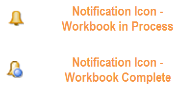
A notification icon appears when the workbook is processing. Clicking this icon opens the Create Workbook Notifications window and lists the status of your workbook.
When your workbook is complete, the icon changes to include a blue dot to indicate a new completed request. Click the Notification icon to show where your workbook is located, For example: Workbook <Name> successfully created on <Date_ time> and can be accessed from task Warehouse Replenishment.
Access your new workbook from the Taskflow Pane> Analyzing Activity> (Store, Warehouse, or Network) Replenishment Task >Show List of Workbooks icon
|
Note: These workbooks are Interactive Evaluation workbooks and are available only under the Analyzing Activity.The Reporting Activity also has tasks for Store, Warehouse, and Network Replenishment, but it does not create Interactive Evaluation workbooks. |


