| Oracle® Retail Merchandising Cloud Services Administration Guide Release 16.0.027 E96476-02 |
|

 Previous |
| Oracle® Retail Merchandising Cloud Services Administration Guide Release 16.0.027 E96476-02 |
|
Previous |
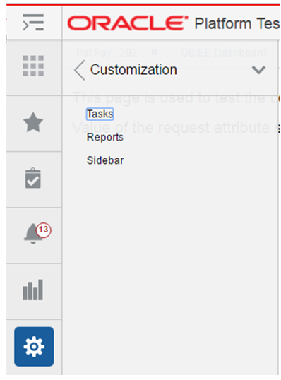
Application Customization is an option in the settings menu that can be used by an administrator to customize the different menus in the Merchandising solutions. The administrator can customize the task menu, reports menu, and the sidebar menu using the customization option.
The task menu model xml file uses the xml schema definition called NavigationModel.xsd for xml validation. The Navigation Model schema definition file is used to validate any changes done by the administrator on the task menu xml file. The Task Menu model file consists of a hierarchy of Item elements. Each element represents a menu item in the task menu. The Item element can either be a folder or has a URL, list of attributes and parameters that identify the task menu item.
An Item in the task menu model renders as either a launchable link or a submenu in the Tasks menu of the Retail Application. A new Item can be added to add a new link or submenu. An existing Item can be modified to change an existing link or submenu. Below is the example of a task menu model Item.
<?xml version="1.0" encoding="UTF-8" standalone="yes"?>
<NavigationDefinition … >
    <Items>
       <Item id="myFolder" title="My Folder"  type="folder">
           <Items>

                <Item id="myContent" type="taskflow"
                      title="My Content">
                    <url>
                       /WEB-INF/mycompany/CustomDashboardTaskFlow.xml#CustomDashboardTaskFlow
                    </url>
                    <Parameters>
                        <Parameter id="productName">"Acme"</Parameter>
                    </Parameters>
                </Item>
           </Items>
       </Item>
    </Items>
</NavigationDefinition>
The following attributes apply to an Item element in the task menu model xml file.
Table 4-1 Task Menu Model Item Attributes
| Attribute | Description |
|---|---|
|
visible |
Indicates if the item should be rendered (visible) or not. It can be an EL Expression that evaluates to true or false. Or it can be a plain string value equal to "true" or "false". Defaults to "true". |
|
type |
Indicates the type of the item. The main values are "folder","taskflow","link". The type "folder" indicates that the item contains additional sub-navigation items. The type "taskflow" indicates it is a task flow, and the type "link" is used for URLs. |
|
title |
The attribute title is used to provide the title of the sidebar item. This attribute is a required attribute. |
|
targetTitle |
The attribute targetTitle is used to provide the title of the tab in the content area. This attribute is an optional attribute. If not provided, the value of the title attribute will be used as the title of the tab in the content area. |
|
accessKey |
The attribute accessKey is used to specify the keyboard keystroke or a group of keystrokes that are used to access the navigation item using the keyboard. |
|
shortDesc |
The attribute shortDesc is used to provide the description of the navigation item which will be displayed when the user hovers over a menu item. |
|
showCloseIcon |
Mainly used when the content is being rendered in a popup, and indicates if the 'x' icon should show or not on the top right corner of the popup to facilitate manual closing of the popup. Takes the values "true" or "false". Defaults to "false". |
|
defaultContent |
Indicates whether the corresponding items from the model show up by default in tabs in the content area when the page template loads. Takes values "true" or "false", or may even take an EL Expression evaluating to "true" or "false". |
|
reuseInstance |
The attribute reuseInstance is used to specify whether the navigation items with the same title and url will use the same tab or not. When this attribute is set to false, the request to open the content for that navigation item will always use a new tab. When the attribute is true, the navigation items with the same title and url will share the same tab in the content area. It defaults to true. |
|
keysList |
Takes name value pairs separated by a semicolon. The attribute keysList provides a way to differentiate two navigation items with the same title and url. If keysList is not provided, then the two navigation items with the same title and url will always use the same tab. When the keysList is provided, it provides uniqueness to the navigation items with the same title and url enabling them to use different tabs. Example keysList="key1=value1;key2=value2" |
|
urlRendererHeight, urlRendererWidth |
Example values are shown below. These used in the case of a popup and indicate the height and width of the popup. urlRendererHeight="200px" urlRender-erWidth="200px" |
|
reloadTab |
When this attribute is set to true, an already opened tab will be reloaded with the new input parameters for the taskflow. When it is set to false, a previously opened tab will only be re-focused, but not reloaded with new input parameters for the taskflow. |
|
refreshOnDisclosure |
When the navigation item has refreshOnDisclosure attribute set to true then the tab displaying that item in the Content Area will be refreshed every time it's disclosed. The attribute can take either of the two values true or false. Default is false. The attribute is useful in the scenarios where we want to display to the user the latest information from the database every time he/she comes back to the tab. The attribute should be used with caution because if the data in that tab is not committed before leaving the tab then the uncommitted data will be lost upon coming back to the tab. |
|
dynamicTabFocus |
When a navigation item is invoked, the tab displaying that item will have its text focused. To override this behavior, set dynamicTabFocus to "false". This attribute defaults to "true". |
|
popupId |
Applicable only when target="_popup". Must be a number between 1 and 15. This attribute allows consuming applications to target a specific popup within the UI Shell. The framework provides 15 popups that consuming applications can take advantage of. In case this attribute has not been specified, a default popup will be used by the framework. This default popup will not store its dimensions in MDS. |
|
popupContentHeight |
Applicable only when target="_popup". This attribute is used to provide the height in pixels of the resulting popup dialog window. |
|
popupContentWidth |
Applicable only when target="_popup". This attribute is used to provide the width in pixels for the resulting popup dialog window. |
|
popupStretchChildren |
Applicable only when target="_popup". This attribute is used to indicate the stretching behavior for the contents of the resulting popup window. The contents are referred to as child components. Valid values are:
|
|
popupResize |
Applicable only when target="_popup". This attribute is used to indicate the resulting popup window's resizing behavior. Valid values are:
|
|
popupHelpTopicId |
Applicable only when target="_popup". This attribute is used to look up a topic in a help-Provider for the resulting popup window. |
|
popupShortDesc |
Applicable only when target="_popup". This attribute is used to provide short description of the resulting popup window. |
|
contentListener |
Specifies the fully qualified name of the class im-plementing the ContentListener interface. This allows applications to have the ability to inject any session or request values before opening tabs. |
|
tabShortDesc |
Specifies the text to be shown when the user hovers over the application tab. Using this attribute application team can keep the title short and the tabShortDesc as fully qualified tab name which can be shown as the tooltip of the tab. This attribute will be displayed as tab title in screen reader mode. |
The following are the sub-elements of the Item element in the task menu model.
Table 4-2 Task Menu Model Item Sub-elements
| Element | Description |
|---|---|
|
url |
The location of the item being launched. If the type is "taskflow" - then the URL element must contain the path to the task flow XML. If the type is "link" - then the URL of the external system must be indicated in this subelement. The entire URL must be marked as character data (e.g. enclosed in CDATA). |
|
Parameter |
The <Parameters> sub-element within <Item> should list all the parameters to the dashboard page if there are any. Each parameter is represented as a <Parameter> element inside <Parameters>. The <Parameter> id should be the actual parameter reference name recognized by the dashboard URL. The value of each <Parameter> is a string value. This is the only supported data type. |
To restrict access to menu items to specific security roles, set the visible property on the <Item> element for the URL to an Expression Language (EL) expression that calls ADF's securityContext API's isUserInRole method. Example:
                <Item id="myDashboard1"
                      type="link"
                      title="Profitability Dashboard"
                      visible="#{securityContext.isUserInRole['BUYER_JOB']} ">
The parameter to the securiytContext.isUserInRole method is a logical security role that is configured for the Retail Application. The API returns true if the user is included in the specified security role. If the user is not authenticated or is not found in the role, the API returns false.
The reports menu uses the same NavigationModel.xsd file used by the task menu. The attributes defined for the task menu apply to the reports menu as well. Please refer to the Task Menu Customization section above for the details on how to customize the reports menu.
The sidebar menu uses a schema called sidebarSchema.xsd for the validation of the sidebar items. The sidebar xml model file consists of Item elements similar to the Item element in the task menu. The Item element in the sidebar xml model has a different set of attributes.
An Item element in the sidebar model xml file renders as a launchable icon in the sidebar. The sidebar has a fixed set of icons and a variable set of icons. Only the variable icons can be customized using the sidebar model xml file. The fixed set of icons cannot be customized. A new sidebar Item can be added to add a new icon on the sidebar. Below is the example of a sidebar menu model Item.
<?xml version="1.0" encoding="UTF-8" ?>
<SidebarModel id="raf_sidebar_items_root" xmlns:xsi="http://www.w3.org/2001/XMLSchema-instance"
              xsi:schemaLocation="urn:www.oracle.com:oracle.retail.apps.framework.sidebar classpath:oracle/retail/apps/framework/uishell/common/sidebar/sidebarSchema.xsd"
              xmlns="urn:www.oracle.com:oracle.retail.apps.framework.sidebar">
    <Items>
        <Item id="quickCreateSidebarItem" title="Quick Create"
              iconUrl="/raf/retail-core/images/quick-create-gray.png"
              selectedIconUrl="/raf/retail-core/images/quick-create.png">
            <taskFlow>/WEB-INF/oracle/retail/apps/framework/uishell/navigation/contentarea/flow/TestQuickCreateFlow.xml#TestQuickCreateFlow</taskFlow>
        </Item>
    </Items>
</SidebarModel>
The following attributes apply to an Item element in the sidebar menu model xml file.
Table 4-3 Sidebar Menu Model Item Attributes
| Attribute | Description |
|---|---|
|
id |
The id of the sidebar item. |
|
title |
The title of the sidebar icon. |
|
visible |
The visible attribute controls the visibility of the sidebar item. |
|
iconUrl |
The icon that is displayed for the sidebar item. |
|
selectedIconUrl |
The icon that is displayed when the sidebar item is selected. |
|
disabledIconUrl |
The icon that is displayed when the sidebar item is disabled. |
|
hoverIconUrl |
The icon that is displayed when the sidebar item is hovered on. |
|
depressedIconUrl |
The icon that is displayed when the sidebar item is depressed. |
The following are the sub-elements of the Item element in the sidebar model.
Table 4-4 Sidebar Model Item Sub-elements
| Element | Description |
|---|---|
|
taskFlow |
The URL of the taskflow being launched. |
|
Parameter |
The <Parameters> sub-element within <Item> should list all the parameters to the sidebar taskflow if there are any. Each parameter is represented as a <Parameter> element inside <Parameters>. The <Parameter> id should be the actual parameter reference name recognized by the taskflow URL. The value of each <Parameter> is a string value. This is the only supported data type. |
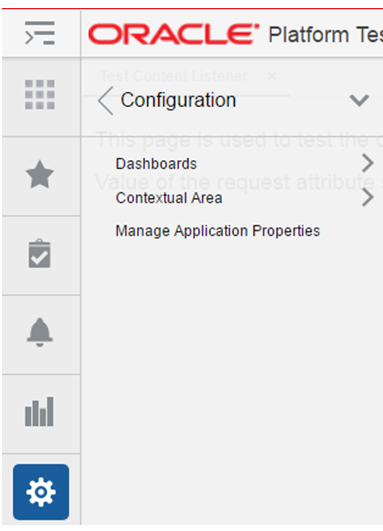
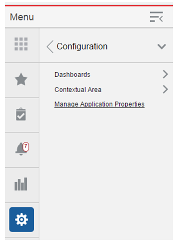
Oracle Retail Application Configuration is an option in the settings menu that can be used by an administrator to configure the dashboards and contextual reports and manage application properties. The administrator can add or replace reports, change the dashboard and report layout using the configuration option.
Retail Dashboards display the status of metrics and key performance indicators relevant to the Retail Application. They are typically tailored for specific roles and they allow users to easily monitor the status of the current data within the application.
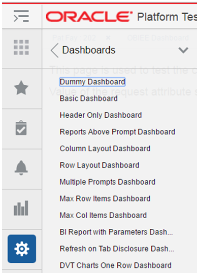
The Dashboard link displays the list of dashboards available in the application. When a dashboard name is clicked, it opens the dashboard xml file in an application tab. The dashboard reports can be added, modified or removed from the dashboard by changing the dashboard xml file. The dashboard layout can also be changed using the dashboard xml file.
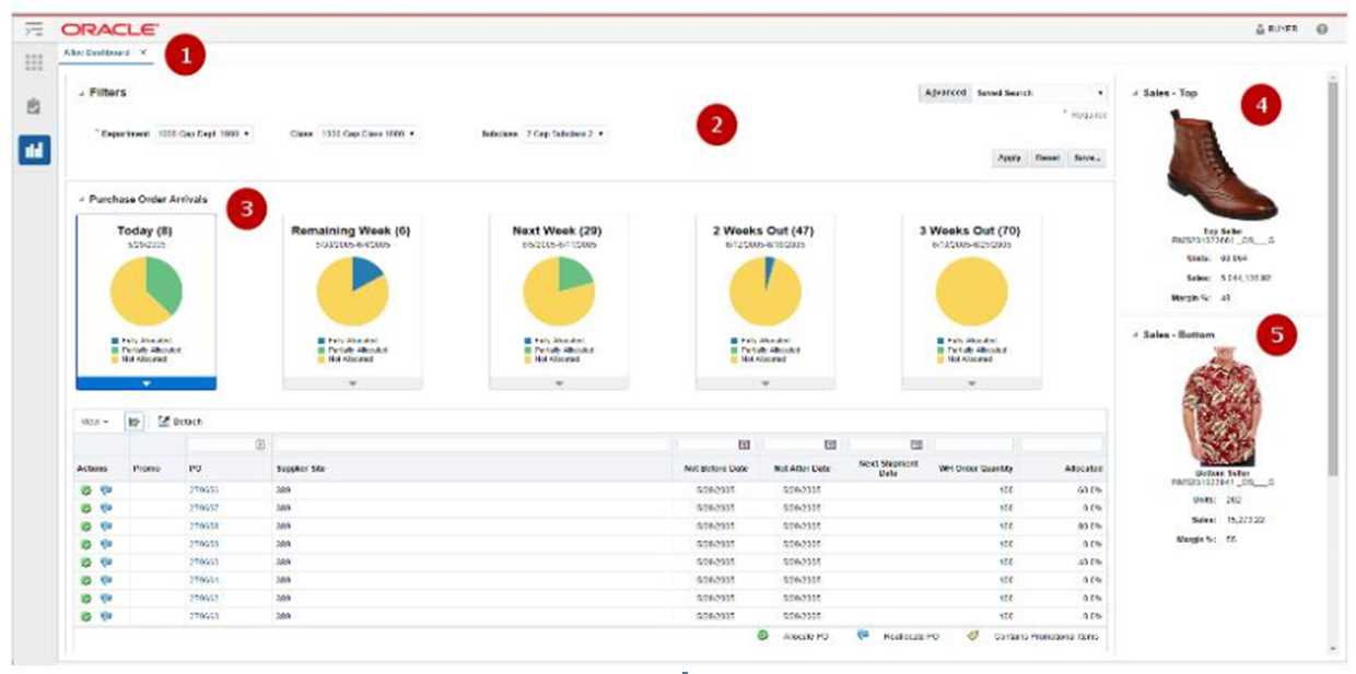
Depicted below is an example of a dashboard that might appear in a Retail Application:
Table 4-5 Dashboard Region Descriptions
| Number | Region | Description |
|---|---|---|
|
1 |
Dashboard Page |
A page rendering a dashboard. A dashboard is composed of 1 or more reports. The dashboard page is launched as a tab within the Retail Application |
|
2 |
Prompt Region |
The prompt region contains a set of editable input components that allow users to modify the parameters of the various reports in the dashboard. This allows users to see different sets of data for the same set of reports. |
|
3 |
Report Region |
A report region shows a graphical view of the application's business data. |
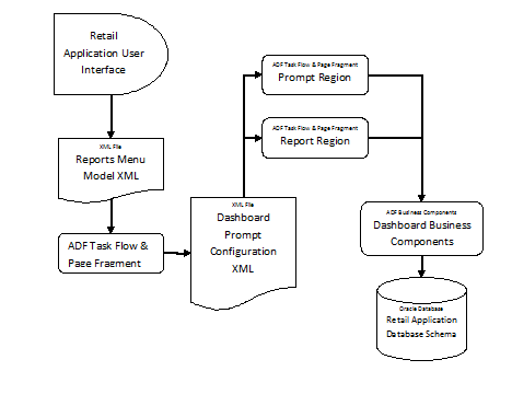
The dashboard page, prompts and reports are implemented as ADF bounded task Flows and page fragments. The prompts and regions are configured in an XML file called a Dashboard Prompt Configuration XML. The dashboard prompt XML arranges visually the prompts and regions on the dashboard page.
The representation of the dashboards is depicted in the diagram below:
The dashboard task flow is launchable from the Retail Application User Interface's Reports Menu. In order to make the report launchable, the dashboard task flow is registered in the application's reports menu model XML.
A set of ADF business components enable data from the Retail Application schema to be rendered in the report regions.
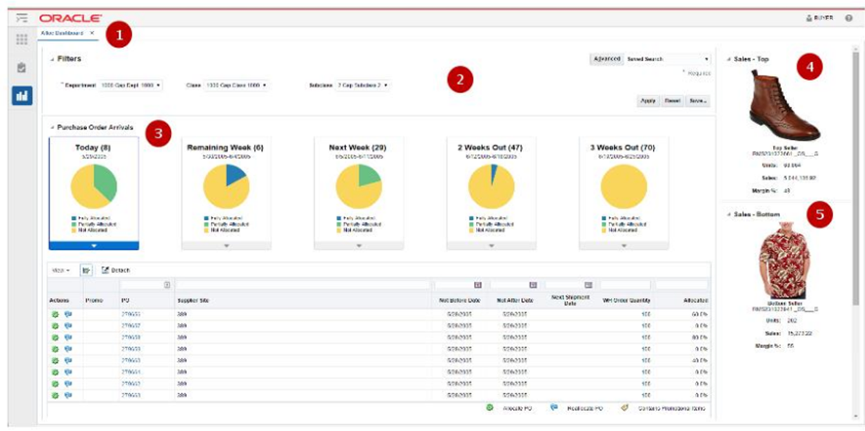
The figure below shows a rendering of a dashboard (called Allocations Dashboard) in a Retail Application:
The different parts of this example dashboard are described below:
Table 4-6 Allocation Dashboard Region Descriptions
| Number | Region | Description |
|---|---|---|
|
1 |
Dashboard Page |
The Allocations Dashboard example contains 1 prompt and 3 reports. It is implemented as an ADF bounded task flow called AllocDashboardFlow. |
|
2 |
Prompt Region |
This is the prompt region that users modify to change the view of the various reports in this dashboard. It is implemented as an ADF bounded task flow called DashboardFilterFlow. |
|
3 |
Order Status Report |
A report region showing a row of information tiles and a detail table.It is implemented as an ADF bounded task flow called OrderStatusFlow. |
|
4 |
Top Seller Report |
A report region showing the top selling item. It is implemented as an ADF bounded task flow called TopSellerFlow. |
|
5 |
Bottom Seller Report |
A report region showing the bottom sell-ing item. It is implemented as an ADF bounded task flow called BottomSellerFlow. |
The reports menu model XML file (as shown below) contains an item called allocDashboard registering the task flow, AllocDashboardFlow, into the reports menu. Note that the dashboard task flow includes a parameter called dashboardConfigXML which references the location of the Dashboard Prompt Configuration XML file.
<?xml version="1.0" encoding="UTF-8" standalone="yes"?>
<NavigationDefinition id="Folder_1"
    xmlns:xsi="http://www.w3.org/2001/XMLSchema-instance"
    xmlns="urn:www.oracle.com:oracle.retail.apps.framework.navigation"
    xsi:schemaLocation="urn:www.oracle.com:oracle.retail.apps.framework.navigation classpath:oracle/retail/apps/framework/uishell/navigation/model/schema/NavigationModel.xsd">
    <Items>
        <Item id="allocDashboard" title="Alloc Dashboard"
              shortDesc="Alloc Dashboard"
              type="taskflow">
            <url>/WEB-INF/AllocDashboardFlow.xml#AllocDashboardFlow</url>
            <Parameters>
                <Parameter id="dashboardConfigXML">/oracle/AllocDashboardPrompt.xml</Parameter>
            <Parameters>
        </Item>
    </Items>
</NavigationDefinition>
The Dashboard Prompt Configuration XML file for this example is called the AllocDashboardPrompt.xml and it contains the following entries:
<?xml version="1.0" encoding="UTF-8" ?>
<Dashboard layout="column" xmlns="urn:www.oracle.com:oracle.retail.apps.framework.dashboard"
           xmlns:xsi="http://www.w3.org/2001/XMLSchema-instance"
           xsi:schemaLocation="urn:www.oracle.com:oracle.retail.apps.framework.dashboard classpath:oracle/retail/apps/framework/dashboard/model/schema/dashboardSchema.xsd">
    <Vectors>
        <Vector>
            <Items>
                <Item id="filter" type="prompt">
                    <url>/WEB-INF/DashboardFilterFlow.xml#DashboardFilterFlow</url>
                </Item>
                <Item id="orderStatus" type="report">
                    <url>/WEB-INF/oracle/retail/apps/framework/dvtcontextawarereport/publicui/flow/DVTContextAwareReportFlow.xml#DVTContextAwareReportFlow</url>
                    <Parameters>
                        <Parameter id="taskflowURL">/WEB-INF/OrderStatusFlow.xml#OrderStatusFlow</Parameter>
                        <Parameter id="parameterName1">departmentIds</Parameter>
                        <Parameter id="payloadKeyName1">DepartmentId</Parameter>
                        <Parameter id="parameterName2">classIds</Parameter>
                        <Parameter id="payloadKeyName2">ClassId</Parameter>
                        <Parameter id="parameterName3">subclassIds</Parameter>
                        <Parameter id="payloadKeyName3">SubclassId</Parameter>
                    </Parameters>
                </Item>
            </Items>
        </Vector>
        <Vector width="300px">
            <Items>
                <Item id="topSeller" type="report">
                    <url>/WEB-INF/oracle/retail/apps/framework/dvtcontextawarereport/publicui/flow/DVTContextAwareReportFlow.xml#DVTContextAwareReportFlow</url>
                    <Parameters>
                        <Parameter id="taskflowURL">/WEB-INF/oracle/retail/apps/flow/TopSellerFlow.xml#TopSellerFlow</Parameter>
                        <Parameter id="parameterName1">departmentIds</Parameter>
                        <Parameter id="payloadKeyName1">DepartmentId</Parameter>
                        <Parameter id="parameterName2">classIds</Parameter>
                        <Parameter id="payloadKeyName2">ClassId</Parameter>
                        <Parameter id="parameterName3">subclassIds</Parameter>
                        <Parameter id="payloadKeyName3">SubclassId</Parameter>
                    </Parameters>
                </Item>
                <Item id="bottomSeller" type="report">
                    <url>/WEB-INF/oracle/retail/apps/framework/dvtcontextawarereport/publicui/flow/DVTContextAwareReportFlow.xml#DVTContextAwareReportFlow</url>
                    <Parameters>
                        <Parameter id="taskflowURL">/WEB-INF/oracle/retail/apps/flow/BottomSellerFlow.xml#BottomSellerFlow</Parameter>
                        <Parameter id="parameterName1">departmentIds</Parameter>
                        <Parameter id="payloadKeyName1">DepartmentId</Parameter>
                        <Parameter id="parameterName2">classIds</Parameter>
                        <Parameter id="payloadKeyName2">ClassId</Parameter>
                        <Parameter id="parameterName3">subclassIds</Parameter>
                        <Parameter id="payloadKeyName3">SubclassId</Parameter>
                    </Parameters>
                </Item>
            </Items>
        </Vector>
    </Vectors>
</Dashboard>
The file registers the prompts and regions into a hierarchy of vectors and items. The structure of the dashboard prompt configuration XML file is explained in the following section.
The Dashboard Prompt Configuration XML file can be modified to change the dashboard layout or add or remove reports from the Dashboard. The root element of the model file is the "Dashboard" element. Other than schema and namespace information, the "Dashboard" element has a "layout" attribute that must be provided, and must contain a value of either "row" or "column". This attribute arranges the regions of the dashboard in rows or columns.
Inside the "Dashboard" element is a "Vectors" element, which contains a list of "Vector" elements. If the dashboard layout="row", then each "Vector" corresponds to a single row in the dashboard. Conversely, if layout="column", then each "Vector" corresponds to a column. To add a new row or column, simply add another "Vector" element inside the "Vectors" element.
Up to 12 rows and 6 columns can be displayed in a dashboard, not including separate header and footer regions. Any items beyond 12 rows or 6 columns will not appear on the dashboard.
Rows in the dashboard display from top to bottom. If layout="row", the first "Vector" will appear toward the top of the page. Columns appear from left to right, so if layout="column", the first "Vector" will appear toward the left of the page.
Each "Vector" element contains an "Items" element, which contains a list of "Item" elements. The xml structure for "Item" elements is very similar to the tasks or reports sidebar menu models.
The following attributes are supported on dashboard items:
Table 4-7 Supported Attributes
| Name | Description | Required |
|---|---|---|
|
id |
A unique id for this region |
Yes |
|
type |
The type of content contained in this region. Valid values: prompt, report |
Yes |
|
width |
The width of this region. See below for more details. |
No |
|
height |
The height of a region. See below for more details. |
No |
|
url |
The task flow url to open in this region |
Yes |
|
Parameters |
Parameters to be sent to the URL |
No |
In addition to the items arranged in rows or columns, you can add a header and footer region to the dashboard. Both horizontally span the full width of the dashboard, with the header appearing at the top and the footer appearing at the bottom. These can be added in the model by specifying a "HeaderItem" or "FooterItem" child of the root "Dashboard" element. These regions support all the same properties as other items in the dashboard.
Vectors and items expose width and height attributes to enable applications to resize elements to best fit on the dashboard. Certain rules and best practices apply when using these attributes.
First, if the dashboard is in row layout, then all items in a row must have the same height. The height attribute from the vector is used to specify the height of every item in that row. Since rows are assumed to span the full width, the vector width is ignored in this layout.
In the same way, when the dashboard is arranged in column layout, all items in a column must have the same width. The vector width is used to specify the width of every item in that column. Columns should expand vertically to accommodate all content, allowing a scrollbar if necessary. Therefore, vector height is ignored in this layout.
In addition to the width and height attributes, a vector also provides a dimensionsFrom attribute. The valid values of the dimensionsFrom attribute can be auto, child or parent. The dimensionsFrom attribute is used to specify whether the Items in the vector inherit their dimensions from the parent decorative box or not. When the dimensionsFrom attribute is parent, the Items in the vector will be stretched to fill any available space in the vector. When the dimensionsFrom attribute is child, the Items in the vector won't stretch but will display scroll bars if they cannot be accommodated in the available space in the decorative box. The default value of the dimensionsFrom attribute is 'auto' which gives preference to the child dimensions.
The following table indicates which attributes are used, based on which dashboard layout has been selected.
Table 4-8 Supported Attributes
| Row layout | Column layout | |
|---|---|---|
|
Vector width |
ignored |
valid |
|
Vector height |
valid |
ignored |
|
Item height |
ignored |
valid |
|
Item width |
valid |
ignored |
In column In column layout, either every vector width should be provided, or every width should be omitted. If all widths are omitted, columns default to divide the total width evenly. When the widths are omitted, the dimensionsFrom attribute of the vector can be set to parent if stretching of the Items is desired. If widths are provided, they should be specified as a percentage, and the sum of all widths should equal 100%.
In row layout, heights may be specified or omitted as desired. If a row's height is omitted, it will default to get the dimension from the content inside the regions. When the row's height is omitted, the dimensionsFrom attribute of the vector can be set to parent if stretching of the Items is desired. Heights should be specified using an exact unit such as px or em. Percentages should not be used.
If these rules and best practices are ignored, results may be inconsistent or undesirable. Items may not size as intended, and horizontal scrollbars or nested vertical scrollbars may appear.
In addition to resizing entire rows or columns, individual items inside the row or column can also be resized. As mentioned above, items in a row should all have the same height, so in row layout, item height is ignored and only item width is valid. And items in a column should have the same width, so item width is ignored and only item height is valid. See the table above for details.
The same rules and best practices that apply to vector height and width also apply to setting item height and width.
When the user changes a value on the dashboard prompt, that value translates as a parameter change on the different reports on the dashboard.
This is accomplished through a feature in ADF called Contextual Events. To put simply, contextual events are signals that a page in a task flow can generate for which pages in other task flows can listen and react to. For the included dashboards, prompt regions generate a contextual event whenever the user changes a prompt field value. When a report "hears" an event, it will process the contextual event information (called a payload) to extract the changed prompt value, use that value as a parameter to the report query and refresh the report region.
In the example depicted in the previous section, the Dashboard Prompt Configuration XML file shows all three reports registered under a wrapper task flow called the DVTContextAwareReportFlow.
                <Item id="bottomSeller" type="report">
                    <url>/WEB-INF/oracle/retail/apps/framework/dvtcontextawarereport/publicui/flow/DVTContextAwareReportFlow.xml#DVTContextAwareReportFlow</url>
                    <Parameters>
                        <Parameter id="taskflowURL">/WEB-INF/oracle/retail/apps/flow/BottomSellerFlow.xml#BottomSellerFlow</Parameter>
                        <Parameter id="parameterName1">departmentIds</Parameter>
                        <Parameter id="payloadKeyName1">DepartmentId</Parameter>
                        <Parameter id="parameterName2">classIds</Parameter>
                        <Parameter id="payloadKeyName2">ClassId</Parameter>
                        <Parameter id="parameterName3">subclassIds</Parameter>
                        <Parameter id="payloadKeyName3">SubclassId</Parameter>
                    </Parameters>
                </Item>
The DVTContextAwareReportFlow wrapper task flow enables a report to listen to contextual events generated by prompt regions.
Note the pairs of parameterNameN and payloadKeyNameN registered in the <Parameters> section for the report task flow BottomSellerFlow. A pair of parameter name and payload key name tells the framework what prompt value is mapped to a specific report parameter. From the example above, parameterName1 is specified as "departmentIds" and payloadKeyName1 as "departmentIds". This means the following:
There is a task flow parameter for the BottomSellerFlow called "departmentIds"
When the user changes the value of the department ID in the prompt region, the system will generate a contextual event with the new department value stored as reference "DepartmentId".
The report is context aware (as indicated by the wrapper task flow - DVTContextAwareReportFlow). When the report detects the contextual event, the framework will get the new department ID value from the payload by using the key "DepartmentId", use it to update the BottomSellerFlow task flow's "departmentId" parameter, and refresh the report region.
This section discusses the steps needed to add or replace a report on an included dashboard.
In the Settings Menu, click on the Dashboard folder and then click on the name of the Dashboard.
Note the new report's task flow URL and parameters.
Modify the Dashboard Prompt Configuration XML file to add an item or replace an existing item for the new report.
If the report has to refresh when a prompt on the dashboard is changed by the user, make sure that report task flow is wrapped in a DVTContextAwareTaskFlow for its item entry in the dashboard prompt configuration XML file.
Test the Dashboard.
This section discusses the steps needed to remove a report from an included dashboard.
In the Settings Menu, click on the Dashboard folder and then click on the name of the Dashboard.
Modify the dashboard prompt configuration XML file and remove the report. You may need to readjust the position of the other reports.
Test the Dashboard.
This section discusses the steps needed to change the layout of the reports in included dashboards.
In the Settings Menu, click on the Dashboard folder and then click on the name of the Dashboard.
Modify the dashboard prompt configuration XML file and rearrange the position of the item entries. Save the dashboard configuration file.
Reopen and test the Dashboard.
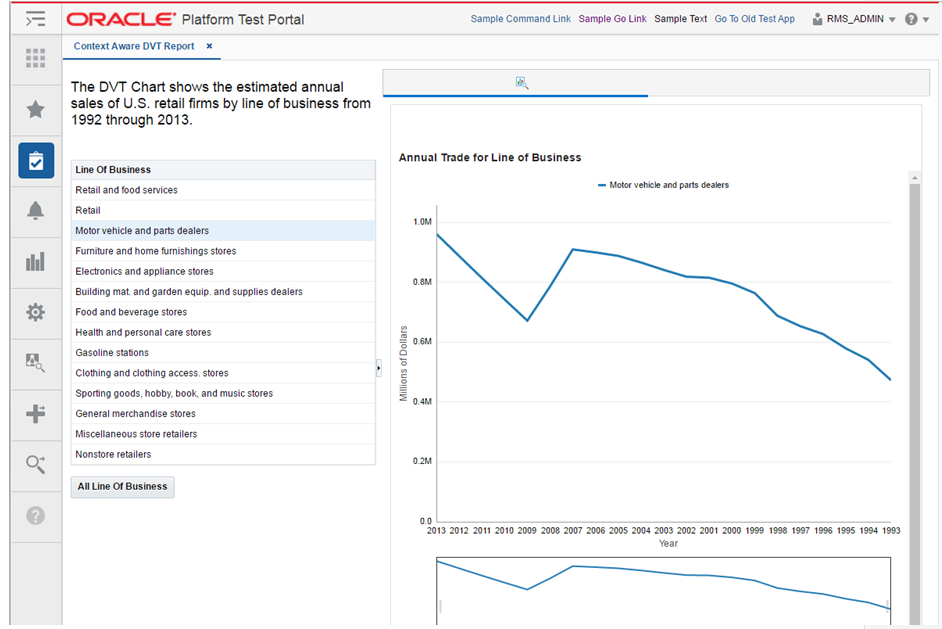
Contextual Reports are reports that appear in a task flow's contextual area section. Contextual Area is a collapsible section to the right of the local area that provides a space to present information that can assist users in completing their tasks.
Since, the information presented in the contextual area is dependent on the task or workflow the user is on, contextual areas are associated to task flows and there can be only one contextual area per task flow.
Within a contextual area - multiple contextual reports can be configured.
Each contextual report can change its contents depending on the action being performed in the user's current workflow.
For example, in the screenshot below, as the user selects the line of business from the table, the line chart will show the annual trade for the selected line of business.
Each task flow publishes contextual business events on key activities happening in the screen. Contextual reports can listen to those events and change its content depending on the payload information associated with the event.
Contextual reports can either be ADF based DVT reports or can be maintained in a separate BI reporting tool. The ADF based DVT reports are ADF taskflows, which are built using the ADF Data Visualization components. The reports maintained in an external reporting tool are URLs accessible in a web browser via a URL. Oracle Retail recommends using Oracle Business Intelligence Enterprise Edition (Oracle BI EE) for an external reporting tool.
The contextual reports are added into a Retail Application by modifying the task flow's contextual area model XML file.
The Contextual Area link displays the list of contextual reports in the application. When a contextual report name is clicked, it opens the contextual report xml file in an application tab. The contextual reports can be added, modified or removed from the contextual area by changing the contextual reports xml file. The contextual reports layout can also be changed using the contextual reports xml file.
Adding a contextual report to a task flow entails the modification of the task flow's Contextual Area Model XML file. Multiple reports can be added to the model. Each report is rendered in a collapsible panel box.
Before adding a URL based contextual report, the retailer must have:
Obtained information about the Retail Application's list of contextual business events that can be broadcast from various workflows. Please refer to the application operations guide for the list of business events.
Created one or more contextual BI reports in the BI reporting tool (e.g. Oracle BI EE).
The web URL for each report must be available in order to proceed with the steps in this section.
Any parameters to configure the content of the report must be known and should be accessible as parameters to the dashboard's URL.
Once the above pre-requisites have been satisfied, proceed with the following steps:
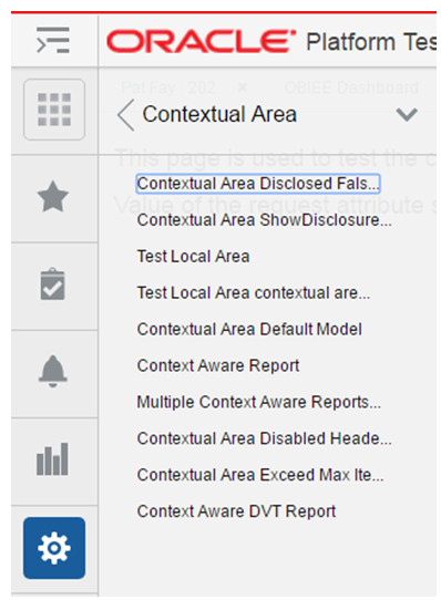
In the Settings Menu, click on the Contextual Area folder and then click on the Contextual Area taskflow name.
This will open the taskflow's contextual area model xml file.
Add an <Item> element within the topmost <Items> element that references the task flow called ViewContextAwareReportFlow. The ViewContextAwareReportFlow is a framework for rendering URL based reports that will be aware of contextual business events emanating from the Retail Application task flows.
Make sure that the <Item> id is unique. Make sure the <Item> type is "taskflow". Provide a meaningful title.
Populate the parameters to the ViewContextAwareReportFlow by adding the following <Parameter>/<Parameters> elements.
<?xml version="1.0" encoding="UTF-8" standalone="yes"?>
<NavigationDefinition … >
<Items>
<Item id="showCustomerMetric"
type="taskflow"
title="Customer Metric">
<url>
/WEB-INF/oracle/retail/apps/framework/contextawarereport/publicui/flow/ViewContextAwareReportFlow.xml#ViewContextAwareReportFlow
</url>
<Parameters>
<Parameter id="reportDescription">Item Metric</Parameter>
<Parameter id="actionType">AllocMaintItemSelectedEvent</Parameter>
<Parameter id="primaryUrl">
<![CDATA[/faces/oracle/retail/apps/framework/contextawarereport/publicui/page/ViewContextAwareReportTestPage.jspx?paramItemId=<selectedItemId>¶mItemType=<selectedItemType:token01>¶mLanguage=<language>]]>
</Parameter>
<Parameter id="token01">regular</Parameter>
</Parameters>
</Item>
</Items>
</NavigationDefinition>
|
Note:
|
Test the Retail Application. Go to the flow where the report was added and verify that the report is rendered correctly.
Before adding a DVT taskflow based contextual report, the retailer must have:
Obtained information about the Retail Application's list of contextual business events that can be broadcast from various workflows. Please refer to the application operations guide for the list of business events.
Created one or more taskflows using the ADF DVT components. Any parameters to configure the content of the report must be known and should be accessible as taskflow parameters.
Once the above pre-requisites have been satisfied, proceed with the following steps:
In the Settings Menu, click on the Contextual Area folder and then click on the Contextual Area taskflow name.
This will open the taskflow's contextual area model xml file.
Add an <Item> element within the topmost <Items> element that references the task flow called DVTContextAwareReportFlow. The DVTContextAwareReportFlow is a framework for rendering ADF DVT based reports that will be aware of contextual business events emanating from the Retail Application task flows.
Make sure that the <Item> id is unique. Make sure the <Item> type is "taskflow". Provide a meaningful title.
Populate the parameters to the DVTContextAwareReportFlow by adding the following <Parameter>/<Parameters> elements.
<?xml version="1.0" encoding="UTF-8" standalone="yes"?>
<NavigationDefinition … >
    <Items>

        <Item id="showCustomerMetric"
              type="taskflow"
              title="Customer Metric">
            <url>
/WEB-INF/oracle/retail/apps/framework/dvtcontextawarereport/publicui/flow/DVTContextAwareReportFlow.xml#DVTContextAwareReportFlow
            </url>
            <Parameters>
                <Parameter id="taskflowURL">/WEB-INF/oracle/retail/apps/framework/uishell/navigation/contextualarea/flow/ItemMetricFlow.xml#ItemMetricFlow</Parameter>
                <Parameter id="parameterName1">itemId</Parameter>
                <Parameter id="payloadKeyName1">ItemId</Parameter>
                <Parameter id="parameterValue1">#{payload.valueMap['ItemId']}</Parameter>
                <Parameter id="refreshOnDisclosure">#{true}</Parameter>
            </Parameters>
         </Item>

    </Items>
</NavigationDefinition>
|
Note:
|
Test the Retail Application. Go to the flow where the report was added and verify that the report is rendered correctly.
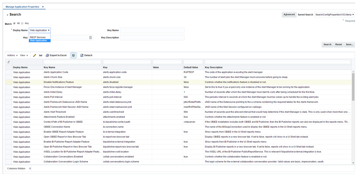
Configuration properties are key-value pairs recognized by Retail Applications during runtime to control application behavior. For instance, a property may exist to turn off certain features within the application.
Administrators of Retail Applications can access the Manage Application Properties screen from the Settings/Configuration menu to view and edit configuration properties.
The Manage Application Properties screen allows administrators to search for configuration properties by deployment (a required criteria). Properties can also be searched by keywords against key names and descriptions.
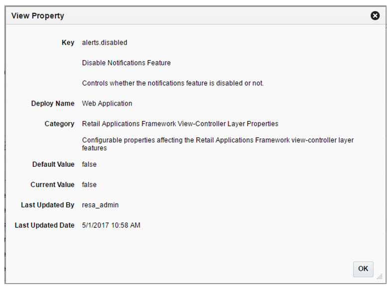
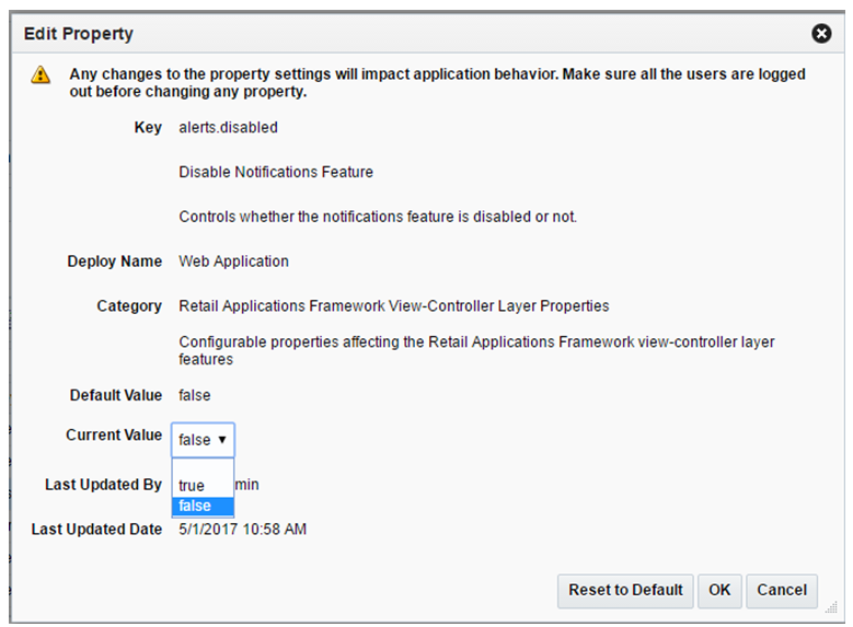
Properties matching the search criteria are displayed in a table from which a user can perform the following actions:
View details of a property
Edit a property
Export properties to CSV
This section discusses important points administrators must consider before updating configuration properties.
Any changes to the configuration properties will impact application behavior. It is recommended that administrators perform configuration updates during downtimes when no users are in the system performing critical business workflows.
Updates to configuration against the main Retail web application are effective immediately. However, users will need to be advised to log-out and log back into the system to see the effects of the configuration change.
Updates to configuration against other deployments such as REST Services, calculation engines, etc are not effective immediately. It can take up to 1 hour before the updates are realized.
A server restart will guarantee the effectivity of any property updates regardless of the type of deployment.
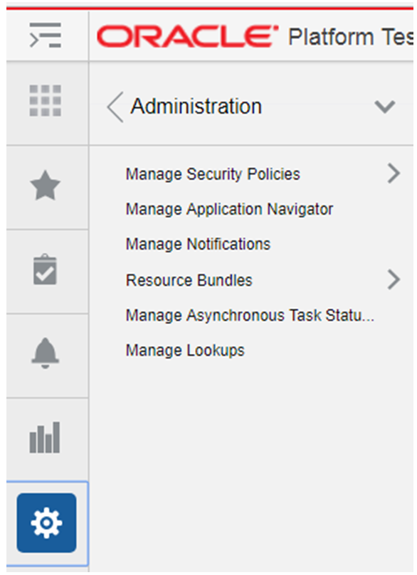
Oracle Retail Application Administration is an option in the Settings menu that can be used by an administrator to manage security policies, application navigator, notifications, resource text, Asynchronous Task Status and Manage Lookups. All the links in the administration menu except for the Manage Asynchronous Task Status and Manage Lookups links open the tasks in a new browser window using the Oracle Retail Application Administration Console (RAAC) application. The Manage Asynchronous Task Status and Manage Lookups functions exists within the application's realm and not the RAAC realm.
The following options are available in the Administration menu:
Manage Security Policies
Manage Application Navigator
Manage Notifications
Resource Bundles
Manage Asynchronous Task Status
Manage Lookups
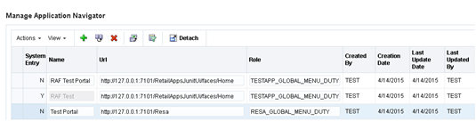
Application Navigator allows users to launch different applications from their current application. This lets users shuffle between multiple applications based on their privileges and avoid having to open a new tab and enter a new URL to launch an application. Users can instead click on the application, which will launch that application in a new tab or window based on the browser settings. If the application is a Single Sign-On (SSO) deployment then the user will be logged in by default and the default application page is displayed. If the deployment is non-SSO then the user is prompted to log in.
If a user has access to multiple applications (based on their defined role) they are able to see the list of available applications under the Application Navigator menu. If the user does not have access to any other applications, only the current application name will be displayed in the application navigator list.
In order for users to see an application in the Application Navigator menu, they need to belong to the role associated with that application on the Manage Application Navigator screen. Only an application administrator is aware of the links to the different installed applications. RAAC provides the ability to add, modify and remove the links so they appear or not appear in the Application Navigator menu. Application administrator can determine which application role has access to which application based on customer's security model. For example, suppose Allocation users belonging to Allocation role X are to see the Invoice Match application link in the Allocation's Application Navigator menu. The administrator would launch RAAC from Allocation, navigate to Manage Application Navigator, add an entry for Invoice Match and enter X for the role.
A system row in RAF_INSTALLED_APPS table is one with the SYSTEM_ENTRY column set to 'Y'. These rows are locked and only administrators will be allowed to change the description, role, and URL.
Each application has one system record inserted at installation time in the RAF_INSTALLED_APPS table. The system records cannot be added or deleted from RAAC. However, administrators are able to modify the role and URL associated with that system record's application using RAAC.
System records are not displayed in the Application Navigator list on the applications. Such records can be duplicated in RAAC (with SYSTEM_ENTRY='N') which then makes them available on the Application Navigator list.
The Add action is enabled at all times and allows an administrator to add a new Application Navigator URL.
From the Actions menu, select Add. A new, empty Application Navigator entry is added to the Manage Application Navigator table.
Enter a name, the application URL, and the role to which the URL applies. The remaining columns are populated automatically.
System records cannot be inserted from the Manage Application Navigator screen. This will be created once per application by the installer at the application install time.
While all the columns on a row can be modified, only the ROLE and URL columns of a System Record can be modified by the administrators.
The Duplicate action adds a copy of each selected row below its originating row. The object name or unique identifier of the duplicate row is "Copy of Object Name" and appears in edit mode. Validation is performed so that a user is not presented with multiple applications with the same application name.
When a system record is duplicated, a copy of the record is created with the System_Entry column set to 'N' and thus made available on the Application Navigator list.
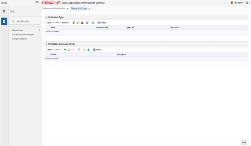
From the RAAC left hand navigation menu, the user can access the Manage Notifications link. The Manage Notifications tab displays the Manage Notifications table. This table is laid out using a master table and a detail table. The master table consists of Notification Types and the detail table consists of Notification Groups and Roles associated with the notification types.
Retail Applications provide the ability to notify authenticated users in the application when business events occur. An example of a business event is when a background asynchronous task such as an approval of an allocation or a validation of a price change has completed. Typically, the user is expected to take action on these notifications.
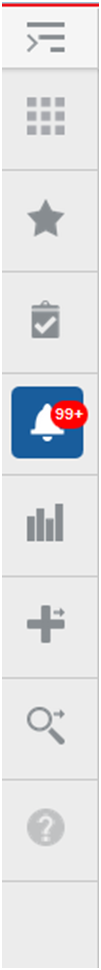
The notification icon on the Retail Application's navigation pane displays the count of unread notifications for the user. When a notification is generated, this count is incremented immediately and thereafter refreshed at regular configurable intervals.
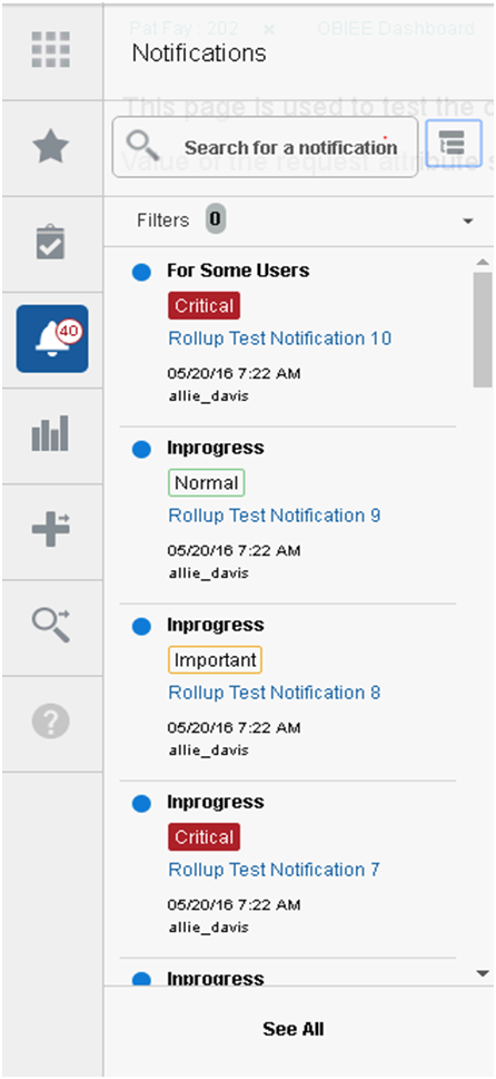
The sliding sidebar menu expands when the user clicks on the notification icon. The expanded sidebar menu will show the latest notifications. Clicking on "See All" will show all the notifications in a new tab.
Clicking on the link for each launchable notification opens the specific UI flow that will allow the user to address any pending action for the notification.
ReST Endpoints have been exposed by the Notifications framework to ease the integration concerns with disparate applications.
Notification Types drive how users are notified about the result of their action. This result can be communicated to one user or a group of users based on the job roles.
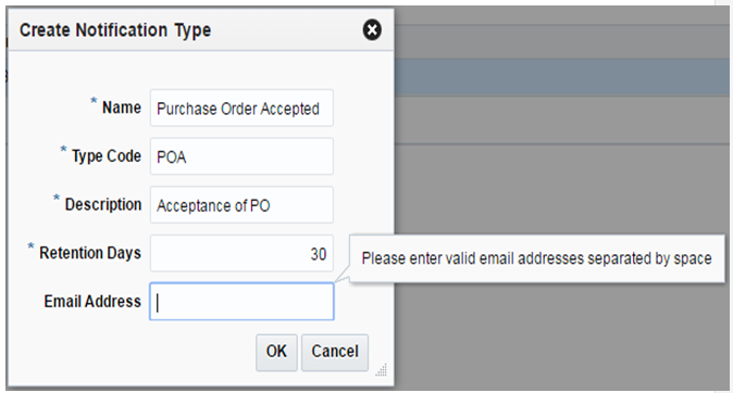
The Add action is enabled at all times and allows you to add a new notification type.
From the Actions menu, select Add. The Create Notification Type dialog is displayed.
Each notification type requires the following information:
Name – The name of the notification type
Type Code – A meaningful name to identify the notification type
The type code provides applications a way to uniquely identify a notification type.
Description – The description of the notification type
Retention Days – The number of days a notification of this type should be retained
The reason for capturing Retention Days information at Notification Type level itself, is that it gives users the flexibility to delete certain Types of notifications quickly without cluttering notification views. To retain records infinitely, this value should be set to -1.
|
Note: Administrators are discouraged from using '-1' for Retention Days as associated notifications will never be purged automatically. Only a system administrator can delete those manually through a sql script or direct row deletes through a sql tool. |
|
Note: Retention Days cannot be set to zero. |
Email Address - Email addresses that must be notified in case a notification of this type is created. Multiple email addresses may be provided here, separated by blank space. This is an optional field, and can be skipped.
|
Note: To be able to send emails for notifications, the Retail Alert Manager application must be deployed. |
Click OK to create the new notification type.
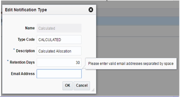
The Edit action is enabled when a notification type is selected. The Edit action is used to add or modify the description and retention days of an existing notification type.
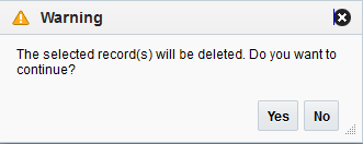
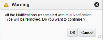
The Delete action is enabled when you select a notification type that can be deleted from the database.
Deleting a notification type removes the notification type and all of the notification type's associated roles and groups. Any past notifications are also removed in order to maintain data integrity.
The Notification Groups and Roles table consists of all the roles associated with a notification type master record. If there are no records associated with the notification type then a "no data to display" message appears in the Notification Groups and Roles table when the notification type is selected in the Notification Types table.
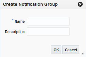
The Create action is enabled at all times when a notification type is selected and allows you to create a new notification group associated with the selected notification type.
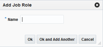
Once a notification group is created, you can add job roles that apply to the selected group.
From the Actions menu, select Add job Role. The Add Job Role dialog is displayed.
Enter a name for the job role.
Click OK to create the new job role or OK and Add Another to create additional job roles.
Upon clicking OK or OK and Add Another, the New name is validated. The validation checks for a valid name in the enterprise security solution of the retailer. If it finds a match, then it allows the user to proceed. If the name is not valid, an error is displayed.
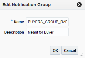
The Edit action is enabled when a notification group or job role is selected. The Edit action is used to modify the name and description of an existing notification group or job role.
Select the notification group or job role you want to edit.
From the Actions menu, select Edit. The Edit Notification Group (or Edit Job Role) dialog is displayed.
Modify the notification group or job role attributes and click OK.
Upon clicking OK, the New name is validated. The validation checks for a valid name in the enterprise security solution of the retailer. If it finds a match, then it allows the user to proceed. If the name is not valid, an error is displayed.
The Delete action is enabled when you select a notification group or job role that can be deleted from the database.
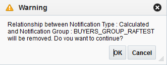
Deleting a notification type removes the notification type and all of the notification type's associated roles and groups. Any past notifications are also removed in order to maintain data integrity.
All Oracle Retail applications come packaged with resource bundles, files that contain text resources. These text resources appear throughout the Oracle Retail application as instructions, messages, labels, errors, virtually any text that appears in the application comes from a resource bundle.
Many Oracle Retail applications support the ability for retailers to customize the text that appears in the Oracle Retail application to better match that retailer's business language. The capability to change the text for a resource is provided through the Resource Bundles area of RAAC. Retailers can customize text resources for any Oracle Retail supported language.
All text resources in the Oracle Retail application have the following values:
Base Application Code – This value identifies the Oracle Retail application that owns this text resource.
Language – This value identifies the language of the text resource.
Bundle – This value identifies the bundle file where this text resource resides.
Resource – This value is the unique name that can be used to get the text for this resource.
Base Text – This value is the text provided by the Oracle Retail application. This is the text that will appear in the application by default.
Every text resource in Oracle Retail applications is uniquely identified by the combination of Application Code, Language, Bundle, and Resource.
A resource customization is a change that a retailer made to the text of a resource. In addition to the values above, customizations also have the following values:
Custom Text – This is the custom text provided by the retailer for the resource.
Text – This is the text that will actually appear in the Oracle Retail application. If a retailer has provided custom text for the resource, then this value will display the retailer's custom text. Otherwise, it will display the base text provided by the Oracle Retail application.
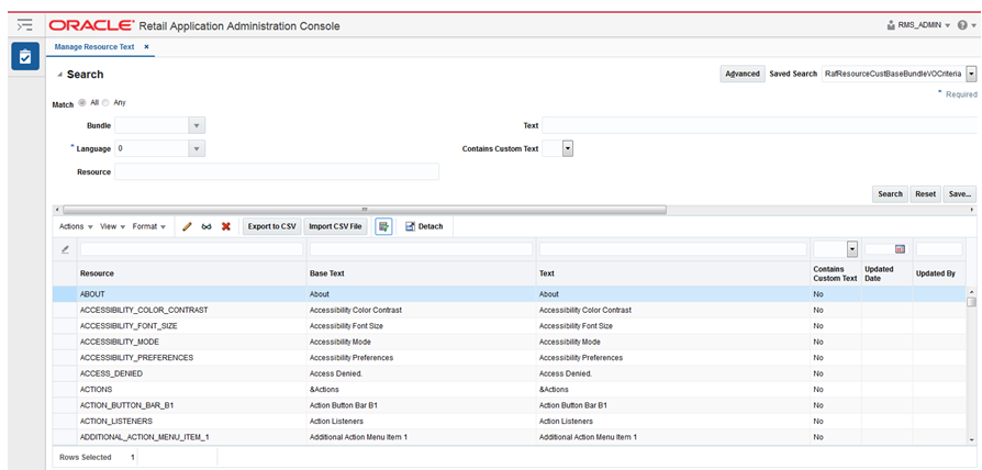
From the RAAC left hand navigation menu, the user can access the Manage Resource Text link. The Manage Resource Text screen provides the capability to customize the resources present in the resource bundles in an application. The user can search the resources in the application using the Bundle, Language, Resource, Contains Custom Text, or Text fields.
The results table in the Manage Resource Text screen will display the Resource, Base Text, Text, Contains Custom Text, Updated Date, and Updated By columns for the resources matching the entered search criteria. If there is a custom value present for a resource, it will be displayed in the Text column along with the date and the user who customized that entry. If there is no custom value present for a resource, the Text column will display the base text and the Updated Date and Updated By columns will be displayed empty. The user can view, add, edit, or remove custom text for a resource using this screen.
The user can also export the results table to an Excel CSV file, or import an Excel CSV file with customized resources using this screen. The export and import actions allow the user to provide custom text for many resources at one time, and upload all the custom values in a single action in RAAC.
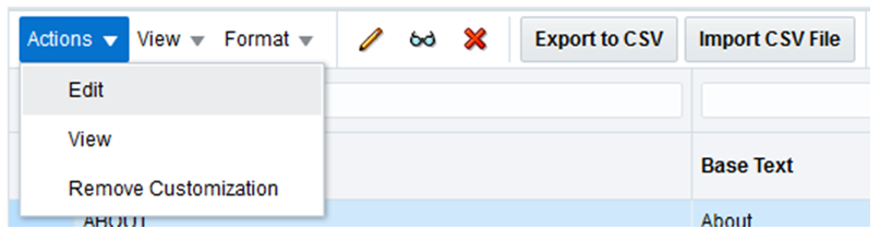
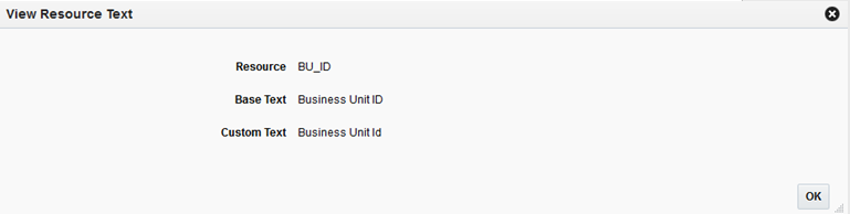
The user can view a resource, base text and custom text using the View menu item or the binoculars icon. The View option opens up a popup showing the resource, its base text and custom text. Only one record can be viewed at a time in a popup. If more than one record or no record is selected, a warning is displayed to the user.
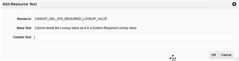
The user can add or edit the custom text for a resource using the Edit menu item or the pencil icon. If no custom text is present for a resource, a new custom text will be added. If a custom text is already present for a resource, it will be modified. The Updated Date and Updated By columns will be changed to reflect the addition or modification. The Edit option opens up a popup showing the resource, its base text and editable custom text. Only one record can be edited at a time in a popup. If more than one record or no record is selected, a warning is displayed to the user. The Edit popup can also be opened by double clicking a record on the results table.
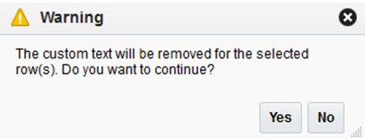
The user can remove the custom text for one, many or all the selected resources using the Remove Customization menu item or the cross icon. The user can select a single or multiple records and remove custom values for the records. The Remove Customization option will give a confirmation warning message before the custom text is removed for the selected records. The base text is not impacted by the Remove Customization operation.
The user can export the details of the resources from the results table to an Excel CSV file. When the user selects the Export to CSV action, the browser will perform its download behavior. Depending on the user's browser preferences, the browser may prompt the user asking whether the exported file should be opened or saved, what program should be used to open the file, or where on the user's computer the file should be saved.
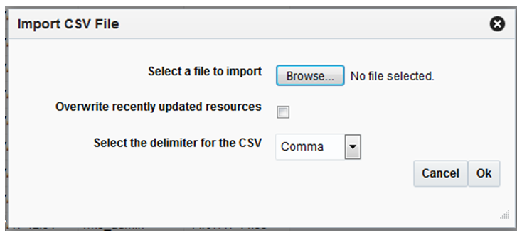
The user can change the values in the Text column of an exported CSV, and then import the CSV file. When the user does this, the values of the Text column are imported into the custom text of each newly customized resource. The user can customize multiple rows with a single action by importing a file which contains multiple customized rows. Importing a file that has not been modified will do nothing, since the text for each resource is already exactly the same in RAAC the Oracle Retail application.
The imported file must meet the following assumptions for the import to succeed:
The imported file must be a well-formed CSV file. The user can use any compatible program to edit the exported CSV file, as long as the program is able to read the CSV file and save it again in CSV format.
The user should only edit values in the Text column. If the user edits any of the values in the Base Application Code, Language, Bundled, or Resource columns, the import may fail, or invalid customizations may be created.
The user can only add or edit customizations in the import. The user cannot remove customizations using import. Deleting the contents of the Text field or copying the Source Text into the Text field will cause the row to be ignored.
The size of the imported file is limited to 2000 KB. Users will not be allowed to upload a file larger than this.
When the user selects the Import CSV file action, a popup opens prompting the user to select a file to import.
It is possible that, after a user exports resources to a CSV file, but before the user imports the file into RAAC, another user may go to RAAC and customize one or more of the exported resources. In this case, the values of resources in RAAC would be newer than the values in the exported file. In order to ensure that an import does not inadvertently overwrite these values, the import action will skip resources that have been recently updated in RAAC, and notify the user. The user can tell the import to instead use the values from the imported file by selecting the "Overwrite recently updated resources" checkbox on the import popup.
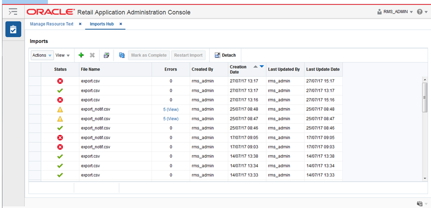
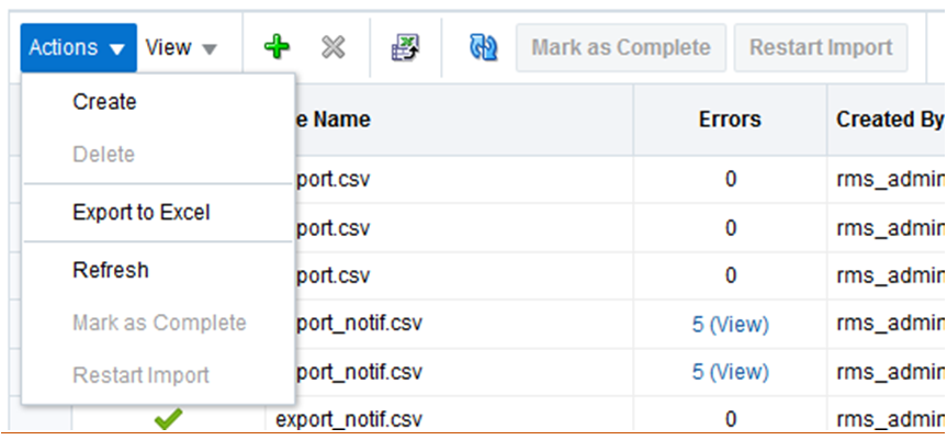
From the RAAC left hand navigation menu, the user can access the Imports Hub link. The Imports Hub screen provides the capability to view and manage import actions that have been created, and take action to resolve any issues encountered during an import.
The Imports table will display information about each import that has been created. The table will display the Status, File Name, Errors, Created By, Creation Date, Last Updated By, and Last Updated Date. The user can create a new import, delete an import, mark an import as complete, restart an import, or view the errors for an import from this screen.
The user can import a CSV file from the Imports Hub page. See "Importing from a File" for additional details.
The user can delete one or more imports. When the user deletes an import, that row is removed from the table completely, as well as any unresolved errors in the import. Any customizations that were already created by the import will still exist. The user cannot delete an import that is in "Pending" status. This is to make sure that an import is not deleted while it is being processed.
Note that there is no purge process for imports. All imports will remain in the database until manually deleted by the user.
The user can select an import that is in "Complete with Errors" status and change the status to "Complete" This indicates that the user has finished addressing errors with the import, and all outstanding errors should be dismissed.
After the user addresses any errors that were encountered when importing customizations, the user can restart the import to create customizations for the fixed resources.
When an import on the Imports Hub screen is marked with status "Complete with Errors," this means that the import encountered errors with one or more of the customizations in the imported file. In the table, the Errors column indicates the number of customizations that had errors. This number becomes a link that the user can click to view details for the customizations with errors. This takes the user to a secondary screen within Imports Hub. See the section below titled "View Errors" for more details.
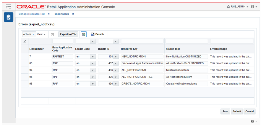
The Import Errors screen allows the user to view the details of any errors encountered while importing customizations from a CSV file. The user can reach this screen via the Imports Hub screen. See "View" within the "Imports Hub" section for additional details.
The Import Errors screen allows the user to view all imported customizations that encountered errors, as well the error message indicating why that customization could not be created. The Errors table displays Line Number, Base Application Code, Language, Bundle, Resource, Text, and Error Message. The user can edit or delete an imported customization, or Export to CSV.
The Errors table provides inline editing for the Base Application Code, Language, Bundle, Resource, and Text columns. This allows the user to resolve cases where a customization does not identify an existing resource, or cases where two or more customizations identify the same resource.
The user can delete an imported customization. The imported record is removed from the errors table, and no customization is created.
The user can export the contents of the Errors table back to a CSV file, fix any errors in the CSV, and re-import the file. In this case, the user would generally want to return to the Imports Hub screen and mark the first import as complete, since the errors were fixed by creating a new import.
These are the important considerations that you should keep in mind while customizing resources:
When customizing a resource text, consider the length of the custom text compared to the base text. Some of the labels and messages may not look good on the page, if the custom text is too long compared to the base text.
After customizing the resource text, the changes are not immediately visible in the application. The customized resources are visible in the application only after the resource bundle cache expires. Please refer to the application documentation for the cache expiry time.
Asynchronous tasks are background processes launched by users of Oracle Retail Applications. An example of a background process is the calculation of allocations.
Each asynchronous task is logged in the database table called RAF_ASYNC_TASKS.
Administrators can view the latest status of asynchronous tasks through the Manage Asynchronous Task Status function from the Oracle Retail Application's Settings menu.
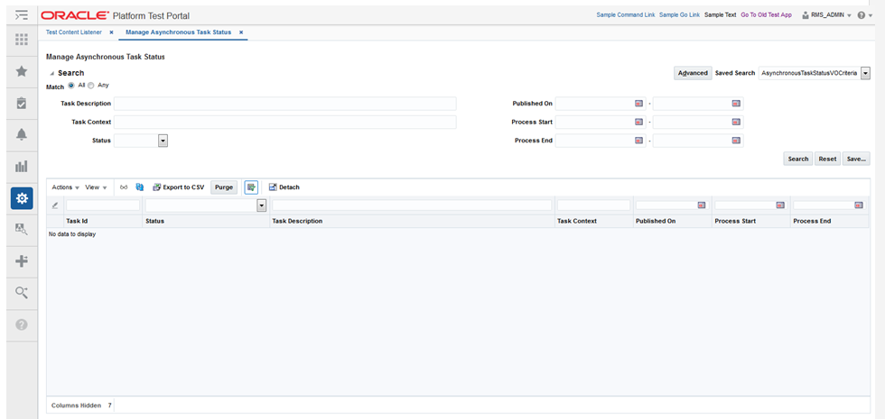
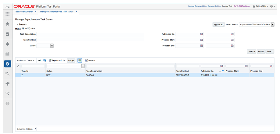
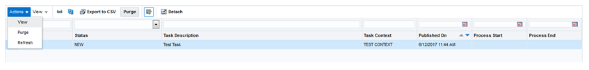
The user can access the Manage Asynchronous Task Status function from the Administration submenu under the Settings menu. This feature is not accessible from the RAAC left hand navigation menu since it is packaged with the application itself rather than the RAAC application. The Manage Resource Asynchronous Task Status screen displays the Asynchronous Task records. Users are able to search for a certain asynchronous task and view a task. Users are also able to purge asynchronous tasks present in the system.
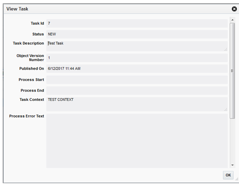
The user can view additional details for the selected asynchronous task by clicking on the View Actions menu item or the View icon of the table toolbar. The View option opens up a popup showing additional details for the selected asynchronous task. Only one record can be viewed at a time in a popup.
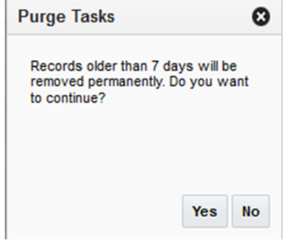
The user can purge asynchronous task records in the system. The number of days is defined in the async.task.purge.retention.days property which can be updated through the Manage Application Properties feature described above in this chapter. The Purge can be invoked through the table toolbar Purge button or Purge Actions menu item.
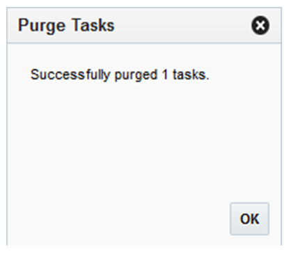
When the Purge action is complete, a popup will appear showing the number of purged asynchronous task records
Lookup records in Oracle Retail Applications represent items that users can select in dropdown and list-of-value inputs in application screens. Examples include:
Location Types (warehouse or store)
Clearance Status (worksheet, submitted, rejected, approved, etc)
Markup Types (cost or retail)
These lookups are stored in the database tables RTC_LOOKUP_TYPES_B and RTC_LOOKUP_VALUES_B.
Administrators can customize these lookups through the Oracle Retail Application's Settings menu.
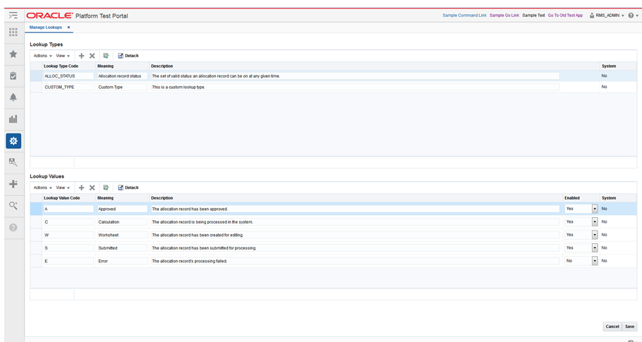
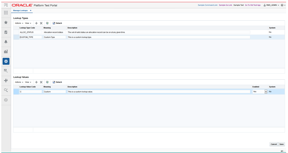
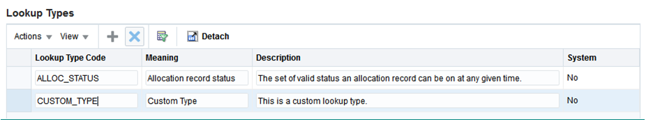
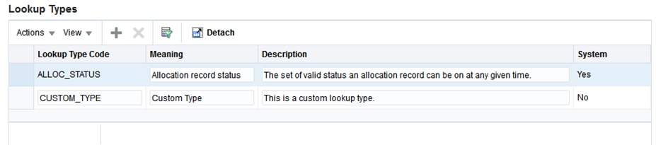
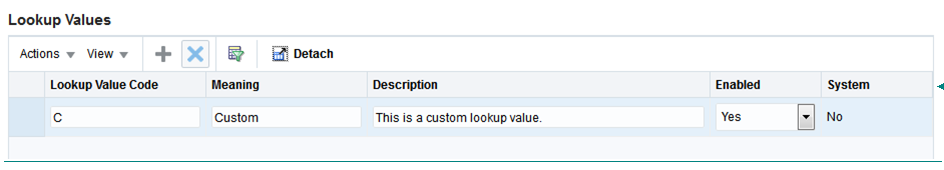
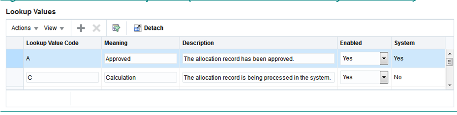
From the Settings menu, the user can access the Manage Lookups screen under the Administration submenu. This feature is not accessible from the RAAC left hand navigation menu since it is packaged with the application itself rather than the RAAC application. The Manage Lookups screen displays the lookup types and their associated lookup values for the Retail Application. The Manage Lookups screen shows information about the lookup types and values such as the Lookup Code, Meaning, Description, System flag, and for the Lookup Value only - an Enabled flag. Users are also able to create, update, delete, cancel, and save changes made to the lookup types and values.
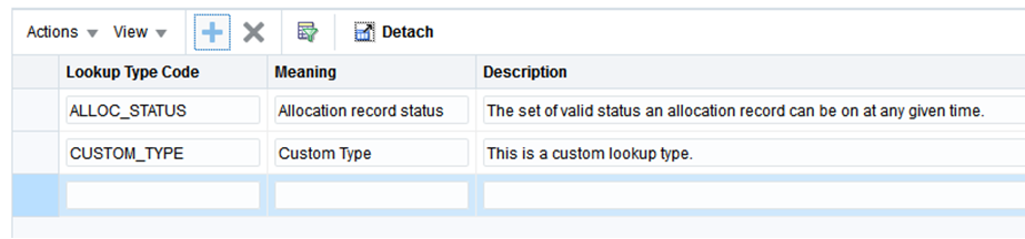
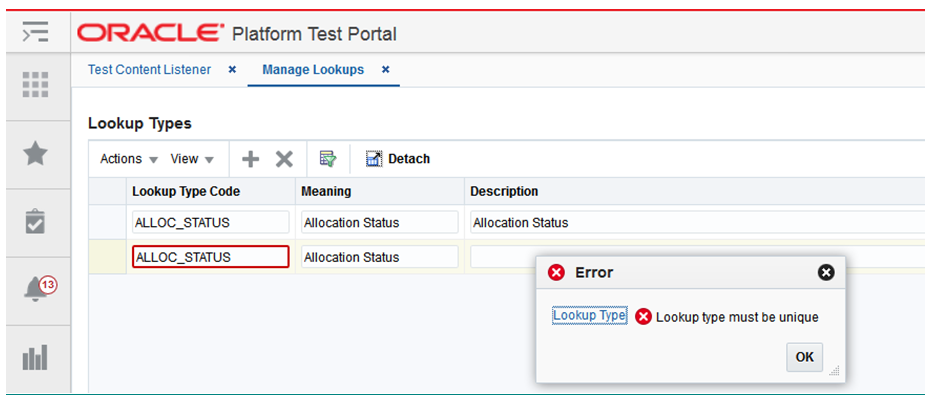
The user can add a lookup type by clicking on the Add menu item or the Add icon of the Lookup Type table toolbar . The user can enter the lookup type's Code, Meaning, and Description. The system column is non-editable and will always be set to No when a user creates a new record. Lookup Types must be unique, so if a user enters an already existing Lookup Type Code, an error message will display.
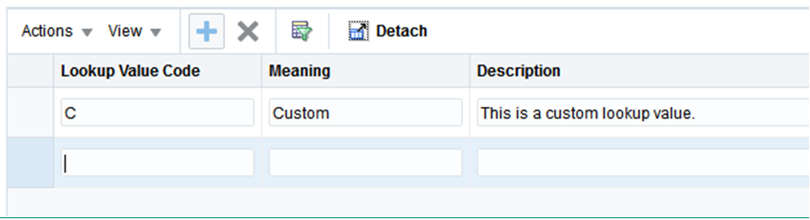
To associate a lookup value with the lookup type, the user can click on the Add menu item or the Add icon of the Lookup Values table toolbar. The user can enter the lookup value's Code, Meaning, Description, and Enabled flag. The system flag is also non-editable.
The Lookup Types and Lookup Value tables are editable so the user can readily update the records. All columns are editable except for the system column. The Lookup Code, however, cannot be edited if it is a system record.
If a lookup type or lookup value is a System record, the user will not be able to update the lookup code for that record.
Lookup code must be unique, so if a user updates to an already existing Lookup Type or Lookup Value Code, an error message will display.
The user can delete a lookup type or lookup value by clicking on the Delete menu item or the Delete icon of the Lookup table toolbar . To delete a lookup type or lookup value, the user should select a record then click either the Delete menu item or the Delete icon.
The Delete function is applicable only to Non-System records. When a user selects a system record, the Delete menu item and the Delete icon are disabled.
Save and Cancel buttons are also available to commit and rollback the changes made to the records. These buttons are located at the bottom right section of the Manage Lookups screen.
The user can save changes made to both the lookup types and lookup values tables using the Save button. All changes made using the screen's Add, Edit, and Delete functions will take effect once the user clicks on the Save button.
The user may also use the cancel button to undo changes made to both the lookup types and lookup value tables. However, the Cancel button may only undo changes that have not yet been saved. All previously saved changes may not be undone using the Cancel button.
Clicking on the Cancel button also closes the Manage Lookups screen after the rollback is complete.