| Oracle® Retail Merchandising Foundation Cloud Service Oracle Retail Merchandising System User Guide Release 19.3.000 F83161-01 |
|

 Previous |
 Next |
| Oracle® Retail Merchandising Foundation Cloud Service Oracle Retail Merchandising System User Guide Release 19.3.000 F83161-01 |
|
Previous |
Next |
Oracle Retail applications, such as the, Oracle Retail Merchandising System, include some common interface options and controls that you can use throughout the application workflow. The following sections describe these user interface controls in more detail.
Although you may have more than one Oracle Retail application installed on your system, each application may use many of the same interface components and abide by common rules and constraints.
You can quickly access the tasks of current applications and switch to other applications from the Navigation bar. For more information on the Navigation bar, see the Task Bar Options section.
The following topics are covered in this chapter:
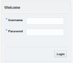
To log on to the application:
Click the User list which is to the top right of the Oracle Merchandising application.
Click Login. The Welcome screen appears.
Provide the following login information:
Enter your user name in the Username field.
Enter your password in the Password field.
Click Login.
This application contains an online HTML help that can guide you through the user interface. User information is included to describe high-level processes and procedures, as well as provide step-by-step instructions for completing a task.
You can access online help for a particular page by clicking on the Help link at the top of the application home page or by clicking the Help icon  available on every page of some of the applications. Once in the help, you can access additional information through the table of contents or by using the index.
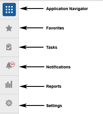
You can quickly access the tasks for Merchandising and switch to other Merchandising Suite solutions from the Navigation bar.
The following navigation bar options are common across all the Merchandising Suite solutions:
Application Navigator
Favorites
Tasks
Notifications
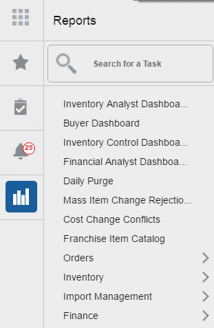
Reports
Settings
|
Note: Your view may vary, depending upon the features selected during the setup process. |
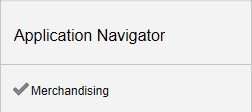
The Application Navigator is optional for the application and provides the ability to switch between applications.
To switch between applications:
At the top left of the application, click the Application Navigator  icon to open the list of available applications.
Select from the listed applications. The application will open in a new tab.
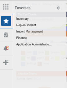
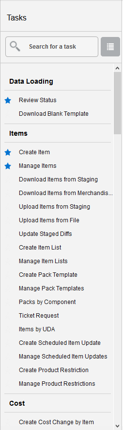
You can select your favorite tasks without accessing the Task Bar menu. It helps you quickly get into your frequently used tasks.
You can click the Favorites icon in the Tasks menu to access tasks designated as favorites. You can also select the cog icon from the Favorites menu to edit the Favorites list. Tasks can be selected or deselected as favorites in the Tasks menu by clicking on the star icon next to the task item.
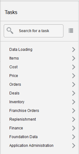
A task is a link to a task flow to accomplish a business process or procedure. For example, a task may be creating a purchase order or editing a previously created item.
Your Tasks list appears in the Task Bar. You can either click on the specific task name to open, or use the Task Search component to search for a Task that you want to open.
|
Note: Your task menu may appear slightly different, depending on which tasks you have privilege to access. By default the tasks are organized into folders in the Grouped View, clicking the List View button toggles to a fully expanded list of all the tasks which allows you to scroll more quickly to the desired task. |
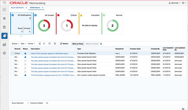
The Notifications functionality is a component built into Merchandising to support raising events to a user's attention. For example, this could be used to alert you to the completion of a background process or the rejection of a transaction you submitted for approval.
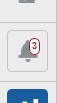
If a notification has been raised, you will see the number on the notification icon on the task bar go up, similar to receiving a new email.
Clicking on this icon will show you a quick view of your most recent unread notifications, including a short description of what triggered the notification, its severity, when it was raised, and the user ID indicating whose action triggered it be raised. There will also be a hyperlink available for the notification. Clicking on this hyperlink will take you to the page where you can take action or view the details related to that specific notification. For example, if you are being notified that a purchase order that you submitted for approval was rejected, clicking on the hyperlink would take you to the purchase order so that you can review the comments from the approver and make the appropriate adjustments.
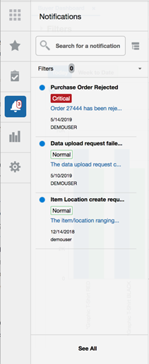
The following notifications are included in Merchandising:
Cost Change Induction
One of the following notifications is raised for cost change downloads and uploads based on the action you've taken and whether it was successful or resulted in errors. Clicking on the hyperlink for this notification will take you to the Data Loading Status screen to review the details of the specific process that resulted in the notification.
Download Complete (note: only raised when download occurs in the background based on large files size)
Download Failed
Upload Complete
Upload Failed
Foundation Data
One of the following notifications is raised if the download or upload of any of the data entities managed via the Foundation Data Loading process fails. Clicking on the hyperlink in the notification will take you to the Data Loading Status screen to review the details of the process that failed. Notifications are not raised if these actions are successful.
Download Failed
Upload Failed
Item Induction
One of the following notifications is raised for item downloads and uploads based on the action you've taken and whether it was successful or resulted in errors. Clicking on the hyperlink for this notification will take you to the Data Loading Status screen to review the details of the specific process that resulted in the notification.
Download Complete (note: only raised when download occurs in the background based on large files size)
Download Failed
Upload Complete
Upload Failed
New Item Location
One of the following notifications is raised for the item/location ranging process when it is executed in the background. Clicking on the hyperlink for this notification will take you to the Item Location screen for the item that resulted in the notification being raised.
Processing Complete
Processing Failed
PO Induction
One of the following notifications is raised for PO downloads and uploads based on the action you've taken and whether it was successful or resulted in errors. Clicking on the hyperlink for this notification will take you to the Data Loading Status screen to review the details of the specific process that resulted in the notification.
Upload Complete
Upload Failed
Download Complete (note: only raised when download occurs in the background based on large files size)
Download Failed
Purchase Order Rejected
This is raised if you previously submitted a purchase order for approval and the approver has rejected it back to a worksheet status, rather than approving the order. Clicking on the hyperlink for this notification will take you to the purchase order in order to take action.
GL Mapping Failure
This notification is raised if any unmapped transactions are found when posting transactions to the General Ledger. Clicking on the hyperlink for this notification will take you to the Download Foundation Data screen where you can download the GL cross reference information to define mappings for those unmapped transactions.
Replenishment Attribute Induction
One of the following notifications is raised for replenishment attribute downloads and uploads based on the action you've taken and whether it was successful or resulted in errors. Clicking on the hyperlink for this notification will take you to the Data Loading Status screen to review the details of the specific process that resulted in the notification.
Download Complete (note: only raised when download occurs in the background based on large files size)
Download Failed
Upload Complete
Upload Failed
Transfer Rejected
This is raised if you previously submitted a transfer for approval and the approver has rejected it back to a worksheet status, rather than approving the transfer. Clicking on the hyperlink for this notification will take you to the transfer in order to take action.
Clicking the See All option at the bottom of the notification pane will take you to a page where you can manage all your notifications, including those you previously reviewed. The actions that can be taken in this page include marking notifications read or unread, deleting old notifications, and reassigning notifications to another user. You can also use the hyperlinked description in this screen to access the page where action can be taken based on this notification.
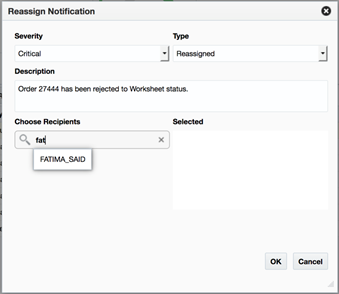
To re-assign a notification, highlight the appropriate notification and select Reassign Notification from the Actions menu. This will display the Reassign Notification popup. Choose one or more recipients that should receive the re-assigned notification and then click OK when all have been added. As part of the reassignment, you can also change the severity of the notification that will be sent to the recipients and the type and description that will be shown to the new recipients.
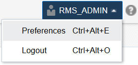
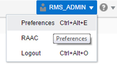
The Preferences pages are where you specify the default regional, language, and accessibility settings that you want to use.
To set your preferences, select Preferences from the user menu at the top of the Merchandising home page. The Preferences page appears.
The standard preference options available are as follows:
Regional
Language
Accessibility
To return to the Merchandising home page, click Back to Home at the top of the page.
Use the following options to specify the default formats for territory, date, time, number, and time zone you want to use.
Table 1-1 Regional Options
| Value | Description |
|---|---|
|
Territory |
Specify the country details. |
|
Date Format |
Select the date format that you want to use. |
|
Time Format |
Select the time format that you want to use. |
|
Number Format |
Select the number format that you want to use. |
|
Time Zone |
Select the time zone you want to use. |
After applying changes, click Save to retain your updates or Revert to revert back to the system defaults.
Use the following options to specify the default language you want to use.
Table 1-2 Language Options
| Value | Description |
|---|---|
|
Default |
Specify the default language you want to use. |
|
Current Session |
Specify the language you want to use for the current session. |
After applying changes, click Save to retain your updates or Revert to revert back to the system defaults.
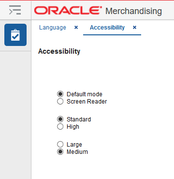
Merchandising provides the ability for users to switch between accessibility support levels in the application, if required. This is done in the Accessibility Option page, where preferences for using a screen reader, as well as desired contrast and font size, can be configured.
Merchandising/Sales Audit provides the ability to switch between the above accessibility support levels in the application, so that users can choose their desired type of accessibility support, if required. It exposes a user preferences screen in which the user can specify the accessibility preferences which will allow the user to operate in that mode.
After applying changes, click Save to retain your updates or Revert to revert back to the system defaults.
The first two options on the page allow you to configure whether or not a screen reader will be used. The two options are:
Default Mode: this is the setting that should be selected if you are not using a screen reader. By default, Merchandising has a rich user interface interaction, and is also accessible through the keyboard. However, for visually impaired users, it is recommended to use Screen Reader mode.
Screen Reader: this mode facilitates the display for visually impaired users, but will degrade the display for sighted users without visual impairment.
Additional configurations can be made for contrast and font size in the remaining groups of settings on this page:
Contrast: Merchandising can display content in standard or high-contrast mode. By default, standard mode is selected. High-contrast mode is intended to make the solutions compatible with operating systems or browsers that have high-contrast features enabled. For example, the use of background images and background colors is changed in high-contrast mode to prevent the loss of visual information. Note that the Merchandising high-contrast mode is more beneficial if used in conjunction with your browser's or operating system's high-contrast mode.
Font Size: the font size displayed in Merchandising is also configurable by choosing either large or medium modes. Medium mode is the default. In medium mode, most text and many containers have a fixed font size to provide a consistent and defined look. In large-font mode, text and containers have a scalable font size. This allows the solutions both to be compatible with browsers that are set to larger font sizes and to work with browser-zoom capabilities. Note that if you are not using large-font mode or browser-zoom capabilities, it is recommended that you disable large-font mode.
|
Note: Figure 1-11, Figure 1-12, Figure 1-13 representations and may differ slightly depending on the page, table, or pop up you are viewing. |
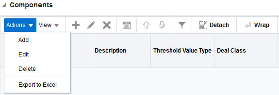
At the table level, there are two menus - Action and View - and several icons used for quick actions on the table. For more information on these options, see the sections Action Menu and Icons and View Menu.
The Actions menu provides the option to take different actions related to entries in the table. Depending on the nature of the table, these actions can be add, view, delete or edit table rows, or export the table contents to the spreadsheet.
The actions and icons described here are those used commonly throughout the solution. Some pages may provide additional options, based on the functionality of the page. The details on those more unique options can be found in the documentation for that particular page.
Table 1-3 Actions Menu/Icons and Descriptions of Components Section
| Actions Menu/Icon | Description |
|---|---|
|
Add and Add icon |
You can add a record to the table by clicking Add from the Actions menu or by clicking the Add icon |
|
Create and Create icon |
You can create a record in the table by clicking Create from the Actions menu or by clicking the Create icon |
|
Create from Existing icon |
You can create from an existing record by clicking Create from Existing from the Actions menu or by clicking the Create from Existing icon |
|
Edit and Edit icon |
You can edit a record in the table by clicking Edit from the Actions menu or by clicking the Edit icon |
|
Delete and Delete icon |
You can delete a record in the table, by clicking Delete from the Actions menu or by clicking the Delete icon |
|
Export to Excel icon |
You can copy the contents of the table to a Microsoft Excel spreadsheet by clicking the Export to Excel option from the Actions menu or by clicking the Export to Excel icon |
|
Move Up and Down icon |
You can move the selected row up or down in the table by clicking the Move Up and Down icons |
|
Wrap icon |
You can wrap the values in the table column by using the Wrap icon |
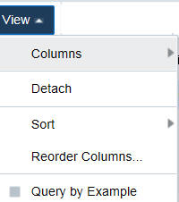
The View menu provides the options for managing the table columns and sorting and filtering the table data.
In some tables you have the option to choose a saved custom view, which is an arrangement of columns different from the default view of the table.
Table 1-4 View Menu and Descriptions
| View Menu List | Description |
|---|---|
|
Columns |
You can manage which of the columns will be shown in the table by clicking the Show All and Manage Columns options. |
|
Detach |
You can view the tables in the application in a separate page by clicking Detach or by clicking the Detach icon |
|
Sort |
You can sort columns by the following options:
|
|
Reorder Columns |
You can reorder columns by clicking the Reorder Columns option. |
|
Query by Example |
You can filter the deal components by one of multiple column values by clicking the Query by Example option or by clicking the query by example icon |
The page level actions display the icons and buttons applicable for a particular task flow's page. This section lists the common page level actions that are used throughout Merchandising.
Table 1-5 Screen Level Action - Icons/Buttons and Descriptions
| Icon/Buttons | Description |
|---|---|
|
Help icon |
You can access online help for a particular page by clicking the Help icon. |
|
Expand and Collapse icon |
You can view all and collapse all the sections in the application page by clicking the Expand and Collapse icon. |
|
Delete icon |
You can delete an entity by selecting the Delete icon. |
|
Status Action Button |
Depending on the status of an entity, this button will be available to change the status of an entity. The status will be changed to the label specified on the button, when the button is clicked. If there is more than one status to which the entity can be changed, clicking the arrow on the right side of the button will display the additional status options. |
|
Revert |
Click the Revert iconic button to reject any changes made in the page and reset it to create or edit another entity. |
|
More Actions |
The More Actions button will have any additional actions and options for navigating to other pages. |
|
Save |
Click Save to save any changes made in the page. |
|
Save and Close |
Click Save and Close to save any changes and exit the page. |
|
Save and Edit Another |
Click Save and Edit Another to save any changes and edit another entity. |
|
Cancel |
Click Cancel to reject any changes and exit the page. |
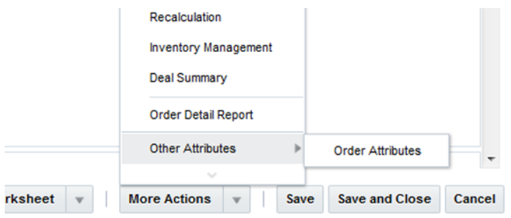
Other Attributes
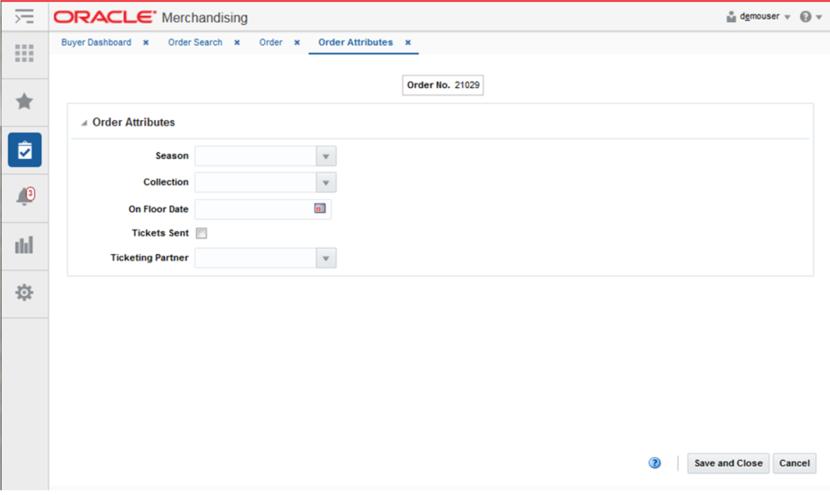
In some pages, under the More Actions menu, there may be an additional menu option titled "Other Attributes". This indicates that custom flex attributes have been enabled for that functional area, such as the example below in the Order page. The sub-menus that are available under the Other Attributes option will vary by functional area, as configured for your business. Depending on how these attributes have been configured, they may be required to be entered in order to save or approve the entity where they exist.
When one of these sub-menu options are selected, a page will open, titled Other Attributes, which will show one or more groupings of attributes associated with the entity, as defined for your business. Below is an example of what the Other Attributes page might look like for attributes associated with a Purchase Order.
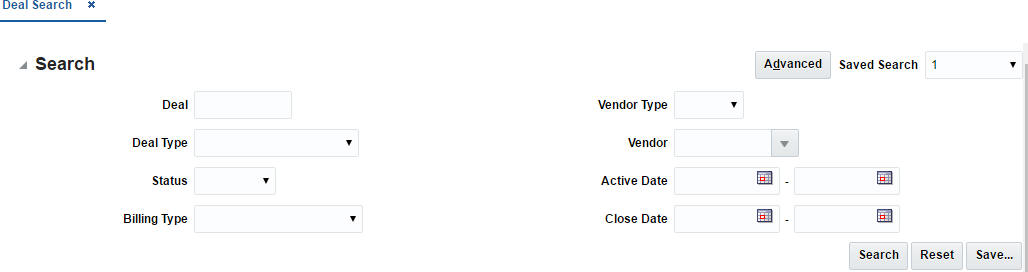
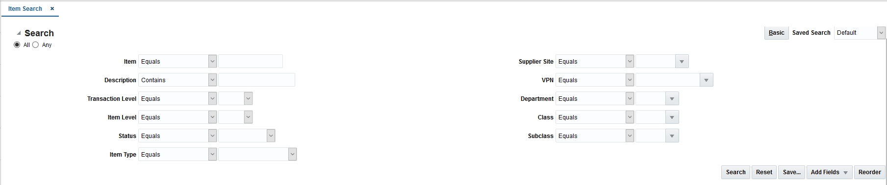
You can search for a particular entity by entering or selecting criteria using the search screens. Searches can be done using basic criteria, or can be done in advanced mode, which allows additional criteria to be added, as well as the use of operators (e.g. greater than, less than) in searches. Searches are generally accessed for most entities under the "Manage" actions in the task list.
The default view when you open a search page will be for a basic search. The criteria available will differ slightly depending on the entity you are searching in.
Enter or select one or all of the following basic search criteria.
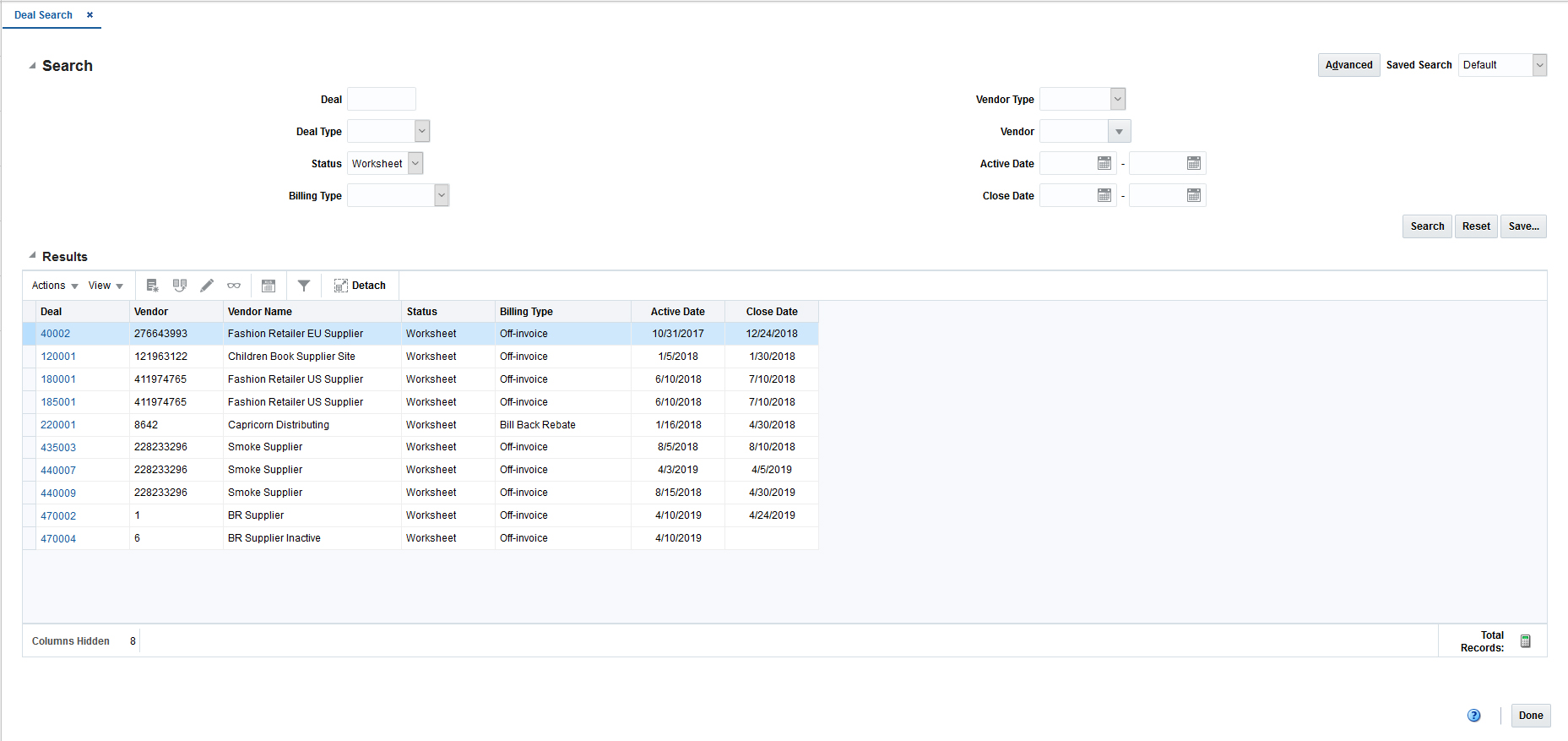
Click Search. The entities that match the search criteria are displayed in the Results section.
From the Search Results, you can manipulate the data using the selections from the Actions menu or selecting one of the table level buttons.
|
Note: If there is no saved search selected in the dropdown, Reset clears the Search section, or resets to a saved search, if applicable. |
Click Done to close the page.
The Advanced Search feature allows you to add new criteria that are not part of basic search, define operators to use in the search, or add multiples of a specific criterion. For example, if searching for an item, using advanced criteria allows you to search on items that are in worksheet or submitted status, by adding the status criterion a second time in the search. Perform the following procedure to define a search using the advanced search criteria:
From a Basic Search page, click the Advanced button in the upper right corner of the screen. This will change the label on the button to Basic, which will allow you to revert back to Basic mode, if needed.
From the Advanced Search page, you can define the variables around how each search is performed.
The All or Any radio buttons allow you to define what items are returned in the search. Select All to return only those results that meet all the search criteria. Select Any to return those results that meet any of the search criteria.
The search field operators allow you to define how each field searches for results.
|
Note: The options available for the operators will differ based on the type of attribute and in some cases may not be available. |
Table 1-6 Search Field Operators
| Operator | Description |
|---|---|
|
Starts with |
The search results start with the specified character(s). |
|
Ends with |
The search results end with the specified character(s). |
|
Equals |
The search results match the specified characters exactly. |
|
Does not equal |
The search results do not match the specified characters. |
|
Less than |
The search results returned are less than the search amount. |
|
Less than or equal to |
The search results returned are less than or equal to the search amount. |
|
Greater than |
The search results returned are greater than the search amount. |
|
Greater than or equal to |
The search results returned are greater than or equal to the search amount. |
|
Between |
The search results returned are between the two specified criteria. |
|
Not between |
The search results returned are not between the two specified criteria. |
|
Contains |
The search results contain the specified character(s). |
|
Does not contain |
The search results do not contain the specified character(s). |
|
Is blank |
The search results are blank. |
|
Is not blank |
The search results are not blank. |
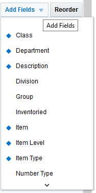
Many of the Advanced Search pages allow you to add additional fields from which to search. This is also the method by which a second instance of a particular criterion can be added. Alternately, some search pages will automatically display all additional criteria that can be used in advanced search.
From the Advanced Search page, click the Add Fields button.
From the Add Fields list, click the field that you want to include.
Repeat these steps for each additional field you want to add. Only one additional field can be added at a time.
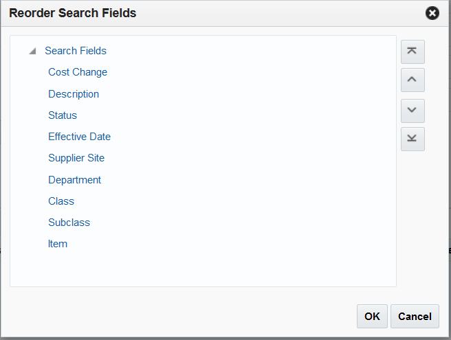
Use the Reorder button to customize the order in which the search criteria appear.
From the Advanced Search page, click the Reorder button. The Reorder Search Fields pop-up appears.
Select the search criteria you want to reorder and use the arrow buttons to move the field up or down the list.
Click OK to save your changes and return to the Advanced Search page.
Click Search. The entities that match the search criteria are displayed in the Results section.
From the Search Results, you can manipulate the data using the selections from the Actions menu or selecting one of the table level buttons.
|
Note: If there is no saved search selected in the dropdown, Reset clears the Search section, or resets to a saved search, if applicable. |
Click Done to close the page.
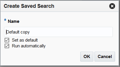
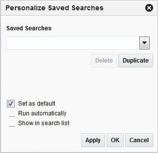
You can create a Saved Search by selecting the Save button in the Search Criteria panel after you have entered the criteria for your search. The Save button will call up the Create Saved Search pop-up where the search is given a name and the user determines whether it should be the default search, which indicates it should be the one displayed when the page is initially opened, as well as whether it should be run automatically.
To view the created saved search, first enter your desired criteria in either basic or advanced mode. Then, follow these steps:
Click the Save... button. The Create Saved Search pop-up appears.
Enter the name of the search.
You can also choose to save the combination of the search criteria by selecting the following check boxes:
Set as default
Run automatically
Click OK to save your search. Click Cancel to close the pop-up without saving.

 .
. .
.
