Managing Settings for Fluid Page Controls
This topic provides an overview and discusses common page control properties for fluid pages.
A basic input page control consists of two items:
The control.
The label.
The system considers the control and the label pairing as a single unit and presents them within a single container in the HTML—ps_box-<control_type>.
For example, in the case of an edit box, the system generated this structure in the HTML.
Image: HTML for fluid page controls
This example illustrates the appearance of the HTML used to display a page control.
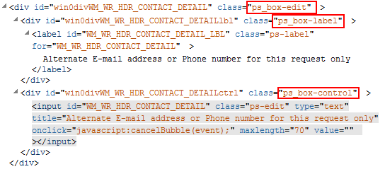
The system generates default styles, which are styled through the style sheets. Applications can override or extend style by adding additional styles or replacing the top-level system default style. In the case of the example above, the application change chose to override the PeopleTools-provided style and it would remove the ps_box-edit class only in favor of the specified class from the application definition.
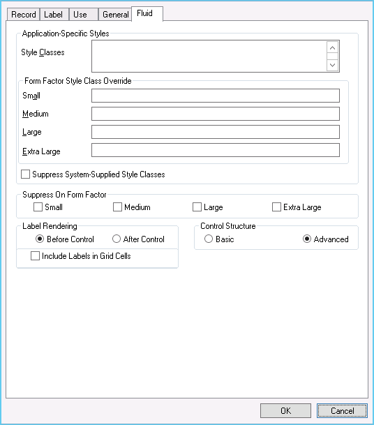
For any control that you can add to a page, such as a group box, an image, a grid, and so on, there is a Fluid tab on the properties dialog box for that control. All of the controls share some properties, while others have additional properties that apply only to the function of that control.
Note: The options documented below apply to all fluid controls. Depending on the control selected for the page, additional properties may appear. Properties specific to an individual control type are documented within a section devoted to that control type.
Image: Common Fluid tab Options
This example illustrates the common page control options available for on the Fluid tab of the Properties dialog box for the control. Descriptions of the options follow the example.
|
Field or Control |
Definition |
|---|---|
| Style Classes |
Enter additional style class specifications used for adjusting the display or behavior of a specific control. This setting applies to all form factors unless specifically overridden by subsequent form factor overrides. These styles are either appended to or are used instead of the system-supplied style classes (that is, styles automatically applied by PeopleTools by default). Separate each style class by a space. |
| Form Factor Style Class Override |
Overrides any styles defined in the Style Classes field by applying additional style classes for a specific form factor (device size). If no value is specified as a form factor override, the Style Classes value is applied. |
| Suppress System-Supplied Style Classes |
Indicates to suppress any default system style classes that are automatically applied for this control type (for example, ps_box-edit would not be applied for an edit box). If selected, it applies to all form factors, and the system applies no PeopleTools default classes for the control (nor does the system load state information). |
| Suppress on Form Factor |
To prevent a page element from being displayed on a specific form factor, select the appropriate form factor. If selected, the page element is never rendered on the client device, similar to setting a field as invisible for a classic page. Suppression can improve throughput as the size of the HTML document is reduced. |
| Label Rendering |
The system processes the display of a control as a combined unit of both the display and its label. You can control the position of the label. Before Control: Select for the label to appear to the right of the control. After Control: Select for the label to appear to the left of the control. |
| Control Structure |
Basic: Select to have the control appear on the fluid page just as it would appear on a classic page. Advanced: Select to have the control appear on the fluid page with the look and feel of a modern, touch-enabled application. For example, a check box would appear as a toggle switch, rather than as a square box. |
| Include Labels in Grid Cells |
If using a Tab Separator in your grid, you are allowed to generate field labels within a grid. Typically, these are suppressed but because you can put group boxes within grids, the labels are appropriate to display what the individual fields are (depending on context). |
Depending on the type of control you are adding to the page, there can be additional options for that control. Use the following links to find more information for each control.