Defining List View Page Element Properties
This topic describes how to define list view page element properties.
This topic describes how to define list view page element properties, including defining properties on the Listview Properties page and on the Modify Listview Mappings page.
Many properties that appear on the Listview Properties page also appear on the properties pages for other page elements. These common properties are described in the topic Common Layout Page Element Properties . This topic discusses using the properties on the Listview Properties page that are unique to working with list view page elements only.
Use the Listview Properties page to set properties for list view page elements. To access the Listview Properties page, in the Layout grid on the Layout Designer – Layout page click the Properties link next to the list view element for which you want to define properties.
The Listview Properties page features a Listview Properties section.
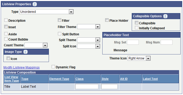
Image: Listview Properties section of the Listview Properties page
This example illustrates the fields and controls on the Listview Properties section of the Listview Properties page. You can find definitions for the fields and controls later on this page.
The following table lists the fields and controls that appear in the Listview Properties section of the Listview Properties page. The fields and controls that are available to select and edit depend on the initial definition of the list view.
The fields and controls are listed in alphabetical order.
|
Field or Control |
Definition |
|---|---|
| Type |
The values are:
|
| Description |
When this read-only field is selected a description is defined for the list view. |
| Inset |
By default the lists are in full-page mode. Select this control to make inline lists. |
| Aside |
When this read-only field is selected an aside is defined for the list view. |
| Count Bubble |
When this read-only field is selected a count bubble is defined for the list view. |
| Count Theme |
From the drop-down list select a jQuery theme for a defined count bubble. |
| Filter |
Select this option to add a filter to the list view to filter names of list items. |
| Filter Theme |
From the drop-down list select a jQuery Mobile theme for a defined filter. |
| Split Button |
When this read-only field is selected a split button is defined for the list view. |
| Split Theme |
From the drop-down list select a jQuery Mobile theme for a defined split button. |
| Split Icon |
From the drop-down list select an icon for a defined split button. The values are:
|
| Place Holder |
Select the box to define a short hint that describes the expected value of an input field. |
| Collapsible Options Section |
The Collapsible Options subsection features these options:
|
| Placeholder Text Section |
If you select the Place Holder field, the fields in this section become enabled. Enter information in the following fields to select placeholder text from the message catalog:
The Message field displays the message text. |
| Image Type Icon |
From the drop-down list select an icon to appear. See the description for Split Button for a list of available icons. The Right Arrow icon is the default. |
| Theme Icon |
From the drop-down list select a jQuery Mobile theme for a defined icon. |
| Modify Listview Mappings |
Click the link to access the Modify Listview Mappings page to add or modify fields and containers for the list view. See Using the Modify Listview Mapping Page for more information. |
| Dynamic Flag |
When this read-only field is selected the page element is defined as a dynamic list view. |
| List View Composition grid |
This section shows the Listview Composition parameters defined. Click the Modify Listview Mappings link to access the Modify Listview Mappings page to add, modify, or delete parameters. |
Use the Modify Listview Field Mappings page to add, modify or remove items from a list view.
To access the page, click the Modify Listview Mappings link in the Listview Properties section of the Listview Properties page.
Image: Modify Listview Field Mappings page (Default view)
This example illustrates the fields and controls on the Modify Listview Field Mappings page.
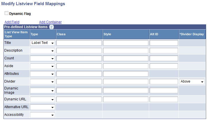
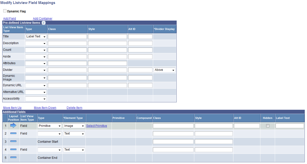
Image: Modify Listview Field Mappings page (Additional fields and container added)
This example illustrates the fields and controls on the Modify Listview Field Mappings page. The Additional Fields grid shows that several additional fields and a container have been added.
Most of the fields and controls that appear on the page are described in the Defining List View Page Elements topic.
The following table describes fields and controls that are not described in that topic:
|
Field or Control |
Definition |
|---|---|
| Add Field |
Click the link to add additional fields to the list view. When you click the link an Additional Fields grid appears at the bottom of the page. |
| Add Container |
Click the Add Container link to add a container to the list view. When you click the link the container appears in the Additional Fields grid appears at the bottom of the page, and features start and end container tags. |
| Alt ID |
Add an alternate attribute for selection. Alternate IDs are populated in the HTML as altid. |
| Move Item Up |
Click the link to move the selected item up in the grid. |
| Move Item Down |
Click the link to move the selected item down in the grid. |
| Delete Item |
Click the link to delete the selected item in the grid. |
| Layout Position |
Indicates if a row is the current row or a non-current row. The following icons indicate position. Click an icon to toggle between making the row the current and non-current row. |
 |
Indicates the current row in the Additional Fields grid. |
 |
Indicates the non-current row in the Additional Fields grid. |