Defining List View Page Elements
This topic provides an overview of list view page elements.
List view elements in the Mobile Application Platform can be dynamic or static.
|
Field or Control |
Definition |
|---|---|
| Dynamic List View |
A dynamic list view is one where the number of rows is determined at runtime based on the number of items in a PeopleSoft document collection element. Note that a compound element wrapped in a collection element must be defined in the PeopleSoft document associated with the layout to define a dynamic list view page element. |
| Static List View |
A static list view is where one row is displayed. |
To add a list view page element to a page:
Access the Layout grid on the Layout Designer – Layout page.
Select to access the page.
Determine the position in the grid to add the page element.
Click the row directly above where you want to add the page element to make it the current row.
The Current Row icon (blue arrow) displays in the first column of the row to indicate that it’s the current row.
Field or Control
Definition

The Current Row button.
Click the Add Listview button on the Layout grid toolbar.
Field or Control
Definition

The Add Listview button.
After you click the button the Listview page appears for you to define the element.
The Listview Page appears after you add a list view page element to the layout grid as described in the previous section.
Important! To create a list view with rows of data, the PeopleSoft document linked to the layout must contain a collection element wrapped in a compound element. It is the collection element that provides n number of rows in the list view. You must also select the Dynamic Flag box on the Listview page to create a multi-row list view.
Image: Listview page (Default view)
This example illustrates the fields and controls on the default view of the Listview page. You can find definitions for the fields and controls later on this page.
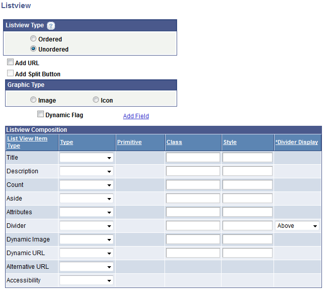
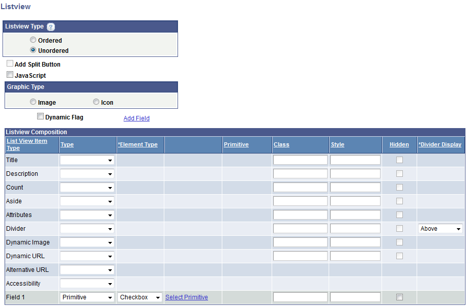
Image: Listview page with field added to the Listview Composition grid
This example illustrates the fields and controls on the Listview page when you add a field to the Listview Composition grid. You can find definitions for the fields and controls later on this page.
This table describes the options you can define at the top of the Listview page:
|
Field or Control |
Definition |
|---|---|
| Ordered |
Select the radio button to create a numbered list. |
| Unordered |
Select the radio button to create an unnumbered list. (Default.) |
| Add URL |
Select the box to add a URL to the row which will be fired off when selected. You will define the URL after you define the values on the Listview page. |
| Add Split Button |
Select the box to create two different interactive actions using URLs on the same row. You will define the split button after you define the values on the Listview page. |
| JavaScript |
This control appears if you add a field to the Listview Composition grid and define the field as any Type for which you can define a primitive element. |
| Image |
Add an Image for the row from the image repository. You will select an image after you define the values on the Listview page. |
| Icon |
Add an for the row from the image repository. You will select an icon after you define the values on the Listview page. |
| Dynamic Flag |
Select the box to create a dynamic list view that will use a collection element to populate the list view composition arguments. |
This table describes the fields and controls in the List View Composition grid. See the previous table for a description of fields and values to define:
|
Field or Control |
Definition |
|---|---|
| Add Field |
Click the link to add an additional column to the list view. You can add up to 50 additional columns. The field appears at the bottom of the Listview Composition grid. See Defining Additional List View Fields later on this page for more information. |
| Title |
Defines the text to show on the list view row. Define the source of the title text: Important! If the Dynamic Flag is selected, in this field you must define a primitive wrapped in a collection, as that determines the number of rows to add for the list view. |
| Description |
Defines the text to show under the title on the list view row. Define the source of the description text. |
| Count bubble |
Generates a circle with a number inside, rendered on the right side of the row. This should ideally be an integer value (primitive of type integer). |
| Aside |
Insert a second column in a row for supplemental text. If a count bubble is used, an aside appears to the left of the count bubble. |
| Attributes |
Add jQuery attributes to a row or rows. |
| Divider |
Create a visual separator between rows. The divider can go above or below the current row. |
| Dynamic Image |
Add a dynamic image to a row or rows. |
| Dynamic URL |
Enter a value to dynamically add a URL to the list view. A dynamic URL will override a URL defined using the Add URL control at the top of the page. |
| Alternate URL |
Use an alternate URL when you want to dynamically change the element’s mapped URL due to a form factor change. You can map a primitive which then can be populated with a Java Script function. In PeopleCode the form factor can be identified and if applicable can set a property on the element (URLAlternativeURL).If the property is set to True, at runtime the JavaScript function will be called instead of the defined mapped URL. Note: You can use an alternate URL on all URL types except the Update type. |
| Accessibility |
Added alternate text to meet accessibility requirements. |
| Field# |
This field appears after you click the Add Field link above the Listview Composition grid. See Defining Additional List View Fields later on this page for more information. |
The following table lists common values used to define parameters in the Listview Composition grid:
|
Field or Control |
Definition |
|---|---|
| Type |
Select the value type and source from the list. Depending on the List View Item Type, the options are:
|
| Msg Set |
This field appears when you select Msg Cat as a list view item type. Enter the message set number to use for the type. |
| Msg Num |
This field appears when you select Msg Cat as a list view item type. Enter the message number to use for the type. |
| Message Text |
After you define a message set and message number, the message text appears in this field. |
| Select Primitive |
Click the link to access the Select Primitive page to select a primitive value. |
| Primitive |
If you select a primitive value for the list view item type, the name of the primitive element displays in this field. |
| Class |
Enter a CSS3 class name for list view item. The class must be defined in the Layout Designer – CSS page or in the layout template if a template is applied to the layout. |
| Style |
Enter HTML5 styles for the list view item. Use a semi-colon (;) to separate multiple style entries. |
| Hidden |
This control appears only when you add a field to the grid. Select the control to hide a column. This control is read-only for all item types except for the Field item type. |
| Divider |
Use this control to insert a visual separator in the list view. The values are:
|
This topic discusses defining additional list view fields.
Understanding Adding List View Fields
Use the Add Field link above the Listview Composition grid on the Listview page to add additional columns to a list view.
Note the following points about adding additional columns to a list view page element:
A PeopleSoft document element type must be selected for each row added.
To remove any column, leave the Type field blank. The system will remove the column during save.
To hide a column, select the Hidden box in the Listview Composition grid. The Hidden box appears in the grid only when you add an additional field to the grid.
Defining Element Types for Additional List View Fields
After you add an additional field to the Listview Composition grid, you must select an element type for the field and define the type. The following table lists the element types you can define for an additional field and the associated type.
Warning! If a dynamic URL is populated on the Listview Composition grid and during run time this primitive is actually populated with a value, then any fields defined as a Checkbox, Radio Button, Button, HTML or Input page element will not be displayed at runtime.
|
Element Type |
Type |
Comments |
|---|---|---|
|
Button. |
Not Applicable |
None. |
|
Check box. |
Primitive |
When you select the check box element type, the Select Primitive link appears. Click the link to access the Select Primitive page to select a primitive element. |
|
HTML. |
Primitive. |
When you select the check box element type, the Select Primitive link appears. Click the link to access the Select Primitive page to select a primitive element. |
|
Image. |
Primitive. |
When you select the check box element type, the Select Primitive link appears. Click the link to access the Select Primitive page to select a primitive element. |
|
Input. |
Primitive. |
When you select the check box element type, the Select Primitive link appears. Click the link to access the Select Primitive page to select a primitive element. |
|
Radio Btn. (Radio button.) |
Primitive. |
When you select the check box element type, the Select Primitive link appears. Click the link to access the Select Primitive page to select a primitive element. |
|
Text. (Default.) |
|
See the Common Elements used to Define List View Composition Parameters earlier in this topic for more information about the type options. |
You can also use the Listview properties page to add fields other than Text or Image under the following conditions:
The Add URL box is not selected.
At least one field element type is not defined as Text or Image.
If you select the Add URL box or the Add Split Button box on the Listview page, the Define Primary URL page appears when you click the OK button. And if you selected the Add Split Button box on the Listview page, the Select Split Button URL page appears after you’ve defined the primary URL.
Image: Select Primary URL page
This example illustrates the fields and controls on the Select Primary URL page.
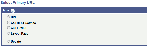
Image: Select Split Button URL page
This example illustrates the fields and controls on the Select Split Button URL page.
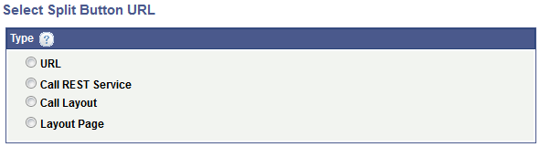
You define the following URL types:
|
URL Type |
Description |
Comments |
|---|---|---|
|
(External) URL |
A URL to an external web site or resource. |
NA |
|
Call REST Service |
Define a URL to a REST service. |
NA |
|
Call Layout |
Define a URL to another Mobile Application Platform layout. |
NA |
|
Layout Page |
Define a URL to a page in the current layout. |
NA |
|
Update |
Define a URL to a PeopleCode Update event. |
This URL type is not available to define for split buttons and does not appear on the Select Split Button URL page. |
The fields and controls that you define depend on the URL type selected.
The documentation forDefining URL Page Elementsapplies to defining primary URLs and split button URLs for list view page elements. Please see that documentation for more information.
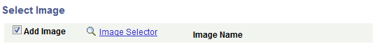
Use the Select Image page to select an image for the list view.
This page appears when you define an image for the list view definition. The page appears after you’ve defined the fields and controls on the Listview page.
Image: Select Image page
This example illustrates the fields and controls on the Select Image page. You can find definitions for the fields and controls later on this page.
|
Field or Control |
Definition |
|---|---|
| Add Image |
Select the box to display the Image Selector link. |
| Image Selector |
Click the link to access the Image Selector page and to select an image. After you select an image, click the OK button to return to the Select Image page. |
| Image Name |
Displays the name of the image selected. |
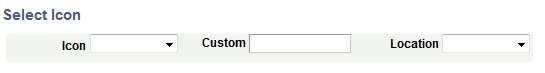
Use the Select Icon page to select an image for the list view.
This page appears when you define an icon for the list view definition and after you’ve defined the fields and controls on the Listview page.
The Mobile Application Platform framework delivers a number of icons from which to choose, however you can easily implement your own icons.
To implement your own icons create CSS on a layout template or on the Layout Designer — CSS page and enter the CSS class name in the Custom field on the Select Icon page. The framework will determine that this value is not one of the default values, and will apply the custom CSS class that will consist of a value for the data icon prefixed with ui-icon-. For example, if you add the value happy in the Custom field, then the value actually rendered will be ui-icon-happy. Icons should be 18 x 18 pixels square.
Image: Select Icon page
This example illustrates the fields and controls on the Select Icon page. You can find definitions for the fields and controls later on this page.
|
Field or Control |
Definition |
|---|---|
| Icon |
From the drop-down list select an icon for a defined split button. The values are:
|
| Custom |
In lieu of selecting one of the delivered icons, enter a CSS class name in the field to use as the icon. |
| Location |
Choose the placement of the icon in the list view row. The values are:
|
Use the Layout URL Creation Page to execute JavaScript for the following list view field elements:
Button.
Check box.
HTML.
Input.
Radio button.
When adding a field to the Listview Composition grid, if you select any of these element types, a JavaScript box appears toward the top of the Listview page. If you check the box, after you finish defining field on the page and click the OK button, the Layout URL Creation Page appears.
Image: Layout URL Creation Page
This example illustrates the fields and controls on the Layout URL Creation Page. You can find definitions for the fields and controls later on this page.
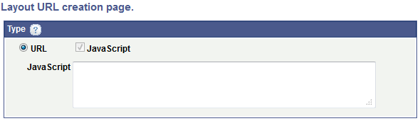
In the JavaScript long edit box, enter the JavaScript to execute when the URL link is selected.
After you define a list view page element the Layout Designer – Layout page appears.
List view page elements are indicated in the Layout grid by the element ID maplistview
Image: List view page element inserted into the Layout grid
This example illustrates a list view page element inserted into the Layout grid.

The system generates default text that appears in the Label Text field, LISTVIEW_TEXT. This is the label that appears for the list view at runtime, so you should enter a more meaningful and appropriate label.
To define properties for a list view element click the Properties link to the right of the element ID.