Managing Table Page Elements
This topic discusses how to manage table page elements.
This section discusses how to:
Add table page elements to pages.
Use the Compound Selection page.
View defined table page elements in the Layout grid.
Define display labels for table page elements.
Understanding Defining Table Page Elements
Tables in the Mobile Application Platform consist of columns of data.
To define a table, the PeopleSoft document associated with the layout must contain a compound element that contains primitive elements. And that compound element must be defined in a collection element. This type of nesting is referred to as a compound of primitives wrapped in a collection.
Image: Document structure for a table element
This example illustrates the document structure for a table element in the Mobile Application Platform.
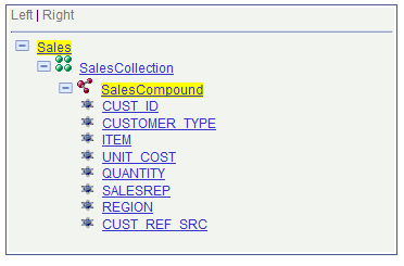
Note: The highlighted areas in the image are system-generated and do not indicate emphasis for documentation purposes.
The document is structured as follows:
Sales is the root element of the PeopleSoft document and was added to the system when the document was added to the system.
Added to the root element is a collection child element named SalesCollection.
Added to the collection element is a compound child element named SalesCompound.
Added to the compound element are a number of primitive child elements. In this example, the primitive elements are fields from a PeopleSoft record.
The primitives (or PeopleSoft record fields) will be the columns in the table in the Mobile Application Platform application.
Adding Table Page Elements to Pages
To add a table page element to a page:
Access the Layout grid on the Layout Designer – Layout page.
Select to access the page.
Determine the position in the grid to add the page element.
Click the row directly above where you want to add the page element to make it the current row.
The Current Row icon (blue arrow) displays in the first column of the row to indicate that it’s the current row.
Field or Control
Definition

The Current Row button.
Click the Add Table button in the Layout grid toolbar.
Field or Control
Definition

The Add Table button.
See Inserting Page Elements into the Layout Grid for more information about positioning and inserting elements into the Layout grid.
After you click the Add Table button the Compound Selection page appears to select the compound element for the table.
Using the Compound Selection Page
Use the Compound Selection page to define the compound for the table. As described previously in this topic, the compound element must contain the primitive elements to use as the table columns and must be wrapped/defined in a collection element
Image: Compound Selection page
This example illustrates the fields and controls on the Compound Selection page. You can find definitions for the fields and controls later on this page.
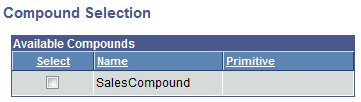
The compound elements defined in the PeopleSoft document defined for the layout appear on the page. The page displays only those compound elements that are not already defined for other elements in the layout.
|
Field or Control |
Definition |
|---|---|
| Select |
Select the compound element to use for the table. |
After you select the value for the element the Layout Designer–Layout page appears.
Viewing Defined Table Page Elements in the Layout Grid
After you define a table using the Compound Selection page the Layout Designer – Layout page appears and the element appears in the Layout grid.
Image: Table page element defined in the Layout grid
This example illustrates a table page element defined in the layout grid.
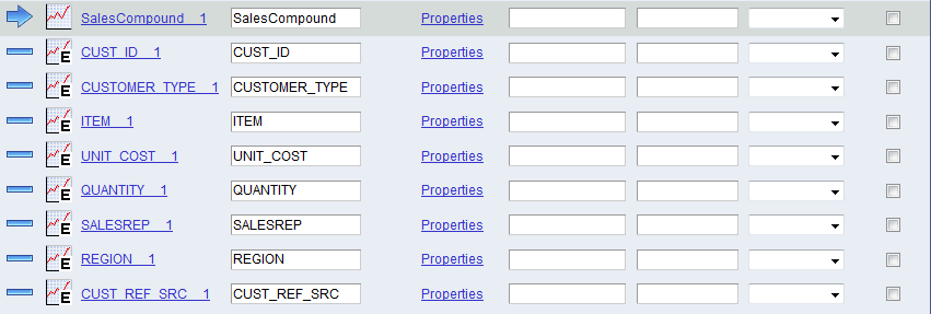
There are two types of icons that appear in the grid for a table element:
|
Field or Control |
Definition |
|---|---|
 |
Indicates the table structure. |
 |
Indicates a table column. |
The default element ID for a table element is the name of the compound document element you defined for it, for example <compound_name>_n. The grid also displays each primitive document element defined in compound element, using the name of the primitive element as defined in the document, for example <primitive_name>_n.
By default the system populates the Label Text field for the compound element and primitive elements in the grid with the value defined in the Element Name field for each element in the PeopleSoft document.
In the example, SalesCompoud_1 is the element ID for the table and SalesCompound is the label text for the table. Both values are defaults from the compound defined for the element.
CUST_ID_1, CUSTOMER_TYPE_1, ITEM_1 and the remaining values in the first column in the grid are element IDs for the primitive elements defined in the compound element. CUST_ID, CUSTOMER_TYPE, ITEM and the remaining values in the second column in the grid are the label text values. These are default values from the primitive elements defined for the compound.
Defining Table Display Labels
The values in the Label Text fields for a table element are the labels that appear for the table at runtime.
The label text value for the compound is the table label and the value for a primitive element is a column label.
And as described previously, the default values are those defined in the Element Name fields for the compound element and primitive elements in the PeopleSoft document.
You can keep the default values, define different values, or remove them.
In the same row for each element ID are class, style, and theme fields. Use these fields to define custom CSS3 class names and custom CSS3 style names for the display labels. (Note that any classes or styles you enter must be defined in the Layout Designer – CSS page.) Use the theme fields to define jQuery themes for the display labels.
This section discusses how to:
Use the Table Properties page.
Use the Table Element Properties page.
Understanding Defining Table Page Element Properties
To define properties for table page elements, use the Table Properties page and the Table Element Properties page.
Many properties that appear these pages also appear on the properties pages for other page elements. For more information and links to topics about these common properties, see the topic Common Layout Page Element Properties
This topic discusses using the properties on Table Properties page and the Table Element Properties page the that are unique to working with table page elements.
Using the Table Properties Page
Use the Table Properties page to define properties for the compound element of the table.
To access the page:
Select
The Layout Designer – Layout page appears.
In the Layout grid, locate the row that contains the compound element for the table.
Click the Properties link.
Image: Table Properties page — Header section
This example illustrates the fields and controls on the Table Properties page — Header section. You can find definitions for the fields and controls later on this page.
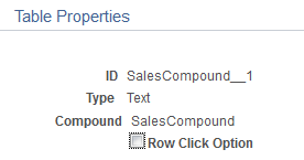
The compound name is displayed header section of the table properties.
|
Field or Control |
Definition |
|---|---|
| Row Click Option |
Selecting this checkbox provides the ability to make the table or grid act like a List view where a row can be selected and data from that row can be passed to another page, call another layout, perform an update and so on. After selecting this checkbox, the Change Type link will appear. Click the Change Type link the Select URL Type page is displayed. Select the appropriate option and complete the configuration. In order to disable the row click option deselect the checkbox or select the Reset Type to Text button. |
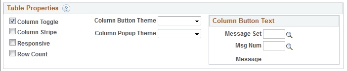
Image: Table Properties page — Table Properties section
This example illustrates the fields and controls in the Table Properties section of the Table properties page. You can find definitions for the fields and controls later on this page.
|
Field or Control |
Definition |
|---|---|
| Column Toggle |
Select this property to hide less important columns and provide a button that opens a menu, allowing the user to choose to increase or decrease the number of viewable columns. The column chooser pop-up contains a dynamically generated list of columns based on the table markup that the user can select and deselect to adjust the visible columns. When you enable this property, use the Table Element Properties page to define a priority for each table element for columns to appear. This unique priority is used to generate a class name (ui-table-priority-<priority number selected>) which one can then modify via CSS. (Using the Table Element Properties page is discussed in the next section.) |
| Column Stripe |
Select this property for the background to be shaded in alternate rows in the table. |
| Responsive |
Select this property to add your own customizations via CSS3 and media queries. |
| Row Count |
Select this property to include the number of rows in the table. |
| Column Button Theme |
From the drop-down list select a jQuery theme to apply to the column pop-up button. |
| Column Popup Theme |
From the drop-down list select a jQuery theme to apply to the pop-up column. |
| Column Button Text section |
The default text that displays in the column pop-up button is Columns. Define a message from the message catalog to define a different label.
|
Using the Table Element Properties Page
Use the Table Element Properties page to define properties for primitive elements/columns of the table.
To access the page:
Select
The Layout Designer – Layout page appears.
In the Layout grid, locate the row that contains a primitive element for the table.
Click the Properties link.
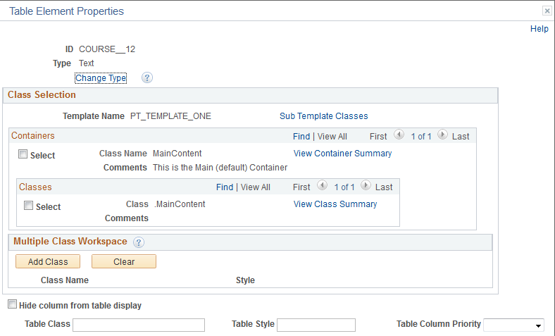
Image: Table Element Properties page
This example illustrates the fields and controls on the Table Element Properties page. You can find definitions for the fields and controls later on this page.
|
Field or Control |
Definition |
|---|---|
| Change Type |
Click this link to change the element type for the primitive. See Changing Element Type |
| Hide column from table display |
Select the property to not display the column in the table. |
| Table Column Priority |
This property determines the order and priority of how the column displays. From the drop-down list, select a priority, 1 through 10, with 1 defining the column as the first to appear in the table with the highest priority. |
| Table Class |
Define the name of a CSS3 class to apply to the column. |
| Table Style |
Define the name of a CSS3 style to apply to the column. |
If you define a class or style name for a column, you must define the class or style in the Layout Designer – CSS page.
For information on the fields and controls on the Table Element Properties page not described in this topic, see Common Layout Page Element Properties.