Working with Available Features in the Pivot Grid Wizard
The pivot grid wizard provides useful features to enhance the charts and grids. You can configure the features through the pivot grid wizard pages.
Each dimension in the Pivot Grid model can be associated with a PeopleSoft Summer Tree (which has the tree details associated with a component). The totals that appear in the Pivot Grid model are limited to only the lowest level of the tree structure.
Using the Attach Tree functionality, note that:
This function is used for Detail Type Tree Structures, which have the tree details associated with a component (Summer Trees). The function may not be used when the tree nodes correspond to details.
The tree structure for the corresponding tree has to be as follows:
The Tree Node must be associated with the Tools delivered TREE_NODE_TBL table.
The Tree Details in the tree structure must point to the application data table.
The field name in Tree Details must match with the field that you are trying to attach the tree to.
If you attach more than one tree, the SQL queries become more complicated and lower the performance rating.
Totals at the lowest level are not available when the Total option is not selected for the dimension.
Aggregation is available only for the lowest level.
You cannot specify skip levels for the tree while performing aggregation; for example, if the tree has eight levels, you cannot select only level one through level five.
For the chart-only view, trees are attached only in the filters.
In fluid view, all filters, facets, grid rows, and grid columns that are attached to Trees are shown in hierarchical order.
In Pivot Grid Viewer, the tree hierarchy level appears only at the lowest level of the grid row or column because Pivot Grid calculates totals only at the lowest levels.
The tree nodes and the tree leaf values used with Pivot Grid models must be distinct to avoid incorrect display of values.
Users can select multiple tree filtering options (nodes or leafs) in fluid view. If partial or full nodes are selected, the colored toggle icons indicate the selection.
Parent nodes are marked as selected if all of their descendents are selected. Parent nodes are marked as partially selected if any child node is selected.
This functionality can be used only in Pivot Grid Viewer and cannot be used in CRTS.
Image: Pivot Grid Viewer When Tree is Attached to Pivot Grid Row
This example shows Pivot Grid Viewer displaying the results of a tree attached to a Pivot Grid row.
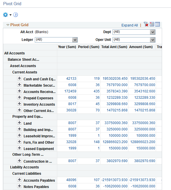
Image: Pivot Grid Viewer When Tree is Attached to the Grid Filter
This example shows Pivot Grid Viewer displaying the results of a tree attached to the grid filter.
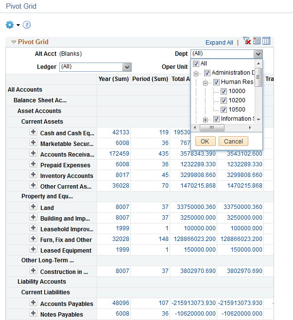
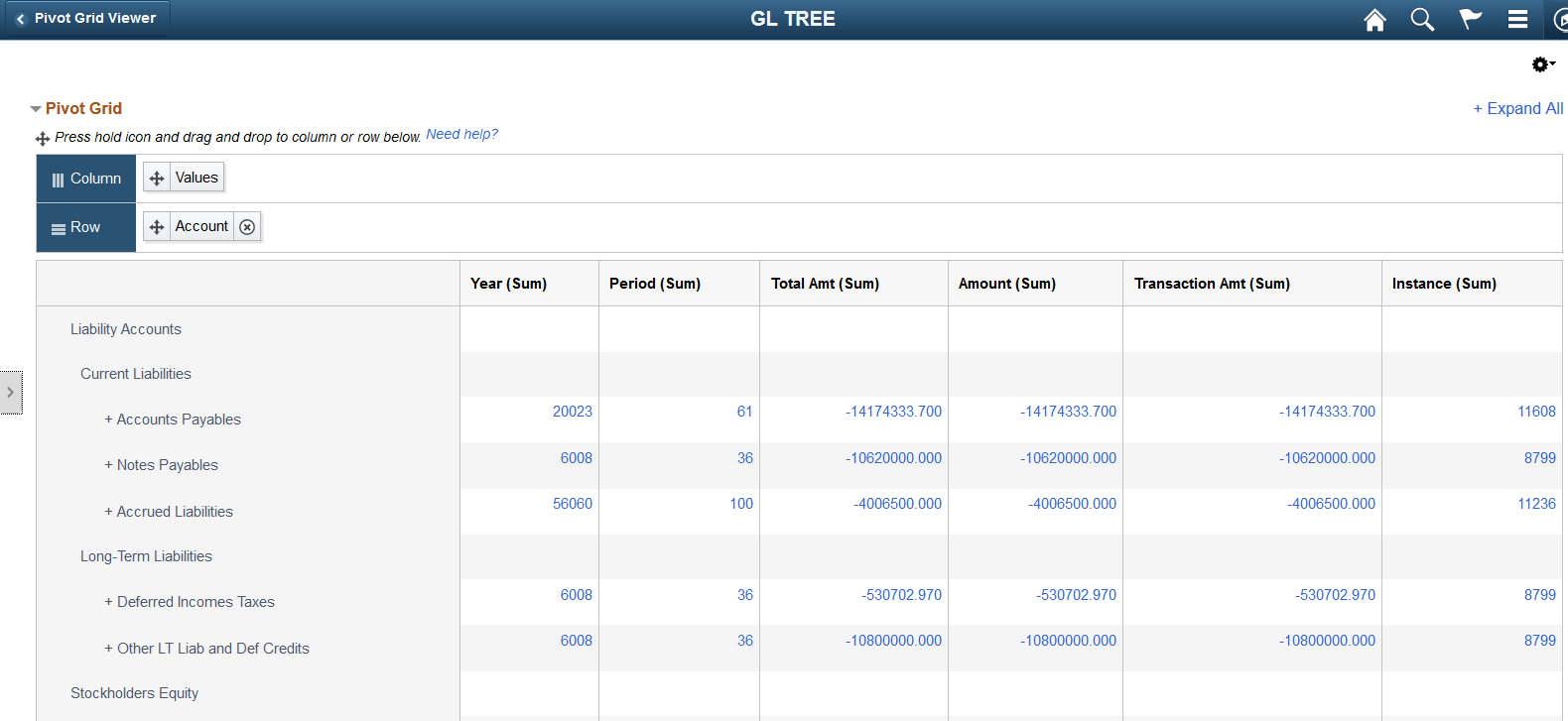
Image: Pivot Grid Viewer in the Fluid Mode displaying the results of a tree attached to the Pivot Grid model
This example shows Pivot Grid Viewer in the Fluid mode displaying the results of a tree attached to the Pivot Grid model.
A filter is a drop-down list that enables you to select multiple items to filter data, which appears in grids and charts. You can select one or more Data Source Columns as a filter. You can also select them to be a filter on the chart or on the grid and if required on both chart and grid pivot grid display.
You can change the grid layout at runtime by dragging axes onto the filter area to create them as filters; the chart layout also changes based on the grid layout to preserve synchronization between the grid and the chart.
Chart Axis or Grid Axis can be assigned a filter for any Data Source Column defined as a dimension column type or Axis in the Specify Data Model Values page in the Pivot Grid Wizard.
Image: Example of filtering on Month
In this Specify Data Model Options page, Month is defined as a filter.
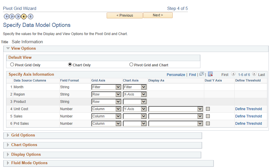
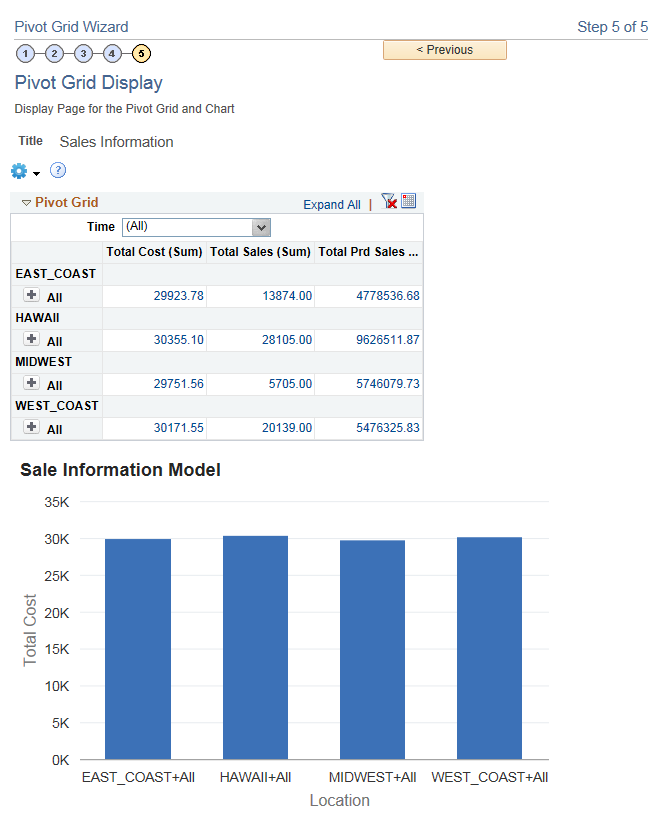
Image: Example of a Pivot Grid model when the display option is Pivot Grid and Chart
This example shows the view of a Pivot Grid model when the display option is Pivot Grid and Chart and the filter is set to Month (Time). In the example Time is the Column Label assigned to the Data Source Column Month.
Series value is automatically determined for the chart when the display option is Pivot Grid and Chart. The automation is dependant on the grid layout; if any dimension (axis type) is selected on the column, then it is automatically selected as a series for the chart.
Image: Using Month for a series
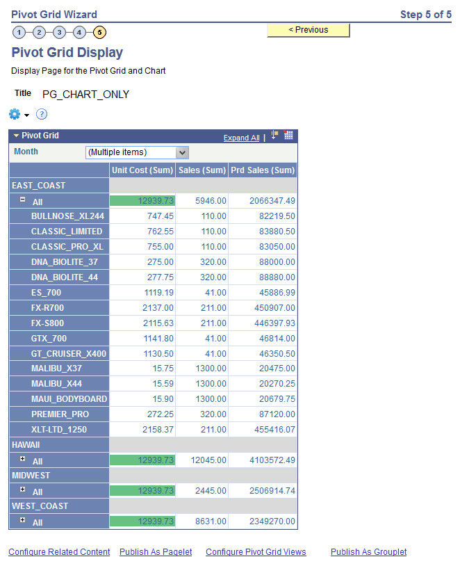
In this example, all the axis columns have All (Total) enabled. On the Data Source page, Month is defined as column axis and used as a series.
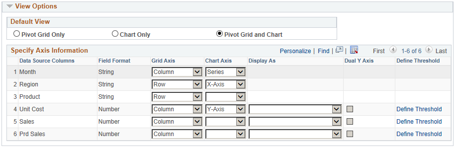
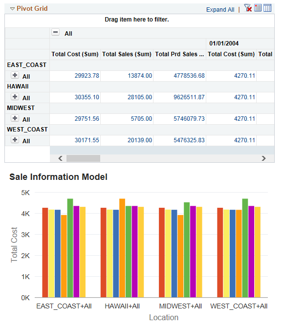
Image: Months displayed as a series on grid and chart
This example shows the grid and chart with detailed data based on the Month field.
Note: Chart overlay is available when the display option is Chart Only and the data appears in bar charts.
Image: Specify Data Model Options page, example of using overlay
If the display option is Chart Only in the Specify Data Model Options page, selecting a column as an overlay field results in plotting multiple charts based on the Y axis and the overlay field. In this example, Unit Cost is used as an overlay field.
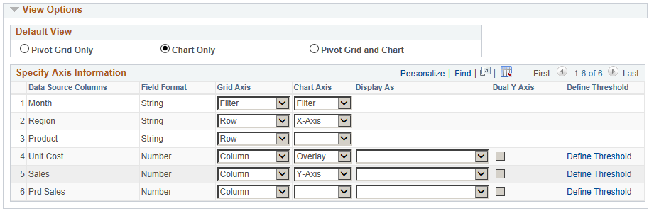
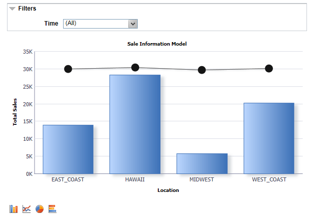
Image: Initial display for overlay
The chart is plotted with Region as the X axis and Unit Sales as the Y axis. The second chart is plotted with Region as the X axis and Unit Cost as the Y axis.
Note: You can change the overlay field using fields in the Specify Data Model Options page, Chart Options section.
See also, Limitations of Charts and Grids for limitations on overlay.
Use the Configure Thresholds page to configure the basic threshold settings for the grids and the charts. Note that all threshold settings are applied for both classic and fluid views.
For the grids, the thresholds will appear as colored cells if the cell values are over the threshold values that you have specified.
For the charts, the values in the Reference Areas and Reference Lines fields from the subproduct PeopleSoft Charting are applied.
Navigation
Access the Configure Thresholds page by:
Selecting Reporting Tools, Pivot Grid, Pivot Grid Wizard.
Accessing the Specify Data Model Options page - Step 4 of the wizard.
Clicking an appropriate Define Thresholds link.
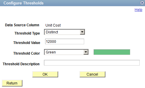
Image: Configure Thresholds page
This example illustrates the fields and controls on the Configure Thresholds page. Definitions for the fields and controls appear following the example.
|
Field or Control |
Definition |
|---|---|
| Data Source Column |
Displays the name of the field for which the threshold is being defined. Note: Only fields that are set to Value can apply threshold. |
| Threshold Type |
Use this field to set the threshold type. The available options are Distinct and Range. If the Distinct option is selected:
If the Range option is selected:
|
| Threshold Value |
This drop-down list is available when the Threshold Type drop-down list is set to Distinct. Use this field to specify a single threshold value. |
| Lower Limit and Higher Limit |
These fields are available when the Threshold Type drop-down list is set to Range. Use these fields to specify a range of minimum and maximum threshold values. |
| Threshold Color |
Select one color from the list of 18 available colors. The color that you select in this list will appear in the grids and the charts for the values that are parts of the threshold. The available colors are derived from the supported colors for PeopleSoft Charting. Note: Only one color can be specified for a threshold. |
| Threshold Description |
Enter the text that will appear when you hover over the charting reference areas and lines. |
Image: Thresholds for the Unit Cost column in a Pivot Grid chart
This example shows the thresholds for the Unit Cost column in a Pivot Grid chart. The threshold type is set to Distinct, the color is set to green, and the value is set to 12000.
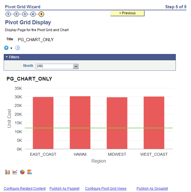
Image: Thresholds for the Unit Cost column in a Pivot Grid chart
This example shows the thresholds for the Unit Cost column in a Pivot Grid chart. The threshold type is set to Ranges, the lower limit is set to 12000, the higher limit is set to 16000, and the color is set to green.
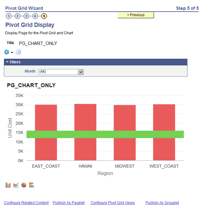
Image: Thresholds for the Unit Cost column in a Pivot Grid grid
This example shows the thresholds for the Unit Cost column in a Pivot Grid grid. The threshold type is set to Distinct, the value is set to 12000, and the color is set to green. Note that all the facts that are plotted on the grid can have thresholds configured.
In the Specify Data Model Options page, General Options, you can select a Data Source Column to be a Facet in the fluid view.
Note: You can enable this option for the columns that are set as Axis or Value in the column type. Columns that are set as Display in the column type cannot be defined as editable facets.
To enable the Axis or Value columns as editable facets:
In the Specify Data Model Values page, select the Editable Facet option for the columns.
In the Specify Data Model Options page, set the columns (that have Editable Facets enabled) to Filters so these columns can appear in fluid view.
In fluid view, click the More Options link (at the bottom-left of the Prompts section) to display the editable facets, Fewer Options link, and Show Operations link.
Click the Show Operations link to display the operators that are specific to each prompt.
Select the available operators for the prompts to filter the data in the grid and in the chart.
Note: Editable facets behave as prompts; therefore, editable facet selections reset the other facet values.
Different operators are available for different type of fields:
Character fields have these operators: Contains (Default), Does Not Contain, Equal To, Not Equal To, In List, and Not In List.
Date and number fields have these operators: Equal To (Default), Not Equal To, Between, Not Between, Greater Than, Not Greater Than, Equal To, and Not Equal To.
Note: Editable facets are valid only when you view the Pivot Grid models in fluid view. If you view the Pivot Grid models in the classic view, the editable facets are not applied.
Values entered in the editable facets are user-specified and not prompted, applying filters using the editable facets may return zero value in the results, or an empty grid and empty chart. Also, security is not applied on the user-specific values, so you must be careful as to which fields can be selected as editable facets.
Using the Specify Data Model Options page, Fluid Mode Options section, Facet Selection region, you are able to set the facet display options to display the single-select and multi-select facets as charts and as lists in fluid views. In the chart facets, you can drill down by clicking the chart data point in the facets. Note that the chart data point is highlighted after your selection.
Image: Specify Data Model Options page, Fluid Mode Options section, Facet Selection region
This example illustrates the fields and controls on the Specify Data Model Options page, Fluid Mode Options section, Facet Selection region. The Contract Type facet is set to appear as a pie chart and the Contract Status facet is set to appears as a bar chart. Other available chart types are Horizontal Bar Chart and Line Chart.
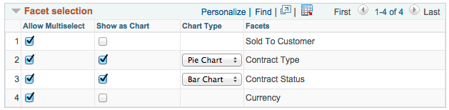
Image: Mini facets in fluid view - facet are shown as bar and pie charts
In this fluid view, the Contract Status facet appears as a bar chart, and the Contract Type facet appears as a pie chart.
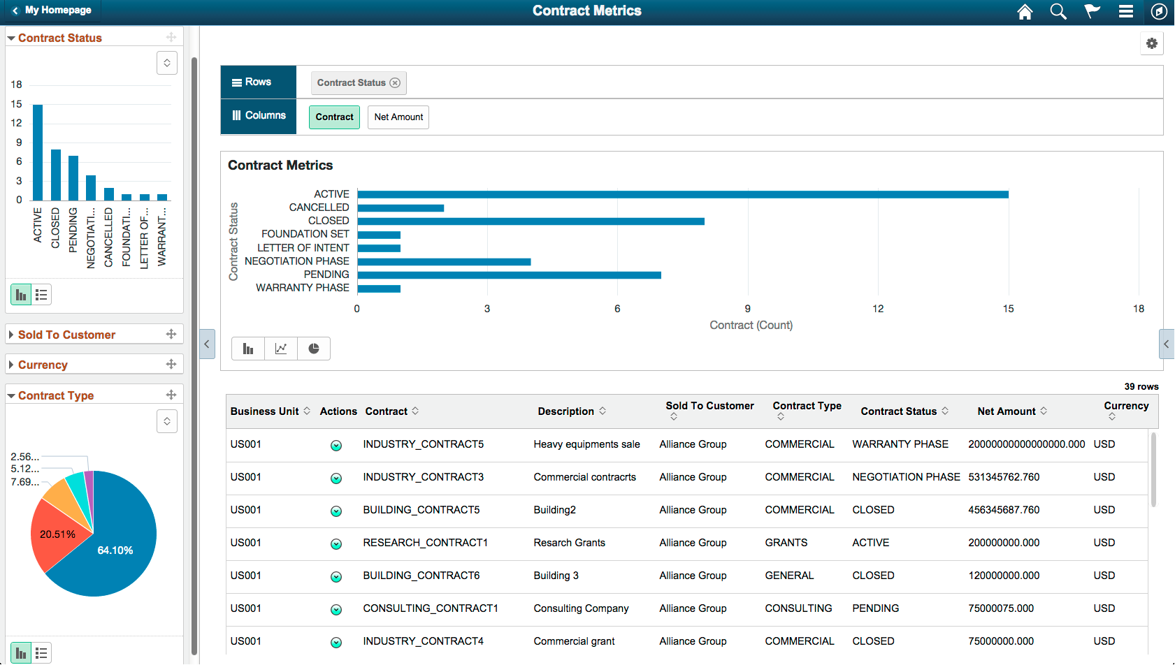
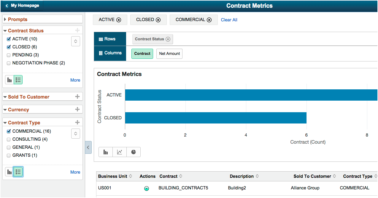
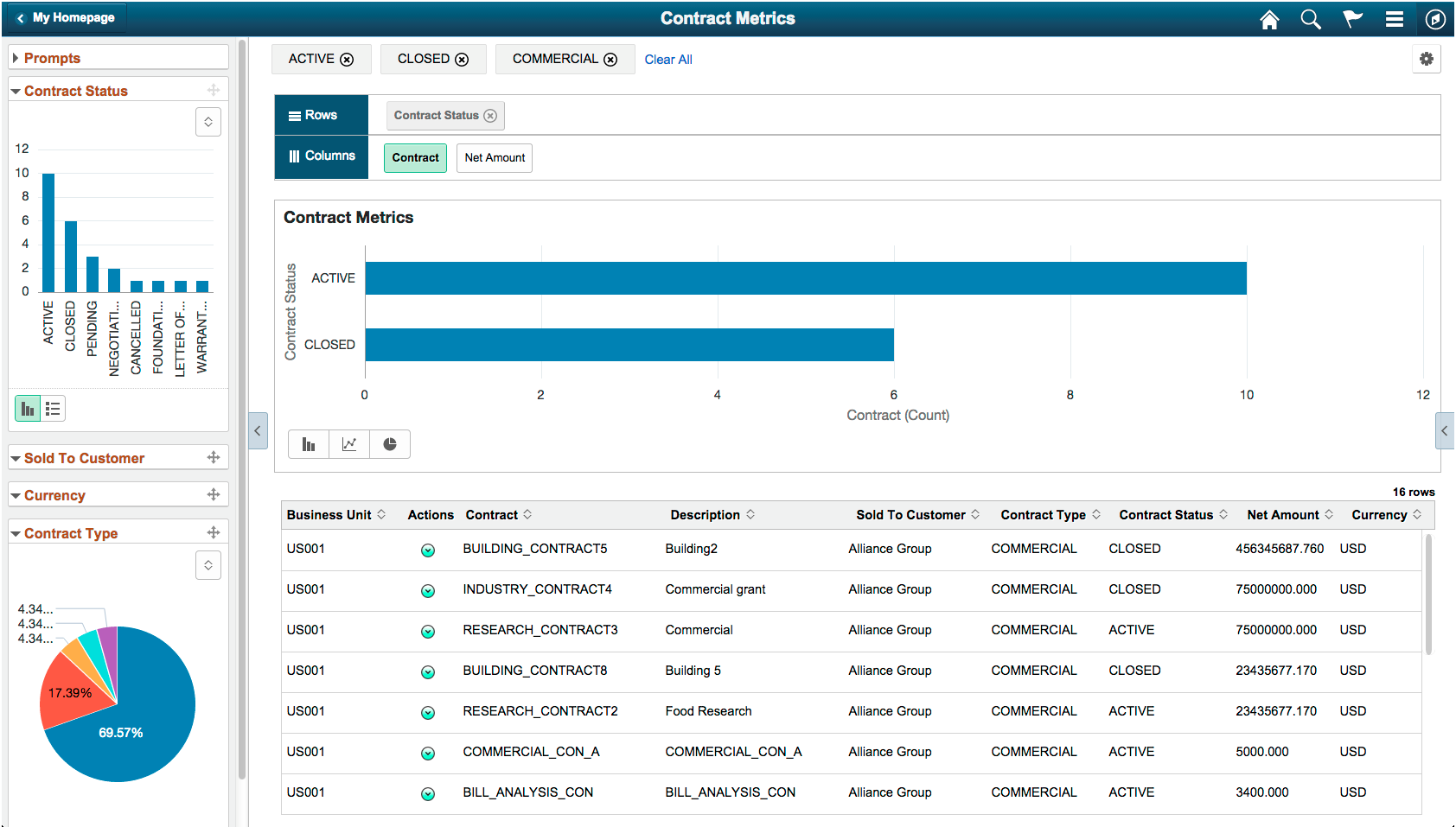
Image: Results are drilled down - ACTIVE, CLOSED, and COMMERCIAL facet values are applied
This example shows the results drilled down after users click the chart data point, which is highlighted after selection. Three facet values – ACTIVE, CLOSED, and COMMERCIAL – are applied from the chart by the user.
The settings in this section apply to both component search and Pivot Grid Viewer. This section is available for all model types in the fluid mode. These settings are also available in the Views Configuration page, where you can set the facet property at each view level.
For all single-select and multi-select filters (facets), use the toggle icon at the lower-left of each facet to switch that facet view between the chart view and the list view.
For single-select configuration, only one value can be applied for a facet dimension. It is recommended to use multi-select for facets.
For multi-select facets, the selections are applied on top of the previous selections.
Image: Mini facets in fluid view - facets are shown as lists
In this fluid view, the Contract Status and Contract Type facets are shown as lists. ACTIVE, CLOSED, AND COMMERCIAL values are selected.