Viewing Data in Scrollable Layout Grids
Scrollable grids offer several functional benefits that original grids and scroll areas do not. This section discusses how to work with scrollable grids:
Developers might design the grid so as to group and separate columns with tabs. Developers might also include vertical and horizontal scroll bars in the grid control. Both grid tabs and scroll bars enable you to view all data columns and have some advantages when used together in scrollable grids. This section discusses:
Grid tabs
Grid scroll bars
Cell navigation
Grid Tabs
Grid tabs enable you to view groups of data columns without scrolling to the right. By clicking the Show All Columns button just below the grid's navigation header, you can view all columns in the grid. Showing all columns, if used in conjunction with grid scroll bars, cause a horizontal grid scroll bar to appear.
To view all columns without tabs:
Click the Show All Columns button just below the grid's navigation header
When the grid expands, use either the horizontal grid scroll bar, if enabled, or the browser scroll bar to scroll left and right to view the data columns.
Note: If the expanded grid has many frozen columns, the page might expand so that the horizontal browser scroll bar appears and must be used to view all columns.
To restore the grid to its original state, click the Show Tabs button.
Grid Scroll Bars
On scrollable grids, developers can configure horizontal and vertical scroll bars to appear within the grid control, which enables you to scroll through data within the grid. Note these points about grid scroll bars:
An advantage of grid scroll bars is that frozen columns and column headers are stationary.
Another advantage is that you can scroll data within the grid without having to use the browser scroll bar, thus other data on the page stays in view.
Application developers can configure a scrollable grid to display the horizontal and vertical scroll bars independently of one another.
Application developers can configure grid scroll bars and grid tabs to work together or separately.
In this example, you see the Define Personalizations grid showing the Definition, Format, and Explanation tabs. Notice the horizontal and vertical scroll bars inside the grid control.
Image: Define Personalizations grid showing grid scroll bars
This example illustrates grid scroll bars in the Define Personalizations grid.
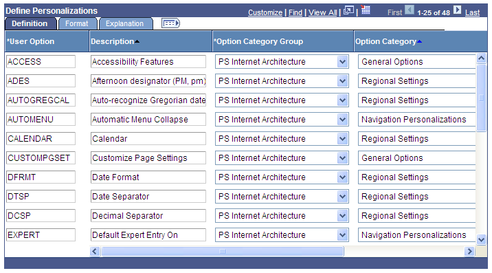
Note: Be aware that the horizontal and vertical scroll bars for the grid appear at the far right and bottom sides within the grid control; the horizontal and vertical scroll bars for the browser appear at the far right and bottom sides of the browser window.
See Using Grids.
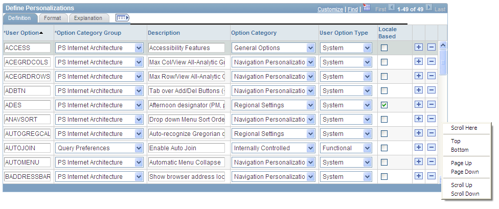
Grid Scroll Bar Pop-up Menus
If you right-click on the horizontal and vertical grid scroll bars, contextual pop-up menus appear.
Image: Define Personalizations grid showing scroll bar pop-up menu
This example illustrates a scroll bar contextual pop-up menu.
This table describes the contextual pop-up menu options:
|
Field or Control |
Definition |
|---|---|
| Scroll Here |
Select to move the scroll slider so that the center of the slider is located under the cursor. |
| Left Edge |
Select to move the horizontal scroll slider to the far left of the grid. |
| Right Edge |
Select to move the horizontal scroll slicer to the far right of the grid. |
| Top |
Select to move the vertical scroll slider to the top of the grid. |
| Bottom |
Select to move the vertical scroll slider to the bottom of the grid. |
| Page Up |
Select to move the rows up the length of one visible set of rows. For example, if 12 rows are showing in a grid, then selecting this option moves the rows in increments of 12 rows at a time. The bottom row becomes the top row. |
| Page Down |
Select to move the rows down the length of one visible set of rows. For example, if 12 rows are showing in a grid, then selecting this option moves the rows in increments of 12 rows at a time. The top row becomes the bottom row. |
| Page Left |
Select to move the columns to the left the width of one visible set of columns. The far right column becomes the left-most column in view. |
| Page Right |
Select to move the columns to the right the width of one visible set of columns. The far left column becomes the right-most column in view. |
| Scroll Up |
Select to move the rows up one row. |
| Scroll Down |
Select to move the rows down one row. |
| Scroll Left |
Select to move the scroll slider five pixels to the left. |
| Scroll Right |
Select to move the scroll slider five pixels to the right. |
Cell Navigation
In scrollable grids, you can navigate through cells in these ways:
Press the Shift + Up Arrow keys to move up one cell.
Movement ceases at the top of the column.
Press the Shift + Down Arrow keys to move down one cell.
Movement ceases at the bottom of the column.
Press the Shift + Right Arrow keys to move right one cell.
Movement ceases at the end of the row.
Note: If you do not hold down the Shift key, the cursor moves only within the current field.
Press the Shift + Left Arrow keys to move left one cell.
Movement ceases at the beginning of the row.
Note: If you do not hold down the Shift key, the cursor moves only within the current field.
Press the Tab key to move one field or page element to the right.
Movement continues from row to row and outside the grid.
Press the Shift + Tab keys to move one field or page element to the left.
Movement continues from row to row, into the column headers, and outside the grid.
Note: When using these methods to navigate, the cursor will move to fields within the grid. If grid scroll bars are present, the cursor will cause the grid to scroll as it moves through rows. If grid tabs are present, the cursor will not cause the tab to change as it moves through rows.
Important! If the grid navigation header is not present or if the Personalize link is not present in the navigation header, then cell navigation is identical to that of the original layout grid.
You can change the column order, freeze columns, and resize columns in a scrollable grid directly within the grid control. Moved and frozen columns persist until you change them. Resized columns persist until you leave the page.
Important! If the grid navigation header is not present or if the Personalize link is not present in the navigation header, you cannot move, freeze, or resize grid columns.
Moving Grid Columns
To move columns:
Place the cursor on the column header label.
The cursor image becomes a hand.
When the cursor changes shape, click the column label and drag the column to its new location.
As you drag the column, a border appears around the column header label, and the label moves with the cursor.
When you have the column in the desired location, release the mouse to drop the column.
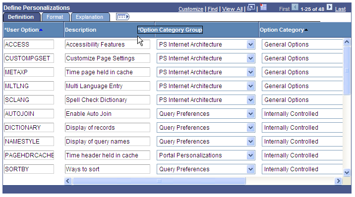
Image: Dragging the Option Category Group column
This example illustrates moving the Option Category Group column.
You can also change the column order by using the Personalize link.
Note: Drag-and-drop functionality is enabled only if the grid can be personalized. If you do not see the Personalize link in the grid header, you cannot drag and drop columns.
Freezing Grid Columns
A grid can be divided into left and right panes. If the grid is divided, the left pane contains the frozen columns and right pane contains the other columns. If enabled, a horizontal scroll bar appears in the right pane if the columns are wider than the right panel width. If the grid has frozen columns, you can freeze other columns on the transaction page.
To freeze grid columns:
Place the cursor on the column header label.
The cursor image becomes a hand.
When the cursor changes shape, click the column label and drag the column to its new location.
As you drag the column, a border appears around the column header label, and the label moves with the cursor.
When you have the column in the frozen column area (to the left of the leading edge of the horizontal scroll bar), release the mouse to drop the column.
You can unfreeze columns by dragging them out of the frozen area.
Note: If the grid has only one frozen column, the grid does not allow you to unfreeze that column by dragging it. You must use the Personalize link. Likewise, if you see no frozen columns, you cannot drag a column to freeze it; you must use the Personalize link.
If the grid has multiple tabs, you can drag a column into the frozen area on the first tab only.
Note: Drag-and-drop functionality is enabled only if the grid can be personalized. If you do not see the Personalize link in the grid header, you cannot drag and drop columns.
Resizing Grid Columns
To resize grid columns on a transaction page.
Move the cursor into the column header.
When the mouse changes to a hand, click and drag to resize the column.
When the column is the size you want, release the mouse.
Note: You cannot resize columns to be smaller than the column header width.
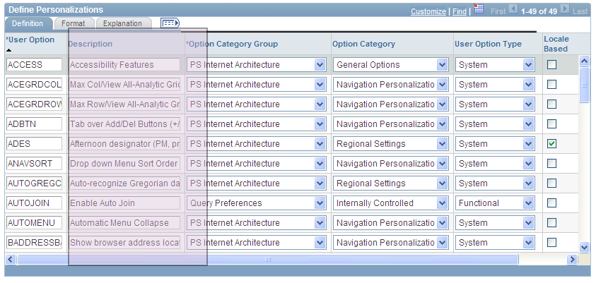
Image: Resizing the Description column
This example illustrates resizing the Description column.
Removing User-Specific Grid Settings
You can remove user-specific settings, thereby restoring the default grid settings. To remove user-specific grid settings:
Click the Personalize link.
On the Personalize Column and Sort Order page, click the Delete Settings link.
On the Delete Settings page, click the Delete button.
On the Personalize Column and Sort Order page, click the OK button.
You can change the sort order of grid columns without leaving the transaction page. Click a single column header to toggle between ascending and descending order. Click multiple column headers in the reverse order that you want to sort them with the last column header that you click becoming the primary sort for the grid. Grids enable you to have primary, secondary, and tertiary sorts. A dark blue arrow to the right of a column header indicates a primary sort; a light blue arrow indicates a secondary or tertiary sort. Any sort changes that you make to a grid remain in place until you change them.
See Removing User-Specific Grid Settings.
In this example of the Define Personalizations grid, the Description field displays the primary descending sort, the Option Category Group field displays the secondary descending sort, and the Option Category field displays no sort:
Image: Grid showing user-specified sort order
This example illustrates the user-specified sort order on the Define Personalizations grid.
You can also change the sort order by using the Personalize link.
Some grids enable you to download grid data to a Microsoft Excel spreadsheet. The download feature extracts all active, unhidden rows, regardless of whether the rows are visible on your screen.
To download grid data:
Click the Download button in the navigation bar of the grid.
A new browser window opens, showing the data in a spreadsheet-like format.
Select and save the data as a Microsoft Excel (.xls) file.
Note: The system downloads all field types (columns) with the exception of images. Hyperlinks and buttons are downloaded as quoted text of the field labels, even though the labels may contain numeric values. If any numeric calculations are to be performed based on hyperlink or button labels, you must convert the text strings to numeric values after downloading.
Note: If you use Microsoft Office 2007, then when performing a download-to-Excel, you might encounter a Microsoft Office Excel warning message suggesting you verify that the file is not corrupted and that it is from a trusted source before opening it. You should click theYes button in this situation.
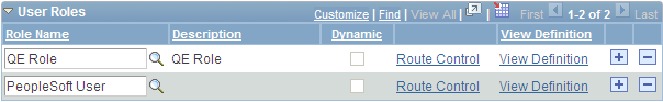
You might encounter grids that you can collapse or expand. Click the right-pointing triangle in front of the grid heading to expand a grid that is hidden from view (collapsed).
These examples show both the collapsed and expanded states of the User Roles grid:
Image: User Roles grid in the collapsed state
This example illustrates the User Roles grid in the collapsed state.
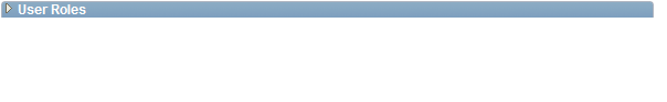
Image: User Roles grid in the expanded state
This example illustrates the User Roles grid in the expanded state.
Note: Developers set the initial state of the grid in Application Designer.
Some grids enable you to zoom the grid to a modal window. When you click the Zoom icon, the grid and its data appear in a modal window over the main page, which is grayed out.
While in the modal window, you can work with the grid just as you would if the grid were on the primary page, for example, you can insert and delete rows. You must return to the primary page to save any changes to your data.
To return to the primary page, click the Return button that you find at the bottom of the grid in the modal window.
Note: You can disable the Display in Modal Window functionality for a grid by changing its properties in Application Designer.