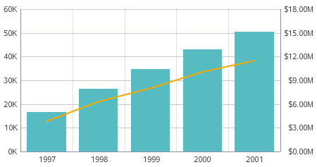
Bar-Line charts show two metric values aggregated across a group dimension. They are useful for showing quantity alongside changes in trends over time.
The first Y-axis metric displays as a bar, and the second displays as a line. The chart uses a dual-axis plot, where bars are plotted against the left vertical axis and the line is plotted against the right vertical axis.
About using a Bar-Line chart
Mousing over a bar or a point on the line displays the X and Y axis values for that data point.
You can refine displayed data by clicking a single bar, or by clicking and dragging to select a section of the chart, then clicking a second time to apply the selection as a refinement. Alternately, hold the CTRL key and select multiple bars, then click Apply refinements in the selection box when finished. You can also select or multi-select values directly from the X-axis.
Selected refinements display in the Selected Refinements Panel and can be toggled to set them as negative refinements. See About the Selected Refinements panel for details.
About configuring a Bar-Line chart
You cannot render only a line or only bars; the chart requires a metric for each axis and for the line in order to render. For detailed configuration steps, see Configuring a Chart.
