| Oracle® Retail Enterprise Inventory Cloud Service User Guide Release 18.0 F13734-03 |
|

 Previous |
 Next |
| Oracle® Retail Enterprise Inventory Cloud Service User Guide Release 18.0 F13734-03 |
|
Previous |
Next |
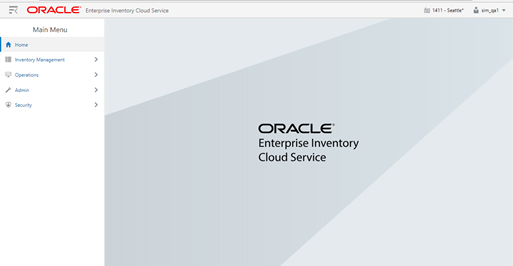
This chapter describes the method by which you log in, and log out, and the menu and how to navigate. It also describes the common User Interface (UI) controls that are used throughout the EICS application.
Features:
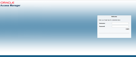
Upon launching the application, the welcome screen is displayed. The first time a user logs into the system, if the logon is successful, the system will log in to the user's first assigned store. The system will remember the store the user was last logged into and log in to that store automatically until the user changes the store. Upon successful login, the system will navigate to the main page with the menu displayed.
The menu panel on the left side of the screen is displayed upon tapping the drawer (hamburger stack which looks like three horizontal lines in the upper left-hand corner of the application). From the menu there are sub-menus which give you access to various functionality of the application.
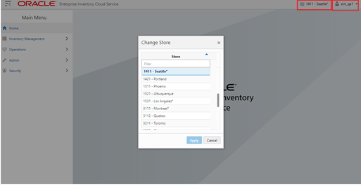
The change store dialog is available two ways. One it is accessed by selecting the store in the upper right hand corner. Secondly it is accessed by selecting the 'Change Store' option from the menu found in the upper right hand corner labeled with the user.
The change store displays all of the stores that the user is authorized for. If needed, the user can filter down the list by entering any characters from the store ID or store name. Selecting a store and choosing 'Apply' will display the new store in store field of the in the upper right hand corner of the application. The user is then officially logged in to the new store. All data and transactions will be for the newly selected store. Every time the user logs in to the system, it will be for the store selected until a new store is selected. The system remembers/saves the store for the user.
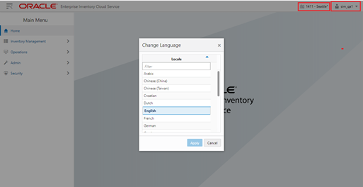
The Change Language screen is displayed by selecting the 'Change Language' menu option within the menu found in the upper right hand corner labeled with the user. The screen will display with a list of the available languages supported in the system. User selects a language and the language will change in the application to the language selected and user will navigate back to the main screen. That language will remain for the user (saved on the user) until the user changes languages. The locale of the device (date format, currency format, and so on) will remain that of the browser.
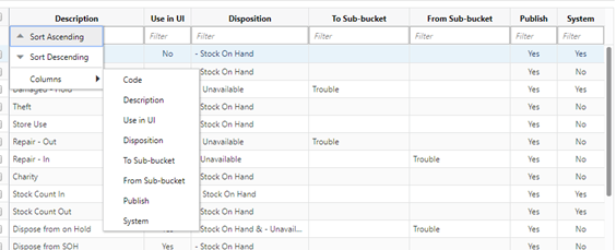
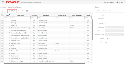
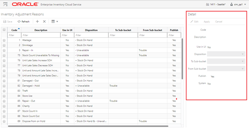
The Grid View can be configured by right clicking on the menu header of any grid / table. Sorting can be done in ascending or descending order for that column by selecting the option from the menu. Sorting can also take place just by clicking on the menu header. You can configure what columns to display or hide from within the menu. In addition columns can be made smaller / larger as well as moved by dragging them. These configurations are per user and device and are remembered forever.
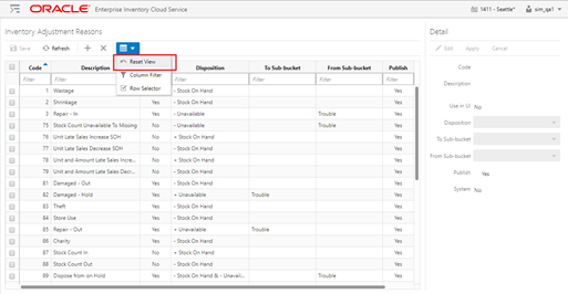
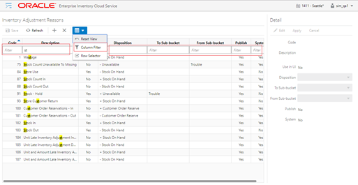
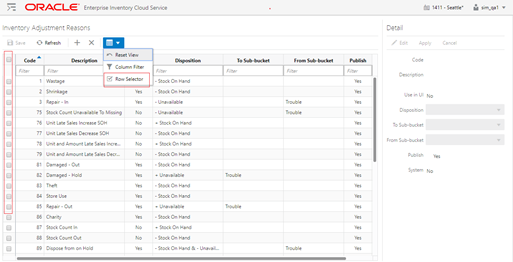
The Grid View can be reset back to the default by selecting the Reset View option from the Grid View menu on the header menu.
The filter option is represented by a funnel icon located in the grid view menu in the header of buttons. The filter is at the top of all lists. When the funnel is selected there will be a row below the column headers in the list that will allow for entry by the user to filter/narrow down the list. When the funnel is unselected then the row below the header for filtering will go away. The default when viewing a list is for the funnel to be active.
Most lists have a Row Selector menu option in the grid view menu on the header of buttons. By selecting the Row Selector option icon the system will display/enable the check box next to each record in the list allowing the user to do a multi select of records. Being able to multi-select allows a user to perform a function to more than one record at a time such as deleting more than one record at the time. Not all lists will have a check box option, because doing a multi-select is not applicable in all areas of the application. The default for list screens is to have the check box not displayed.
The Refresh button is found throughout the application mainly in the header of list screens. This button simulates what happens when a user first navigates to the screen by refreshing the screen to how it was prior to making any changes. If there are pending changes, a confirmation message to discard the changes is presented to the user before the data is reloaded with a fresh copy.
For the most part lists cannot be updated directly in the table (list). All updates to values in a list must be done via the Detail (Apply) block. Where applicable new records can be created and existing records can be updated via the detail block. Once applied the data will be updated into the table. Stock Count Authorization is an exception to this allowing for updating directly in the list (table) itself.