2 Do the Basics
Oracle Retail applications, such as Oracle Retail Import Management Cloud Service, include some common interface options and controls that you can use throughout the application workflow. The following sections describe these user interface controls in more detail.
Although you may have more than one Oracle Retail application installed on your system, each application may use many of the same interface components and abide by common rules and constraints.
You can quickly access the tasks of current applications and switch to other applications from the Navigation bar. For more information on the Navigation bar, see the Task Bar Options section.
The following topics are covered in this chapter:
Log In and Out
Log on to the Application
To log on to the application:
-
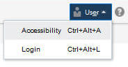
Click the User list which is to the top right of the Oracle Merchandising window.
-
Click Login. The Welcome screen appears.
-
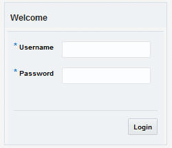
Provide the following login information:
-
Enter your user name in the Username field.
-
Enter your password in the Password field.
-
-
Click Login.
User Help
This application contains an online HTML help that can guide you through the user interface. User information is included to describe high-level processes and procedures, as well as provide step-by-step instructions for completing a task.
You can access online help for a particular page by clicking on the Help link at the top of the application home page or by clicking the Help icon  on every page of the application. Once in the help, you can access additional information through the table of contents or by using the index.
Common Actions and Icons
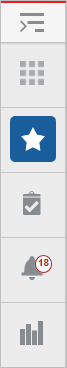
Task Bar Options
You can quickly access the tasks of current applications and switch to other applications from the Navigation bar.
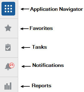
The following navigation bar options are common across all the applications:
-
Application Navigator
-
Favorites
-
Tasks
-
Notifications
-
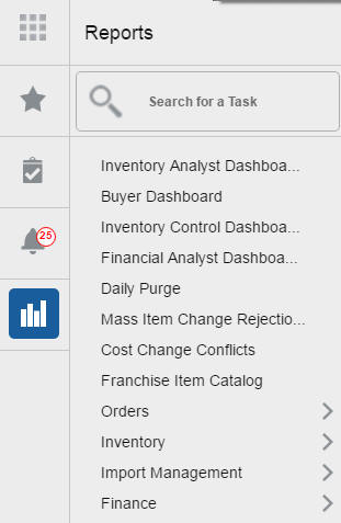
Reports
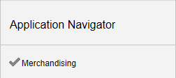
Application Navigator
The Application Navigator is optional for the application and provides the ability to switch between applications.
Note:
Your view may vary, depending upon the features selected during the setup process.To switch between applications:
-
At the top left of the application, click the Application Navigator
 icon to open the list of available applications.
 -
Select the listed applications. The application will open in a new tab.
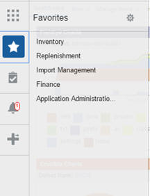
Favorites
You can select your favorite tasks without accessing the Tasks menu. It helps you quickly get into your frequently used tasks.
You can click the Favorites icon in the Tasks menu to access tasks designated as favorites. You can also select the cog icon from the Favorites menu to edit the favorite list. Tasks can be selected or deselected as favorites in the Tasks menu.
Tasks
Oracle Retail applications support a variety of navigational tools and methods that allow you to move efficiently between application pages. Information on how to use and manage each of the tools and methods is included in this section.
A task is a set of links to a series of task flows organized in a specific sequence to accomplish a business process or procedure. For example, tasks can be defined for common multi-step procedures or processes so that you can quickly step through tasks. By navigating sequentially to the pages outlined in the task, you are assisted in stepping through the business process or activity.
Your Tasks list appears on the top left side of the home page. All of the tasks to which you have access are listed on the Tasks window. You can either click on the specific task name to open, or use the Task Search component to search for a Task that you want to open.
To begin working with a task, choose the application feature or process from the list.
Note:
Your task menu may appear slightly different, depending on your retail application.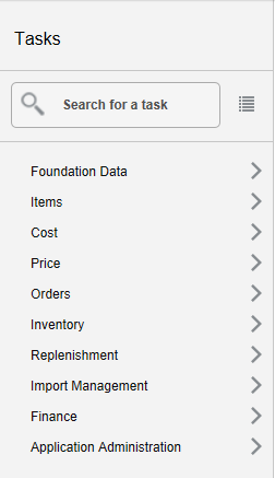
Notifications
Notifications bring events within the application to your attention.
See the following examples:
-
A simple, informative message indicating a long-running process has completed
-
A message indicating a critical exception has occurred
-
The store create request failed
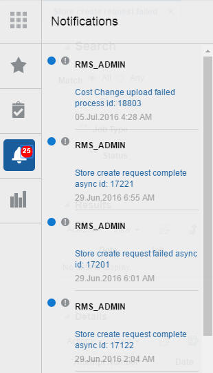
Notification Badge
The Notification Badge displays the number of unread notifications for the user in the sidebar menu. The Notification Badge displays '99+', when there are more than 99 notifications.
The notification count is periodically refreshed at regular intervals. This interval is determined by a system-configured value.
Notification Sidebar
When you click the Notification icon, the Notifications Sidebar is shown displaying the most recent set of unread notifications (depending on the filter set).
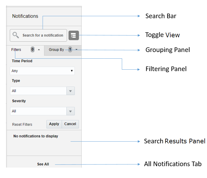
Each component of the Notifications Sidebar is discussed in detail in the following sections:
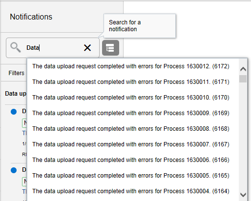
Search Bar
A search bar at the top of the panel allows for searching through notifications. The search bar has auto-suggest enabled, so it displays notifications as the user types.
Right next to the search bar is the 'List/Group' view toggle button. This causes the Notification results to be displayed either in a flat or grouped view.
Filtering Panel
The Filtering Panel allows you to filter notifications based on Creation time, Severity and Type.
The values for the Time Periods and Severity components are pre-seeded constants. The Type drop-down lists all the notification types available in the system.
When you click the Apply button, notifications that match the criteria are shown in the Results Panel.
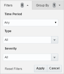
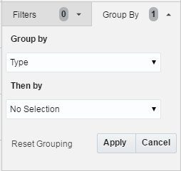
Grouping Panel
This panel allows you to group notifications based on different attributes.
The values of the 'Group by' and the 'Then by' components are pre-seeded.
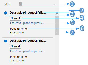
Results Panel - List View
When no selection is made in the Grouping Panel, the Results Panel displays notifications in a list format.
The image below shows a simple search without any filtering or grouping.
-
Indicates that no filtering was done.
-
Notification Type - A description of the Type is displayed.
-
Read/Unread - A blue icon
 is shown next to the notification if it is unread.
 -
Notification Severity - A colored label indicating the severity of the notification is shown.
-
Description - The description associated with the notification. If the notification was designed to launch into a relevant flow, then this is displayed as a link. Otherwise, the description is rendered as plain text.
-
Creation Time - A timestamp that shows the date and time at which the notification was created.
-
User name - Creator of the notification.
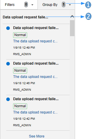
Results Panel - Grouped View
Notifications are displayed in a grouped format within the Results Panel, when the Group By drop-down in the Grouping Panel is selected.
Notifications are displayed in groups with three notifications shown for each group.
-
Indicates the Group-By drop-down is selected on the Grouping Panel.
-
The value of the Group-By attribute. In this example, the results were grouped by Notification Type. Hence the Notification Type is shown as the header of the group.
For each group, three notifications are shown followed by a 'See More' link. When you click this link, up to 25 notifications are displayed for that group.
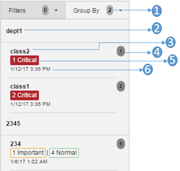
Results Panel - Summarized View
Notifications are summarized as shown in this example, when both the Group By and the Then By drop-downs in the Grouping Panel are selected.
The summary view displays various groups and within them subgroups based on the selections on the Grouping Panel. For each subgroup, a count of the notifications within that subgroup, grouped by severity is displayed.
The example below depicts a grouping by department, then by class.
-
Indicates that both options on the Grouping Panel have been selected.
-
First level of grouping is by Department. Here the first department shown is 'dept1'.
-
The subgroup within department 'dept1'. In this example, this is the Class name.
-
The number of notifications within that combination of Group and Subgroup.
-
A grouping by severity of all notifications within that combination of Group and Subgroup.
-
The timestamp of the most recent notification of that combination of Group and Subgroup.
All Notifications Tab
The All Notifications tab is shown when you click the 'See All' link at the bottom of the Notifications side panel.
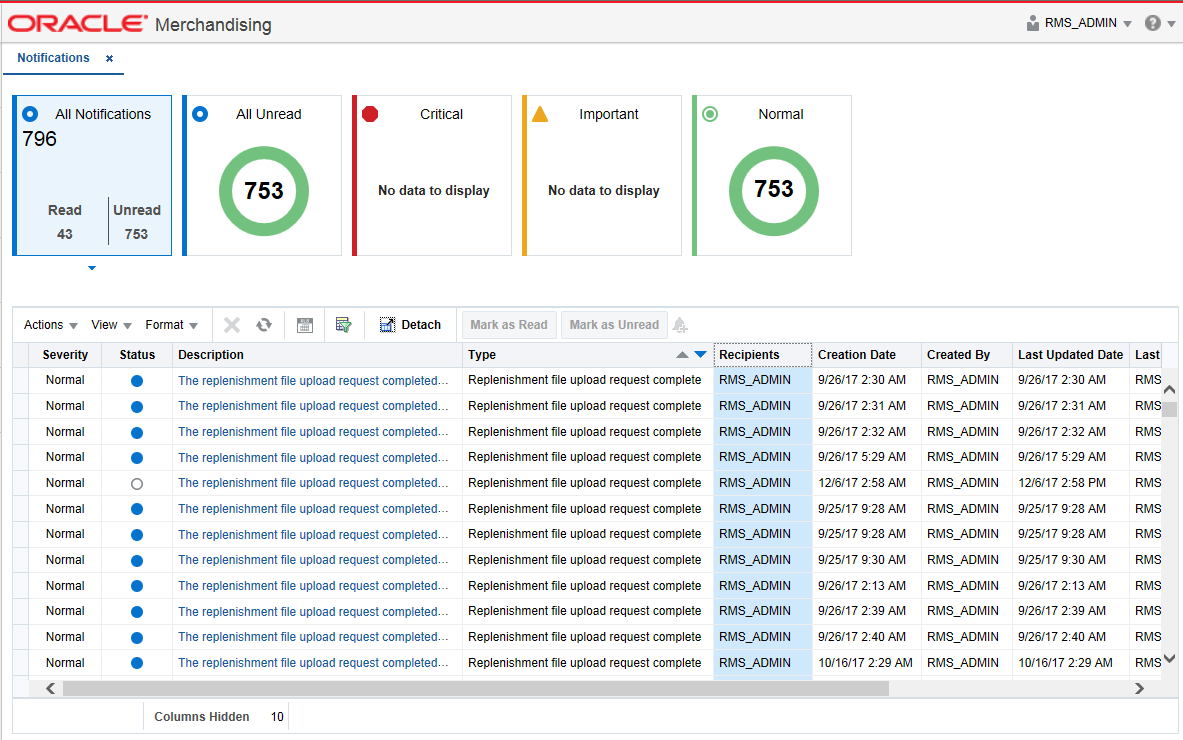
This tab lists all the Notifications for the logged-in user, regardless of whether they are in Read or Unread status. Information tiles display a break-up of the total notifications by severity. Clicking these tiles refreshes the table below to display only those notifications that are relevant to that tile.
You can perform the following operations from this tab.
-
Delete
 - The table allows for multiple selection and hence multiple notifications can be deleted at a time. Use the row header to select the row.
 -
Refresh
 - This refreshes the list of notifications in the table.
 -
Mark as Read - Multiple Unread Notifications can be marked as Read by clicking this button.
-
Mark as Unread - Multiple Read Notifications can be marked as Unread by clicking this button.
-
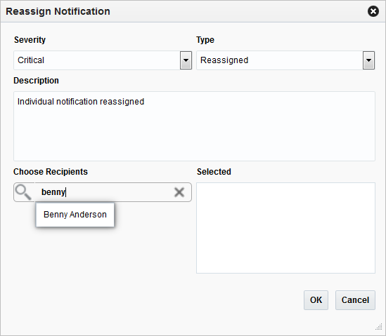
Reassign Notifications
 - Notifications can be reassigned to individual recipients or a group by clicking the Reassign Notifications icon. On selecting a row in the All Notifications table, and clicking the icon, the reassign notification popup is displayed. The Type is set to Reassigned by default, and the Severity and Description are pre-populated from the selected row; you can then change any of these values and assign the notification to one or more recipients.
The All Notifications table displays the following columns:
-
Notification Severity - A colored label indicating the Notification Severity.
-
Status - If the status is unread, an icon
is shown. Otherwise it is blank. -
Description - The description of the notification itself.
-
Type - The description of the Notification Type for the notification.
-
Recipients - In case of individual notifications, this column contains the user ID of the user to whom the notification is assigned. When the notification is assigned to multiple users, it displays the text 'Multiple' and enables a context popup which lists all the recipients. This field is empty when the notification is assigned to a group associated with a type.
-
Creation Date - Timestamp showing the date and time of creation.
-
Created By - User ID of the user who created the notification.
-
Last Updated Date - Timestamp showing the date and time when the last update was made.
-
Last Updated By - User ID of the user who last updated the notification.
-
Application ID - Unique identifier that identifies the application. Not visible by default.
-
Department - The Department associated with the notification. Not visible by default.
-
Class - The Class associated with the notification. Not visible by default.
-
Subclass - The Subclass associated with the notification. Not visible by default.
-
Location - The Location associated with the notification. Not visible by default.
-
Supplier - The Supplier associated with the notification. Not visible by default.
-
Performance - The Performance value associated with the notification. Not visible by default.
-
Brand - The Brand associated with the notification. Not visible by default.
-
Rollup Count - The Rollup Count associated with the notification. Not visible by default.
-
Additional Information - Refers to the Additional Information attribute associated with the notification. Not visible by default.
Screen Level
Screen Level Action - Icons and Buttons
The screen level actions display the icons and buttons.
Table 2-1 Screen Level Action - Icons/Buttons and Descriptions
| Icon/Buttons | Description |
|---|---|
|
Help icon |
You can access online help for a particular page by clicking the Help icon. |
|
Expand and Collapse icon |
You can view all and collapse all the sections in the application window by clicking the Expand and Collapse icon. |
|
Delete icon |
You can delete a deal component by selecting the Delete icon. |
|
Status Action Button |
Depending on the status of your deals, the status action button displays. For example, Submit. Wherever applicable, this button will be available to change the status of an entity. The status will be changed to the label specified on the button. If there is more than one status to which the entity can be changed, clicking the arrow on the right side of the button will display the additional status options. |
|
More Actions |
The More Actions button will have any additional actions and options for navigating to other screens. For information on the More Actions menu, see Deal - More Actions Menu in the Oracle© Retail Merchandising Foundation Cloud Service Deal and Cost Change User Guide. |
|
Save |
Click Save to save the created deals and stay in the Deal window. |
|
Save and Close |
Click Save and Close to save the deals and exit the Deal window. |
|
Cancel |
Click Cancel to reject the deal and exit the Deal window. |
View all the Sections Within a Window
You can view all the sections in the Deal window by clicking the Expand icon  . You can shrink all the sections in the Deal window by clicking the Shrink icon
  .
.
Table Level
Note:
-
Deals is used as an example which is specific to the Oracle Retail Merchandising System, and may not be relevant to this application.
-
Figure 2-21, Figure 2-22, Figure 2-23 are mere representation and may be different for every window/table/popup.
The Actions menu, View menu, and icons are displayed in the form of a table. For more information on these options, see the sections Action Menu and Icons and View Menu.
Action Menu and Icons
The Actions menu provides the option to take different actions related to entries in the table. Depending on the nature of the table, these actions can be add, view, delete or edit table rows, create by moving to a new screen or export the table contents to the spreadsheet. Alternatively these actions can also be performed by using the icon buttons on the table toolbar. For more information on the icon/buttons, see the Screen Level Action - Icons and Buttons.
In some tables, it may also contain some table specific actions.
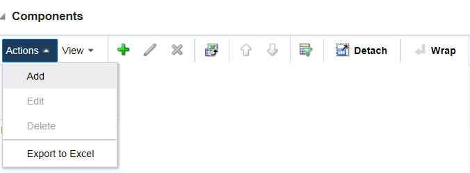
Table 2-2 Actions Menu/Icons and Descriptions of Components Section
| Actions Menu/Icon | Description |
|---|---|
|
Add and Add icon |
You can add a deal component by clicking Add from the Actions menu or by clicking the Add icon For more information on adding a deal component, see Adding Deal Components in the Oracle© Retail Merchandising Foundation Cloud Service Deal and Cost Change User Guide. |
|
Edit and Edit icon |
You can edit a deal component by clicking Edit from the Actions menu or by clicking the Edit icon For more information on editing a deal component, see Editing a Deal Component in the Oracle© Retail Merchandising Foundation Cloud Service Deal and Cost Change User Guide. |
|
Delete and Delete icon |
You can delete a deal component, by clicking Delete from the Actions menu or by clicking the Delete icon For more information on deleting a deal component, see Deleting a Deal Component in the Oracle© Retail Merchandising Foundation Cloud Service Deal and Cost Change User Guide. |
|
Export to Excel icon |
You can save the table to a Microsoft Excel spreadsheet by clicking the Export to Excel option from the Actions menu or by clicking the Export to Excel icon |
|
Move Up and Down icon |
You can move up and down the components to change the order in which they will be applied while calculating the deal by clicking the Move Up and Down icons |
|
Wrap icon |
You can wrap the values in the table column by using the Wrap icon |
For more information on the Actions menu and icons, see Components - Actions Menu and Icons in the Oracle© Retail Merchandising Foundation Cloud Service Deal and Cost Change User Guide.
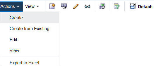
Table 2-3 Actions Menu/Icons and Descriptions of Managing a Deal
| Actions Menu/Icon | Description |
|---|---|
|
Create and Create icon |
You can create a deal by clicking Create from the Actions menu or by clicking the Create icon For more information on creating a deal, see Create a Deal in the Oracle© Retail Merchandising Foundation Cloud Service Deal and Cost Change User Guide. |
|
Create from Existing icon |
You can create from an existing deal by clicking Create from Existing from the Actions menu or by clicking the Create from Existing icon For more information on create from existing deal, see Creating from an Existing Deal in the Oracle© Retail Merchandising Foundation Cloud Service Deal and Cost Change User Guide. |
|
Edit and Edit icon |
You can edit a deal by clicking Edit from the Actions menu or by clicking the Edit icon For more information on editing a deal, see Editing a Deal in the Oracle© Retail Merchandising Foundation Cloud Service Deal and Cost Change User Guide. |
|
View and View icon |
You can view a deal by clicking View from the Actions menu or by clicking the View icon For more information on viewing a deal, see Viewing a Deal in the Oracle© Retail Merchandising Foundation Cloud Service Deal and Cost Change User Guide. |
|
Export to Excel icon |
You can save the table to a Microsoft Excel spreadsheet by clicking the Export to Excel option from the Actions menu or by clicking the Export to Excel icon |
|
Wrap icon |
You can wrap the values in the table column by using the Wrap icon |
View Menu
The View menu provides the options for managing the table columns and sorting and filtering the table data.
In some tables you have the option to choose a saved custom view, which is an arrangement of columns different from the default view of the table.
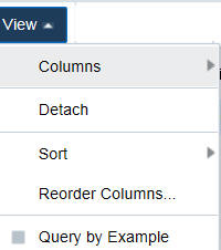
Table 2-4 Components Section - View Menu and Descriptions
| View Menu List | Description |
|---|---|
|
Columns |
You can manage which of the columns will be shown in the table by clicking the Show All and Manage Columns options. |
|
Detach |
You can view the tables in the application in a separate window by clicking Detach or by clicking the Detach icon |
|
Sort |
You can sort columns by the following options:
|
|
Reorder Columns |
You can reorder columns by clicking the Reorder Columns option. |
|
Query by Example |
You can filter the deal components by one of multiple column values by clicking the Query by Example option or by clicking the query by example icon |
 .
. .
.For more information on the View menu, see Components - View Menu and Icons in the Oracle© Retail Merchandising Foundation Cloud Service Deal and Cost Change User Guide.
Search Screens
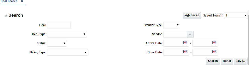
You can search for a particular entity by entering, selecting, or searching in the Merchandising Operations Management (MOM) application, for example to search for a deal.
To search for a deal:
-
From the Tasks menu, select Orders > Deals > Manage Deal. The Deal Search window appears.
-
You can search for a deal by providing search criteria in the search section. The criteria can be provided either in Basic or Advanced mode, depending on the requirement. Basic is the default mode when the search screen is entered. Click Advanced to access the search panel in advanced mode. You can return to Basic mode by clicking Basic.
Search for a Deal Through the Basic Search Criteria
To search for a deal through the basic search criteria:
-
Enter or select one or all of the following basic search criteria.
Table 2-5 Basic Search Criteria
Search Field Description Deal
Enter the deal ID.
Deal Type
Select the deal type. The options are: Annual, Promotional, PO Specific, and Vendor Funded Markdown.
Status
Select the status of the deal. The options are: Worksheet, Submitted, Approved, Rejected, Closed.
Billing Type
Select the type of deal being created. The options are: Off invoice, Bill Back, Bill Back Rebate, Vendor Funded Promotion, Vendor Funded Markdown.
Vendor Type
Select the vendor type.
Vendor
Enter, select or search for the vendor.
Active Date
Enter the date on which the deal becomes active, or click the calendar icon and select the date.
Close Date
Enter the date on which the deal ends, or click the calendar icon and select the date.
-
You can also click on the Saved Search drop down to select one of the saved sets of search criteria. Selecting a saved search will populate the criteria section with saved criteria. If the saved search is selected to run automatically then the search will be executed too. You can also choose to manage and personalize the saved searches by clicking Personalize in the list. The Personalize Saved Searches window appears. For more information on the Personalize Saved Searches, see the section Personalize Saved Search.
-
Click Search. The deals that match the search criteria are displayed in the Results section.
-
Click Reset to execute the saved search.
-
Click the Save.. button to save the current set of search criteria as a Saved Search. The Create Saved Search window appears. For information on the Create Saved Search window, see the section Create Saved Search.
-
Click Done to close the window.
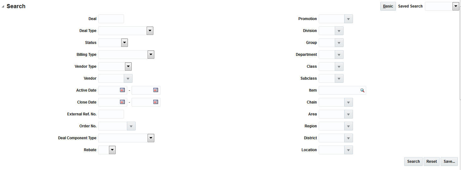
Search for a Deal Through the Advanced Search Criteria
To search for a deal through the advanced search criteria:
-
Enter or select one or all of the following advanced search criteria.
Table 2-6 Advanced Search Criteria
Search Field Description Deal
Enter the deal ID.
Deal Type
Select the deal type.
Status
Select the status of the deal.
Billing Type
Select the type of deal being created.
Vendor Type
Select the vendor type.
Vendor
Enter, select or search for the vendor.
Active Date
Enter the date on which the deal becomes active, or click the calendar icon and select the date.
Close Date
Enter the date on which the deal ends, or click the calendar icon and select the date.
External Ref. No.
Enter the external reference number.
Order No.
Enter, select or search for the order number.
Deal Component Type
Select the deal component type.
Rebate
Select Yes if the rebate is included in the deal or select No if the rebate is not included in the deal.
Promotion
Enter, select or search the promotion from the list.
Division
Enter the division number, select or search for the division name and number.
Group
Enter the group number, select or search for the group name and number from the list.
Department
Enter the department number, select or search for the department name and number from the list.
Class
Enter the class number, select or search for the class name and number from the list.
Subclass
Enter the subclass number, select or search for the subclass name and number from the list.
Item
Enter the item number, or search by using the search icon.
Chain
Enter the chain number, select or search for the chain name and number from the list.
Area
Enter the area number, select or search for the area name and number from the list.
Region
Enter the region number, select or search for the region name and number from the list.
District
Enter the district number, select or search for the district name and number from the list.
Location
Enter the location number, select or search for the location name and number from the list.
-
You can also click the Saved Search drop down to select one of the saved sets of search criteria. Selecting a saved search will populate the criteria section with saved criteria. If the saved search is selected to run automatically then the search will be executed too. You can also choose to manage and personalize the saved searches by clicking Personalize in the list. The Personalize Saved Searches window appears. For more information on the Personalize Saved Searches, see the section Personalize Saved Search.
-
Click Search. The deals that match the search criteria are displayed in the Results section.
-
Click the Save... button to save the current set of search criteria as a Saved Search. The Create Saved Search window appears. For information on the Create Saved Search window, see the section Create Saved Search.
-
Click Done to close the window.
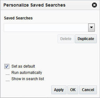
Personalize Saved Search
Select Personalize from the Saved Search list to view the personalized saved search. The Personalize Saved Searches pop up allows you to edit, copy, or delete Saved Searches.
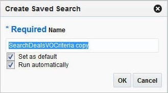
Create Saved Search
You can create a Saved Search by selecting the Save button in the Search Criteria panel after you have entered the criteria for your search. The Save button will call up the Create Saved Search window where the search is given a name and the user determines whether it should be the default search as well as whether it should be run automatically.
To view the created saved search:
-
Click the Save.. button. The Create Saved Search window appears.
-
Enter the name of the search.
-
You can also choose to save the combination of the search criteria by selecting the following check boxes:
-
Set as default
-
Run automatically
-
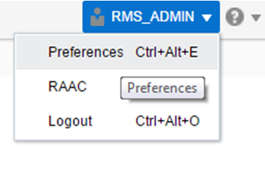
Set User Preferences
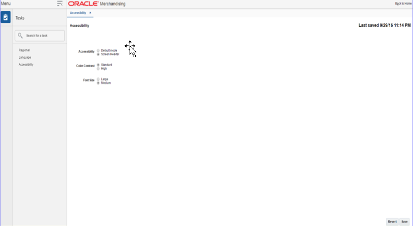
The Preferences pages are where you specify the default regional, language, and accessibility settings that you want to use throughout the system.
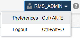
To set your preferred preferences, click User list > Preferences at the top of the application home page. The Preferences page appears. The standard preference options available are as follows:
-
Regional
-
Language
-
Accessibility
To return to the application home page, click Back to Home at the top of the page. The Preferences pages are where you specify the default regional, language, and accessibility settings that you want to use throughout the system.
Regional Options
Use the following options to specify the default formats for territory, date, time, number, and time zone you want to use throughout the system.
| Value | Description |
|---|---|
|
Territory |
Specify the country details. |
|
Date Format |
Select the date format that you want to use. |
|
Time Format |
Select the time format that you want to use. |
|
Number Format |
Select the number format that you want to use. |
|
Time Zone |
Select the time zone you want to use. |
Language Options
Use the following options to specify the default language you want to use throughout the system.
Accessibility Options
Use the following options to specify the default accessibility preferences you want to use throughout the system.
Accessibility
Accessibility involves making your application usable for differently abled persons such as low vision or blindness, deafness, or other physical limitations. This means creating applications that can be used without a mouse (keyboard only), used with a screen reader for blind or low-vision users, and used without reliance on sound, color, or animation and timing.
The Merchandising Foundation Cloud Service solutions provides the ability for users to switch between accessibility support levels in the application, so that users can choose their desired type of accessibility support, if required. They do so by exposing a user preferences screen in which the user can specify the accessibility preferences/mode which will allow the user to operate in that mode.
-
Default Mode: By default, the Merchandising Foundation Cloud Service solutions a have rich user interface interaction, and are also accessible through the keyboard. Note that in the default mode, screen readers cannot access all components. If a visually impaired user is using a screen reader, it is recommended to use the Screen Reader mode.
-
Screen Reader: Merchandising Foundation Cloud Service solutions are optimized for use with screen readers. The Screen Reader mode facilitates the display for visually impaired users, but will degrade the display for sighted users (without visual impairment.
Additional fine grained accessibility levels as described below are also supported:
-
High-contrast: Merchandising Foundation Cloud Service solutions can display high-contrast-friendly visual content. High-contrast mode is intended to make the solutions compatible with operating systems or browsers that have high-contrast features enabled. For example, they changes its use of background images and background colors in high-contrast mode to prevent the loss of visual information. Note that the Merchandising Foundation Cloud Service solutions high-contrast mode is more beneficial if used in conjunction with your browser's or operating system's high-contrast mode. Also, some users might find it beneficial to use large-font mode along with high-contrast mode.
-
Large-fonts: Merchandising Foundation Cloud Service solutions also support browser-zoom-friendly content. In default mode, most text and many containers have a fixed font size to provide a consistent and defined look. In large-font mode, text and containers have a scalable font size. This allows the solutions both to be compatible with browsers that are set to larger font sizes and to work with browser-zoom capabilities. Note that if you are not using large-font mode or browser-zoom capabilities, you should disable large-font mode. Some users might also find it beneficial to use high-contrast mode along with the large-font mode.
Merchandising Foundation Cloud Service/Sales Audit Cloud Service provides the ability to switch between the above accessibility support levels in the application, so that users can choose their desired type of accessibility support, if required. It exposes a user preferences screen in which the user can specify the accessibility preferences/mode which will allow the user to operate in that mode.
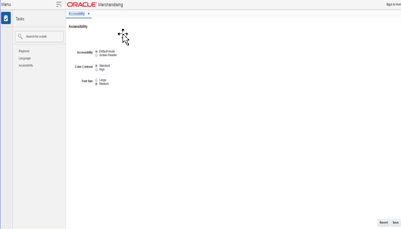
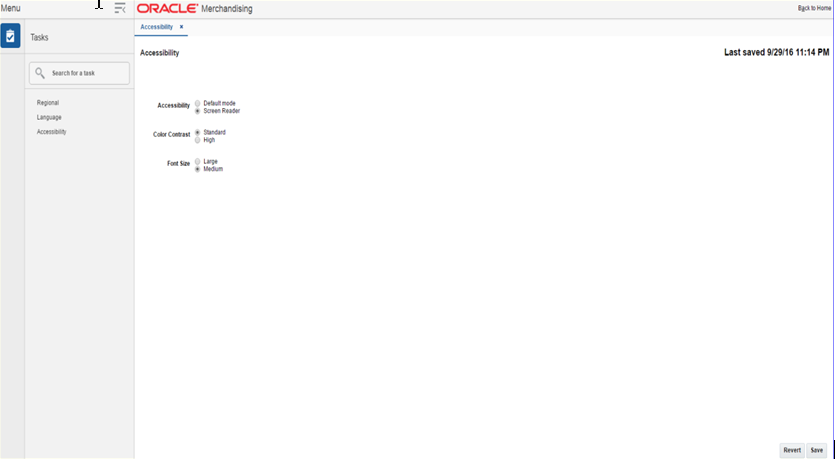
Configure Application for Screen Reader Mode
Users can configure their session to the accessibility mode by setting user references on the home page of the application as shown below. Perform the following procedure to configure a user preference for screen reader mode.
-
Log into one of the Merchandising Foundation Cloud Service solutions. In this example, we use Merchandising Foundation Cloud Service.
-
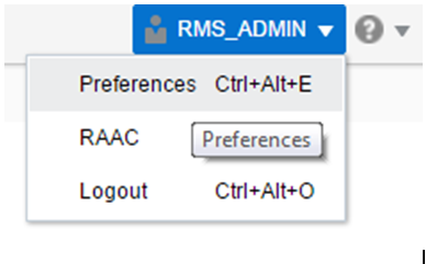
From the application home page, select Preferences from the logged in user menu.
-
From the Tasks pane, click Accessibility to open the Accessibility tab.
-
Select Screen Reader to enable accessibility mode, and click Save.
-
Click on Back to Home to return to the home page. Now the application is enabled in the screen reader mode to assist a visibly challenged user. Some of the graphical content of Operational Insights is also displayed in a tabular mode.
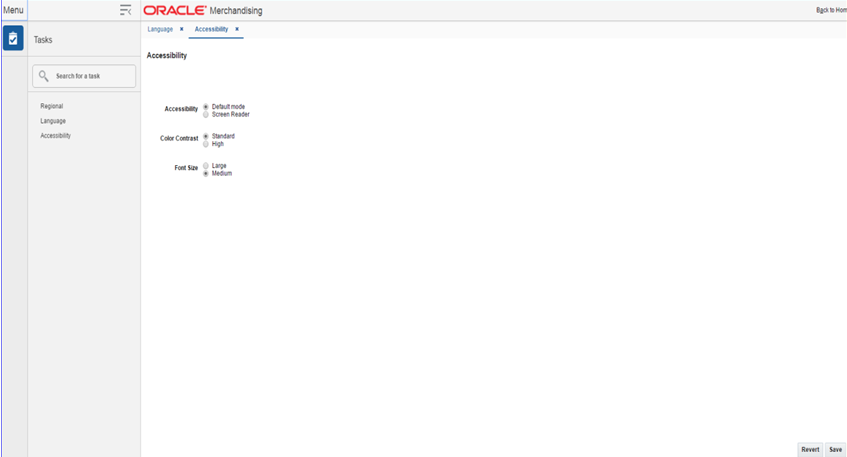
Set Accessibility to Default
Perform the following procedure to set Accessibility mode to Default mode.
-
From the application home page, select Preferences from the logged in user menu.
-
From the Tasks pane, click Accessibility to open the Accessibility tab.
-
Select Default mode.
-
Click Save to save the settings.
-
Click Back to Home to return to the home page. Application is returned to default mode and you can view graphical reports.
Translate Data
You can create, modify and delete translations of data in RMS. This can be done in two different ways.
-
for a single entity at a time
-
view all entities that have translatable values and translate them in a centralized window.
Translations
The Translations window is a centralized window where you can see all entities that have translatable values in RMS.
The Translations window contains the following sections.
-
Header
The header contains the Entity to Translate field. Select the entity you want to create translations for.
Entity to Translate
Depending on the entity to translate you have selected in the header, the title of this section varies.
For example, if you select an Entity to Translate of 'Warehouse', the title of this section will be 'Warehouse' and a list of all existing warehouses in the system will display in the table. You can select the row containing the desired warehouse to see any existing translations in the Translations table below.
Use the Actions Menu and icons to apply actions to the table. You can perform the actions listed below.
Table 2-10 Entity to Translate - Actions Menu/Icons and Description
| Actions Menu/Icons | Description |
|---|---|
|
Export to Excel and Export to Excel icon |
You can export the records in the table to a Microsoft Excel spreadsheet by selecting Actions > Export to Excel or by using the Export to Excel icon |
You can customize the view of the table by using the options in the View Menu.
Table 2-11 Entity to Translate - View Menu/Icons and Description
| View Menu/Icons | Description |
|---|---|
|
Columns |
You can manage which of the columns will be shown in the table by clicking the Show All and Manage Columns options. |
|
Detach and Detach icon |
You can view the tables in the application in a separate window by clicking Detach or by using the Detach icon |
|
Sort |
You can sort columns by the following options:
|
|
Reorder Columns |
You can reorder columns by clicking the Reorder Columns option. |
|
Query by Example and Query by Example icon |
You can filter the items by one or multiple column values by clicking the Query by Example option or by using the Query by Example icon |
Translations
The Translations section contains all available translations of the selected entity to translate. Existing translations can be modified directly in the table.
Use the Actions Menu and icons to apply actions to the table. In addition to editing existing translations, you can perform the actions listed below.
Table 2-12 Translations - Actions Menu/Icons and Description
| Actions Menu/Icons | Description |
|---|---|
|
Add and Add icon |
You can add new translations by selecting Actions > Add or by using the Add icon For more information about how to add additional translations, see the Create a Translation section. |
|
Delete and Delete icon |
You can delete a translation:
|
You can customize the view of the table by using the options in the View Menu.
Table 2-13 Translations - View Menu/Icons and Description
| View Menu/Icons | Description |
|---|---|
|
Columns |
You can manage which of the columns will be shown in the table by clicking the Show All and Manage Columns options. |
|
Detach and Detach icon |
You can view the tables in the application in a separate window by clicking Detach or by using the Detach icon |
|
Sort |
You can sort columns by the following options:
|
|
Reorder Columns |
You can reorder columns by clicking the Reorder Columns option. |
|
Query by Example and Query by Example icon |
You can filter the items by one or multiple column values by clicking the Query by Example option or by using the Query by Example icon |
Translations Toolbar
The toolbar contains the following icons and buttons.
Table 2-14 Translations Toolbar - Icons/Buttons and Description
| Icons/Buttons | Description |
|---|---|
|
Help icon |
You can access the online help for a particular page by clicking the Help icon |
|
Save |
Click Save to save the entered records. |
|
Save and Close |
Click Save and Close to save the entered records and close the window. |
|
Cancel |
Click Cancel to reject all entries and close the window. |
Translate a Single Entry
The Translate window for a single entry displays the system's primary language and the current language in the top right corner. The table of the Translate window displays the language and the corresponding description for the entry. Existing translations can be modified directly in the table.
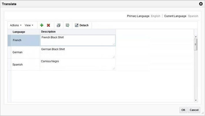
Use the Actions menu and icons to apply actions to the table. In addition to editing existing translations, you can perform the actions listed below.
Table 2-15 Translate Table - Actions Menu/Icons and Description
| Actions Menu/Icons | Description |
|---|---|
|
Add and Add icon |
You can add a translation by selecting Actions > Add or by using the Add icon For more information about how to create a translation for a single entity, see the Create a Translation section. |
|
Delete and Delete icon |
Delete a translation:
|
You can customize the view of the table. Use the View menu and icons to customize the view as listed below.
Table 2-16 Translate Table - View Menu/Icons and Description
| View Menu/Icons | Description |
|---|---|
|
Detach and Detach icon |
You can view the tables in the application in a separate window by clicking Detach or by using the Detach icon |
|
Sort |
You can sort columns by the following options:
|
|
Reorder Columns |
You can reorder columns by clicking the Reorder Columns option. |
|
Query by Example and Query by Example icon |
You can filter the items by one or multiple column values by clicking the Query by Example option or by using the Query by Example icon |
Create a Translation
To create a translation, follow the steps below.
-
Select Actions > Translate or use the Translate icon
 , if available. The Translate window appears.
 -
In the table, select Actions > Add, or use the Add icon
 . The Add Translation window appears.
 -
In the Language field, select the desired language from the list. This field is a required field.
-
In the Description field, enter the desired description. This field is a required field.
-
Then choose one of the following options.
-
Click OK to add the translation to the table and close the window.
-
Click OK and Add Another to add additional translations.
-
Click Cancel to reject all entries and close the window.
-
Download/Upload Data from Spreadsheets
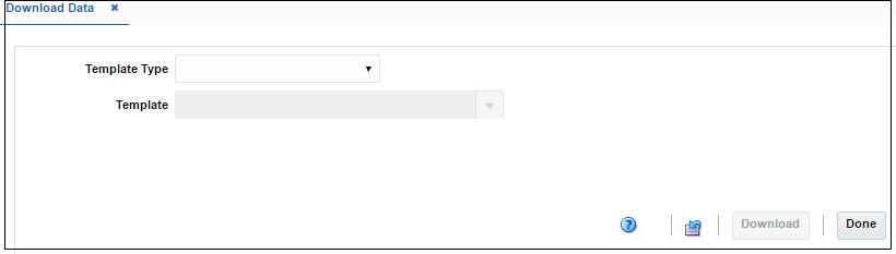
Data Download
The Data Download window allows you to view and maintain RMS Foundation Data through a spreadsheet.
-
You can access the Download Data window from the Task menu, select Foundation Data > Data Loading > Download. The Download Data window appears.
-
In the Template Type field, select the template type from the list.
-
In the Template field, enter, select or search for the template you want to download.
-
Then choose one of the following options:
-
Click Download to download the file.
-
Click Revert to clear out the screen inputs.
-
-
Click Done to close the Download Data window.
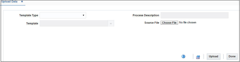
Data Upload
The Upload Data window allows you to upload and maintain RMS Foundation Data through a spreadsheet.
-
You can access the Upload Data window from the Task menu, select Foundation Data > Data Loading > Upload. The Upload Data window appears.
-
In the Template Type field, select the template type from the list.
-
In the Template field, enter, select or search for the template you want to upload.
-
The Process Description field displays the default process name with the date and timestamp. You can edit the name of the upload process in this field.
-
In the Source File field, click the Choose File button to upload the file.
-
Then choose one of the following options:
-
Click Upload to upload the file. If error occurs during the upload process, you will get a notification.
-
Click Revert to clear out the screen inputs.
-
-
Click Done to close the Upload Data window.
View Data Loading Status
The Data Loading Status window allows you to view the status of the upload and download processes happening in RMS, so that you can rectify the issues associated with the upload/download process.
The window allows you to drill down to the errors or warnings associated with a selected upload/download request.
You can access the Data Loading Status window from the Task menu, select Foundation Data > Data Loading > Review Status. The Data Loading Status window appears.
The Data Loading Status window contains the following sections.
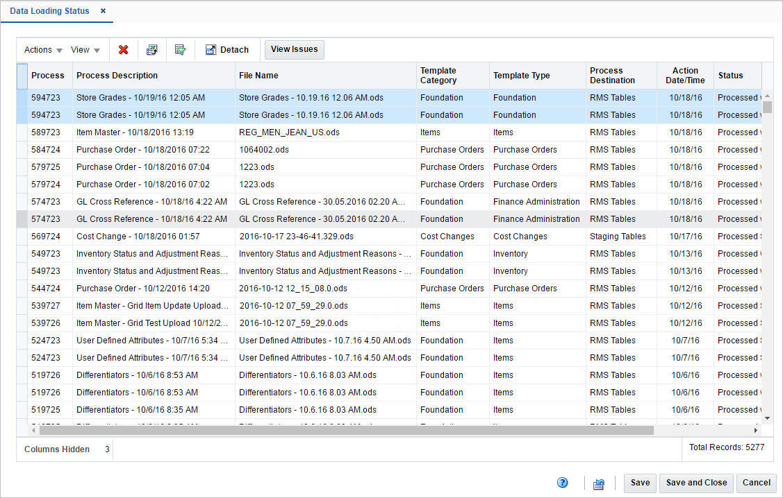
Table
The table displays the process, process description, file name, template category and type, destination, action date and time, status and the user, who initiated the process.
Table - Actions Menu and Icons
Use the Actions Menu and icons to apply actions to the table. You can perform the actions listed below.
Table 2-18 Data Loading Status Table - Actions Menu/Icons and Description
| Actions Menu/Icons | Description |
|---|---|
|
Delete and Delete icon |
You can delete a process by using the following steps:
|
|
Export to Excel and Export to Excel icon |
You can export the records in the table to a Microsoft Excel spreadsheet by selecting Actions > Export to Excel or by using the Export to Excel icon |
|
View Issues and View Issues button |
To view the warnings and errors associated with a selected upload/download request:
|
|
Upload to RMS |
With this option you can upload the selected process from Staging to RMS. This option is only enabled for records which have Staging Tables as a destination and do not hold the status ”Processed with Errors”. Additionally, this option is only enabled for Item induction, Cost Change induction and Order induction records. |
|
Download Staged |
This option allows you to download the staged records of a process to a spreadsheet.
This option is only enabled for Item induction, Cost Change induction and Order induction records. |
Data Loading Status - View Menu and Icons
You can customize the view of the table by using the options in the View Menu.
Table 2-19 Table Data Loading Status - View Menu/Icons and Description
| View Menu/Icons | Description |
|---|---|
|
Columns |
You can manage which of the columns will be shown in the table by clicking the Show All and Manage Columns options. |
|
Detach and Detach icon |
You can view the table in the application in a separate window by clicking Detach or by using the Detach icon |
|
Sort |
You can sort columns by the following options:
|
|
Reorder Columns |
You can reorder columns by clicking the Reorder Columns option. |
|
Query by Example and Query by Example icon |
You can filter the items by one or multiple column values by clicking the Query by Example option or by using the Query by Example icon |
Data Loading Status Toolbar
The toolbar contains the following icons and buttons.
Table 2-20 Data Loading Status Toolbar - Icons/Buttons and Description
| Icons/Buttons | Description |
|---|---|
|
Help icon |
You can access the online help for a particular page by clicking the Help icon |
|
Refresh icon |
You can refresh the window by clicking the Refresh icon. All entries are reset and not saved. |
|
Save |
Click Save to save the entered records. |
|
Save and Close |
Click Save and Close to save the entered records and close the window. |
|
Cancel |
Click Cancel to reject all entries and close the window. |
|
Done |
If you open the window in view mode, the Done button is displayed. Click Done to close the window. |