11Creating Custom Siebel Configurator User Interfaces
Creating Custom Siebel Product Configurator User Interfaces
This chapter describes how to create a custom user interface for configuring a customizable product and how to assign user interfaces to users. You can create this interface for products with components and products with attributes.
This chapter includes the following topics:
About Default and Custom Siebel Product Configurator User Interfaces
You must decide whether to use the default Siebel Product Configurator user interface or to design a custom user interface.
The default user interface displays all the configurable items in the customizable product on a single selection page. If you create a custom interface, you can display the configurable items on multiple pages.
The default user interface makes intelligent choices for UI controls based on attribute domain type and upon relationship cardinality. For example:
If an attribute has an LOV type domain, the default interface displays a combo box for setting the attribute.
If a relationship has a min and max cardinality of 1, the application displays a combo box without multiple instances. If the max cardinality is greater than 1, the application displays a combo box with multiple instances.
If you create a custom interface, you can select the control used for each configurable item, and you can create several Open UI interfaces and assign them to users based on their responsibilities and their browsers.
The application decides which interface to assign to a user using the decision flow shown in the following.

About the Siebel Product Configurator User Interface View
Using the User Interface view, you can define the page or series of pages that display during a configuration session. These pages display when the user configures a customizable product as part of creating a quote in the Quotes screen. They also display when a user selects a customizable product in an eSales Web page. The same pages display when an administrator validates a customizable product.
The pages that display during the configuration process are called selection pages. The user makes selections from these pages to configure the customizable product.
You can design the following features of selection pages:
Basic page layout. You set the basic look and feel of the customizable product's selection pages by choosing a base theme. Several base themes are provided. You can also build your own base themes.
Method of presenting products. There are several ways to present your products. You can present them all on one page, you can set up several tabbed pages, or you can set up a wizard to guide the user through pages sequentially. You select a product theme in the Versions tab. You can also build your own product themes.
What items a page will contain. You can choose which items to display on a page using a grouping mechanism provided in the User Interface view. You can add to a group the items in a relationship, the attributes of the customizable product, its links, or its resources. Depending on the product theme, each group displays on a separate page.
How items will be selected. When you add an item to a group in the User Interface view, you can choose among several user interface control types for it such as combo box, check box, radio button, quantity box, and text box. These UI control types determine how the user goes about selecting an item.
The user interface you design is part of the customizable product's current work space. When you release a customizable product, the user interface is stored as part of the released version.
About Themes for the Siebel Product Configurator
When you create a work space for a customizable product, you can select a base theme and product theme. These control the basic look and feel of the pages a user sees when they configure the product.
About the Base Theme
A base theme defines the home page for the customizable product. It is the container within which the product theme pages display. The base theme has a thread bar you can use to navigate between product theme pages. Four types of base theme are provided:
Base Theme with Auto Pricing. When the user selects an item, its price is updated immediately.
This base theme has the following variations:
Base Theme with Auto Pricing with Open UI. When the user selects an item, the item price is updated immediately, this includes styling for Open UI.
SIS OM Base Theme with Auto Pricing. The theme provides additional fields within the container that are relevant to the communications industry.
Base Theme with Manual Pricing. The pricing of items is not updated until the user clicks Update Price.
This base theme has the following variation:
SIS OM Base Theme with Manual Pricing. The theme provides additional fields within the container that are relevant to the communications industry.
Base Theme with Multi Select JS. The user can select many product components, and then click the Submit button to validate them all at once.
Base Theme with Quick Edit JS. The user can turn validation on and off. Turning validation off saves time in configuring items.
Although both Multi Select and Quick Edit allow users to configure products more quickly, there are important differences between the two:
Constraint validation:
A Multi Select user interface can invoke constraint validation for certain user actions, such as page refresh or selections using combo boxes. For example, when a user drills down on a child customizable product or changes tabs, the UI controls on the new page invoke object manager code which invokes the constraint engine and prompts the user to validate the Siebel Product Configurator session.
With a Quick Edit user interface, the user enables or disables the constraint engine by explicitly clicking a button.
Modification by the user:
With a Multi Select user interface, the underlying logic for altering constraint engine invocation and constraint violation behavior can be changed by modifying the client side JavaScript files.
With a Quick Edit user interface, logic for altering the constraint engine cannot be modified by end users, because it resides in the object manager code.
Upgrade users: If you do not select a base or product theme, default themes are used. If you do not specify groups or controls, intelligent defaults are used. These defaults replace Configuration Assistant in release 6.x and lower.
About Product Themes
Product themes specify the style used to group items together on selection pages. You define which items appear on a page by defining groups in the User Interface view and adding products to the groups. Each group is displayed on a separate selection page.
Three basic product theme types are provided.
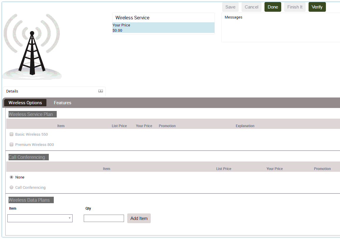
Tab Product Theme
The items in each group are displayed on a separate page, as shown in the following figure. The Wireless Options group and the Features group each have a tab, and the user can move between pages by clicking the tab. A standard group of buttons, Save, Cancel, Done, and Finish It display in the header bar.
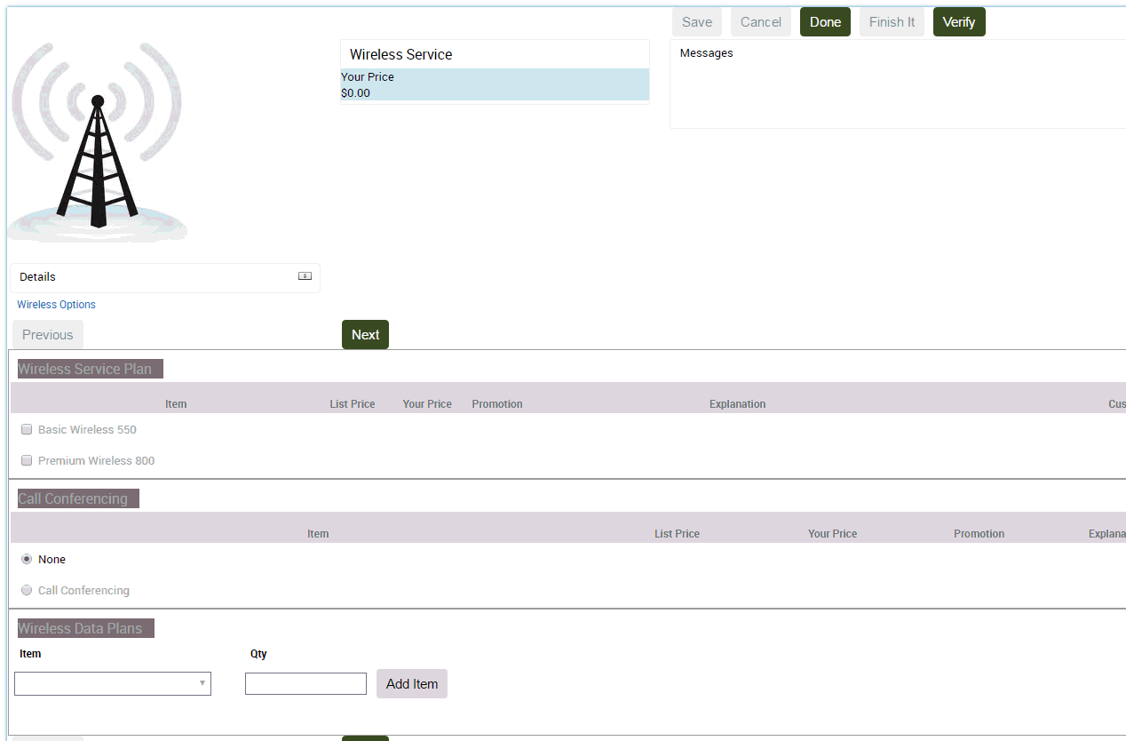
Wizard Product Theme
The items in each group are presented on separate pages, as shown in the following figure. The Wireless Options group is displayed by itself as the first page in the sequence. A standard group of buttons, Save, Cancel, Done, and Finish It display in the header bar. Previous and Next buttons, located within the page, allow the user to move between pages.
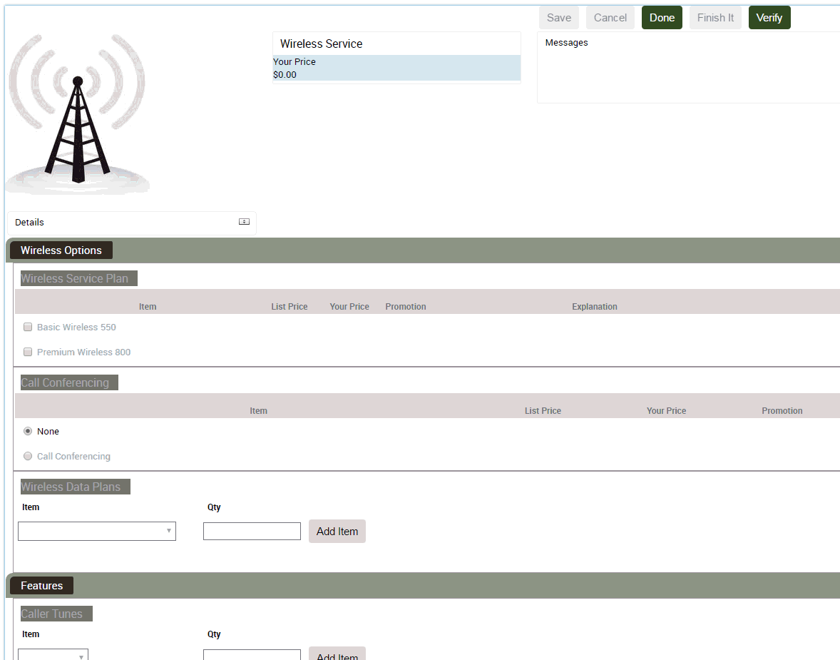
Single Page Product Theme
All the groups in the customizable product are presented on a single selection page, as shown in the following figure. The tab pages used in the Tab theme and Wizard theme are stacked vertically one beneath the other to form the selection page. A standard group of buttons, Save, Cancel, Done, and Finish It display in the header bar.
About Creating a Menu-Based Siebel Product Configurator UI
A special set of themes and UI controls is provided to build a menu-based interface:
Base Theme with Menu. This theme must be selected as the base theme. This theme provides auto-repricing. No base theme is provided to select manual repricing.
Menu Product Theme. This theme must be selected as the product theme. It displays relationships and their contents. It does not display attributes, resources, or linked items.
Standard Menu Group Theme. This theme must be selected for all groups except a summary page group.
Summary Menu Group Theme. Assign this theme to a group when you want to display a summary page. For more information on summary pages, see Adding a Summary Page to the Siebel Product Configurator User Interface.
Check Box For Menu Theme. Select this UI control to display a check box with price.
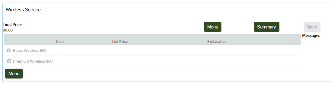
The menu-based interface displays each group as a menu item. When the user clicks on the group name, a pane opens and displays the items that can be selected in that group. When the user makes a selection, the selection is displayed after the group name. The following figure shows a menu-based selection page. Two groups have been defined, Wireless Options and Features. The user's selection is shown after each group.
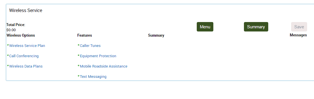
Both group names are hyperlinks. If the user clicks on the Options group, a pane displaying the contents of that group opens as shown in the following figure. The user can then select items from that group. When the user is finished, they click Menu to close the pane.
Observe the following guidelines when using these themes and controls:
The menu-based themes and controls can be used in conjunction with employee and partner applications. They cannot be used with customer applications, such as Siebel eSales.
You cannot mix menu-based themes and controls with other types of themes and controls in a product. For example, if you select a menu-based base theme, you must also select a menu-based product theme as well as menu-based UI controls.
A product with components that will be a component of another product with components cannot use menu-based themes and controls. For example CP2 is a product with components and a component of product CP1. CP2 cannot use menu-based themes and controls. Note that CP1 is not restricted from using menu-based themes and controls.
Menu-based UI controls for links, resources, and attributes are not supported. Do not add links, resources, or attributes to groups.
About Siebel Product Configurator UI Groups
Groups are the way you define what items appear on a selection page. Depending on the product theme, each group you define causes a separate selection page to be created. For example, you want all the hard disks in a product with components to appear on the same page. You do this by defining a group in the User Interface view and then adding the Hard Disks relationship to this group. If you selected a tab type product theme, the hard disks display as a selectable page tab. When the user clicks on the tab, a selection page displays containing only the hard disks.
The User Interface view lets you create groups that contain relationships, attributes, resources, or links.
When you create a group, you can choose a group style. The group style defines the details of how a group will display.
About Siebel Product Configurator UI Controls
A user interface control determines how an object is displayed for selection. For example, a radio button control, displays a list of items with a button for each one. You choose a control as part of adding an item to a group in the User Interface view.
The User Interface view provides several types of UI controls:
Combo Box. A combo box is a drop-down menu. Items are hidden from view until you click the down-arrow to open the menu and make selections. There are two types of combo box:
Single selection. The user can select only one value from the drop-down menu.
Multiple selection. The user can select multiple values from the drop-down menu using an Add Item button.
Check Box. Items display as a list. Each item has a check box next to it. When you select an item, a check mark appears in the check box. You can select more than one item.
Radio Button. Items display as a list. Each item has a button next to it. When you select an item, a dot appears in the button. You can select only one item. If you select another item, the previous item's button clears, and the current item displays a dot in the button.
Quantity Box. A box displays next to the item in which the user enters or edits the quantity. The user then clicks elsewhere in the page to update the quantity.
Text Box. A read-only box displays next to the item. The box contains the value of the displayed item. Use this UI control to display the current value of resources or linked items.
Edit Box. A text box displays next to the item. The text box contains the value of the displayed item. You can edit the value. Use this control when you want users to be able to manually enter or edit attribute values.
Keep in mind the following factors when choosing a user interface control:
For items added from a relationship, what are the cardinalities? If the minimum and maximum cardinality for the relationship is 1, this means only one item can be selected. The radio button or single-selection combo box can be used because it allows only one selection. If the relationship cardinality allows more than one selection, you must choose a UI control that allows multiple selections such as a check box or multiple-selection combo box.
For attribute items, select a UI control that matches the attribute type. For LOV attributes use a combo box. For a range of values attribute or a single-value attribute, use a quantity box or text box.
For resource items and for linked items, use a text box.
The following table describes the specific UI controls available in the User Interface view. In the Multiple Items column, Yes means that the UI control allows selection of more than one item from a list. No means you can select only one item.
For all controls, excluded items display unavailable. For example, if you assign a radio button control to a relationship, excluded items display with the radio button grayed out so that it cannot be selected.
You can revise this so that excluded items do not display at all. You do this by assigning the predefined Excluded UI property to an item. You assign the Excluded UI property in the Properties view.
Table User Interface view UI Controls
| UI Control Type | Select Multiple Items? | Description |
|---|---|---|
Combo Box |
No |
Selected item highlighted. |
Combo Box with Add Button |
Yes |
Selected item highlighted. Unselected items have Add button. |
Combo Box with Price |
No |
Selected item highlighted. Displays price. |
Combo Box with Price and Quantity |
No |
Selected item highlighted. Displays price. Allows user to enter quantity. |
Combo Box with Add Button and Price |
Yes |
Selected item highlighted. Unselected items have Add button. Displays price. |
Combo Box with Update Quantity button |
No |
Selected item highlighted. User can specify a quantity for the selected item. |
Check Box with Price |
Yes |
Displays item price. |
Check Box without Price |
Yes |
Price not displayed. |
Radio Buttons with Price |
No |
Displays item price. |
Radio Buttons without Price |
No |
Price not displayed. |
Quantity Box |
User enters quantity |
Update Quantity button displays next to item name. |
Quantity Box with Price |
User enters quantity |
Displays item price. Update Quantity button displays next to item name. |
Text Box with Price |
No |
Read-only. Displays item price. |
Text Box |
No |
Read-only. |
Combo Box for Attribute |
No |
Selected item highlighted. |
Edit Box for Attribute |
No |
Displays value of attribute. Can be edited. |
Radio Button for Attribute |
No |
User can select one attribute value. |
Text Box for Attribute |
No |
Read-only. Displays value of attribute. |
Linked Item |
No |
Read-only. Displays value of linked item. |
Resource |
No |
Read-only. Displays value of resource. |
About Pricing Integration with Siebel Product Configurator
Siebel Pricer works in conjunction with Siebel Product Configurator to provide updated pricing information during a configuration session. There are two methods for obtaining updated pricing information: automatic and manual. You select which method to use when you select a base theme.
Automatic price updates is the default method and is the method used by the default base theme. Base themes that provide manual price updates are labeled as such when displayed in the dialog box where you select the base theme. Unless labeled otherwise, base themes use the automatic price update method.
With automatic price updates, the pricing of the entire product with components is updated when the session starts, each time a new solution is created during the session, and when the session ends. When the user picks a product, the price of the product displays automatically.
With manual price updates, the pricing of the entire product with components is updated when the session starts, when the user clicks the Check Price button, and when the session ends. During the session, prices are not updated automatically when the user picks a product. Users must click the Check Price button to obtain the prices of the products they select.
When a price update occurs during a configuration session Pricer pricing elements trigger in the following order:
Component-based pricing adjustments
Attribute-based pricing adjustments
Pricing procedures. Only pricing that applies to the individual product triggers. Aggregate and volume discount pricing does not trigger.
When the session ends, Pricer pricing elements trigger in the same order.
When building a customizable product, use automatic price updates. Switch to manual price updates only if performance becomes too slow. The sequence of events after the user selects a product is as follows:
Siebel Product Configurator engine computes a new solution
Siebel Product Configurator engine forwards the solution to Pricer
Pricer returns pricing for all items in the solution
Siebel Product Configurator redisplays the selection page
If you do not need interactive pricing, consider switching to manual price updates.
Creating Custom UIs for Customizable Products
End users use Siebel Product Configurator to choose the features of products with attributes and products with components. You can customize the Siebel Product Configurator interface for both of these.
To create custom UIs for products with attributes
Navigate to the Administration - Product screen, then the Product Classes view.
In the Product Classes list, select and lock the desired product class.
In the Versions list, click the Work Space version.
Navigate to the User Interface view.
Design the user interface by following the instructions in this chapter.
All products associated with this product class inherit this interface.
To create custom UIs for products with components
Navigate to the Administration - Product screen, then the Product Definitions view.
In the Products list, select and lock the desired customizable product.
In the Versions list, click the Work Space version.
Navigate to the User Interface view.
Design the user interface by following the instructions in this chapter.
Process of Creating a Custom Siebel Product Configurator User Interface
To create a custom Siebel Product Configurator user interface, perform the following tasks:
Creating the Siebel Product Configurator User Interface Record
Enabling the Multiselect Feature for Siebel Product Configurator
Enabling the Quick Edit Feature for Siebel Product Configurator
Grouping Items onto Pages of the Siebel Product Configurator User Interface
Adding a Summary Page to the Siebel Product Configurator User Interface
Creating the Siebel Product Configurator User Interface Record
First, create the user interface record.
To create the user interface record
Select and lock the desired product, and navigate to the User Interface view, as described in Creating Custom UIs for Customizable Products.
In the User Interface list, add a new record and complete the necessary fields, described in the following table.
Field Comments Option Name
Enter a name for the user interface.
Option Type
Select High Interactivity.
Note: This value must be used in Open UI.Sequence
Enter a sequence number, which is used to decide which user interface to assign to users who are assigned multiple user interfaces. For more information, see Assigning Siebel Product Configurator Interfaces to Users.
Selecting the Base and Product Themes
User interface themes are templates that control the basic look and feel of the selection pages that users see when configuring a customizable product. Base themes control basic page design and product themes control the method used to present product choices. For more information, see About Themes for the Siebel Product Configurator.
This task is a step in Process of Creating a Custom Siebel Product Configurator User Interface.
To select the base and product themes
Navigate to the Administration - Product screen, then the Product Definitions view.
In the Products list, select the desired product.
In the Versions list, click the Workspace hyperlink.
Click the User Interface view tab.
In the User Interface list:
In the Base Theme field, select the desired base theme.
In the Product Theme field, select the desired product theme.
Enabling the Multiselect Feature for Siebel Product Configurator
The multiselect user interface (UI) for Siebel Product Configurator allows the user to select many product components, and then click the Submit button to validate them all at once. You enable this feature by selecting the appropriate base and product theme.
If you do not enable this feature, the Siebel Product Configurator engine validates each product component individually when it is added. This means that the user has to wait for the UI to be refreshed and for the engine to validate the product after each component is added. Power users of Siebel Product Configurator, who already understand which components are valid, prefer to add many components and validate them all at once.
After the user clicks Submit, Siebel Product Configurator does the following:
Fulfills all requests that are valid and displays the product with all these features incorporated.
Lists all the conflicts for requests that are invalid.
If any items submitted are invalid, the configuration reverts to the last successful submission.
Then the user can resolve conflicts by selecting Proceed for some features, and clicking the Resolve Conflicts button to submit these selected features for validation.
Alternatively, the user can not resolve these conflicts and instead make new selections in Siebel Product Configurator for these product features.
At any time during the configuration session, the user can click the Reset button to restore the configuration to what it was at the time of the last successful submit operation.
The multiselect UI base theme restricts the UI control themes that can be used. Use one of the following control themes:
With the Web template JS (RELATIONSHIP):
Check Box with or without price
Combo Box with price JS (eCfgControlComboPriceJS) (no add button)
Quantity Box JS (eCfgControlQuantityJS) quantity with or without price
Radio Buttons with or without price
With the Web template JS (ATTRIBUTES):
Combo Box for Attribute JS (eCfgAttributeComboBoxJS)
Radio Button for Attribute JS (eCfgAttributeRadioJS)
Edit Box for Attribute JS (eCfgCompAttributeEditJS)
To enable the multiselect feature for Siebel Product Configurator UI
Navigate to the Administration - Product screen, then the Product Definitions view.
In the Products list, select the desired product.
In the Versions list, click the Workspace hyperlink.
Click the User Interface view tab.
In the User Interface list, in the Base Theme field, select eCfgBaseAutoRepriceMultiJS.
Enabling the Quick Edit Feature for Siebel Product Configurator
This task is a step in Process of Creating a Custom Siebel Product Configurator User Interface.
The quick edit feature gives users flexibility to speed up configuration by turning off validation by the constraint engine, so the user does not have to wait for each change to be validated. Configuration is launched with validation turned off. In the Siebel Product Configurator user interface, users can:
Turn quick edit off and turn validation on by clicking the Turn Off Quick-Edit button.
Turn quick edit on and turn validation off by clicking the Turn On Quick-Edit button.
This feature allows more experienced users to make changes more quickly by using Siebel Product Configurator with validation turned off. Less experienced users can turn validation on to avoid making errors.
If Quick-Edit is turned on and the user clicks the Done button to exit Siebel Product Configurator, a message appears prompting the user to validate the configuration. The user can validate the configuration by clicking the Turn Off Quick-Edit button to enable the constraint engine.
Scenario for Using the Quick Edit Feature
For example, a business sells a complex frame relay product.
Some sales agents have extensive experience configuring this product, so they know which components are compatible, and they want the ability to add many components and validate them all at once. Other sales agents have little experience configuring this product, and they want the product to be validated after each component is added.
The product administrator creates the Siebel Product Configurator user interface using the Quick Edit base theme. After completing the design of the user interface, the administrator associates it with the responsibility of all these sales agents.
When sales agents launch Siebel Product Configurator, validation is turned off. Less experienced agents click the Turn Off Quick Edit button, so each component they add is validated as they configure the product.
More experienced agents add several components that are not validated individually. Then they click the Turn Off Quick Edit button to have the engine validate all the components that they have added up to that point. Then they click the Turn On Quick Edit button and add another group of components that are not validated individually.
Error Messages for Quick Edit
If a sales agent adds several components that are not validated individually and then clicks the Turn Off Quick Edit button, the Siebel Product Configurator might display error messages:
If the components are compatible and the configuration is valid, no message is displayed.
If a required component is missing and the configuration is incomplete, Siebel Product Configurator adds missing products to create a valid configuration and displays a message in the Messages box saying which products are added by the engine.
If incompatible components are added, Siebel Product Configurator displays a conflict message and the user has two options:
Click Undo to go back to the previous page and correct the error.
Click Proceed. Siebel Product Configurator might display one incompatible product in red or might remove one incompatible product.
Modifying the Web Template for Quick Edit
To enable the quick edit feature, use the following procedure to modify the Web template.
To modify the Web template for quick edit
Navigate to the directory \siebel install directory\webtempl.
Open the Web template file eCfgTopLevelButtonsJS for the UI control using a text editor such as Notepad.
Edit the file by adding the lines highlighted in boldface below:
<table datatable="O" summary="" border="0" bgcolor="white" widthg="100%">

<tr>
<td nowrap>
	<od-type="control" id="swe:EnableEngine" CfgUIControl="EnableEngine" CfgHtmlType="MiniButton"
	InvokeMethod="EnableEngine"/>
</td>

<td nowrap>

	<od-type="control" id="swe:CheckPrice" CfgUIControl="Check the price" CfgHtmlType="MiniButton"
	InvokeMethod="CalculatePriceCX"/>

</td>

<td nowrap>

	<od-type="control" id="swe:Save" CfgUIControl="Save" CfgHtmlType="MiniButton"
	InvokeMethod="SyncInstance"/>

</td>
Verifying the Signals for Quick Edit
To enable the quick edit feature, use this procedure to verify that the following signal definitions are present:
PrepareEnableEngine
ReEnableiLogForQuickEdit
UpdateUIForQuickEdit
PrepareDisableEngine
To verify the signals for quick edit
Navigate to Administration - Order Management screen, then the Signals view.
In the Signals list, confirm that the PrepareEnableEngine signal was created.
In the Versions list, click on the latest version of the signal to drill down to the Actions list.
In the Actions list, confirm that the fields of the Action record have the values in the following table.
Field Value Sequence
1
Service Type
Business Service
Service Name
Remote Complex Object Instance Service
Service Method
PrepareEnableEngine
Repeat Step 1 to Step 4 for the signals ReEnableiLogForQuickEdit, UpdateUIForQuickEdit, and PrepareDisableEngine.
Clear the cache.
Setting Up the Quick Edit Feature
To set up the quick edit feature, design the Siebel Product Configurator user interface in the usual way. Choose Base Theme with Quick Edit JS as the base theme for the interface. Associate this interface with the appropriate responsibility.
To set up the quick edit feature for the Siebel Product Configurator UI
Navigate to the Administration - Product screen, and then the Product Definitions view.
In the Products list, select the desired product and lock it if necessary.
In the Versions list, click the Workspace hyperlink.
Navigate to the User Interface view.
In the User Interface list, in the Base Theme field, select the template eCfgBaseAutoRepriceQuickEditJS.
Disabling the Proceed Button
The Proceed button is available after the user clicks the Turn Off Quick Edit button to display conflicts among the components already added.
If there are incompatible components and the user clicks Proceed, Siebel Product Configurator might display one incompatible component in red or might remove one incompatible component. The product administrator can disable the Proceed button, if users might be confused by this behavior.
Disabling the Proceed button applies only when the Quick Edit mode is turned on. Because the user can make multiple selections before validating the configuration, the constraint engine cannot determine which user action caused the conflict, so the Proceed button is disabled. However, when the quick edit mode is turned off, each user action is evaluated by the constraint engine, so the engine knows which action causes a conflict; in this case, the Proceed button is enabled.
To disable the Proceed button
Navigate to the Administration - Product screen, and then the Product Definitions view.
In the Products list, select the root product and lock it if necessary.
In the Versions list, click the Workspace hyperlink.
Navigate to the Properties view.
Add a new record to the Properties and complete the necessary fields as described in the following table.
| Field | Comments |
|---|---|
Name |
Enter DisableProceed. |
Value |
Enter Y. |
When the sales agent configures the product, the Proceed button is disabled and grayed out.
Grouping Items onto Pages of the Siebel Product Configurator User Interface
Groups are the way you define which components or attributes of a product go on which selection pages. Depending on the product theme, all the items in a group display on one page. These pages display when the user selects the item for configuration.
For example, you design a customizable product that includes a computer monitor and a service plan. The user can select from among 4 monitors and 3 service plans. To display monitors and service plans on separate selection pages, you would create one group for monitors and one for service plans.
All the relationships, resource definitions, and linked items in a customizable product are listed in the User Interface view. Each item has an Add Item to Group button.
The attributes of the product are also listed. For products with components, these are not the attributes defined for items in relationships. These are the attributes that the whole product with components inherits from the class to which it belongs in the product table.
Setting up groups requires two steps:
Create a group for each selection page.
Add items to the groups.
This task is a step in Process of Creating a Custom Siebel Product Configurator User Interface.
To create a group
In the User Interface list, click the name of a user interface.
The User Interface Group list appears.
In the User Interface Group list, add a new record and complete the necessary fields, described in the following table.
Field Comments Group Name
Enter a name for the group. This name displays on the selection page. Use the product theme to guide how you choose group names. For example, if you use a tab theme, name the group according to what you want to appear on the page tabs.
Group Theme
Select the group theme, which controls the layout of the group within the base theme. You can select the Standard Group Theme. You can also select the Grid Layout Theme when you want to display controls across multiple rows and columns.
For information about using the Grid Layout Theme, see The Grid Layout Group Theme.
Sequence
Enter a number specifying the order in which pages display. The group with sequence = 1 displays first in the page series.
Description
Enter a description of the group for your own use. The description does do not display on the selection page.
Repeat Step 2 until you have created all the desired groups.
Each group definition corresponds to one selection page. After you define a group, add the items you want to display on its corresponding page.
To add items to a group
Select the desired group.
In the explorer display of the product, select the desired item and click Add Item.
The item appears in the Group Item list, after the Group list.
Complete the remaining fields in the Group Item list, described in the following table.
Field Comments Name
Displays the name of the item you added. For Relationship items, this field contains the product display name. For Attribute, Resource and Linked Items, this field contains the item name. This field displays in the selection page.
Type
Displays whether the item is from a relationship, is a resource, a linked item, or is an attributes.
Sequence
Enter a sequence number to control the order of display of relationships within a group. The item with Sequence =1 is displayed first in the group.
UI Control
Select a UI control, such as radio button or check box for the item or for the items in a relationship. For more information, see About Siebel Product Configurator UI Controls.
Repeat Step 3 for each item you want to add to the group.
Adding a Summary Page to the Siebel Product Configurator User Interface
You can add a summary page that shows users how they have configured a product. This page displays the relationships from which the user has made selections along with attribute values. It also displays all the selected products the user has chosen with an editable quantity. If needed, you can make this quantity read-only by customizing the summary tab.
Each relationship is a hyperlink. When the user clicks on the relationship name, the selection page containing that relationship displays, and users can revise their selections.
The following figure shows an example of a summary page. The first portion of the page lists the relationships and the attribute values that have been selected. The last portion of the page shows the items that the user has selected from each relationship.

This task is a step in Process of Creating a Custom Siebel Product Configurator User Interface.
To add a summary page
In the User Interface view, create a group, as described in Grouping Items onto Pages of the Siebel Product Configurator User Interface, and complete the fields with the values described in the following table.
Field Value Group Name
Enter the name that will be the tab or page title name. For example, enter Summary.
Group Theme
Select Summary Group Theme.
Sequence
Enter a number to set the sequence of the summary page. To make the summary page the last page in the series, enter a sequence number that is higher than the number of the other groups
Do not add items to the group. The application generates the summary page automatically.
Assigning Siebel Product Configurator Interfaces to Users
After you have created custom user interfaces for all your users, you must assign each interface to the appropriate users.
This task is a step in Process of Creating a Custom Siebel Product Configurator User Interface.
You can create a number of Siebel Product Configurator user interfaces for the same customizable product and assign them to different users. This can be useful for the following reasons:
You can create a simple user interface for customers buying the product through the Web and an interface that allows quicker data entry for call center agents.
You can create a user interface with only a small number of options for salespeople doing indicative quoting, who need to select only a limited number of product options to determine price. You can create a user interface with all available options for technical designers, who need to select all product options before submitting the order.
Because several user interfaces use the same product model, maintenance is reduced.
You assign a user interface to users by associating it with a responsibility. Users have responsibilities that determine what views they can see. If you set up your application for the first example above, you would have the responsibilities Web Customers and Call Center Agents. For the second example above, you would have the responsibilities Salesperson and Technical Designer. For more information about responsibilities, see Siebel Security Guide.
If you leave the responsibility blank, the user interface is assigned to all users. If you add another option with a specific responsibility to override the blank responsibility for some users, you must make the sequence number for this specific responsibility lower than the sequence number for the blank responsibility.
You can also control the UI option using SetUIOption Method.
To assign a Siebel Product Configurator user interface to users
Navigate to the Administration - Product, then the Product Definitions screen.
In the Products list, select and lock the desired customizable product.
In the versions list, click the Work Space version.
Navigate to the User Interface view.
Add records to the User Interface list and complete the necessary fields. Some fields are described in the following table.
Field Comments Option Name
Enter the name of a custom user interface.
Option Type
Select high interactivity.
Sequence
Enter the sequence in which this record is checked. When a user clicks Customize, the application checks the records in this list in order of sequence, and it assign the user the first record it finds that is assigned to the user's responsibility and supports the user's browser.
Responsibility
Enter the responsibility that this user interface is assigned to.
The Grid Layout Group Theme
The following topics discuss the grid layout group theme:
About the Grid Layout Group Theme
You use the Grid Layout Group Theme to define a grid of rows and columns and specify where on the grid you display each control.
The logic of the grid layout is also included in the underlying Web templates, so developers can enhance it.
The following figure shows an example of a page created using the grid layout group theme.
Creating the Grid Layout Group User Interface
The grid layout group user interface allows you to control the location of each control in the group very precisely:
You specify the number of columns used to display the controls.
You specify where on the grid of rows and columns each control appears by entering the GridBegin and GridEnd property for that control.
You do not specify the number of rows. The application determines the number of rows needed by the controls you define.
For example, you specify that the grid has three columns. To make a control appear on the second row, third column, you add that control as a Group Item and you give it the following properties and values:
GridBegin = {2,3}
GridEnd = {2,3}
Notice that the values are enclosed in curly brackets, the value of the row comes first, and the values of the row and column are separated by a comma. You must enter both a GridBegin and a GridEnd property for each control. In this example, the GridBegin and GridEnd properties have the same value, because the control occupies only one row-column combination on the grid.
You can also specify that controls occupy several rows and columns of the grid. For example, you have defined a grid with three columns. You want one of the controls to occupy the second and third columns of the fourth, fifth, and sixth rows. Give that control the following properties and values:
GridBegin = {4,2}
GridEnd = {6,3}
To create the grid layout group user interface
Create the group and add items to it, as described in Grouping Items onto Pages of the Siebel Product Configurator User Interface.
When you create the group, in the Group Theme field, select GridLayout Group Theme JS.
Note: If the GridLayout Group Theme JS is not available within the Group Theme pick applet, then manually create a record within the Group Theme pick applet and map it to the eCfgGroupGridLayoutJS file.Define the number of columns for the group:
Select the group in the panel to the side.
Click the Properties tab.
Add a new record to the properties list, and complete the necessary fields, described in the following table.
Field Comments Name
Enter NumofCol
Value
Enter the number of columns that you want.
If you do not enter a number, the default value of 4 is used.
Define the locations of controls:
Select each control in the panel to the side.
Click the Properties tab.
Add a new record to the properties list, and complete the necessary fields, described in the following table.
Field Comments Name
Enter GridBegin.
Value
Enter the number of the row and column where you want this control to begin.
Add another new record to the properties list, and complete the necessary fields, described in the following table.
Field Comments Name
Enter GridEnd.
Value
Enter the number of the row and column where you want this control to end.
Optionally, to customize the style of the cell, add another new record to the properties list, and complete the necessary fields, described in the following table.
Field Comments Name
Enter CellClass.
Value
Enter the name of a style class if you want to customize the style of the cell, for example by specifying the font or background color.
For example:
Add a new entry .eCfgRadioGrid3 {background-color:#FAAFBE} in the main.css file.
Enter Cell Class as the property and eCfgRadioGrid3 as the value.
The cell will display with a pink background color.
It is recommended that you not use the Cell Class property to control height or width attributes.
Guidelines for Using the Grid Layout Group Theme
Observe the following guidelines when using the Grid Layout Group Theme:
The Grid layout feature is not supported for multi-level grandchild control templates, which recursively includes the group theme to show a grid table inside of another grid table.
The grid layout theme should be used judiciously. The performance of the Siebel Product Configurator UI degrades with the number of controls displayed within the page.
The grid layout theme can be used to control the display of all types of controls in the interface, including controls based on fields, relationships, attributes, linked items and resources.
The following UI Control templates can be used with the Grid layout Group Theme.
With the Web template JS (RELATIONSHIP):
Check Box GridLayout JS (eCfgControlCheckGridLayoutJS)
Radio Buttons GridLayout JS (CfgControlRadioGridLayoutJS)
Combo Box with Price Attribute Grid JS (eCfgControlComboAddPriceAttribGridJS)
With the Web template JS (ATTRIBUTES):
- Radio Button GridLayout for Attribute JS (eCfgAttributeRadioGridLayoutJS.)
Note: If these templates are not available within the UI Control pick applet, then manually create a record in the pick applet and map it to the appropriate Web template files.
Example of Using the Grid Layout Group Theme
This topic gives one example of using the grid layout group theme. You might use this feature differently, depending on your business model.
The Product Administer has created a product called Car that has four attributes: Manufacturer, Model, Color, and Year. The administrator wants to display the attributes Manufacturer and Model grouped together in the first row, and the attributes Color and Year grouped together in the second row.
To use the Grid Layout Group Theme
Select the desired group.
In the Group Theme pick applet, make sure that the Group Theme is GridLayout Group Theme JS.
Note: If the GridLayout Group Theme JS is not available within the Group Theme pick applet, then manually create a record within the Group Theme pick applet and map it to the eCfgGroupGridLayoutJS file.In the Group Item List applet, create the attribute controls.
Create the attribute control for Manufacturer by completing the necessary fields. Some fields are described in the following table.
Field Value Name
Enter Manufacturer.
Type
Select Attribute.
Sequence
Enter 1.
UI Control
Select Edit Box for Attribute JS.
Create the attribute control for Model by completing the necessary fields. Some fields are described in the following table.
Field Value Name
Enter Model.
Type
Select Attribute.
Sequence
Enter 2.
UI Control
Select Edit Box for Attribute JS.
Create the attribute control for Color by completing the necessary fields. Some fields are described in the following table.
Field Value Name
Enter Color.
Type
Select Attribute.
Sequence
Enter 3.
UI Control
Select Edit Box for Attribute JS.
Create the attribute control for Year by completing the necessary fields. Some fields are described in the following table.
Field Value Name
Enter Year.
Type
Select Attribute.
Sequence
Enter 4.
UI Control
Select Edit Box for Attribute JS.
Select the Properties Detail tab.
In the explorer display of the product, expand UI Options.
Select the desired Group and create a new record in the Properties list by completing the necessary fields. Some fields are described in the following table.
Field Comments Name
Enter NumofCol.
Value
Enter 2.
In the explorer display of the product, expand the desired group.
Select Control Item.
Click the Properties tab.
Select the Manufacturer Control Item and create a new record in the Properties list by completing the necessary fields. Some fields are described in the following table.
Field Comments GridBegin
Enter {1,1}.
GridEnd
Enter {1,2}.
Select the Model Control Item and create a new record in the Properties list by completing the necessary fields. Some fields are described in the following table.
Field Comments GridBegin
Enter {1,3}.
GridEnd
Enter {1,4}.
Select the Color Control Item and create a new record in the Properties list by completing the necessary fields.Some fields are described in the following table.
Field Comments GridBegin
Enter {2,1}.
GridEnd
Enter {2,2}.
Select the Year Control Item and create a new record in the Properties list by completing the necessary fields. Some fields are described in the following table.
Field Comments GridBegin
Enter {2,3}.
GridEnd
Enter {2,4}.
When the product administrator validates the model, attributes Manufacturer and Model will be displayed in the first row and attributes Color and Year will displayed in the second row. Note that each control is processed and rendered to the grid table sequentially; from each side of the grid table, from start to end. The sequence is decided by Group Item sequence.
Tasks for Setting Up the Siebel Product Configurator Open UI User Interface
The Open UI user interface has several features that require configuration. The following topics describe how to set them up:
Setting Up the Grandchild Display of the Open UI Siebel Product Configurator User Interface
The grandchild display of the Open UI Siebel Product Configurator user interface allows you to display an arbitrarily deep model and instance hierarchy on a single page, with minimum refresh.
This feature must be used carefully, because performance degrades with the depth of the hierarchy displayed.
To turn on the grandchild display
Set the following UI Properties:
MultiChildrenPort = <the name of the port that has grand child> (at the parent CP group level)
Default Group = <Group Name> (At the child level)
Change the template, as follows:
<!-- Template Start: eCfgControlCheckPriceMultiLevelJS -->
<od-include file="eCfgPort_HeaderJS"/>
<tr>
   <td colspan=3>
      <od-iterator id="500" CfgLoopType="DomainAndChildren" startValue="1500"
count="Dynamic" iteratorName="101Id"
       Usage="CheckBox"
       CfgFieldList="CfgFieldName:Name, CfgUIControl:lblName, HtmlAttrib_width:310,
Default:Y*
                     CfgFieldName:RequireMoreChild, Default:Y*
                     CfgFieldName:List Price, CfgUIControl:lblListPrice,
DataType:DTYPE_CURRENCY, NeedRefresh:N, HtmlAttrib_align:center,
HtmlAttrib_width:80*
                     CfgFieldName:Current Price, CfgUIControl:lblYourPrice,
DataType:DTYPE_CURRENCY, HtmlAttrib_align:center, HtmlAttrib_width:80*
                     CfgFieldName:Explanation, CfgUIControl:lblExplanation,
HtmlAttrib_align:center*
                     CfgFieldName:Customize, CfgUIControl:lblCustomize,
HtmlAttrib_align:center"
                     >
          <od-type="control" id="swe:111Id + 4000" CfgHtmlType="CfgCheckBox"
ForceRefresh="Y"
           CfgJSShow="showCheckBox" CfgJSUpdateExclusion="updateExcludedItemForPort"
CfgJSUpdateSelection="updatePortItemsForCheckBox"/>
      </od-iterator>
   </td>
</tr>
<!-- LM: for each selected product of the current relationship, include full UI
starting from group level -->
<tr>
   <td width="100%" colspan="3">
         <table width="100%" cellpadding="0" cellspacing="0" border="0">
           <od-iterator id="500" CfgLoopType="Children" startValue="1500"
count="Dynamic" iteratorName="101Id">
                  <swe:switch>
                     <swe:case condition="Default, TestFieldValue, Operator:==,
FieldName:CanDrillDown, FieldValue:Y">
            <od-iterator id="110" CfgLoopType="CurrentGroup" startValue="8100"
count="Dynamic" iteratorName="100Id">
               <tr>
                  <td width="10%">
                  </td>
                  <td width="80%">
                  <od-include id="swe:151Id" CfgHtmlType="CurrentGroup"/>
                  </td>
                  <td width="10%">
                  </td>
               </tr>
        </od-iterator>
                     </swe:case>
                     <swe:default>
   <od-iterator id="110" CfgLoopType="Attribute" startValue="1100" count="Dynamic"
iteratorName="IncId" >
      <tr class="listRowOff">
         <td class="row" width="100%" class="AppletBlank">
            <od-include id="swe:151Id" CfgHtmlType="Children"/>
         </td>
      </tr>
   </od-iterator>
   <tr><td width="100%" class="AppletBlank"></td></tr>
   <tr><td width="100%" class="AppletBlank"></td></tr>
   <od-iterator id="100" CfgLoopType="Port" startValue="2100" count="Dynamic"
iteratorName="IncId" >
       <tr class="listRowOff">
          <td width="100%" class="row" class="AppletBlank" >
             <od-include id="swe:151Id" CfgHtmlType="Children"/>
          </td>
       </tr>
   </od-iterator>
   <tr><td width="100%" class="AppletBlank"></td></tr>
   <tr><td width="100%" class="AppletBlank"></td></tr>
                     </swe:default>
                  </swe:switch>
           </od-iterator>
         </table>
   </td>
</tr>
<od-include file="eCfgPort_FooterJS"/>
<!-- Template End: eCfgControlCheckPriceMultiLevelJS -->
Using the Attribute Inline Display Control in the Open UI Siebel Product Configurator User Interface
The Attribute Inline Display control allows you to display attributes of child products on the same Siebel Product Configurator selection page as the parent product.
The control is a form with attributes of the child product. You can click tabs at the beginning of the control to display forms for different child products.
For example, a parent product might be Mobile Package, a package of options for purchasing cell phone service. Child products might be Mobile Subscription Options, Price Plans, and Accessories. When the user displays the selection page for Mobile Package, the Attribute Inline Display Control has a series of tabs that the user can click to display the attributes for these child products.
To set up the Attribute Inline Display control
For the Parent Product from which users can choose a Child Product:
Navigate to the Administration - Product screen, then the Product Definitions view and select the Customizable Product (for example, Mobile Package).
In the Versions list, click the Work Space version.
Click the User Interface view tab.
Select the UI Group where the child product is referenced (for example, Subscription Details).
Select eCfgControlComboAddPriceAttribGridJSas the Group item theme.For the Group name defined earlier (for example, Subscription Details), add new User Property named MultiChildrenPort, and provide the relationship name as its value (for example, Mobile Subscription Options).
For the child product whose attributes will be shown and selected:
Navigate to the Administration - Product screen, then the Product Definitions view and select the Customizable Product (for example, Mobile Subscription).
Navigate to User Interface view.
Create a new UI Group, and complete the fields with the values described in the following table.
Field Value Group Name
Grandchild Attr
Group Theme
Standard Group Theme JS
Sequence
10
Add all the attributes that you want to show as Group Items in this new UI Group, for example, Activate Immediately, Activated.
Navigate to User Interface view.
Create a new root product UI Property and complete the fields with the values described in the following table.
Field Value Default Group
Grandchild Attr
For an attributes that you specified earlier, such as Activate Immediately, create a new UI Property and complete the fields with the values described in the following table.
Field Value Grandchild Enabled
Y
Create another new UI Property and complete the fields with the appropriate values, such as the values described in the following table.
Field Value Grandchild Type
combo
Note: The type is case sensitive and must be in all lower case. Other supported types are text and radio.For other attributes that you specified earlier, such as Activated, create a new UI Property and complete the fields with the values described in the following table.
Field Value Grandchild Enabled
Y
Create another new UI Property and complete the fields with the appropriate values, such as the values described in the following table.
Field Value Grandchild Type
Combo
- Release a New Version of the product
Release the Parent Customizable Product.
Validating the User Interface for Customizable Products
When you validate the user interface for customizable products, you can pick an option for validation in the workspace list applet. When you click Validate, Siebel Product Configurator tries to load the specified user interface regardless of the current user or browser. This allows you to test all the user interfaces for every different type of user.
For more information about validating products, see Testing a Product with Components in Validation Mode.
About Managing Item Groups
You can manage item groups in the following ways:
Editing Item Groups
You edit item groups by selecting a group and then editing the group record or by editing items in the group's Group Item List.
In the group record, you can change the group theme or the order in which the group displays.
In the Group Item List for a group, you can edit records by changing their sequence of display or by changing the type of UI control used to display the item.
If you change the UI control for a relationship, make sure that the new control allows the user to exercise the full range of the cardinalities you have defined for the relationship.
Deleting Item Groups
Item groups are the mechanism you use to group items onto selection pages. Deleting a group removes the page and all its items from the collection of pages displayed in Siebel Product Configurator.