| Oracle® Retail Science Cloud Services User Guide Release 18.0.002 F17712-02 |
|

 Previous |
 Next |
This chapter describes the Social Analytics Cloud Service module.
Social Analytics (SA) is an enterprise-specific tool that delivers insights derived from patterns in social data and sales transactions data. It helps retailers, especially in fashion industry, to track online references to different keywords (such as a brand, color, style, and so on) and relate metrics such as sentiment or number of references to sales numbers for different categories of products. The joint analysis of social and sales data sheds light on what customers like and dislike about products, which products (or colors, or styles) may be trending, and the social metrics for the retailer as well as its competitors.
The SA cloud service consists of an Overview screen and a Social Analytics screen. The Overview screen displays the summary of insights, including trending keywords, and regional distribution and daily trends of social metrics. In the Social Analytics screen, you can visualize the daily and weekly trends in social and sales data for different keywords (such as brand, color, style, and so on) and different categories of product and look for patterns that indicate a link between social metrics and trends in sales.
The Social Analytics application is one of the modules in the Decision Insight section. To access the Overview screen, log into the Retail Science Engine Cloud Services, click Tasks, and select Decision Insight from the menu.
The Overview screen consists of three cards. You can navigate through the cards using the small round buttons below the SA tile. The information displayed in each card is based on all active topics that you have defined in Oracle Social Relationship Management (SRM).
Besides displaying the summary of insights in the three cards, you can also navigate to the Social Analytics screen by clicking Social Analytics at the top of any of the cards.
The first card shows the top three trending keywords and trending sources, based on all of your active topics in the SRM application. Trending keywords are those with the highest number of references, and trending sources are the media outlets and blogs that mention the keywords most frequently. You can find a longer list (top ten) of trending keywords and trending sources in the right panel.
The second card displays the summary of activity and sentiments across all regions, that is, the regions with the highest and lowest activity, positive sentiment, and negative sentiment, based on all your active topics in the SRM application. Activity is the total number of conversations across all topics over a specific date range, and sentiment (which is either negative, neutral, or positive for each conversation), is determined based on the overall tonality score of the conversations.
You can display the activity and sentiments breakdown by region for the most recent week by hovering over the map in the right panel. The applicable date range (most recent week) is shown on the top of the panel. For each region, rate of sales and best/worst categories of the product are displayed. Rate of sales is defined as the percentage of change in sales across all categories of product in the most recent week (compared to the previous week). Best (worst) categories of product are defined as the categories that have highest (lowest) percentage of change in sales.
The third card displays a summary of activity and sentiments, that is, the dates with the highest and lowest activity, positive sentiment, and negative sentiment, based on all your active topics in the SRM application, over the most recent week. You can display the daily activity and daily share of positive and negative sentiments in the right panel.
For a detailed explanation of social metrics (such as sentiment, mentions, and so on) see the Oracle SRM documentation.
To access the Social Analytics screen, click Social Analytics on the top of any of the cards in the Overview screen. The Social Analytics screen consists of one tab (Trend Analysis).
You can use the Trend Analysis tab to visualize the social and sales trends and look for patterns that indicate a link between social metrics and trends in sales.
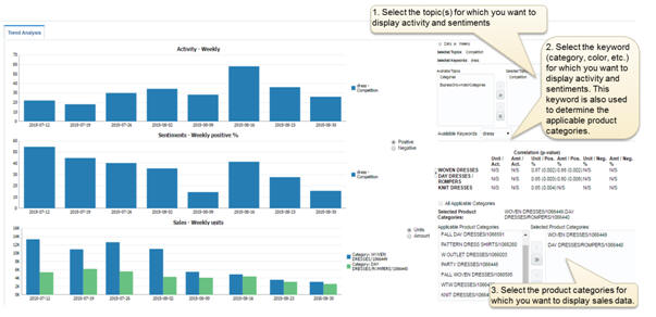
On the left side, there are three graphs that show the daily or weekly activity, sentiments, and sales trend. To switch between daily and weekly view, use the radio buttons on the top right of the screen.
The top graph shows the daily or weekly activity for the most recent eight weeks and for the topics(s) and keyword selected on the right side. For example, if you select the topic "competition" and select the keyword "dress", the graph will show number of daily or weekly conversations that match the filters defined for "competition" (in the SRM application) and also contain the keyword "dress".
The middle graph shows the daily or weekly percentage of positive and negative sentiments for the most recent eight weeks and for the topic(s) and keyword selected on the right side. To switch between positive and negative sentiments, use the radio buttons next to the graph.
The bottom graph shows the daily or weekly unit and amount of sales for each of the selected product categories on the right. Alternatively, you can display the aggregate sales over all applicable categories by checking the check box above the list of categories on the right. The applicable product categories displayed on the bottom right are determined based on the name of sub-classes within the category (that is, by looking for categories where the name of at least one sub-class matches the selected keyword).
To switch between unit and amount in the bottom graph, use the radio buttons next to the graph.
To update the graphs after selecting product categories, click Update Graphs on the bottom left.
Figure 9-1 shows the Trend Analysis tab and the three steps for specifying topics, keyword, and product categories.
Based on the selected product categories (for sales data) and selected topics (for social data), the correlation table on the right shows the correlation numbers between unit or amount of sales and activity or positive/negative sentiments. Large correlation numbers (close to 1) indicate that trends in sales numbers and social metrics are correlated (that is, they tend to go up and down together). For example, a strong correlation between activity for a specific color and sales units for a specific product category can be an indication that there is growing demand for that particular color.