Purpose
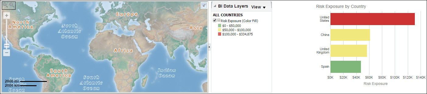
The map shows total risk exposure by country code.
Zoom in and out with the control on the left and hover over a country, state, or province to see specific information.
The bar graph shows a bar for each country showing Risk Exposure in dollars. Red bars denote a risk exposure greater than $100,000, yellow bars denote a risk exposure between $50,000 and $100,000, and green bars denote risk exposure less than $50,000.
The x-axis shows Risk Exposure. The y-axis shows country name.
Location
- On the Home page, click Dashboards.
- Under Primavera, select Main.
- On the Main dashboard, click the Risk page.
- On the Risk page, expand the Risk Exposure by Location section.
Subject Area
Project History