Purpose
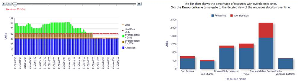
The bar chart shows how resource usage is distributed over time.
The x-axis shows calendar dates. The y-axis shows Units of time.
The solid horizontal line represents the allocation Limit; the dotted horizontal line represents the overallocation Limit Plus 25%. The green area represents time overallocated by more than 25%; the brown area represents time overallocated by less than 25%; the blue area represents time that is not overallocated. Hover over a bar for specific details. Use the slide to view the allocation for resources in a given quarter.
The stacked bar chart shows the remaining and overallocated units for a resource.
The x-axis shows Resource Name. The y-axis shows Units of time. Blue bands on the bar represent Remaining Units. Red bands represent Overallocation Units. Hover over a bar for specific details.
Location
- On the Home page, click Dashboards.
- Under Primavera, select Resource Analysis.
- On the Resource Analysis dashboard, click the Overview page.
- On the Overview page, expand the Resource Allocation section.
Subject Area
Resource Utilization