Purpose
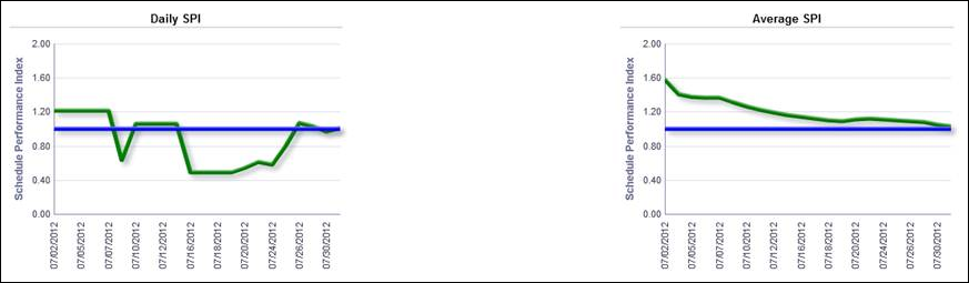
The Daily SPI and Average SPI line charts show the Schedule Performance Index (SPI) using a green line. The blue line shows the target (set at 1.0). The Average SPI is based on the cumulative average over time from the beginning of the chart. Once the chart exceeds 30 days, the average is of the 30 days prior to the data point.
The x-axis for both charts shows dates. The y-axis for both charts shows the SPI.
Location
- On the Home page, click Dashboards.
- Under Primavera, select Resource Analysis.
- On the Resource Analysis dashboard, click the Productivity page.
- On the Productivity page, expand the Daily vs. Average SPI by Resource section.
Subject Area
Activity