Purpose
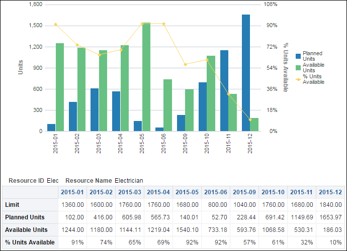
The line-bar chart provides availability data for the selected resource. If no resource is selected, the selection defaults to the first resource in the list. The chart shows:
- Bars for Planned Units and Available Units
- A line for the % Units Available (Available Units calculated as a percentage of Available plus Planned Units)
The x-axis shows dates broken into weeks. The y-axis for the bars, on the left, shows Units. The y-axis for the line, on the right, shows Percentage of Units Available.
The pivot table shows the same data as the line-bar chart. Rows show Available Units, Planned Units, and % Available. Columns show the date broken into weeks.
Location
- On the Home page, click Dashboards.
- Under Primavera, select Resource Analysis.
- On the Resource Analysis dashboard, click the Utilization page.
- On the Utilization page, expand the Resource Availability section.
Subject Area
Resource Utilization