Purpose
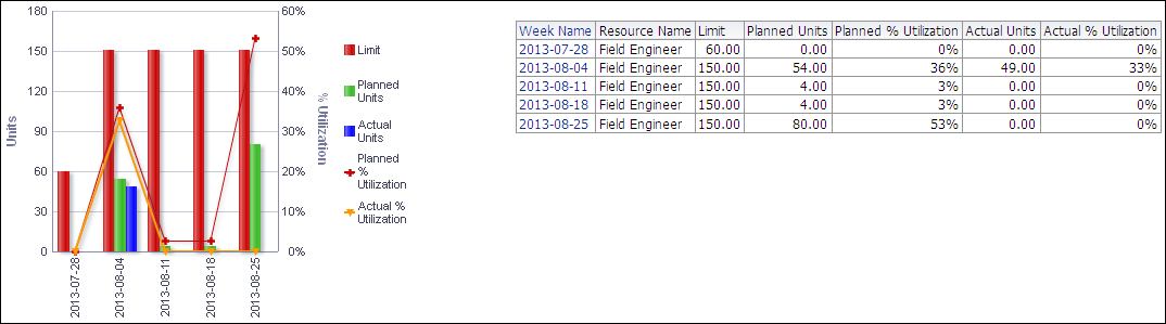
The line-bar chart breaks data down for the selected resource by week. If no resource is selected, the selection defaults to the first resource in the list. The line-bar chart shows:
- Bars for Limit, Planned Units, and Actual Units
- Lines for Planned % Utilization and Actual % Utilization
The x-axis shows dates broken into weeks. The y-axis for the bars, on the left, shows Units. The y-axis for the lines, on the right, shows Percent Utilization. Hover over a bar or a point on a line to see details.
The table breaks down the selected resource's data by week, showing columns for:
- Week Name
- Resource Name
- Limit
- Planned Units
- Planned % Utilization
- Actual Units
- Actual % Utilization
Click a week name to drill down to resource analysis information for that week.
Location
- On the Home page, click Dashboards.
- Under Primavera, select Resource Analysis.
- On the Resource Analysis dashboard, click the Utilization page.
- On the Utilization page, expand the Utilization section.
Subject Area
Resource Utilization