Purpose
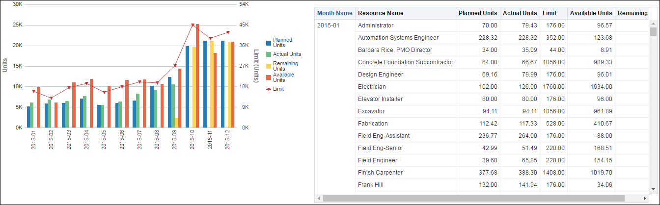
The line-bar chart breaks data for the selected resource down by month. The chart shows:
- Bars for Planned Units, Actual Units, Remaining Units, and Available Units
- A line for Limit
The x-axis shows months. The y-axis for the bars, on the left, shows Units. The y-axis for the line, on the right, shows Limit (Units). Hover over a bar or a point on a line for details.
The pivot table breaks data down by month then resource. For each resource, the pivot table contains columns for:
- Month Name
- Resource Name
- Planned Units
- Actual Units
- Limit
- Available Units
- Remaining Units
Use the up and down arrows below the table to navigate to other sections of the table. Use the double-ended arrow to view the whole table in one screen (to a maximum of 500 rows per page).
Location
- On the Home page, click Dashboards.
- Under Primavera, select Resource Analysis.
- On the Resource Analysis dashboard, click the Utilization page.
- On the Utilization page, expand the Capacity section.
Subject Area
Resource Assignment