Purpose
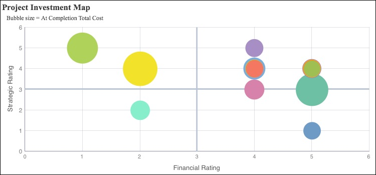
Product Investment Map Bubble Chart
The bubble chart plots projects according to their financial and strategic rating.
The x-axis shows Financial Rating. The y-axis shows Strategic Rating. Bubble size represents At Completion Total Cost, with a larger bubble representing a larger value. Bubble color is used only to differentiate between bubbles.
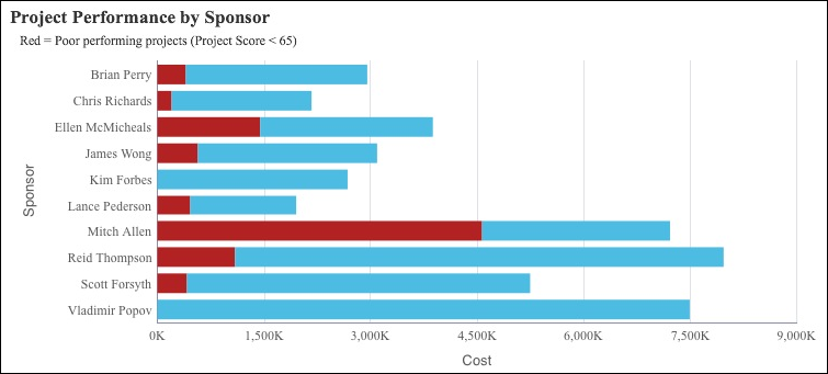
Project Performance by Sponsor Bar Chart
The stacked bar chart shows stacked bars plotting the At Completion Total Cost per sponsor. Each band on a bar represents a different project and bands are colored according to their project score, which is a measure of their performance. Blue bands represent projects with a project score of more than 65; red bands represent poorly performing projects with a project score of less than 65.
The x-axis shows investment Cost. The y-axis shows the project Sponsor.
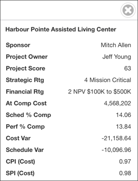
Portfolio Overview Sidebar
The sidebar shows detailed project information for the data point selected in either the Project Investment Map bubble chart or the Project Performance by Sponsor bar chart.
The columns shown are:
- Project Name
- Sponsor
- Project Owner
- Project Score
- Strategic Rating
- Financial Rating
- At Completion Total Cost
- Schedule % Completed
- Performance % Completed
- Cost Variance
- Schedule Variance
- CPI
- SPI
Location
- From the My Apps page, tap Tablet Apps.
- Tap Executive Dashboard - Tablet (Light).
- Tap
 Table of Contents.
 - Tap Portfolio: Overview.
Subject Area
Activity