Purpose
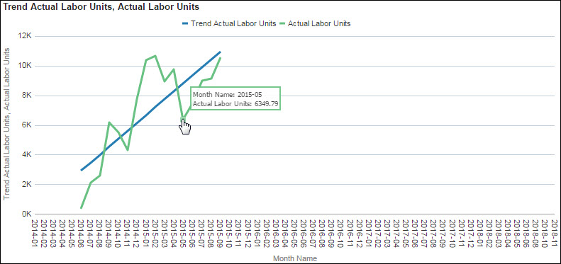
Use the line graph to display trendline details. The x-axis shows the month name. The blue y-axis shows trend actual labor units, and the green y-axis shows actual labor units. Click a point on either line to drill-down for more information about a particular month.
Location
- On the Home page, click Dashboards.
- Under Primavera, select More.
- On the More dashboard, click the Advanced Analytics page.
- On the Advanced Analytics page, expand the Trendline section.
Subject Area
Activity