Purpose
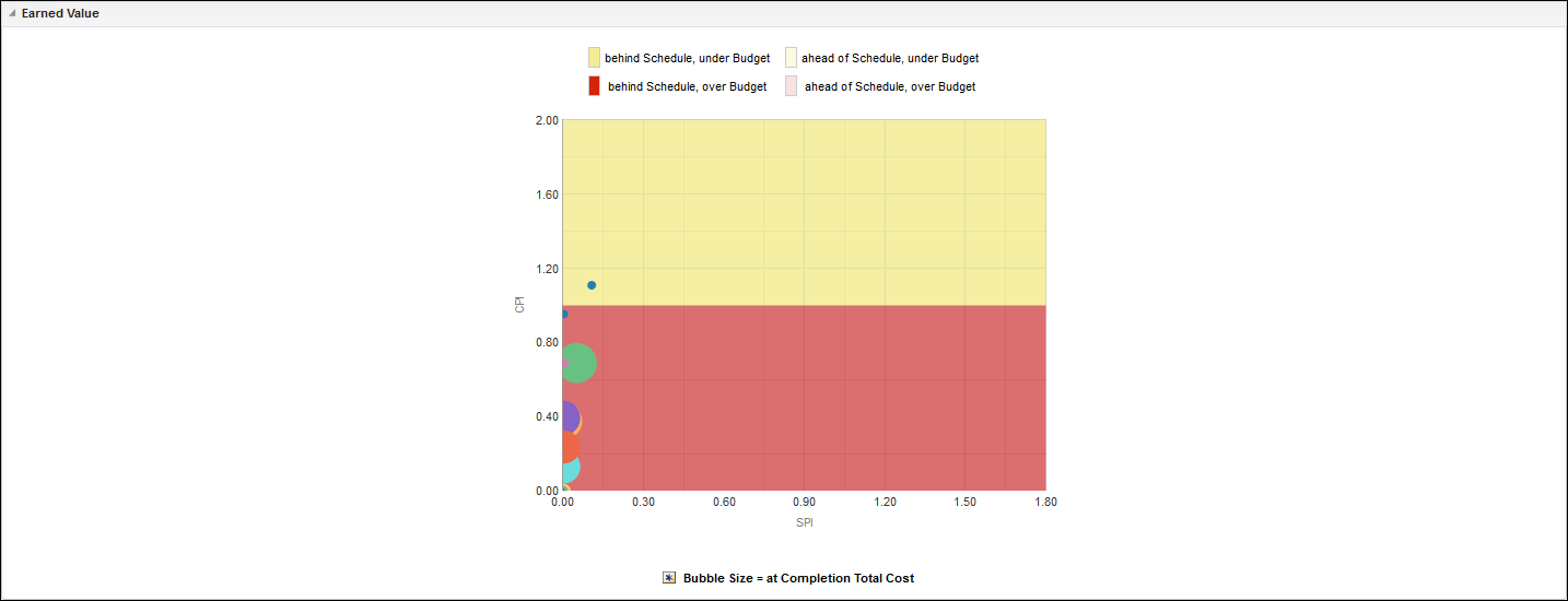
The bubble chart plots bubbles for projects according to their Cost Performance Index (Cost) and Schedule Performance Index (Cost). The location of each bubble in the chart will tell you whether the project it represents is under or over budget (above or below the horizontal center, respectively) and whether it is behind or ahead of schedule (left or right of the vertical center, respectively).
The x-axis shows Schedule Performance Index (Cost). The y-axis shows Cost Performance Index (Cost). Bubble size represents At Completion Total Cost, with larger bubbles representing larger values. Bubble color is used only to differentiate between bubbles. Hover over a bubble for specific details.
Location
- On the Home page, click Dashboards.
- Under Primavera, select Project Earned Value.
- On the Project Earned Value dashboard, click Unifier, and then click the CPI/SPI page.
- On the CPI/SPI page, expand the Earned Value section.
Subject Area
Activity