Pie Charts
A pie chart is a type of chart that compares the relative difference across categories. It divides a circle into segments that represents the percentage of the whole for each category. This topic includes examples of pie charts.
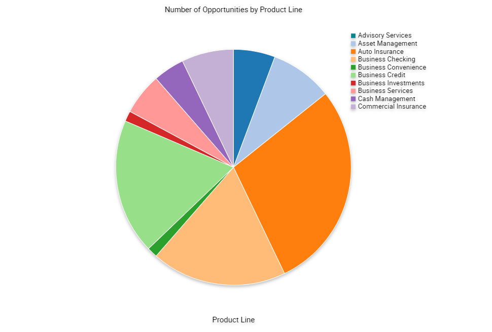
Two Dimensional Pie Chart
The following figure shows a two dimensional pie chart that aggregates data in the records according to category and displays each category as a separate segment in the pie chart.
-
The category constitutes the X-axis. It is the set of pie slices and corresponding labels.
-
The data points constitute the Y-axis. It determines the relative size of each pie slice as a percentage of the total.
You cannot define a series axis for a pie chart.