Understanding the Characteristics of Fluid Applications
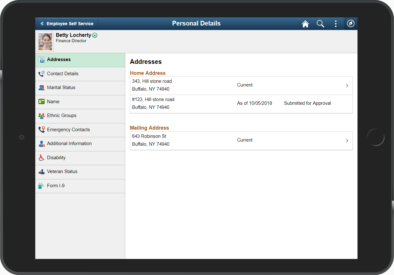
A PeopleSoft system recognizes the device used to access it, and renders fluid pages so that the application appears naturally, as expected by the user of a certain device type. For example, the following shows a PeopleSoft fluid application page appearing on a browser on a laptop or a tablet device.
Image: Fluid page
This example shows a fluid page displayed on a tablet in landscape mode.
If you access that same page using a cell phone and view it in landscape mode, it would appear similar to the following example.
Image: Fluid page on a smart phone in landscape mode
The following example shows how a fluid page may appear on a smart phone in landscape mode.
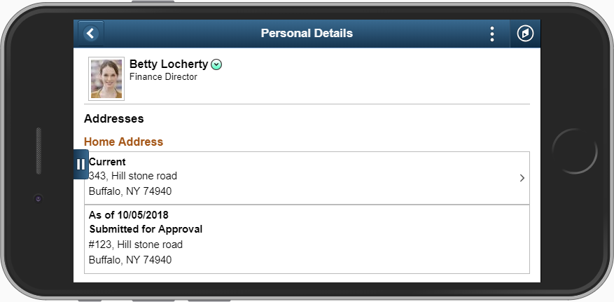
Notice that the page shrinks to fit the screen size of the device. The elements in the header are the same, only closer together, and the grid displays only the most critical columns. The user can use typical gestures, such as swiping (on homepages only), to scroll through the fluid page.
If you access the same page using a mobile phone and view it in portrait mode, you will notice additional changes as the page further adapts and responds to the adjusted screen display. The PeopleSoft Fluid User Interface is adaptive in that the system detects the device and generates the page rendering appropriate to that device, and it is responsive in that the CSS defined for the application responds to user actions on the client device, such as changing from portrait to landscape mode.
Note: The PeopleSoft Fluid User Interface adaptive qualities require a server trip, while the responsive qualities do not.
Image: Fluid page in portrait mode
The following example shows a fluid page displayed on a smart phone in portrait mode.
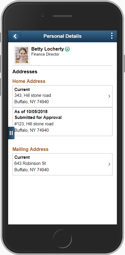
Notice that the system further shrinks the page, while maintaining the fundamental structure.