Working with Fluid Pages and Controls
The pages displayed by the PeopleSoft Fluid User Interface are designed to provide a simple, sleek look and feel, resembling many of the web applications used today on tablets and smart phones. In addition to the contemporary user interface, a fluid page can also display differently depending upon the device accessing it. For example, the same page can be accessed on a tablet or a smart phone, yet the page layout will be different for each device. On the tablet, more fields may appear, with more space between them, while on the smart phone less fields may appear, and the display will adjust to the smaller space available on the smart phone. Presented in this topic are some examples of the controls and the look and feel of PeopleSoft applications that have been designed for fluid user interface access.
When you use a mobile device to access your PeopleSoft applications, your interactions will differ from how you interact when using a browser on a desktop or laptop computer. In part, this is due to the gestures used to interact directly with the mobile device. In addition, this can be due to how PeopleSoft applications are displayed on mobile devices. Also note that in this context, Windows 8 laptops with touch screens are considered mobile devices since the Internet Explorer user agent running on these laptops identifies itself as a mobile device.
Mobile devices use an interface that enables you to use finger gestures to interact with the device and its applications. This table describes the common gestures that you use to interact with PeopleSoft applications on mobile devices.
|
Gesture |
Description |
Purpose |
|---|---|---|
|
Tap |
Quickly touch your finger to the display and release. |
Use to click a link or select a page control or item. |
|
Drag |
Touch, hold, and then slide your finger on the page. |
Use to scroll the page vertically, or pan the page horizontally. Note: The term scrolling indicates vertical movement, while the term panning indicates horizontal movement. |
|
Flick (or swipe) |
Place your finger on the screen and quickly swipe it in the desired direction. |
Use to scroll or pan quickly. On a fluid homepage, swipe left or right to move through your available homepages. |
|
Two-finger drag |
Touch and hold two fingers to the display, and then slide both fingers. |
Use to scroll through scrollable grid rows, to pan through scrollable grid columns, or to scroll through content in an element with overflow capability (such as a long edit box in a grid). |
|
Double-tap |
Quickly tap and release your finger two times. |
Use to zoom quickly in on a section of the page and to zoom out if you are zoomed in currently. |
|
Pinch open |
Touch two fingers to the page then, spread the fingers apart. |
Use to zoom in. |
|
Pinch close |
Touch two fingers to the page then, bring the fingers together. |
Use to zoom out. |
The fluid banner is displayed on every fluid application page and contains many of the same controls displayed on fluid homepages. However, the controls displayed within the fluid banner can vary from component to component, depending on component settings, system settings, where you navigated from, and so on.
Note: Classic pages also display a fluid-like portal header with similar buttons and controls. This fluid-like portal header creates a consistent look and feel between classic and fluid applications.
Image: Fluid page with the fluid banner
This example illustrates the fluid banner on a fluid application page. You can find definitions for the fields and controls in the banner later on this page.
|
Field or Control |
Definition |
|---|---|
 |
Back button. Use to navigate back to the previously visited component, homepage, activity guide, navigation collection, or WorkCenter. The label on the Back button varies to indicate the item to which you will return (in this example, to the Employee Self Service homepage). See Using the Back Button. |
 |
Page title (display only). There is no action associated with clicking the page title. |
 |
Home button. Use to return to the system-defined default homepage, which is the homepage that you arrive at immediately upon signon. |
 |
Search button. Use to perform global searches. See Working with Global Search. |
 |
Notifications button (without a numeric badge). Use to display the Notification window showing any pending actions or alerts. See Using the Notification Window. |
 |
Actions button. Use to display the Actions menu. See Using the Actions Menu. |
 |
Navigation bar button. Use to display the navigation bar (NavBar). See Working with the NavBar. |
The Back button is displayed on the left side of the fluid banner (or the left side of the fluid-like portal header on classic pages). Use the Back button to navigate back to the previously visited item (for example, component, homepage, activity guide, navigation collection, or WorkCenter). The label on the Back button varies to indicate the item to which you will return.
Warning! In PeopleSoft applications, never perform back navigation using the browser’s or your smart phone’s back button. You will bypass standard component processing causing data loss, corrupt the navigation history stack used by the Back button, and possibly cause other processing errors.
Standard Behavior
The navigation history stack tracks navigation from component to component, including navigation from standard components, homepages, dashboards, activity guides, navigation collections, classic WorkCenters, and MAP applications. When you navigate from one of these items, the Back button will be labeled appropriately and will point back to that item. However, page transfers within a component are not tracked in the navigation history stack, unless overridden by the application developer.
In screen reader mode,
the aria-label attribute for the Back button is: Back to Back_button_label.
Note: Application developers can override the default Back button behavior (for example, specifying a custom Back button label or indicating that a specific transfer is to be ignored) using the SetTransferAttributes PeopleCode function, which alters the entries written to the navigation history stack. In addition, component property settings or the SetTransferAttributes function can be used to enable tracking of page-to-page transfers within a component.
When the Back Button Is Not Displayed
The Back button is not displayed on:
Fluid homepages, classic homepages, and classic dashboards. Navigating to any of these items is considered a navigation reset, and the navigation history stack is cleared.
Fluid activity guides. Instead, an Exit button is displayed, which allows you to exit the activity guide and return to the item visited before entering the activity guide.
Any component in which the Back button has been disabled in the component’s properties.
Any page displayed in a new browser window or tab, either as the result of clicking the New Window link or as the result of a PeopleCode program. This new window has a separate session and navigation history stack.
Similarly, any other initial content displayed to you (for example, as the result of clicking a link in an email or any other link to a component that requires you to login first).
The Back Button Within Two-Panel Items Constructs
Note: While the pagelet area and target content area of classic WorkCenters and classic activity guides are not “panels” strictly speaking, they function much in the same way as their fluid counterparts. For the purposes of this discussion of the Back button, classic WorkCenters and classic activity guides will be referred to as “two-panel constructs.”
When you access content that is displayed in any type of two-panel construct (classic WorkCenters, classic activity guides, fluid navigation collections, master/detail components, or 8.54 implementations of a two-panel fluid component), the Back button points to the item visited prior to accessing the two-panel construct. When you select a link from the left panel, the content is replaced in the right panel. However, the Back button is not affected and still points to the item visited prior to accessing the two-panel construct. When you navigate out of the two-panel construct, then the Back button points back to the two-panel construct. Clicking the Back button at this point will return you to the two-panel construct in its initial state—that is, you do not return to the last item visited within the two-panel construct.
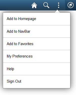
Press the Actions button to reveal the Actions menu, which contains actions users can make based on their location in the application.
Image: Actions menu from a fluid homepage
This example illustrates the options appearing on the Actions menu while accessing a fluid homepage. Descriptions of the options follow the examples.
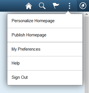
Image: Actions menu from a fluid page
This example illustrates the options appearing on the Actions menu while accessing a fluid application page.
|
Field or Control |
Definition |
|---|---|
| Personalize Homepage |
Enables the user to personalize the fluid homepage experience, which can include:
|
| My Preferences |
Takes you to the My Preferences interface, where you can modify settings that control a variety options in the PeopleSoft system based on your preferences. See Defining User Preferences. |
| Add To Homepage |
Adds an ad hoc tile to the selected fluid homepage, enabling you to access the page directly from that homepage. See “Adding Ad Hoc Tiles to Fluid Homepages” in Managing Tiles on Fluid Homepages and Dashboards. Add To links enable you to personalize application navigation by adding access to any fluid or classic page as needed for your user experience. When you add an ad hoc tile to a homepage or the NavBar, or when you add a favorite, you can edit and personalize the label for the item. Note: SmartNavigation pages cannot be added to a fluid homepage, to the NavBar, or to the Favorites list. |
| Add To NavBar |
Adds an ad hoc tile to the left-hand side of the NavBar, enabling you to access to that page directly from the NavBar. See “Adding Ad Hoc Tiles to the NavBar” in Working with the NavBar. Add To links enable you to personalize application navigation by adding access to any fluid or classic page as needed for your user experience. When you add an ad hoc tile to a homepage or the NavBar, or when you add a favorite, you can edit and personalize the label for the item. Note: SmartNavigation pages cannot be added to a fluid homepage, to the NavBar, or to the Favorites list. |
| Add To Favorites |
Adds a link to the My Favorites section of the NavBar, as well as the Favorites menu folder available from a classic homepage. See Working with Favorites. Add To links enable you to personalize application navigation by adding access to any fluid or classic page as needed for your user experience. When you add an ad hoc tile to a homepage or the NavBar, or when you add a favorite, you can edit and personalize the label for the item. Note: SmartNavigation pages cannot be added to a fluid homepage, to the NavBar, or to the Favorites list. |
| Help |
If the Help option is enabled for the current component or homepage, the Help link appears in the Actions menu. Selecting Help takes you to the section in PeopleSoft Online Help for the current component or homepage. |
| Sign Out |
Signs you out of the system, returning them to the PeopleSoft sign-in page. |
After clicking the NavBar button, the NavBar side page appears. Use this page to access additional navigational options.
Image: NavBar When First Selected
This example illustrates how the NavBar (Navigation Bar) appears after it is first selected. It hugs the right side of the interface, displaying the available options. These options will be discussed in the following sections.
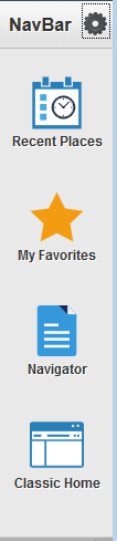
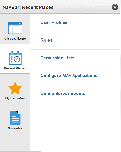
Recent Places
Image: Navigation Bar: Recent Places
This example illustrates selecting Recent Places. This option displays for you the five most recent places in the application you have been. Using this subset of links enables you to choose quickly the application pages you are currently using frequently.
My Favorites
Navigator
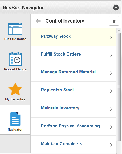
Displays the traditional menu structure as the user would see when accessing PeopleSoft in classic mode and using the Main Menu.
Image: Navigator
This example illustrates using Navigator. You can navigate through the set of links just as you would using the Main Menu using classic PeopleSoft applications in the same order.
|
Field or Control |
Definition |
|---|---|
 |
Use this button to navigate back up one level in the Navigator (for example, Back). |
 |
Use this button to navigate back to the top level in the Navigator (for example, Back to Top). |
Personalizing the NavBar
|
Field or Control |
Definition |
|---|---|
 |
Use to add tiles to the NavBar or remove tiles from the NavBar. These would be NavBar tiles, whereas those appearing on the homepage are homepage tiles. You can also change the sequence of the tiles appearing in the left pane. See the following section. |
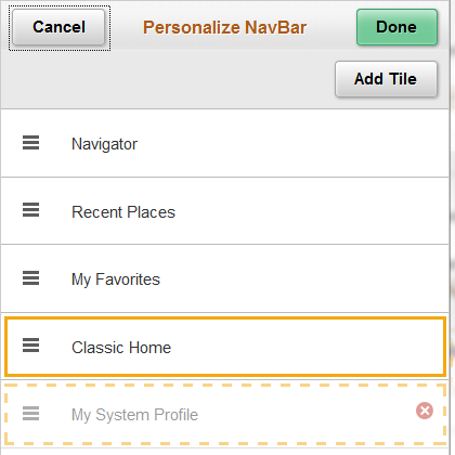
Image: Personalize NavBar Dialog Box
This example illustrates the options available for personalizing the NavBar. Descriptions of the options appear after the example.
|
Field or Control |
Definition |
|---|---|
| Cancel |
Cancel the current selections and close the dialog box. |
| Done |
Save your personalization selections and close the dialog box. |
| Add Tile |
Add a tile to the left pane of the NavBar. For more details on selecting tiles, see Managing Tiles on Fluid Homepages and Dashboards. |
You can alter the sequence in which the tiles appear in the left pane using drag and drop. Press the tile icon and drag it to the desired position, then release. The dotted line indicates the tile you are dragging, and the solid line indicates the location where you are dropping the tile.
To remove a tile you’ve added to the NavBar, press the Delete <link name> icon (red circle with a white ‘x' inside). You can only remove links you have added.
Classic Home
Selecting Classic Home takes you to your default classic homepage.
Note: This tile is labelled Classic Home when the default system homepage is defined as fluid. However, this tile is labelled Fluid Home only when the default system homepage is defined as classic. In that case, selecting Fluid Home takes you to your default fluid homepage.
Important! When a classic content reference is selected as the default custom homepage tab by your system administrators or through user personalization, you must add the Homepages tile to the NavBar in order to be able to navigate to any fluid homepages.
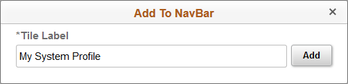
Adding Ad Hoc Tiles to the NavBar
You can also add ad hoc tiles to the NavBar using the Add To NavBar link in the Actions menu. No actual tile definition will be created for ad hoc tiles. The information is stored in the system as personalization data only.
Image: Add To NavBar dialog box
When you add an ad hoc tile to the NavBar, you can edit and personalize the label for the item. For example:
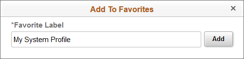
In the Actions menu, click the Add to Favorites link to add the current page as a favorite.
Image: Add To Favorites dialog box
When you add a favorite, you can edit and personalize the label for the item. For example:
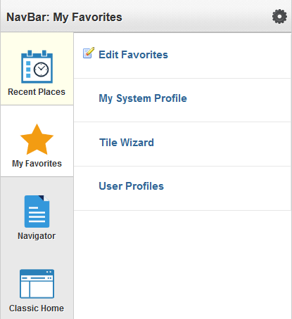
In the NavBar, click the My Favorites tile to display your list of favorite pages.
Image: My Favorites
This example illustrates links added to My Favorites:
Click the Edit Favorites link to access the Edit Favorites page. On the Edit Favorites page you can re-label favorites, delete favorites, or modify the sequence in which they appear under My Favorites.
Image: Edit Favorites page
This example illustrates the fields and controls on the Edit Favorites page.
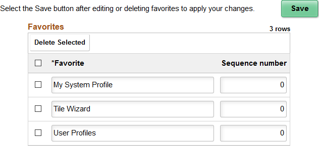
The Edit Favorites page displays a grid with the favorites that you’ve added and their sequence numbers.
Image: Fluid Lookup page
This example illustrates the contemporary look and feel of the controls on a fluid lookup page.
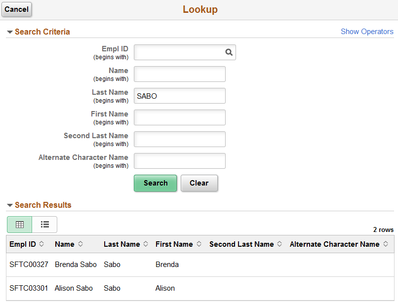
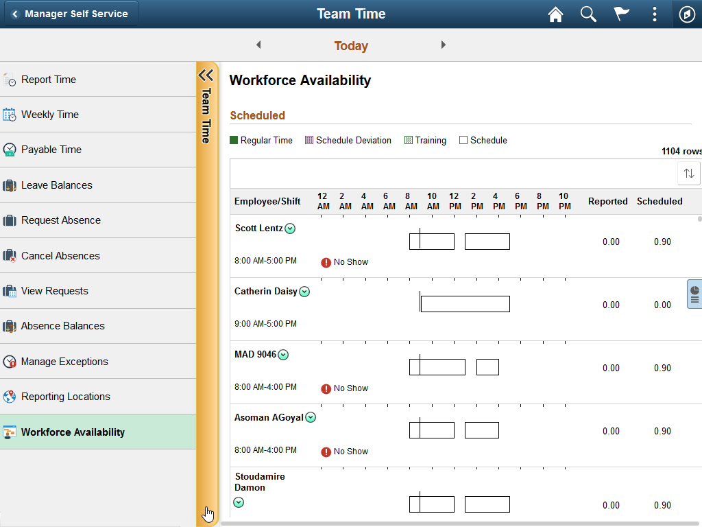
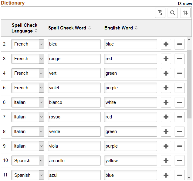
Image: Fluid grid example
This example illustrates the appearance of a grid on a fluid page.
|
Field or Control |
Definition |
|---|---|
 |
Displays the title of the grid. |
 |
Displays the total number of rows in the grid on the server, not the current number of rows displayed or available in the browser. |
 |
Download to Excel button. Click to download the grid contents to an Excel spreadsheet (ps.xls). |
 |
Find button. The find feature looks for matches in edit boxes, display-only fields, disabled or shaded fields, dynamic links, and text in long edit boxes. It does not find column headings, field labels, text values on icons, static links, and hidden fields. It also does not search HTML areas that are on the grid or scroll area. See Finding Data for more information. |
  |
Sort button. Click to display the Sort pop-up menu. When the default sort is in effect, the button background color is white; when a user sort is in effect, the button background color is green. |
| Grid Column Heading |
Click a grid column heading to sort or resort the grid data. An up or down arrow indicates the direction of the active sort. Note: Sorting is disabled on columns consisting of radio button fields. |
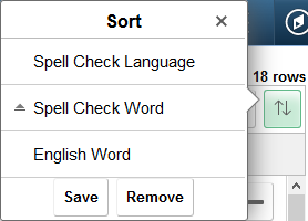
Sorting and Personalizing a Grid
Image: Sort pop-up menu
This example illustrates the fields and controls on the Sort pop-up menu when grid personalization has been enabled. You can find definitions for the fields and controls later on this page.
|
Field or Control |
Definition |
|---|---|
| Grid Column Heading |
Click a grid column heading to sort or resort the grid data. An up or down arrow indicates the direction of the active sort. Note: Sorting is disabled on columns consisting of radio button fields. |
| Save |
Note: The Save button is available only when personalization has been enabled for the grid. The Save button is displayed only after a user sort is in effect. Click the Save button to save a user sort. |
| Remove |
Note: The Remove button is available only when personalization has been enabled for the grid. The Remove button is displayed only after a user sort has been saved. Click the Remove button to remove a saved user sort. |
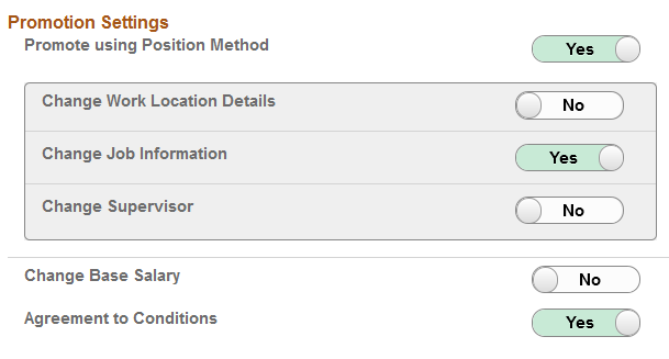
Image: Toggle Switches
This example illustrates the use of contemporary controls widely used in modern web applications, specifically the toggle switch to indicate Yes/No values by tapping on the control.
The “slide-out” left panel is a feature that enables you to reveal the left panel of an outer, fluid wrapper (master/detail component, fluid activity guide, or fluid navigation collection) when the currently displayed component includes its own left panel.
Image: Inner component without a left panel (slide-out left panel not in effect)
When the slide-out left panel is enabled and an inner component without its own left panel is displayed, the left panel of the outer, fluid wrapper is displayed normally; there is no need for a slide-out left panel.
Image: Slide-out left panel in a closed state
When the slide-out left panel is enabled and an inner component with its own left panel is displayed, the left panel of the outer, fluid wrapper is initially minimized as shown in the following example. The navigation links displayed are those from the inner component:
Image: Slide-out left panel in an open state
Clicking anywhere on the tab divider (labeled Detail, in this example) will slide open the left panel of the outer, fluid wrapper. The navigation links displayed are those from the outer, fluid wrapper: