Using the Chart Class
Use the Chart class to create charts that display data series in several common formats, including bar charts, line charts, pie charts, and others.
This section provides an overview of Chart class terms and discusses how to use various Chart classes.
The following is a list of Chart class terms and their descriptions:
|
Field or Control |
Definition |
|---|---|
| Label |
Text that identifies the data on one of the axes. |
| Legend |
Text that identifies the different series in the chart. |
| Series |
A grouping of related information. For example, if you were tracking sales for several divisions over many years, each division could be a series. Generally, every series in a chart has a distinct color. You can have more than one series in a chart for comparison. Each line in a line chart represents one series. |
| Title |
The three titles are main, x-axis, and y-axis. Each title identifies a portion of the chart. |
| Subtitle |
The subtitle appears to the left of the main title. |
| Footnote |
The footnote appears at the bottom left of the chart. |
| X-axis |
The axis that data is measured against. |
| Y-axis |
The axis that contains the data. In most charts, this is the vertical axis. In a horizontal bar chart, this is the horizontal axis. |
| Secondary y-axis |
A secondary y-axis (or Y2 axis) is one that contains data that differs from the primary y-axis but is measured against the same x-axis data and plotted on the same chart as the primary y-axis data. |
| Reference area |
A reference area is displayed in conjunction with a chart as a band of color drawn based on numeric values along a chart axis. For each band of color, you would create a separate instance of the ReferenceArea class. |
| Reference line |
A reference line is displayed in conjunction with a chart as a colored line drawn based on a numeric value along a chart axis. For each line, you would create a separate instance of the ReferenceLine class |
| Series |
A series is a set of data grouped together based on a common attribute and most often is plotted on the y-axis. In PeopleSoft applications, chart data series are a grouping of related information. For example, if you were tracking sales for several divisions over many years, each division could represent a series. Generally, every series in a chart has a distinct color and you can have more than one series in a chart for comparison.. |
| Tooltip |
A tooltip is a message that appears when the cursor is positioned over a data point, legend or other element in a chart. The tooltip provides more information about the item of interest. While default tooltips are generated automatically, the ToolTipLabel class and the SetDataHints method provide two alternative methodologies for generating custom tooltips. |
You can specify a rowset and have it graphed using a chart object with minimal PeopleCode. Within this rowset, one column must contain data for the x-axis and another column must contain data for the y-axis. If more than one series of data is used, an additional column is required for each series. You can also set color and data hint text for each point in this rowset using additional columns.
The following distinguishable types of data can be included in a chart:
Primary data.
Secondary data.
For a conceptual overview, a chart is easier to view in parts; however, these parts do not represent sub-objects. A chart contains the following major parts:
X-axis.
Y-axis.
Legend.
Data .
Title.
Subtitle.
Footnote
The x- and y-axes have access to titles and labels associated with their data.
The following chart types are available for the Chart class:
Bar.
Bubble.
Funnel.
Histogram.
Horizontal bar.
Horizontal percent bar.
Horizontal stacked bar.
Line.
Percent bar.
Pie.
Ring.
Scatter.
Stacked bar.
These topics provide an overview of how charts represent data and discuss:
Charting numeric data sets.
Determining the appropriate chart type.
Setting chart colors.
Setting chart legends.
Understanding How Charts Represent Data
PeopleSoft charts are an alternative means of visualizing tabular data.
For example, here is an example data table (with column headings):
|
Product |
Color |
Created In |
Applied in Month |
Salesperson |
Chart Height* |
Units* |
Revenue* |
|---|---|---|---|---|---|---|---|
|
Bicycle |
Red |
2012 |
01 |
Terry |
72 |
5 |
360 |
|
Tricycle |
Blue |
2012 |
01 |
Jim |
84 |
3 |
600 |
|
Unicycle |
Silver |
2012 |
02 |
Terry |
72 |
1 |
150 |
* Numeric data
Some of the columns carry numeric measures (in our example, Units, Revenue, and Chart Height in Inches) and other columns have values that describe the data (for example, Product, Color, Month, Year, and Salesperson). Some of the data columns are numeric; others are not.
To create a chart you need to determine which fields you want to see in the chart. Then, you pass those into certain Chart class methods:
SetDataXAxis.
SetDataYAxis.
SetDataSeries.
SetDataZAxis
SetFunnelDataActual (for funnel charts only).
SetFunnelDataTarget (for funnel charts only).
Each of these methods takes RECORD.FIELD as a parameter. In addition, SetDataYAxis can take multiple RECORD.FIELD parameters.
Charting Numeric Data Sets
These sections discuss:
Charting one set of numeric data.
Charting two sets of numeric data.
Charting three sets of numeric data.
Charting One Set of Numeric Data
In general, you pass a field with numeric data to SetDataYAxis and a field with non-numeric data to SetDataXAxis. These two methods are required.
Here’s a simple example. Suppose you want to show revenue by product as a chart. Essentially, this is the rowset that you’ll be working with, a subset of the rowset introduced previously:
|
Product |
Revenue* |
|---|---|
|
Product |
Revenue* |
|
Bicycle |
360 |
|
Tricycle |
600 |
|
Unicycle |
150 |
* Numeric data
In this case, choose the Revenue field to be passed to SetDataYAxis and the Product field to be passed to SetDataXAxis.
Image: A pie chart showing product sales data
If you choose to display this as a pie chart, you end up with this:
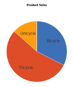
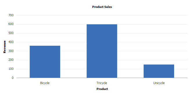
Image: A bar chart showing product sales data
Or, you could display the data as a bar chart:
Alternatively, you could display the data with any chart type that can display one dimension of data, such as a horizontal bar, a line, a histogram, or other chart type.
What if you also wanted to show the same information but with additional month information? The table of data that you would be interested in is:
|
Product |
Month |
Revenue* |
|---|---|---|
|
Bicycle |
01 |
360 |
|
Tricycle |
01 |
600 |
|
Unicycle |
02 |
150 |
* Numeric data
In that case, choose the Revenue field to be passed to SetDataYAxis , the Product field to be passed to SetDataXAxis , and the month field to be passed to SetDataSeries.
Image: A bar chart showing product sales data by month
You would need to use a chart type that can display two dimensions along with the data. This rules out the pie chart, but you can still use a bar chart:
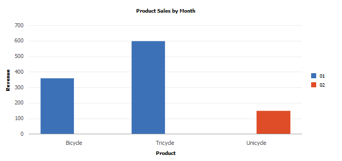
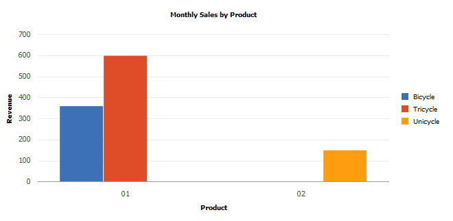
Image: A bar chart showing monthly sales data by product
To get a different view of the same data, you can change the method assignments, so that Month is passed in SetDataXAxis and Product is passed in SetDataSeries . The chart that results is this:
Charting Two Sets of Numeric Data
The following chart types allow you to plot two sets of numeric data:
Scatter chart
Line chart
Histogram
Funnel chart
Overlay chart
The scatter and line charts let you plot one set of numeric data vertically along the y-axis and one set of data horizontally along the x-axis.
The funnel chart lets you plot both sets of numeric data vertically on the y-axis.
Here’s an example of a scatter chart representing the following table of data:
|
Tenure* |
Salary* |
|---|---|
|
11 |
88000 |
|
12.2 |
96200 |
|
4.6 |
101300 |
|
6.6 |
83000 |
|
14 |
111200 |
|
8.5 |
118000 |
* Numeric data
Image: Scatter chart
This example illustrates the scatter chart for the preceding data:
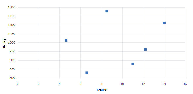
You can also use a line chart to represent the same data. Whereas the scatter chart requires both x- and y-axes to be numeric, the line chart x-axis can be either numeric or non-numeric.
In a funnel chart one set of data is specified using the SetFunnelDataActual method and the other set of data is specified using the SetFunnelDataTarget method.
Image: Funnel chart
Here’s an example of a funnel chart that graphs two sets of data, a target amount and an actual amount:
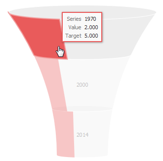
For funnel charts, these additional considerations apply:
SetData and SetDataXAxis are required.
SetFunnelChartDataActual can be used instead of SetDataYAxis; either are valid.
SetFunnelChartDataTarget is optional. When used, SetFunnelChartDataTarget must specify the same record as SetFunnelChartDataActual.
Note: Legends are not available for funnel charts. The use of Chart class methods and properties for legends has no effect on a funnel chart.
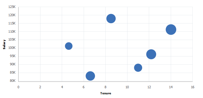
Charting Three Sets of Numeric Data
You can use the bubble chart to display three sets of numeric data. The first two sets are along the x- and y-axes just as if you were plotting two sets of numeric data. The third set of numeric data is displayed as the size of the bubble positioned at the (x,y) coordinate in the chart and is set by passing the field in the SetDataZAxis method.
Using the same data as the previous scatter chart example, a third column of numeric data (Age) is included:
|
Tenure* |
Salary* |
Age* |
Name |
|---|---|---|---|
|
11 |
88000 |
39 |
Joyce |
|
12.2 |
96200 |
55 |
Tolstoy |
|
4.6 |
101300 |
32 |
Shelley |
|
6.6 |
83000 |
48 |
Tolkien |
|
14 |
111200 |
59 |
Dickens |
|
8.5 |
118000 |
49 |
Hemingway |
* Numeric data
Image: Bubble chart
This example illustrates the bubble chart for the preceding data:
Determining the Appropriate Chart Type
Use the following procedures to determine the chart types that are appropriate for your data set:
One set of numeric data.
Two sets of numeric data.
Three sets of numeric data.
Care should be taken when using the line chart with non-numeric data on the x-axis. You should only use it when the data along the x-axis suggests some sort of progression. For example, using a line chart when the x-axis represents a sequence of months is appropriate; using a line chart when the x-axis represents a list of people in alphabetical order probably is not.
Image: Flowchart for determining the appropriate chart types
Use the following flowchart to determine which chart types are appropriate to your data. In addition, the flowchart visually presents the methods and properties to use with your chart:
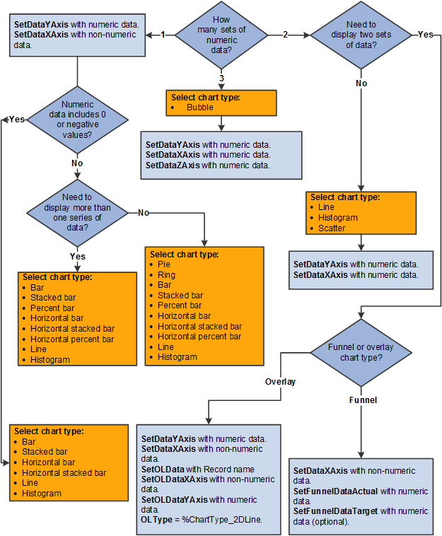
Determining the Chart Type for One Set of Numeric Data
Use the following procedure to determine the chart type and methods and properties to use for one set of numeric data:
Use the following flowchart to determine which chart types are appropriate to your data. In addition, the flowchart visually presents the methods and properties to use with your chart:
Pass numeric data to SetDataYAxis.
Pass non-numeric data to SetDataXAxis.
Does the numeric data include 0 or negative values? If yes, finish by selecting one of these appropriate chart types:
Bar
Stacked bar
Horizontal bar
Horizontal stacked bar
Line
Histogram
Note: Negative values cannot be displayed in any type of percent bar chart.
Otherwise, do you need to display more than one series of data? If no, finish by selecting one of these appropriate chart types:
Pie
Ring
Bar
Stacked bar
Percent bar
Horizontal bar
Horizontal stacked bar
Horizontal percent bar
Line
Histogram
Otherwise, select one of these appropriate chart types:
Bar
Stacked bar
Percent bar
Horizontal bar
Horizontal stacked bar
Horizontal percent bar
Line
Histogram
Determining the Chart Type for Two Sets of Numeric Data
Use the following procedure to determine the chart type and methods and properties to use for two sets of numeric data:
Do you have other non-numeric data to display? If no, complete steps 2 and 3:
Select one of these appropriate chart types:
Line.
Histogram.
Scatter.
Funnel (with both actual and target data).
Overlay.
Use these methods and properties for scatter, line, and histogram charts:
Pass numeric data to SetDataYAxis.
Pass numeric data to SetDataXAxis.
Otherwise, if you need to display more than one series of data in a funnel chart, complete the following:
Pass the non-numeric data to SetDataXAxis.
Pass numeric data to SetFunnelDataActual. (Alternatively, pass the numeric data to SetDataYAxis).
(Optional) Pass numeric data to SetFunnelDataTarget.
Determining the Chart Type for Three Sets of Numeric Data
Use the following procedure to determine the chart type and methods and properties to use for three sets of numeric data:
Select the appropriate chart type: Bubble.
Pass numeric data to SetDataYAxis.
Pass numeric data to SetDataXAxis.
Pass numeric data to SetDataZAxis.
Setting Chart Colors
Chart colors are determined in the following ways:
Automatically.
By using the SetColorArray method to specify an array of color choices.
By using the SetDataColor method to specify a field on a record that holds a color value.
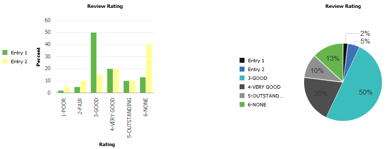
Automatic color determination occurs when neither of the other two methods is used. For all charts except pie charts, each data series is assigned a color; all data points within a series share that color. For pie charts each data point is assigned its own color. In that way it’s easier to distinguish pie segments from one another. Here is an example of the base data that will be charted:
|
Year |
Review Rating |
Percent |
Color |
|---|---|---|---|
|
2011 |
1-POOR |
2.00 |
0 |
|
2011 |
2-FAIR |
5.00 |
1 |
|
2011 |
3-GOOD |
50.00 |
2 |
|
2011 |
4-VERY GOOD |
20.00 |
3 |
|
2011 |
5-OUTSTANDING |
10.00 |
4 |
|
2011 |
6-NONE |
13.00 |
5 |
|
2012 |
1-POOR |
5.00 |
6 |
|
2012 |
2-FAIR |
10.00 |
7 |
|
2012 |
3-GOOD |
15.00 |
8 |
|
2012 |
4-VERY GOOD |
20.00 |
9 |
|
2012 |
5-OUTSTANDING |
10.00 |
10 |
|
2012 |
6-NONE |
40.00 |
11 |
The Review Rating field is assigned to the x-axis, Percent is assigned to the y-axis, and Year is assigned to the data series:
&cChart.SetData(Record.CJY_RVW_DSTRBTN);
&cChart.SetDataXAxis(CJY_RVW_DSTRBTN.CJY_RVW_RTG);
&cChart.SetDataYAxis(CJY_RVW_DSTRBTN.CJY_DSTRBTN_PCT);
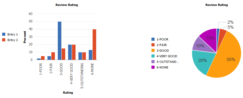
&cChart.SetDataSeries(CJY_RVW_DSTRBTN.CJY_YR);Note: In the following examples, because pie charts can display one series of numeric data only, the pie charts reflect data from the first six rows only (the first data series). The bar charts reflect both series of data.
Image: Bar and pie charts using automatic color generation
Automatic color generation results in the following bar and pie charts:
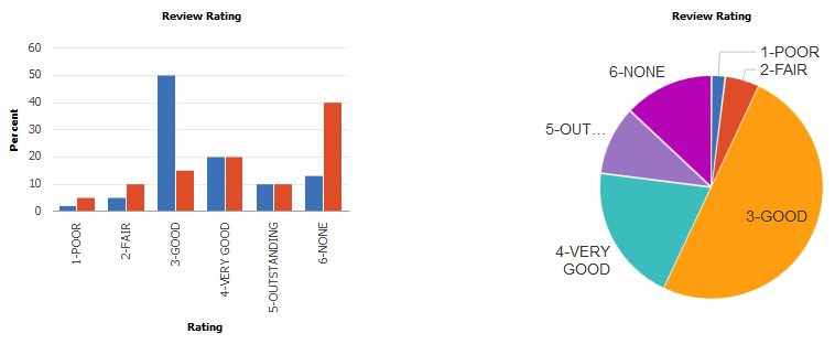
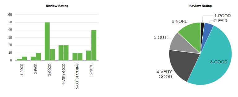
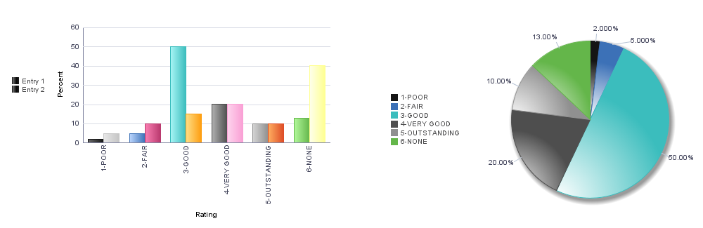
SetColorArray allows you to create an array of color values in PeopleCode and pass that to the charting engine for use in rendering the chart. It works the same way as using automatic color assignment, except that it allows you to pass in a color sequence that differs from the style sheet’s default sequence. For bar charts, each data series is assigned a color; all data points within a series share that color. In the preceding example, all data for the year 2011 is displayed in blue bars; for the year 2012, in red bars. For pie charts each data point is assigned its own color.
Using the same data as before, the SetColorArray method can be used to specify a color array:
&clr_array = CreateArray(%ChartColor_Black,%ChartColor_Blue,%ChartColor_Cyan,%ChartColor_DarkGray,%ChartColor_Gray, %ChartColor_Green);

rem The preceding is equivalent to CreateArray(0,1,2,3,4,5);

&cChart.SetColorArray(&clr_array);
Image: Bar and pie charts using the specified color array
Specifying the color array results in these charts:
SetDataColor works a bit differently from SetColorArray. By using the value of a record field, SetDataColor provides more granular control of bar chart colors, in that you can vary bar color data point by data point and not by the higher level data series:
&cChart.SetDataColor(CJY_RVW_DSTRBTN.CJY_COLOR);Image: Bar and pie charts using the specified data color values
Note that in the preceding data grid, each row of data also includes a color value. The charts that result are:
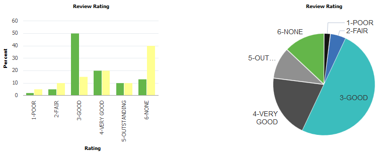
If both SetColorArray and SetDataColor are set for a chart, SetDataColor takes precedence and SetColorArray is ignored.
Setting Chart Legends
The chart property HasLegend must be set to true for a legend to appear.
&cChart.HasLegend = True;Legend entries are determined in two ways:
Automatically
By using the SetLegend method to specify an array of legend entries
Image: Bar and pie charts using automatic legend generation
Here are charts that have automatically generated legend entries:
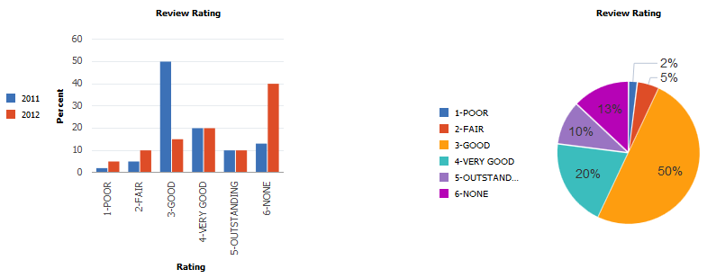
The default position for the legend is to the left of the chart. Set the chart property LegendPosition to move the legend to other locations next to the chart.
A legend entry provides a text description that explains what a color in the chart represents. The colors in the legend are sequenced in the same order as the data and colors are sequenced in the chart.
In all chart types except pie charts, the default legend entries describe the data series. In a pie chart, the default legend entries describe the data points (that is, the pie segments). In a pie chart if you have a legend, each pie chart segment is automatically labeled with the percentage it contributes to the whole.
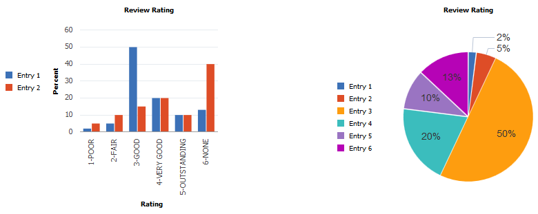
If you use SetLegend to create legend entries, as an application developer you must ensure that the number of entries in the legend array matches exactly the number of data points that appear in your chart.
&LegendArray = CreateArray("Entry 1", "Entry 2");
&cChart.SetLegend(&LegendArray);
Image: Bar and pie charts using the specified legend array
These charts use the specified legend array:
Note that in the case of the pie chart, there were not enough legend entries in the array to account for all the segments in the pie chart. Therefore, for the pie chart, the default legend was used.
If the number of entries in the array is increased to match the number of pie slices, there are more entries than are needed for the bar chart, which produces several undesirable results.
&LegendArray = CreateArray("Entry 1", "Entry 2", "Entry 3", "Entry 4", "Entry 5", "Entry 6");
&cChart.SetLegend(&LegendArray);
Image: Bar and pie charts using a legend array that matches the number of pie segments
The bar chart displays the default legend entries (2) ignoring any additional entries that were supplied in the legend array:
If the number of entries is increased to be larger than needed for either the bar chart or the pie chart, similar undesirable results are displayed for the bar chart.
&LegendArray = CreateArray("Entry 1", "Entry 2", "Entry 3", "Entry 4", "Entry 5",
"Entry 6", "Entry 7");
&cChart.SetLegend(&LegendArray);
Image: Bar and pie charts using a legend array that is greater than the number of pie segments
In this case, the pie chart reverts to the automatically generated legend:
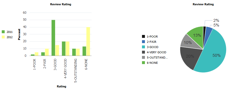
If color is set by SetDataColor and the default legend is chosen, the bar chart only shows legend entries for the data series.
&cChart.SetDataColor(CJY_RVW_DSTRBTN.CJY_COLOR);
&cChart.HasLegend = True;
Image: Bar and pie charts using default legends and set data colors
The bar chart and pie charts show default legends.
If color is set by SetDataColor and the legend array is larger than needed for either chart type, the results are also undesirable.
&cChart.SetDataColor(CJY_RVW_DSTRBTN.CJY_COLOR);
&cChart.HasLegend = True;
&LegendArray = CreateArray("Entry 1", "Entry 2", "Entry 3", "Entry 4", "Entry 5", "Entry 6", "Entry 7", "Entry 8", "Entry 9", "Entry 10", "Entry 11", "Entry 12");
Image: Bar and pie charts with a legend array larger than needed by either chart
The bar chart displays the default legend entries (2) ignoring any additional entries that were supplied in the legend array.
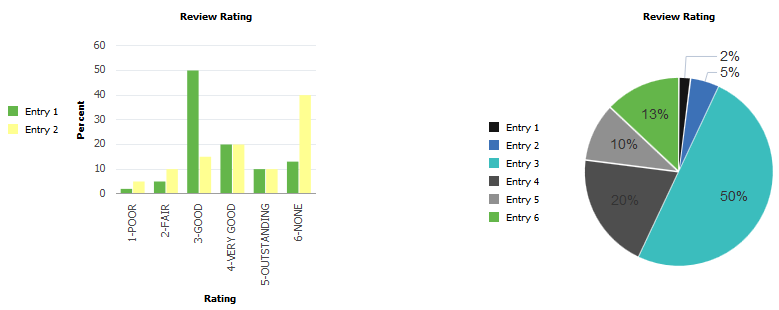
If color is set by SetDataColor and the legend array is the size required by the pie chart, the results are also undesirable.
&cChart.SetDataColor(CJY_RVW_DSTRBTN.CJY_COLOR);
&cChart.HasLegend = True;
&LegendArray = CreateArray("Entry 1", "Entry 2", "Entry 3", "Entry 4", "Entry 5", "Entry 6");
Image: Bar and pie charts with a legend array the size required by the pie chart
The pie chart uses the specified legend array.
If color is set by SetDataColor and the legend array is the size required by the bar chart, the desired results are produced for both charts.
&cChart.SetDataColor(CJY_RVW_DSTRBTN.CJY_COLOR);
&cChart.HasLegend = True;
&LegendArray = CreateArray("Entry 1", "Entry 2");
Image: Bar and pie charts with a legend array the size required by the bar chart
The legends for both charts are correct. The bar chart uses the specified legend array; the pie chart uses the default legend.
In PeopleSoft applications, chart data series are a grouping of related information. For example, if you were tracking sales for several divisions over many years, each division could be a series. Generally, every series in a chart has a distinct color. You can have more than one series in a chart for comparison. Each line in a line chart represents one series.
Image: Example of a data series
In the following example, the region has been set as the data series:
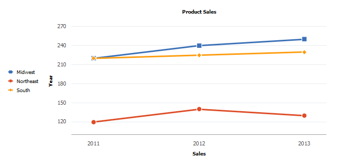
You can identify the data that you want in each series in two alternative ways:
Using the SetDataSeries method.
Specifying more than one field with the SetDataYAxis method.
If you use SetDataSeries, you pass into that method a RECORD.FIELD reference. That field will have values for each data item in the chart that associates the data item with a series. For instance, consider this layout of the PRODUCT_SALES table:
|
Year |
Sales |
Region |
|---|---|---|
|
2011 |
120K |
Northeast |
|
2011 |
220K |
South |
|
2011 |
220K |
Midwest |
|
2012 |
140K |
Northeast |
|
2012 |
225K |
South |
|
2012 |
240K |
Midwest |
|
2013 |
130K |
Northeast |
|
2013 |
230K |
South |
|
2013 |
250K |
Midwest |
The relevant PeopleCode would look as follows:
SetDataXAxis(PRODUCT_SALES.YEAR);
SetDataYAxis(PRODUCT_SALES.SALES);
SetDataSeries(PRODUCT_SALES.REGION);
This would produce the red, blue, and yellow lines in the preceding line chart.
If you specify more than one field in SetDataYAxis, each field passed into SetDataYAxis will result in one data series in the chart. For instance, here’s an alternative table layout for the PRODUCT_SALES table:
|
Year |
SALES_NE |
SALES_S |
SALES_MW |
|---|---|---|---|
|
2011 |
120K |
220K |
220K |
|
2012 |
140K |
225K |
240K |
|
2013 |
130K |
230K |
250K |
The relevant PeopleCode would look as follows:
SetDataXAxis(PRODUCT_SALES.YEAR);
SetDataYAxis(PRODUCT_SALES.NE,
PRODUCT_SALES.SALES_S, PRODUCT_SALES.MW);
This would also produce exactly the same red, blue, and yellow lines in the preceding line chart.
When the values in a chart vary widely from data series to data series, or when you have mixed types of data (for example, both revenue and quantity data), you can plot the additional data series on a second vertical axis referred to as a “secondary y-axis” (or Y2 axis). The scale of the secondary y-axis reflects the values for the associated data series.
Two y-axes can only be displayed for bar charts, horizontal bar charts, stacked bar charts, horizontal stacked bar charts, and the line charts. In addition, you must specify multiple fields when you invoke the SetDataYAxis method; you cannot display multiple y-axes when only one field is specified.
Consider the following table of revenue data:
|
Account Name |
Year |
Actual |
Budget |
Forecast |
Quantity |
|---|---|---|---|---|---|
|
Revenue |
2011 |
12000 |
14000 |
15000 |
500 |
|
Revenue |
2012 |
21000 |
20000 |
22000 |
800 |
|
Revenue |
2013 |
15000 |
16000 |
12000 |
110 |
One set of data (quantity) varies widely from the other three sets– actual revenue, budgeted revenue, and forecast revenue. All of the revenue can be plotted on the primary y-axis and quantity on the the secondary y-axis. The x-axis (year) is common between the two y-axes.
Use certain PeopleCode methods and properties to specify the format of charts with two y-axes. Use the SetDataYAxis method to specify all of the fields that will be plotted on the y-axes. In this example, the four fields are specified as follows:
&oChart.SetDataYAxis(QE_COL_MULTI_2Y.LY_AMOUNT_ACTUAL, QE_COL_MULTI_2Y.LY_AMOUNT_BUDGET, QE_COL_MULTI_2Y.LY_AMOUNT_FORCAST, QE_COL_MULTI_2Y.QE_QUANTTY);Then, use the SetYAxisColumnType method to specify which values appear on the primary y-axis and which appear on the secondary y-axis. Use the following constants to indicate which axis:
|
Constant |
Description |
|---|---|
|
%Axis_Y |
Associate column to the primary y-axis. |
|
%Axix_Y2 |
Associate column to the secondary y-axis. |
For example, only the fourth field will appear on the secondary y-axis:
&oChart.SetYAxisColumnType(CreateArray(%Axis_Y, %Axis_Y, %Axis_Y, %Axis_Y2));You can use the Y2AxisTitle property to specify the title for the secondary y-axis. For example:
&oChart.Y2AxisTitle = "Quantity";Image: Example of two y-axes
The following example displays the revenue data plotted on the primary y-axis and the quantity data plotted on the secondary y-axis:
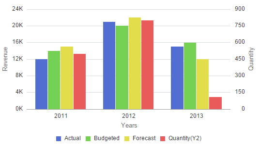
The following PeopleCode was used to generate the preceding chart:
Component Chart &oChart;

&oChart = GetChart(QE_JET_2YWRK.QE_CHART_FIELD);
&oChart.Reset();
&oChart.Type = %ChartType_2DBar;

rem Set the record for chart data;
&oChart.SetData(Record.QE_COL_MULTI_2Y);

rem Specify the field for the x-axis;
&oChart.SetDataXAxis(QE_COL_MULTI_2Y.LY_YEARS);

rem Specify multiple fields for the y-axes;
&oChart.SetDataYAxis(QE_COL_MULTI_2Y.LY_AMOUNT_ACTUAL, QE_COL_MULTI_2Y.LY_AMOUNT_BUDGET, QE_COL_MULTI_2Y.LY_AMOUNT_FORCAST, QE_COL_MULTI_2Y.QE_QUANTTY);

&oChart.SetSeriesLabels(CreateArray("Actual", "Budgeted", "Forecast", "Quantity"));

rem Specify which fields appear on which y-axis;
&oChart.SetYAxisColumnType(CreateArray(%Axis_Y, %Axis_Y, %Axis_Y, %Axis_Y2));

&oChart.XAxisTitle = "Years";
&oChart.YAxisTitle = "Revenue";
&oChart.Y2AxisTitle = "Quantity";

rem Specify whether the Y2 axis is split from the primary y-axis;
&oChart.IsSplitDualY = False;

&oChart.HasLegend = True;
&oChart.LegendPosition = %ChartLegend_Bottom;
With the addition of the following PeopleCode excerpt that instantiates a Series object, the preceding PeopleCode program will plot the secondary y-axis data as a line chart instead of as a bar chart:
rem defining new Series object with its type;
Local Series &S1;

&S1 = GetSeries();
&S1.Name = "Quantity";
&S1.Type = %SeriesType_Line;
&jSeries = CreateArray(&S1);
&oChart.SetSeries(CreateArray(&S1));
Image: Secondary Y-axis data plotted as a different chart type
In the following chart example, the a Series object is used to plot data on the secondary y-axis as a line chart to visually differentiate it from the revenue data:
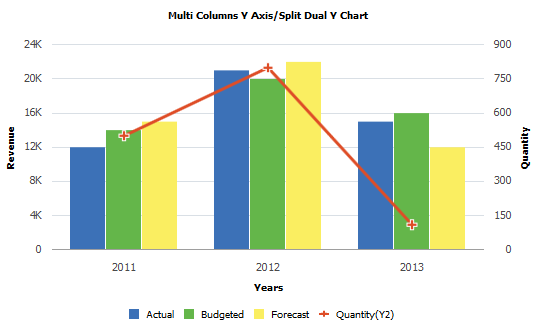
In addition, the IsSplitDualY property allows you to split the chart into two charts: one displaying the primary y-axis and the displaying the secondary y-axis.
Image: Using the IsSplitDualY property to create two separate y-axes
Set IsSplitDualY to True to create a chart similar to the following:
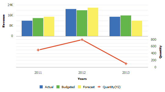
Additional properties provide ways for you to modify the secondary y-axis including: IsY2AxisInteger, Y2AxisMin, Y2AxisMax, and Y2AxisPrecision.
Users can select one or more data points (bars, slices, and so on) on a chart. Selection creates a highlight around the data item. Users can also de-select one or more of these items.
Selection can trigger:
FieldChange PeopleCode for those data items.
Redirection to a URL for the data items as defined by the SetDataURLs method.
De-selection can trigger:
FieldChange PeopleCode for the RECORD.FIELD associated with the chart control.
Redirection to a URL for the chart as defined by the ChartURL property.
In addition, users can interactively change the chart type—for example, changing a pie chart to display as a bar chart.
PeopleCode features allow PeopleSoft application to manage and maintain user-selected data items:
Use the DataSelectionMode property of the Chart class to specify whether data selection is available for a chart.
Use the aSelections property of the ChartClientState class to identify which data items are selected on a chart.
Use the nType property of the ChartClientState class to identify which chart type was selected by the user.
Use the SetSelectedData method of the Chart class to to redraw a chart while maintaining which data items were previously selected by the user.
The ReferenceArea class is used in conjunction with the Chart class to display bands of color to be drawn with the chart based on numeric values along a chart axis. For each band of color, you would create a separate instance of the ReferenceArea class.
Creating Reference Areas Using the ReferenceArea Class
The essential steps to use the ReferenceArea class are:
Create an instance of the ReferenceArea class in PeopleCode by using the GetReferenceArea built-in function:
&ref1 = GetReferenceArea();Set the properties on the instance of ReferenceArea class that you created.
Add the instance to an array of ReferenceArea instances:
&ref_areas = CreateArray(&ref1);Note: For each band of color, you would add a separate instance of the ReferenceArea class to this array.
Pass the array into the SetReferenceArea method of the Chart class:
&cChart.SetReferenceArea(&ref_areas);
Using Reference Areas with Charts
Image: Reference areas on a bar chart
To produce a bar chart similar to the following example that displays a reference area, you would create two instances of the ReferenceArea class:
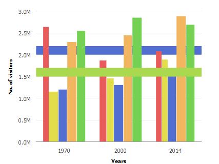
While it is not required, you could create a user-defined PeopleCode function that returns the array of reference areas.
Function bld_ref_areas Returns array;
   &ref1 = GetReferenceArea();
   &ref1.Association = %Ref_Association_Y1;
   &ref1.Description = "1 STD from Mean";
   &ref1.ShortText = "Ref Area1";
   &ref1.IsDisplayedTextInLegend = True;
   &ref1.ReferenceAreaColor = %ChartColor_Yellow;
   &ref1.ReferenceAreaValues = CreateArray(50000, 30000);
   &ref_areas = CreateArray(&ref1);
   Return &ref_areas;
End-Function;
Then, you associate the array returned by this function to the instance of Chart class using the SetReferenceArea method:
&cChart.SetReferenceArea(bld_ref_areas());The ReferenceLine class is used in conjunction with the Chart class to display colored lines to be drawn with the chart based on numeric values along a chart axis. For each reference line, you would create a separate instance of the ReferenceLine class.
Creating Reference Lines Using the ReferenceLine Class
The essential steps to use the ReferenceLine class are:
Create an instance of the ReferenceLine class in PeopleCode by using the GetReferenceLine built-in function:
&refln1 = GetReferenceLine();Set the properties on the instance of ReferenceLine class that you created.
Add the instance to an array of ReferenceLine instances:
&ref_lines = CreateArray(&refln1);Note: For each reference line, you would add a separate instance of the ReferenceLine class to this array.
Pass the array into the SetReferenceLine method of the Chart class:
&cChart.SetReferenceLine(&ref_lines);
Using Reference Lines with Charts
Image: Reference lines on a bar chart
To produce a chart similar to the following example that displays a reference line, you would create two instances of the ReferenceLine class:
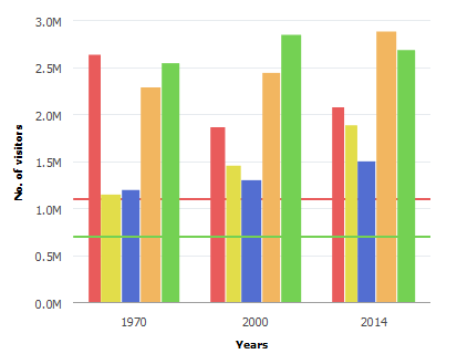
While it is not required, you could create a user-defined PeopleCode function that returns the array of reference lines.
Function bld_ref_lines() Returns array;
   &refln1 = GetReferenceLine();
   &refln1.Association = %Ref_Association_Y1;
   &refln1.Description = "Average";
   &refln1.ShortText = "Avg";
   &refln1.IsDisplayedTextInLegend = False;
   &refln1.ReferenceLineLocation = %Ref_Back;
   &refln1.ReferenceLineColor = %ChartColor_Red;
   &refln1.ReferenceLineValue = CJY_CHRT_REF_WK.CJY_AMT;
   &reflines = CreateArray(&refln1);
   Return &reflines;
End-Function;
Then, you associate the array returned by this function to the instance of Chart class using the SetReferenceLine method:
Function bld_chrt();
   &cChart = GetChart(CJY_CHRT_REF_WK.CJY_CHRT1);
   &cChart.Reset();
   &cChart.SetData(Record.CJY_SLRY);
   &cChart.SetDataXAxis(CJY_SLRY.CJY_NM);
   &cChart.setDataYAxis(CJY_SLRY.CJY_SLRY);
   &cChart.SetReferenceLine(bld_ref_lines());
End-Function;
The Series class is used in conjunction with the Chart class to override the default chart type (as defined by the Type property for the Chart object) for selected members of the data series. (The field representing the data series is specified using the SetDataSeries method.) Using the Series class allows you to render more than one chart type simultaneously.
The Series class can only be used in conjunction with bar charts, horizontal bar charts, stacked bar charts, horizontal stacked bar charts, and the line charts.
Using the Series Class with the Chart Class
The essential steps to use the Series class are:
Specify the field representing the data series for the chart.
&cChart.SetDataSeries(RECORD.FIELD);Create an instance of the Series class in PeopleCode by using the GetSeries built-in function:
&series1 = GetSeries();Set the Name and Type properties on each instance of the Series class that you created.
Note: The value of the Name property must match exactly the value of a member in the data series as specified by either the SetDataSeries method or set by the SetSeriesLabel method.
Add the instance to an array of Series instances:
&all_series = CreateArray(&series1);Note: Add a separate instance of the Series class to this array for each member of the data series that you want to override the default chart type. Members not explicitly added to this array will inherit the default chart type. Alternatively, you can use the %SeriesType_Inherit constant to specify that a data series member inherit the default chart type.
Pass the array into the SetSeries method of the Chart class:
&cChart.SetSeries(&all_series);
Overriding the Chart Type Using the Series Class
Image: A bar chart displaying two additional chart types
In the following example of a bar chart, two of the five series are displayed as different chart types:
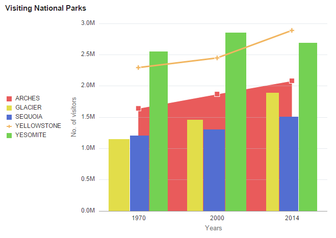
To produce a bar chart similar to the preceding example that uses a different chart type for the first and the fourth of five series, you would create two instances of the Series class. In this example, the Name property matches the value of the field as specified by the SetDataSeries method:
Component Chart &oChart;

&oChart = GetChart(QE_JET_CHARTWRK.QE_JET);
&oChart.Reset();
&oChart.Type = %ChartType_2DBar;

&oChart.SetData(Record.QE_CHART_NPARKS);

&oChart.SetDataYAxis(QE_CHART_NPARKS.QE_VISITORS);
&oChart.SetDataXAxis(QE_CHART_NPARKS.QE_YEARS);

&oChart.SetDataSeries(QE_CHART_NPARKS.QE_PARKNAME);

&oChart.XAxisTitle = "Years";
&oChart.YAxisTitle = "No. of visitors";
&oChart.MainTitle = "Visiting National Parks";

&oChart.HasLegend = True;
&oChart.LegendPosition = %ChartLegend_Left;

Local Series &S1, &S2;

&S1 = GetSeries();
&S1.Name = "YELLOWSTONE";
&S1.Type = %SeriesType_Line;

&S2 = GetSeries();
&S2.Name = "ARCHES";
&S2.Type = %SeriesType_Area;

&oChart.SetSeries(CreateArray(&S1, &S2));
The ToolTipLabel class is used in conjunction with the Chart class to display custom tooltips (also referred to as “data hints” or “hover text) on chart data points thereby overriding the default tooltips that are automatically created from the chart data.
Using the ToolTipLabel Class with the Chart Class
The essential steps to use the ToolTipLabel class are:
Create an instance of the ToolTipLabel class in PeopleCode by using the GetToolTip built-in function:
&label1 = GetToolTip();Set the ToolTipLabelType and ToolTipLabelValue properties on each ToolTipLabel object that you created.
Add the object to an array of ToolTipLabel objects:
&tooltip_labels = CreateArray(&label1, &label2);Pass the array into the SetToolTipLabels method of the Chart object:
&cChart.SetToolTipLabels(&tooltip_labels);
Creating Custom Tooltips
Image: Custom tooltips
To create custom tooltips similar to the following example, you would create three instances of the ToolTipLabel class.
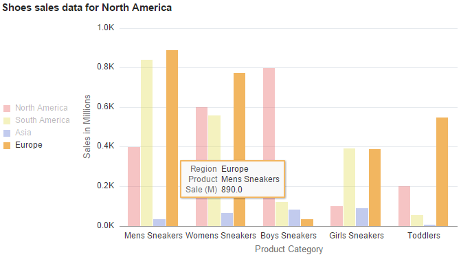
In the preceding example, the custom tooltip displays the x-axis data (%TooltipLbl_X), y-axis data (%TooltipLbl_Y), and the data series (%TooltipLbl_Series). The following PeopleCode program would generate these custom tooltips:
/* Declare and instantiate a chart object */
Component Chart &QEChart;
Component TooltipLabel &label1, &label2, &label3;
Component array of TooltipLabel &tooltip_labels;

&QEChart = GetChart(QE_CHART_T2_CHR.QE_CHART_T2_CHRTFL);
&QEChart.Reset();

/* Set the chart parameters for chart descriptions */
&QEChart.Type = %ChartType_2DBar;
&QEChart.MainTitle = "Shoes sales data for North America";
&QEChart.XAxisTitle = "Product Category";
&QEChart.YAxisTitle = "Sales in Millions";
&QEChart.HasLegend = True;

/* Set the chart data record and specify x-axis, y-axis, and series data */
&QEChart.SetData(Record.QE_CHART_T1_PRO);
&QEChart.SetDataXAxis(QE_CHART_T1_PRO.QE_CHART_T1_PROD);
&QEChart.SetDataYAxis(QE_CHART_T1_PRO.QE_CHART_T1_SALES);
&QEChart.SetDataSeries(QE_CHART_T1_PRO.QE_CHART_T1_REGION);
&label1 = GetToolTip();
&label1.ToolTipLabelType = %TooltipLbl_X;
&label1.ToolTipLabelValue = "Product";
&label2 = GetToolTip();
&label2.ToolTipLabelType = %TooltipLbl_Series;
&label2.ToolTipLabelValue = "Region";
&label3 = GetToolTip();
&label3.ToolTipLabelType = %TooltipLbl_Y;
&label3.ToolTipLabelValue = "Sale (M)";
&tooltip_labels = CreateArray(&label1, &label2, &label3);
&QEChart.SetToolTipLabel(&tooltip_labels);
A Chart object can be instantiated only from PeopleCode. You can use this object only in PeopleCode programs that are associated with an online process, not in an Application Engine program, a message notification, a Component Interface, and so on.
Chart objects are declared using the Chart data type. For example:
Local Chart &MyChart;

Component Chart &Abs_Hist_Chart;The PeopleCode program is terminated if a field or record is missing at runtime.
If a valid record is specified but no data is found, or for any other error, the chart is replaced by the message "Image creation failed."
If the Java Runtime Environment (JRE) is missing, an error appears and is logged.