Using Drop-Down Menus
This topic describes how to use the drop-down menus previously used in PeopleSoft classic applications.
Important! The information in this topic pertains to a prior version of PeopleSoft classic applications only. The default navigational interface for PeopleSoft applications in the current release is based on the fluid banner, which can be used for both classic and fluid applications. For information on working with the fluid user interface, see Working with Fluid Pages and Controls.
PeopleSoft Terminology
PeopleSoft applications are made up of a navigational structure, components (groups of pages), and pages. Using these elements, you can enter new data or change, delete, and modify existing data in your application. Using a PeopleSoft system is similar to browsing web pages; it provides a simple, intuitive way of working with a database.
Here are some of the basic elements used in PeopleSoft applications:
|
Field or Control |
Definition |
|---|---|
| Main Menu |
This PeopleSoft navigation structure, located at the top of your page, organizes and provides access to transaction pages from which you can carry out actions and modify data. The Main Menu contains menu items; some lead directly to transaction pages and some lead to submenus in a hierarchical format. |
| Menu pagelet |
This PeopleSoft navigation structure, located to one side of your page, organizes and provides access to transaction pages from which you can carry out actions and modify data. The Menu pagelet contains links, some leading directly to transaction pages and some leading to other links in a hierarchical format. |
| Content reference |
A link in the menu that accesses a transaction page or group of pages. A content reference is a reference to a URL for the transaction page. |
| Navigation path |
The collective set of links that appear as you navigate the menu structure; they indicate the hierarchical path to your current location. Sometimes called breadcrumbs, they appear in the drop-down menu header and in the navigation page header. |
| Keys |
The fields, such as EmplID (employee identifier), that uniquely identify one row of data in a transaction. Keys appears as fields on search pages and transaction pages. All information on a page is related to a key, which usually appears at the top of the page and is display-only. |
| Component |
The page or group of pages that appear when you perform a search. Multiple pages in a component must share the same high-level key; |
| Page |
The individual display and data-entry screens for each part of your PeopleSoft application. Pages appear in the browser window. |
Drop-down menus are an intuitive, nonlinear way to navigate PeopleSoft applications and access your application data. Drop-down menus appear at the top of your browser, above the transaction page or content area, and contain lists of menu items. The menu items are either links that provide direct access to a transaction or detail page, or they are folders that provide access to submenus, which cascade to the side and contain more menu items. Folders typically organize menu items based on business processes or other relationships that exist among transactions.
Image: Drop-down menu navigation showing the Main Menu, folders, and pages
This example shows the Main Menu drop-down navigation.
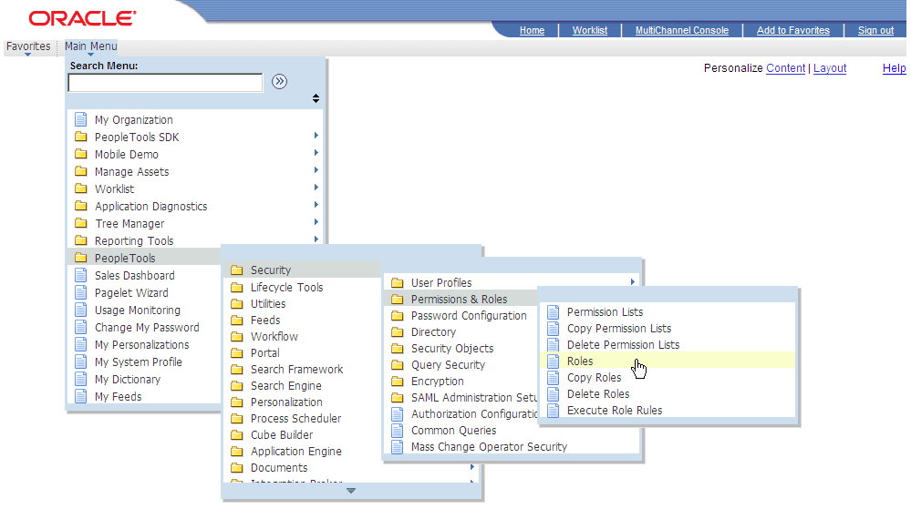
Access the Main Menu.
Note: The Main Menu and all subsequent menus display only menu items that you are authorized to access.
Click a folder label to open its submenu.
Click a link to open the resource in the content area.
Note: If you click the folder icon instead of the label, the navigation page appears.
Submenus always open in the viewable area. If the viewable area is too small to display the full list of items in a submenu, then scroll indicators (up and down arrows) appear at the top and bottom of the submenu to let you know that the list contains more menu items. Hover your mouse over the up or down arrow to make the menu scroll in the direction of the arrow. Click and hold the arrow to double the scrolling speed. You can also use your mouse wheel to scroll through a menu.
You can sort the drop-down menu alphabetically by clicking the sort icon on the Main Menu window. Continue clicking to toggle through an ascending, descending, and portal sequence number sort. As you click the sort icon, the icon changes to indicate the direction of the sort.
Image: Sample drop-down menu navigation showing scroll and menu sort indicators
This example shows the Main Menu drop-down navigation with scroll and menu sort indicators.
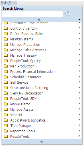
Note: While the sort icon appears only on the Main Menu, any sort you initiate at the Main Menu level applies to all submenus and persists until you change the sort or sign out.
Breadcrumbs refer to the collective sequence of items that appear above the content area when you navigate to transaction pages or navigation pages using the drop-down menu. The breadcrumbs display the path you took to get to where you are—that is, the component you are on. Each item in the breadcrumb list is either a link to a folder, subfolder, or component, and represents a level in the overall menu hierarchy. When navigating within a WorkCenter or from a dashboard, the breadcrumbs include the WorkCenter or dashboard link. In addition, the breadcrumbs might also include search text, related actions, and the persistent search icon. Click any breadcrumb item to navigate directly to the corresponding item and reveal the subordinate menu items.
Note: Breadcrumbs are updated only when you use drop-down menu navigation; tracking of navigation paths when using menu pagelets is not supported.
All PeopleSoft applications dynamically generate the individual items in the breadcrumb list using the following criteria:
The first item in the sequence is always the Main Menu.
The intermediate items in the sequence are the names of each item that you click to access the resource; menu items and component names appear in the order that you click them
The last item in the sequence is:
The label of the component link when you access a transaction page.
The folder name when you access a navigation page.
The WorkCenter or dashboard name when you access the WorkCenter or dashboard.
The value of the focus node when you access a SmartNavigation page.
Breadcrumbs can reveal both the navigational path to your current location and the hierarchical or parent-child relationships that exist among the items in the breadcrumb sequence.
In certain circumstances, the breadcrumbs will not be updated when you navigate to a new page. These circumstances include:
When the new page comes from a content provider system on a release earlier than PeopleTools 8.53.
If the page, or the folder that contains it, is hidden.
If the page is part of an unregistered component.
If the page is part of a component that does not have the Include in Navigation option selected.
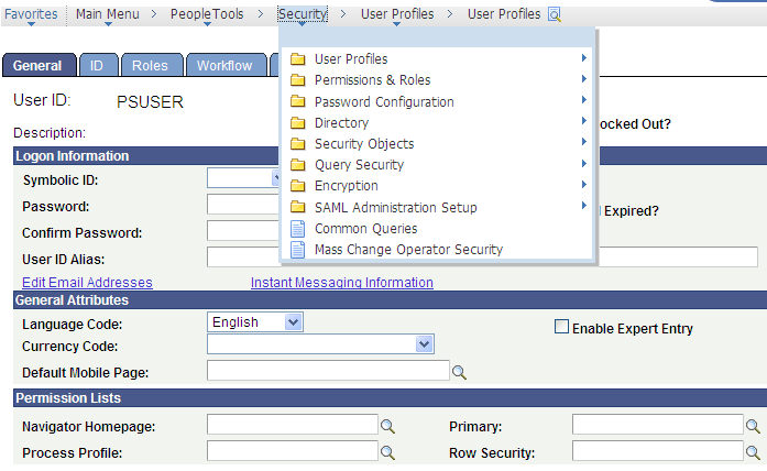
Image: Sample drop-down menu navigation showing breadcrumbs, a submenu, and the persistent search icon.
The following example shows a breadcrumb that lists the navigation path that was used to access the User Profiles component. The user has selected the Security item within the breadcrumb, revealing the items subordinate to that menu level.
Most drop-down menus are comprised of menu items that are static and completely independent of your application data and any relationships that exist among your data. You navigate through menu items to access a link that you click to open a search page. You then enter a search value that the system uses to retrieve data, which populates the transaction page
SmartNavigation extends and enhances drop-down menus by incorporating your data into the menu structure itself. Menu items are dynamic and appear in the menu hierarchy based on parent-child relationships. When you use SmartNavigation menus, rather than navigating to your data you navigate the data itself.
SmartNavigation menus and menu items represent hierarchically related entities, such as:
Employees in a department.
Accounts in a region.
Students in a class.
Image: Example of SmartNavigation menu
This example illustrates SmartNavigation drop-down menus.
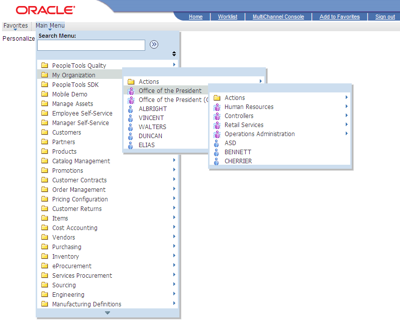
Each menu item is a unique row of data. The menu items are organized based on parent-child relationships. The key field values of the row determine the labels of the menu items. The key field structure of the underlying table determines the position of the menu items in the menu hierarchy.
Similar to standard menu items, SmartNavigation menu items expand when you click the label of a parent menu item. When you click the icon of a child menu item, the transaction or detail page appears.
In addition to your data, SmartNavigation menus also display an Actions folder. The Actions folder contains links to the details component and related actions components.
Note: Left navigation from the Menu pagelet does not support SmartNavigation menus.
Note: In addition, in certain scenarios, when navigating through a SmartNavigation menu to content contained in an Actions folder, the breadcrumb list is painted with an "Actions" element. This Actions element is non-operable—that is, you cannot select the drop-down menu beneath this Actions element like a normal folder. Rather, it is only there to suggest your navigation through the menu. If you attempt to select the drop-down menu beneath this Actions element, the following message will be displayed:
Updating DOM Unsuccessful:
Error - TypeError: flyout is null
SmartNavigation Icons
SmartNavigation menu items do not use the standard folder and content reference icons. SmartNavigation menu items icons are graphically stylized representations of entities. A multi-entity icon appears next to menu items that are parent rows with one or more subordinate menu items that are child rows. A single-entity icon appears next to menu items that are child rows with no subordinate menu items or child rows.