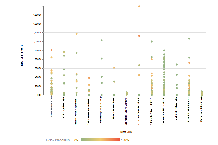
The Scatter Plot graph allows you to compare a metric from your ongoing project, and compare it with the projects included in the benchmarked groups. Select a metric from the Compare list. The X-axis displays your project and the projects in the benchmarked groups. The Y-axis displays the metric selected from the Compare list.
Use the scatter plot to:
- compare individual data points
- observe a trend for a selected metric between the projects
A positive trend is indicated when the data points move higher from left to right on the x-axis. A negative trend is indicated when the data points move higher from left to right on the Y-axis.
- identify a relationship (positive, negative, or no correlation) between the variables selected in the X-axis and the Y-axis.
A positive relationship or correlation is observed when the y-axis values increase with an increase in the x-axis values.
A negative relationship or correlation is observed when the y-axis values increase with an decrease in the x-axis values.