Activity Delay Section
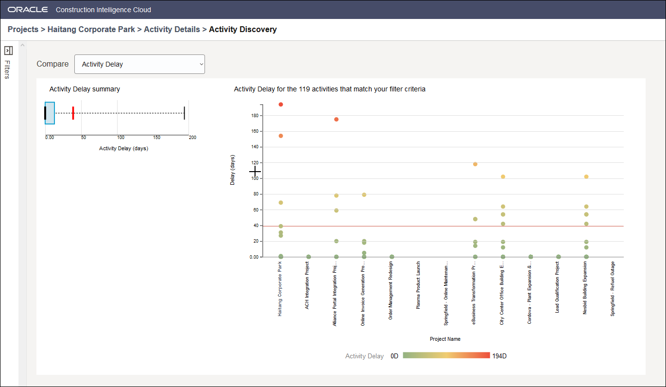
The Activity Discovery section displays two types of charts:
- A summary graph specific to the metric selected in the Compare list.
The summary graph compares the metric specified for your project with the metrics of similar activities from past projects. For example, in the Activity Delay Summary graph above, the metric for your project is indicated by the red marker which seems to be an outlier when compared to the metrics of similar projects in the past is indicated by the blue box. The median value for this metric from all past projects is indicated by the black marker.
- A Bubble chart that compares the activity in your project with similar activities identified based on the filter criteria specified in the Filters pane, and the metric selected in the Compare list. Each circle indicates an activity.
Related Topics
Last Published Tuesday, December 24, 2024