Working with Portfolio View Histograms
Histograms render data into multi-colored bars with relative sizes to help you make fast comparisons. Three similar types of histograms are available: basic, side-by-side, and stacked.
Example: Todd wants to analyze current budget values for each project in the Corporate Projects portfolio. He also wants to compare this data to the BL Total Cost for the current project phase. He navigates to the Portfolio Analysis page and customizes the portfolio views, filters, and histogram chart options shown below. He sets Project to appear on the x-axis and Current Budget on the y-axis. When the chart appears, each bar represents a project; the size of the bar represents the Current Budget. He configures a second histogram to display the Current Phase on the x-axis and BL Total Cost on the y-axis.
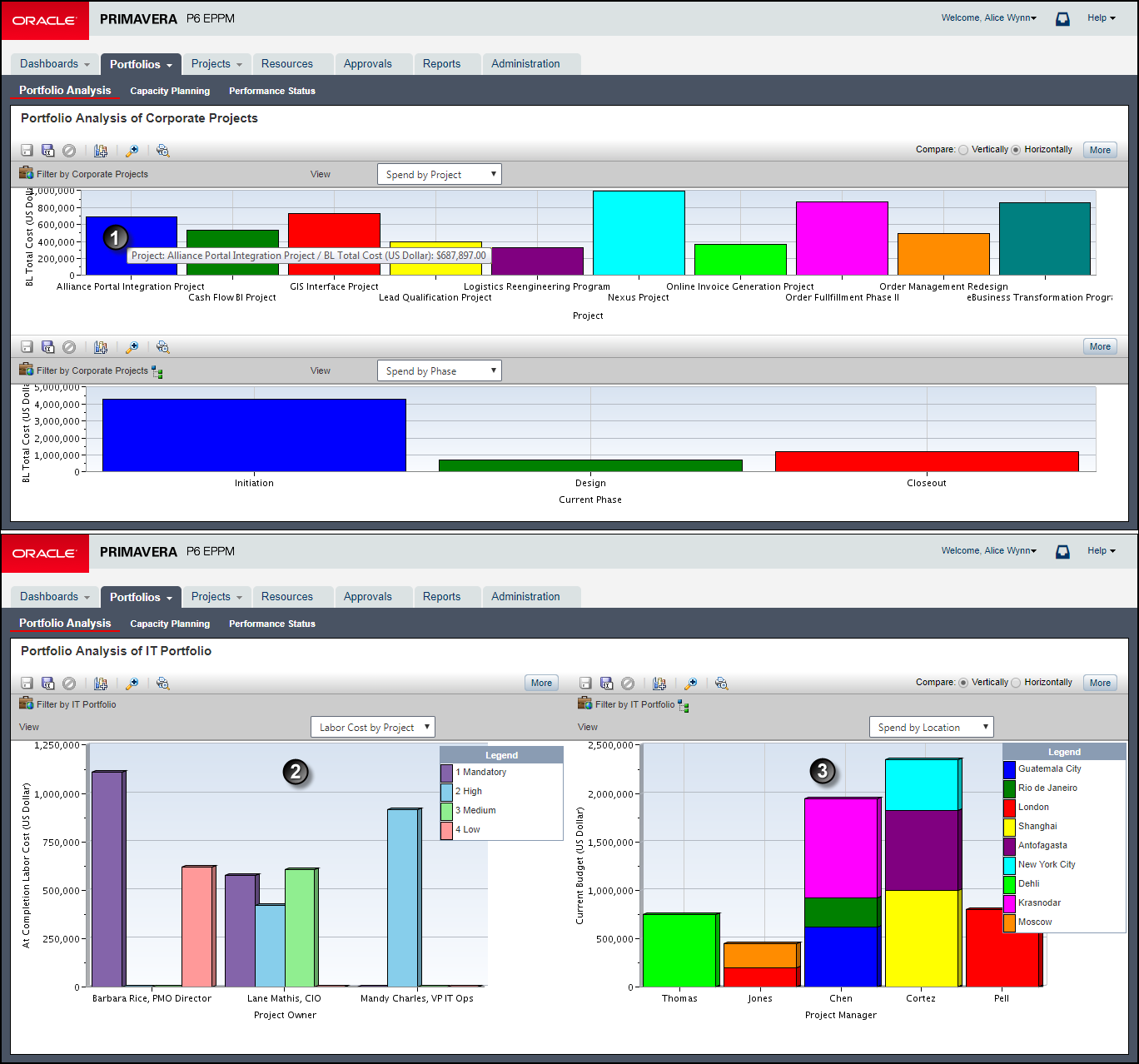
Table of Key Histogram Elements
Item | Description |
|---|---|
| Tooltip: Mouse over a bar to view a summary. |
| Side-by-Side Histogram: The Group By field is added. In this example, At Completion Labor Cost is tracked along the y-axis for each Priority grouped by Project Owner along the x-axis. |
| Stacked Histogram: The Stack By field is added instead of the Group By field. In this example, the Current Budget is graphed for each Project Manager. The data is stacked by location. |
Related Topics
Last Published Thursday, February 1, 2024