Working with Portfolio View Pie Charts
A pie chart is a circular chart divided into slices, where each slice represents a particular group. The size of the slice represents the value of the selected data field, relative to the group's total value. A pie chart is useful for analyzing relative parts of a whole.
Example 1: You can create a pie chart to analyze the at completion total cost for projects, based on project status. To do this, customize the chart and select At Completion Total Cost as the data field, then choose to group by Project Status. When the chart displays, each slice represents a single project status (e.g., Planned, Active, Inactive, What If); the size of the slice represents the At Completion Total Cost value for all projects assigned the project status.
Example 2: The pie chart below shows Current Budget in slices representing Location.
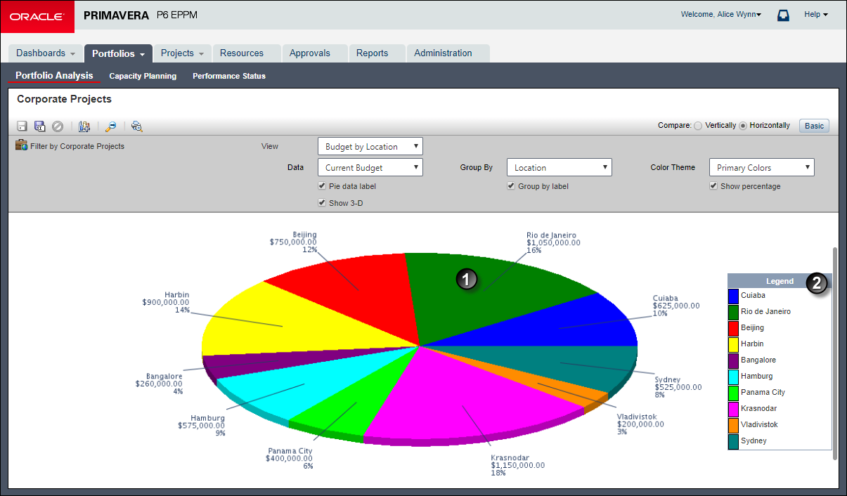
Table of Common Pie Chart Elements
Item | Description |
|---|---|
| Slice: The proportionate contribution of each data group to the total is represented by a color-coded wedge or piece of the pie. In the example, this slice represents Rio de Janeiro's value of $1,050,000.00 which equates to 16% of the Current Budget by Location. |
| Legend: Based on the Group By field, each item in the legend is given a color based on the selected color theme. |
Related Topics
Last Published Thursday, February 1, 2024