Viewing Life Events Insights
This topic discusses how the benefits administrators can use the Benefits Insights dashboards to view and analyze life events activity for their workforce using Insights visualizations.
The Life Events Insights dashboard is built on the PeopleSoft Insights platform, which relies on an underlying analytics engine and search engine. The life event data that is visible on the dashboard comes from the Benefits Search indexes.
These videos provide an overview of the PeopleSoft Insights feature:
Video: Insights with PeopleSoft
Video: PeopleSoft HCM Insights
Video: Image Highlights, PeopleSoft HCM Update Image 34: HCM Insights
This topic provides an overview of how to set up the Insights Dashboard for Life Events analytics and discusses the PeopleSoft Insights Dashboard for Life Events.
Understanding PeopleSoft Insights
PeopleSoft Insights is an analytical engine that provides visual reports (visualizations) in the form of charts, tables, graphs and so on. The visualizations are based on queries that retrieve data from the PeopleSoft Search Framework.
For information on Insights dashboards, see:
PeopleTools Search Technology: “Monitoring PeopleSoft Search Framework and OpenSearch” and “Working with Insights Dashboards for PeopleSoft Application Data” documentation
|
Page Name |
Definition Name |
Usage |
|---|---|---|
|
Access the Life Events Insights dashboard. |
||
|
HC_HBN_LE_INSIGHTS_FL |
Review and analyze the active life events activity of employees using Insights visualizations. |
Before users can access the Life Event Insights dashboards, the following steps should be performed:
Deploy these benefits indexes:
HC_BEN_LE_DATA
HC_BEN_ATTACH_DATA
HC_BEN_APPR_DATA
HC_BEN_EOI_DATA
HC_BNE_LIFEEVT_EXPIRE
()
Build the deployed benefits search indexes.
()
Deploy the Life Events Insights tiles and dashboards.
Life Events Insights Tile
Life Events Insights
()
Note: The full index must be run before the dashboard can be deployed.
Assign the Benefits Analyst or Benefits Analyst Admin user role to administrators to access and view the Life Events Insights visualizations.
()
Use the Life Events Insights tile to access the Insights visualizations related to life events.
Navigation:
The Life Events Insights tile is delivered as part of the Manage Benefits tile in Workforce Administrator Home Page. You can add the tile, through personalization, to a system-delivered homepage or a homepage that you create.
This example illustrates the Life Events Insights tile.
Select the Life Events Insights tile to access the Life Events Insights Dashboard.
Use the Life Events Insights dashboard (HC_HBN_LE_INSIGHTS_FL) to review and analyze life events data of employees using Insights visualizations.
Navigation:
Select the Life Events Insights Tile.
This example illustrates the fields and controls on the Life Events Insights dashboard (1 of 4).
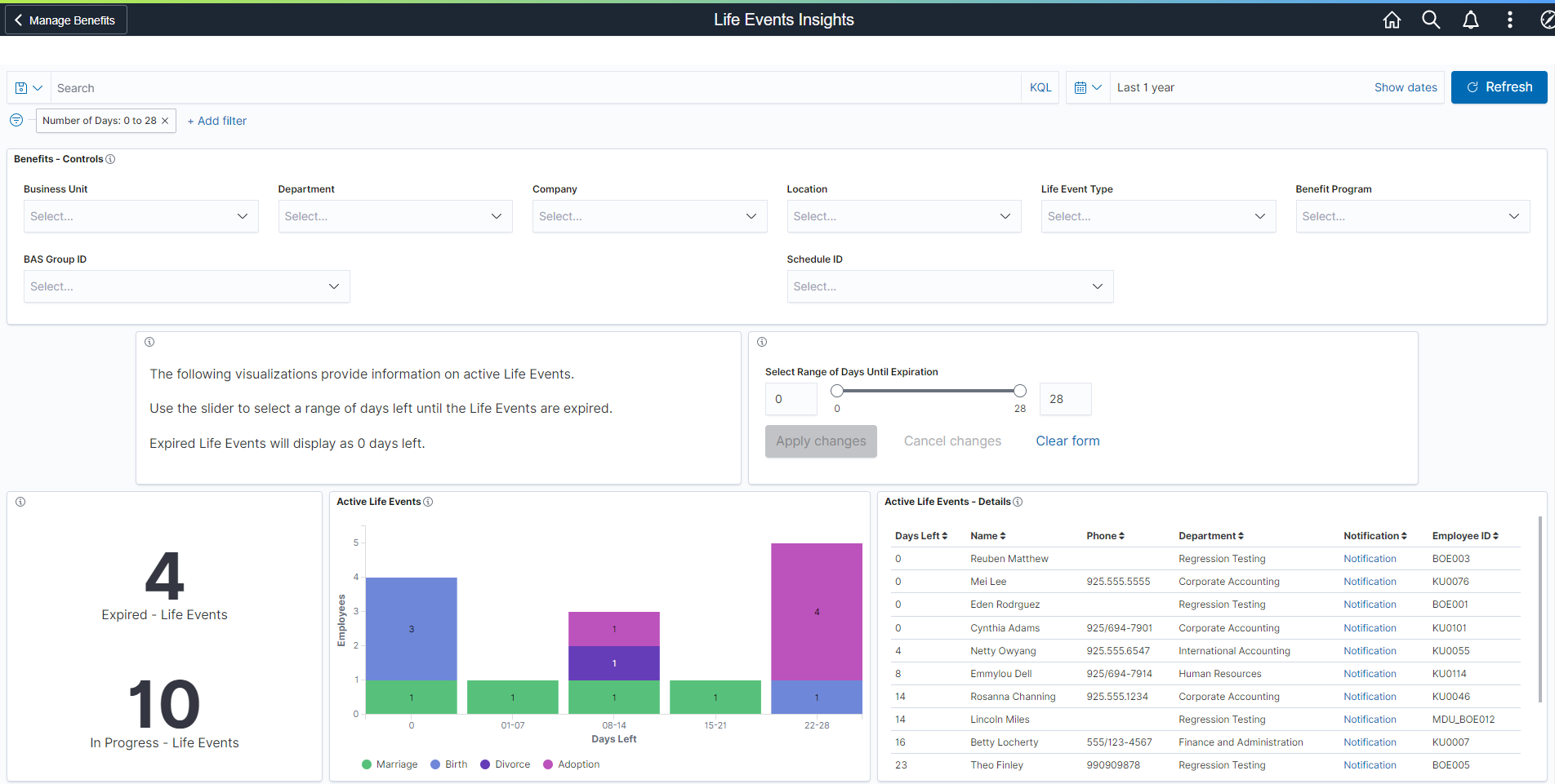
This example illustrates the fields and controls on the Life Events Insights dashboard (2 of 4).
This example illustrates the fields and controls on the Life Events Insights dashboard (3 of 4).
This example illustrates the fields and controls on the Life Events Insights dashboard (4 of 4).
Warning! PeopleSoft Insights dashboards may not render properly if you access them using unsupported platforms.
The Life Events Insights dashboard provides you with different visualizations to analyze the life event data for your workforce. When you select filters or chart items, Insights dynamically updates all visualizations using the sources from the index.
Each visualization enables you to inspect the chart, table or map to view the details of that visualization. Pause over a visualization to have the have additional page elements appear, view numbers, or click items to add filters to your visualizations.
Using the interactive visualizations that are available on the dashboard, you can see the details of the active life events of employees and the documents that are missing or pending approval for these events. The dashboard also provides details of life event enrollment changes that are blocked due to missing EOI proofs. You can choose the range of days to view the life events that are nearing expiry. This dashboard also shows the step-wise distribution of each event type.
For more information on working with PeopleSoft Insights and filters, see PeopleTools: Search Technology, “Working with Insights Dashboards for PeopleSoft Application Data” documentation.
The Life Events Insights Analytics dashboard delivers these visualizations:
Days left Life Events
Active Life Events
Active Life Events – Details
Employee missing attachment count
Missing Attachments
Missing Attachments – Details
Count for Life Event documents needing approval
Pending Approvals
Pending Approvals – Details
Life Event EOI missing
EOI Proofs Missing
EOI Proofs Missing – Details
Life Event Types
Life Events Steps
Additional Filters
Additional Filters allows you select filters based on below attributes:
Business Unit
Department
Company
Location
Life Event Type
Benefit Program
BAS Group ID
Schedule ID
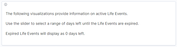
Description Box
The Description box provides instructional text to view the Life Events Insights dashboard.
This example illustrates the fields and controls on the Description box.
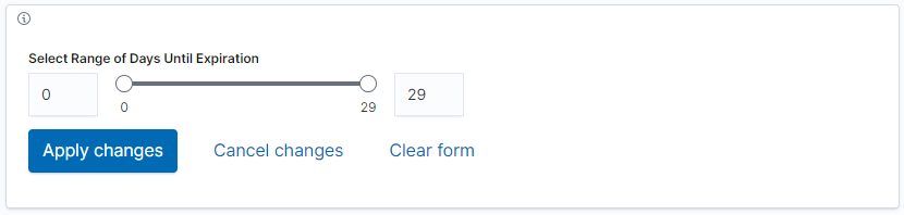
Select Range of Days Until Expiration
The date range selector allows the benefits administrator to enter the upper and lower limit of days to view the life events nearing expiry. For example, if the lower and upper limit is 5 and 10 respectively, then the visualizations display the life events that expires in 5 to 10 days.
This example illustrates the fields and controls on the date range selector.
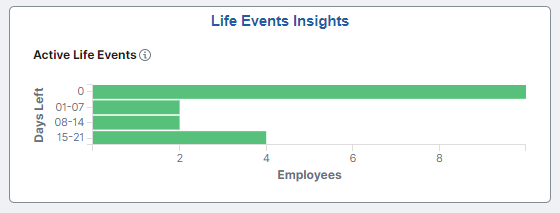
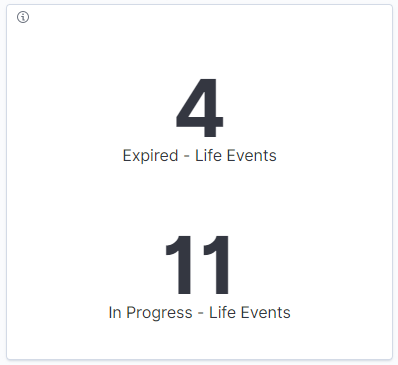
Days left Life Events
This visualization displays the count of the life events within the selected days range. These include life events in the following statuses:
In Progress: The events that are in progress by employee and yet to expire.
Expired: The events that are in progress by employee and crossed the expiration date.
Change in date range selector updates all the visualizations in this dashboard.
This example illustrates the fields and controls on the Days left Life Events visualization.
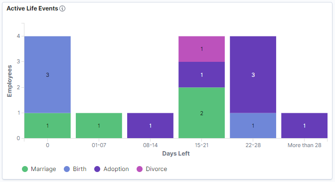
Active Life Events
This stacked vertical bar visualization displays the breakdown of active life events distributed by employees and days to expiration. The first bar with zero days indicates the employees with expired life events. Click on the sub-bars to filter by life event type.
This example illustrates the fields and controls on the Active Life Events visualization.
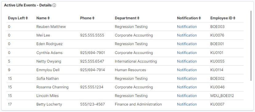
Active Life Events – Details
This data-grid lists the active life events in tabular format along with employee details. Click the Notification link to send notification message to the selected employee.
This example illustrates the fields and controls on the Active Life Events – Details visualization.
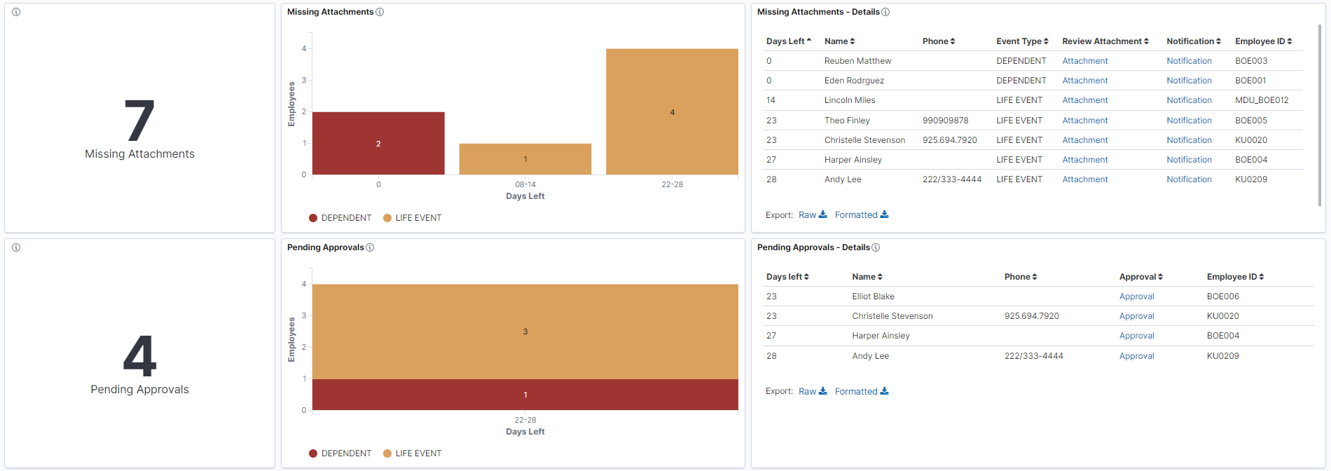
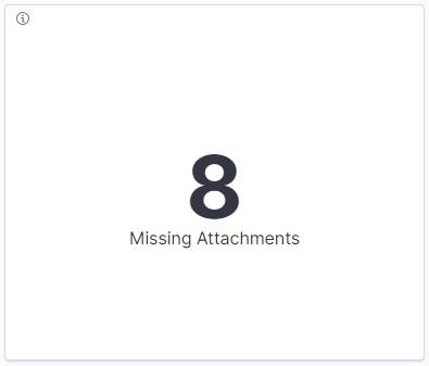
Employee missing attachment count
This count visualization displays the count of employees with active life events for which document upload is pending.
This example illustrates the fields and controls on the Employee missing attachment count visualization.
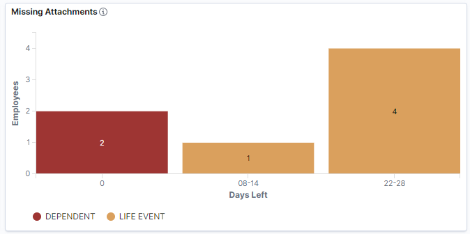
Missing Attachments
This compound bar chart visualization displays the breakdown of missing documents distributed by employees and days to expiration. Click on the bars to filter by life events or dependent updates for which document upload is required but pending.
This example illustrates the fields and controls on the Missing Attachments visualization.
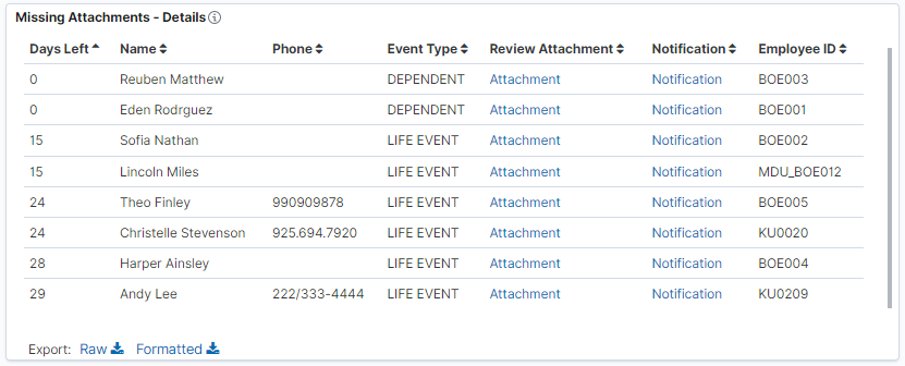
Missing Attachments – Details
This data-grid lists the documents missing data in tabular format along with employee details. Click the Notification link to send notification message to the selected employee. Select the Attachment hyperlink to view the Review Benefits Attachment page for the employee.
This example illustrates the fields and controls on the Missing Attachments – Details visualization.
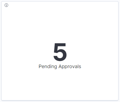
Count for Life Event documents needing approval
This count visualization displays the count of employees with active life events for which document upload and approval is required, and the documents are uploaded but approval is pending.
This example illustrates the fields and controls on the Count for Life Event documents needing approval visualization.
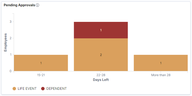
Pending Approvals
This compound bar chart visualization displays the breakdown of pending document approvals distributed by employees and days to expiration. Click on compound bars to filter pending approvals by life events and dependent updates. The first bar with zero days indicates the employees with expired life events.
This example illustrates the fields and controls on the Pending Approvals visualization.
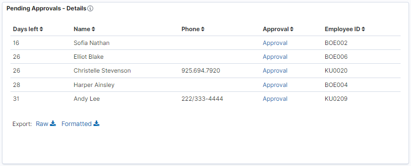
Pending Approvals – Details
This grid lists the employees with pending approvals in a tabular format. Click the Approval link to approve the documents for the selected employee.
This example illustrates the fields and controls on the Pending Approvals – Details visualization.
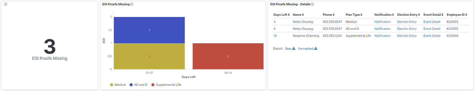
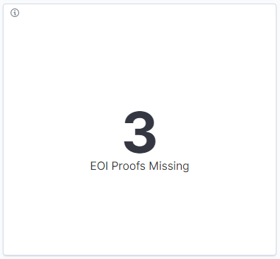
Life Event EOI missing
This count visualization displays the count of employees whose Life Event enrollment changes are blocked due to missing EOI proof. The count is duplicated for the employees with pending EOI for more than two plan types.
This example illustrates the fields and controls on the Life Event EOI missing visualization.
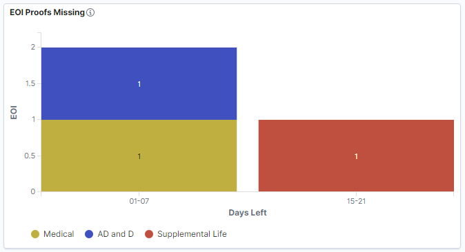
EOI Proofs Missing
This stacked vertical bar visualization displays the breakdown of missing EOI proof distributed by employees and days to expiration. The first bar with zero days indicates the employees with expired life events. Click on the sub-bars to filter by benefit plan type.
This example illustrates the fields and controls on the EOI Proofs Missing visualization.
EOI Proofs Missing – Details
This grid lists the employees with missing EOI proofs in a tabular format.
This example illustrates the fields and controls on the EOI Proofs Missing – Details visualization.
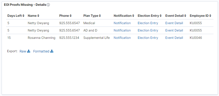
Click on the hyperlinks to view the specific pages for the selected employee:
Notification: Notify the employee.
Election Entry: View On-Demand Event Process page and specify election requirements.
Event Detail: View Employee Event Detail page.
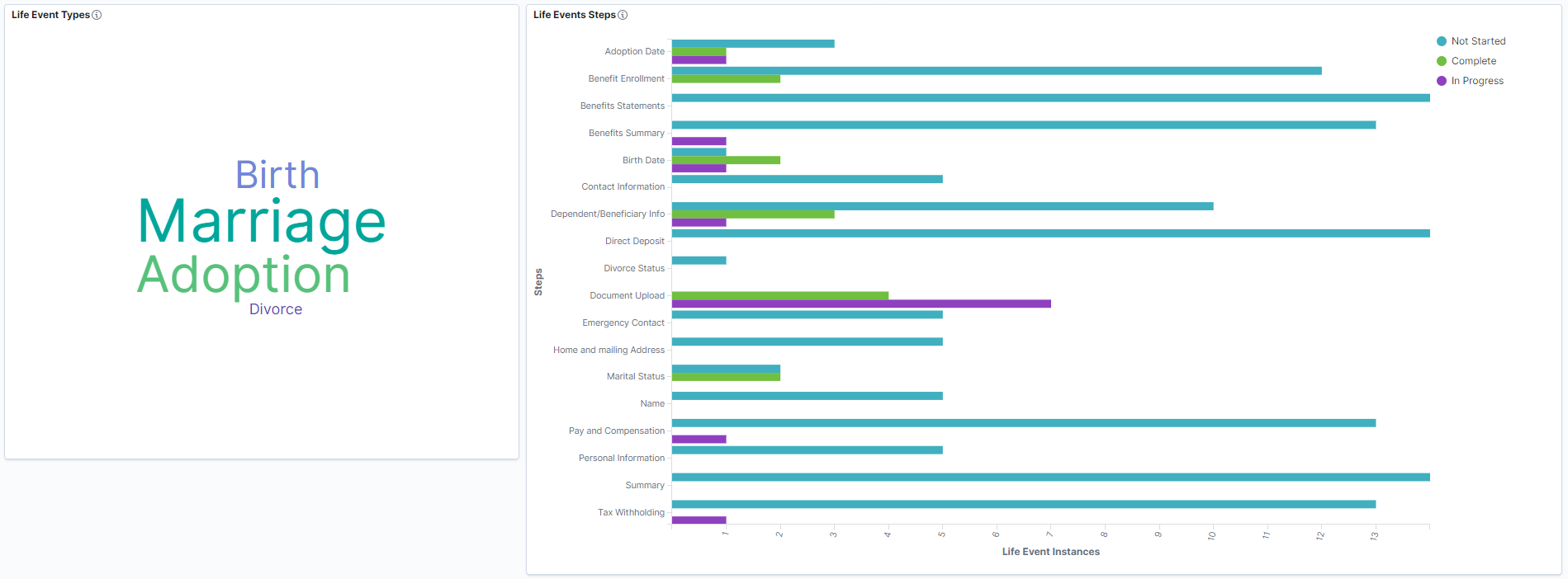
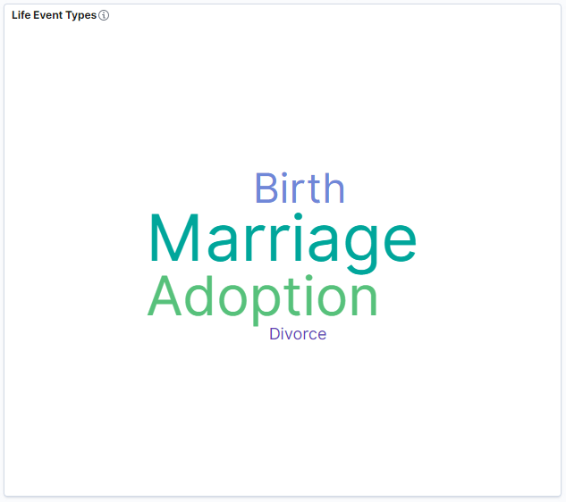
Life Event Types
This tag cloud visualization displays the life event types. Larger the font size, higher the number of that life event type. These tag clouds help administrators to easily filter the dashboard by a life event type.
This example illustrates the fields and controls on the Life Event Types visualization.
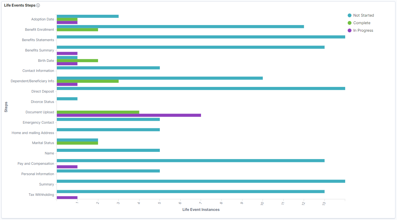
Life Events Steps
This horizontal compound bar chart displays the breakdown of the steps in the life event activity guide process and count of life event instances. Click on the compound bars to filter by life event status for a step. Life event status includes Not Started, In Progress, and Complete.
This example illustrates the fields and controls on the Life Events Steps visualization.