Viewing Workforce Equity Insights
Administrators can use the Workforce Equity dashboard to evaluate workforce equity data. Based on their user privileges and criteria, like gender and ethnicity, administrators can analyze diversity and compensation for the entire workforce or for a subset of the organization.
The PeopleSoft Workforce Equity dashboard is built on the PeopleSoft Insights platform, which relies on an underlying analytics engine and search engine. This dashboard is built on workforce equity data and uses search index HC_HR_WF_DIVERSITY.
This video provides an overview of the Workforce Equity Insights feature:
Video: Image Highlights, PeopleSoft HCM Update Image 34: HCM Insights
This topic provides an overview of how to set up the Insights dashboard for Workforce Equity analytics, lists common elements and controls, and discusses the PeopleSoft Insights Workforce Equity dashboard.
Understanding PeopleSoft Insights
PeopleSoft Insights is an analytical engine that provides visual reports (visualizations) in the form of charts, tables, graphs and so on. The visualizations are based on queries that retrieve data from the PeopleSoft Search Framework.
These videos provide an overview of the Insights feature:
Video: Insights with PeopleSoft
Video: PeopleSoft HCM Insights
For information on Insights dashboards, see:
PeopleTools Search Technology: “Monitoring PeopleSoft Search Framework and OpenSearch” and “Working with Insights Dashboards for PeopleSoft Application Data” documentation.
|
Page Name |
Definition Name |
Usage |
|---|---|---|
|
HC_WORKFORCE_EQUITY (this is the cref for the tile) |
Access and view HR workforce equity analytics that are based on diversity and compensation. For example, view employee data by job code, gender, ethnic group, compa-ratio information, and country. |
|
|
KIBANA_COMP (this is the cref for the dashboard) PTSF_KIBANA_COMP |
Review Insights visualizations related to workforce equity. |
Note: The Workforce Diversity (HC_HR_WF_DIVERSITY) search index, which allows administrators to view workforce equity data, supports real time indexing (RTI) with PeopleTools version 8.59.10 or higher. When enabled, RTI allows real-time updates to the indexed data to provide search results using the latest information.
For more information about Real Time Indexing, refer to PeopleTools Search Technology, “Administering Real Time Indexing."
Before administrators can access the visualizations for Workforce Equity data, the following steps should be performed:
Deploy the HC_HR_WF_DIVERSITY (Workforce Diversity) index.
()
Build the HC_HR_WF_DIVERSITY search index.
()
Deploy the Workforce Equity Tile and Workforce Equity dashboard.
()
Note: The full index must be run before the dashboard can be deployed
Assign the HR Analytics Administrator role to users that should be granted access the Workforce Equity dashboard.
This section lists the common elements and controls that are used in Insights analytics.
Note: Filtering options apply to all visualizations, which allows users to drill down on all the charts at once.
|
Term |
Definition |
|---|---|
|
|
Click to save the current query text and filters that you want to reuse in the future, or select an existing query to use to update the visualizations. |
|
Search field |
Enter a query to filter data, if applicable. |
|
|
Enter criteria to filter data on the visualizations. You can apply filters in a number of ways:
Added filters are displayed next to the + Add filter link for reference. For example, when you click a doughnut chart item, the filter is automatically added to your filters list. When you click the horizontal bar item for the 18-24 age group for females, the system will prompt you to add the Age Range: 18-24 and Gender: F filters since this item consists of more than one filter. Click the Change all filters icon for a list of actions that can be performed on all filters, for example, disable them temporarily, remove them permanently, or invert inclusion (show data that does not meet filter criteria). Click a filter item for a list of similar actions that can be performed on it individually. |
|
|
Click to select a different time period for the analytics. You can enter it manually, or choose from commonly used date ranges provided the system as well as recently used selections. When a new period is selected, all visualizations are refreshed automatically to reflect that change. If you have selected a commonly used date range, for example, This week, or Last 30 days, click the Show dates link to view the approximate date period in relation to the current date. For example, the current date is November 1 and the selected date range is Year to date. Clicking the Show dates link displays ~ 10 months ago —> now, which indicates that the selected date range started from approximately 10 months ago and ends on the current date. |
|
Business Unit, Location, and Department |
Select to filter data by business unit, followed by location, and then by department. You must select a business unit before selecting a location. A location must be specified before you can filter data by department. |
 (See saved queries)
 (Change all filters), and
  (Calendar) or
 When you pause over a visualization, the Options and Legend icons (if applicable) are displayed on the top right and bottom corners respectively. Use them to inspect the chart or table and view the details of that visualization, and toggle the legend display.
|
Term |
Definition |
|---|---|
|
|
Pause over the Options icon to select one of these options:
|
|
|
Click this icon to hide or display the legend for the chart, if available. You can click an item in the legend to change its color, or add it as a filter (if applicable). |
|
Chart item (bar, pie slice, and so forth) |
Pause over a chart item, such as a bar item or pie slice, to view a summary of details for that item. Select a chart item to add a filter for it to apply to all visualizations. |
 (Options)
 (Toggle legend)
For more information on working with PeopleSoft Insights and filters, see PeopleTools: Search Technology, “Working with Insights Dashboards for PeopleSoft Application Data” documentation.
Use the Workforce Equity tile to access and view HR workforce equity analytics that are based on diversity and compensation. For example, view employee data by job code, gender, ethnic group, compa-ratio information, and country.
Navigation:
From the Workforce Administrator homepage, click the Workforce Insight Tile. The Workforce Equity tile is located on the Workforce Insight Dashboard.
This example illustrates the Workforce Equity tile.
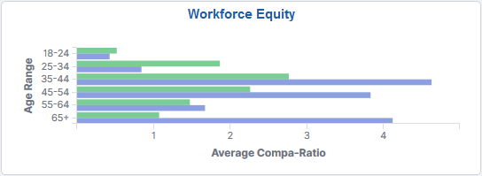
The Workforce Equity tile displays the Compa-ratio by Age and Gender graph.
Click this tile to access the Workforce Equity Dashboard and analyze visualizations related to diversity and compensation information for your workforce.
Use the Workforce Equity dashboard to review Insights visualizations related to workforce equity.
Navigation:
You must be assigned the HR Analytics Administrator role to view this dashboard.
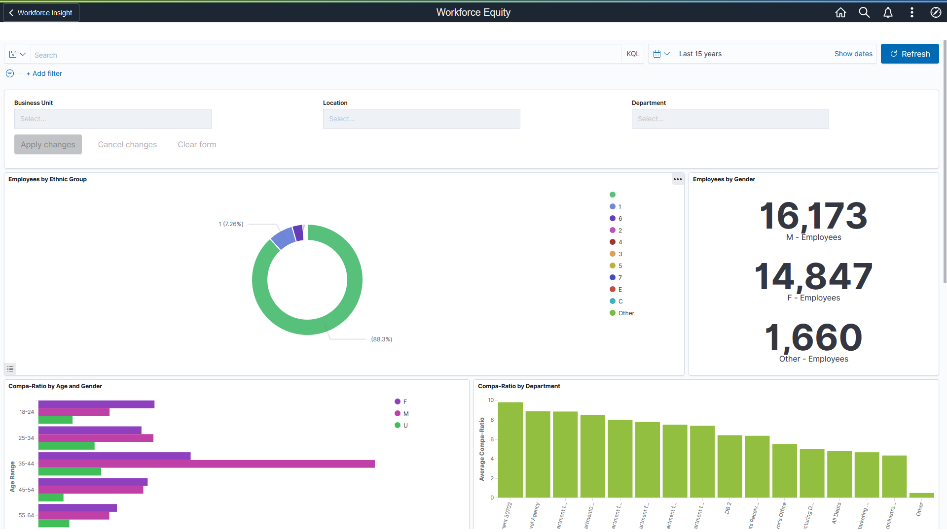
This example illustrates the Workforce Equity dashboard (1 of 2).
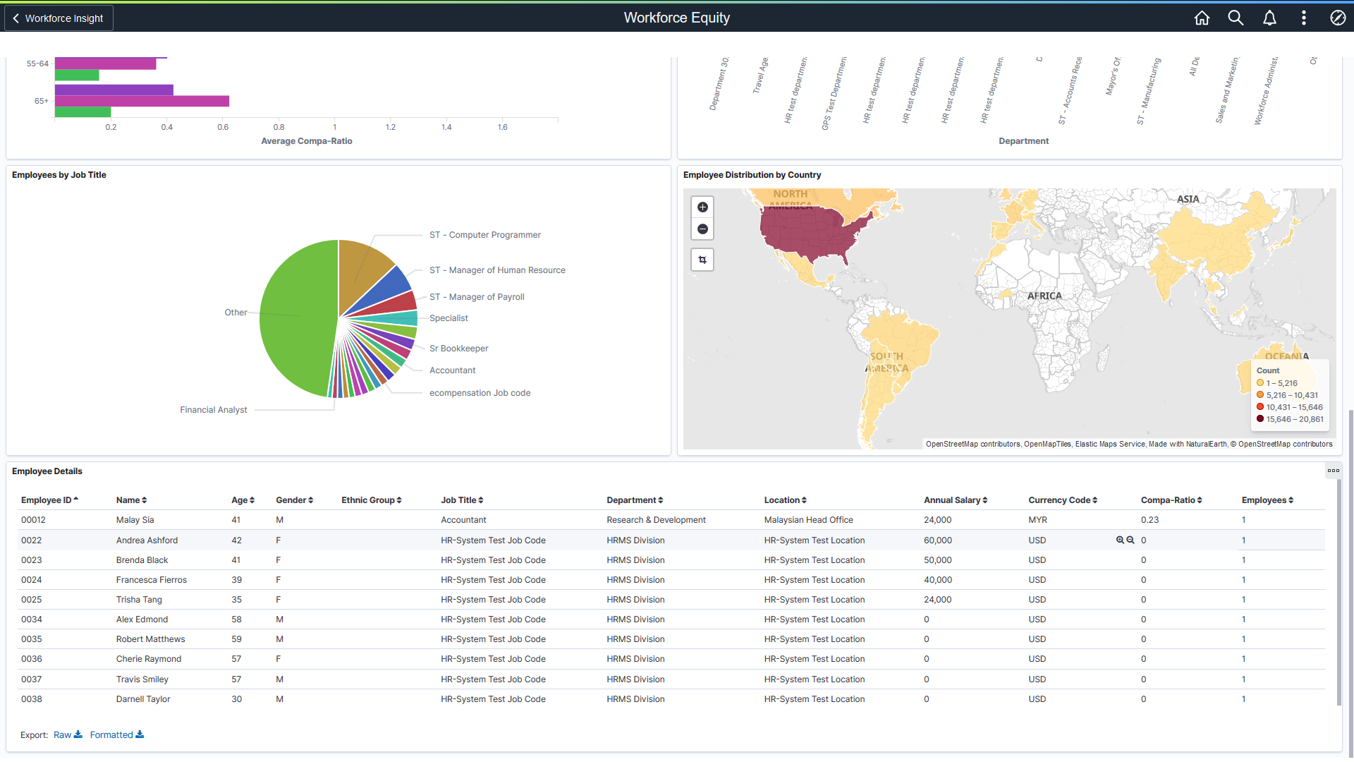
This example illustrates the Workforce Equity dashboard (2 of 2).
Warning! PeopleSoft Insights dashboards may not render properly if you access them using unsupported platforms.
Workforce Equity Visualizations
The Workforce Equity dashboard provides you with different visualizations to analyze workforce equity data. When you select filters or chart items, Insights dynamically updates all visualizations using the sources from the index.
Note: The dashboard uses role level security to display permitted data to the user.
Important! For optimal performance, only the first 500 rows of data are displayed on the dashboard. Use filters to refine the set of data you wish to visualize using the dashboard.
The Workforce Equity dashboard provides this collection of visualizations:
Visualization |
Description |
|---|---|
Employees by Ethnic Group |
This doughnut chart visualization displays the number and percentage of employees that are included in an ethnic group. The chart displays the top 30 ethnic groups (based on count). Employees that indicate more than one ethnicity will appear in a Two or More group. |
Employees by Gender |
This visualization displays a count of males, females, and others (those with undefined genders). |
Compa-Ratio by Age and Gender (comparison ratio by age and gender) |
This horizontal bar graph visualization displays the average compa-ratio calculation by age groups and then grouped by male and female within those categories. Compa-ratio allows you to see where workers' salaries lie in relation to the midpoint range for their salary grades. Age groups include:
Note: The system calculates the ratio by comparing the worker salary to the midpoint amount of the salary grade. If the worker's current rate is the same as the midpoint, then the compa-ratio is 1.00, or 100 percent, of the midpoint. If the rate is above or below the midpoint, the system calculates a ratio for the difference between the salary and the midpoint, and then it adds or subtracts the difference from 1.00. If there is no defined midpoint, the compa-ratio will be 0. The system then averages all the compa-ratios for employee’s within a group, and displays that number on the chart. |
Compa-Ratio by Department (comparison ratio by department) |
This vertical bar graph visualization displays the average compa-ratio calculation by department. The chart displays the top 15 departments (based on highest compa-ratio values) at a time. The Other department item contains information for all others departments that were not included in top 15 departments. Select the Other department bar item to display the next 15 departments in the list. For more information on compa-ratio calculations, see the Compa-Ratio by Age and Gender field descriptions above. |
Employees by Job Code |
This pie chart visualization displays the count and percentage of employees assigned to a job code. The chart displays the top 20 job codes (based on employee count) and the percentages are based on the job codes that appear in the chart. Select the Other job code item to display the next 20 job codes in the list. |
Employee Distribution by Country |
This map visualization displays a map of where employees are located world-wide. |
Employee Details Grid
The Employee Details grid lists the employees, which are presented in visualizations, in a tabular format, providing a summary of all visualization data based on the selected filters.
|
Field or Control |
Description |
|---|---|

(Sort column heading) |
Click a column heading to sort grid rows by the column value in ascending or descending order. |
|
|
These filter icons appear when you pause next to a field value. These icons are available for all column values in the grid, and provide a quick way to add filters to the analytics. Click the Filter for value (+ magnify glass) icon to add the shown field value as a filter to all visualizations. For example, if you click to filter for a Department value, all visualizations will refresh to show employees for that department. Click the Filter out value (- magnify glass) icon to remove the shown field value from the filter process for all visualizations. For example, if you click to filter out the HRMS Division value in the Department column, visualizations will refresh to show information for any type except HRMS Division. Filters can be removed from the Filters area at the top of the page. |
|
Raw or Formatted |
Click to export data from the grid into a .csv file format. |
 (Filter for value) and
  (Filter out value)