Viewing Workforce Insight Reports as an HR Administrator Using Fluid
PeopleSoft Pivot Grid is a PeopleTools technology that provides operational dashboard reporting. Pivot grids are self-service, multi-dimensional analytics built into the applications that provide users with improved analytic capabilities and the business intelligence needed to make informed decisions.
HR administrators can leverage this functionality using the Workforce Insight dashboard to streamline the process of viewing and analyzing workforce data. Workforce Insight delivers a number of pivot grids and Insights visualizations to provide quick, real-time reporting capabilities to administrators from a single location using the PeopleSoft Fluid User Interface. By default, the dashboard displays data in charts, but users can easily change the display options and view information in a grid format.
The pivot grids include analytics for headcount, workforce turnover, diversity, education level, and position status reporting. HR analytics also leverages the PeopleTools 8.57 Personalized Analytics Notification feature to notify the HR administrator when the organization’s status falls below the recommended threshold.
The Workforce Insight dashboard also provides access to tiles and dashboards that display workforce equity and composition analytics for your organization using PeopleSoft Insights.
This topic provides an overview of the Workforce Insight pivot grids, layout and common elements, and discusses the Workforce Insight reports.
For general information about fluid pages in PeopleSoft HCM, see Understanding PeopleSoft Fluid User Interface Homepages.
The following videos provide an overview of workforce analytics for the HR administrator:
Video: Image Highlights, PeopleSoft HCM Update Image 29: Analytics for the HR Administrators
|
Page Name |
Definition Name |
Usage |
|---|---|---|
|
RUN_CNTL_HR_PG |
Run the process to extract and populate data for the analytics reports. |
|
|
HC_HR_WORKFORCE_INSIGHT_FL (this is the cref for the tile) |
Access a collection of frequently-used analytic reports for workforce administration. |
|
|
PT_LANDINGPAGE |
Select from a collection of frequently used administrator analytic reports. |
|
|
HC_HR_PG_CURRNT_MGR_FL (this is the cref for the tile) PTPG_NUI_VWR |
View the distribution of the organizational population by employees, contingent workers, and persons of interest based upon the current job effective dated rows. |
|
|
HC_HR_PG_MOVMNT_MGR_FL (this is the cref for the tile) PTPG_NUI_VWR |
Analyze the headcount movement within your organization by job actions, such as hires or terminations, over a period of time. |
|
|
HC_HR_PG_WF_TRNOVR_ADM_FL (this is the cref for the tile) PTPG_NUI_VWR |
Identify areas within the organization with the highest turnover. |
|
|
HC_HR_PG_ED_LVL_ADM_FL (this is the cref for the tile) PTPG_NUI_VWR |
View the highest level of education completed by your workforce. |
|
|
HC_HR_PG_WF_DIV_ADM_FL (this is the cref for the tile) PTPG_NUI_VWR |
View the workforce by several diversity types at once (age, disability, ethnicity, gender, and veteran status). |
|
|
HC_WORKFORCE_EQUITY (this is the cref for the tile) KIBANA_COMP (this is the cref for the dashboard) PTSF_KIBANA_COMP |
Access and view HR workforce equity reports that are based on diversity and compensation using PeopleSoft Insights. For example, view employee data by job code, gender, ethnic group, compa-ratio information, and country. |
|
|
HC_WORKFORCE_COMP_FL (this is the cref for the tile) KIBANA_COMP (this is the cref for the dashboard) PTSF_KIBANA_COMP |
Access Insights visualizations related to employee number counts throughout your organization based on your row level security. |
|
|
HC_HR_PG_WF_DIV_TYPE_ADM_FL (this is the cref for the tile) PTPG_NUI_VWR |
Review the employee distribution percentage for one diversity type at a time. |
|
|
HC_HR_PG_POS_STATUS_ADM_FL (this is the cref for the tile) PTPG_NUI_VWR |
View vacant positions within the organization by approved or frozen status. |
|
|
PTPG_GRIDVIEWERNUI |
View a summary of data counts and select specific values to view the details in grid format. |
|
|
PTPG_NUI_DETAIL |
View details of specific data in the grid format. |
|
|
PTPG_NUI_FACETUPD |
Add or remove filters to be available for use in the pivot grid model. |
|
|
PTPG_NUI_CHTOPT |
Define the display settings for the chart titles and axes. |
|
|
PTPG_NUI_THOLD_PER |
Configure the threshold levels and options for a pivot grid. |
PeopleSoft Pivot Grid is a PeopleTools technology that provides operational analytics using charts and grids. Pivot grids enable users to visually display real-time data and organize it on the fly by pivoting and filtering. The self-service, multi-dimensional analytics provided by PeopleSoft Pivot Grid provides users with the business intelligence needed to make informed decisions.
The Workforce Insight dashboard delivers these pivot grids that provide graphic views of important workforce measures:
Term |
Definition |
|---|---|
Current Headcount |
Enables administrators to compare the distribution of the organizational population by employee, contingent worker, and persons of interest, based upon current job effective dated rows. |
Headcount Movement |
Shows all job actions that occurred during the specified reporting period (the default chart renders the latest 12 months). |
Workforce Turnover |
Identifies areas within the organization with the highest turnover. |
Highest Education Level |
Charts the highest education levels obtained by your employees by company, location, department, and job code. |
Diversity Overview |
Provides administrators the ability to view the workforce by several diversity types at once (age, disability, ethnicity, gender, and veteran status), or drill down for a closer look at a specific diversity type. Counts each included employee just once, regardless of how many jobs a person may hold. |
Diversity Analysis |
Shows the employee distribution percentage for one diversity type at a time and provides filters so you can change which diversity type is displayed. |
Position Status |
Enables administrators to view vacant positions within the organization by approved or frozen status. |
For more information on the setup and capabilities of PeopleSoft Pivot Grid, see the PeopleTools: Pivot Grid documentation.
Security Role for Analytics
The PeopleSoft HCM application delivers the HR Analytics Administrator role to secure the Workforce Insight dashboard and the individual analytics on the dashboard. Users with this role will be granted permission to access the analytic reports available from this dashboard.
When you select an analytics tile, the system displays the transactional pivot grid page for the tile you selected. Although pivot grid options may vary, the page layout is similar between all pivot grids. This section will discuss some of the common elements shared by pivot grids.
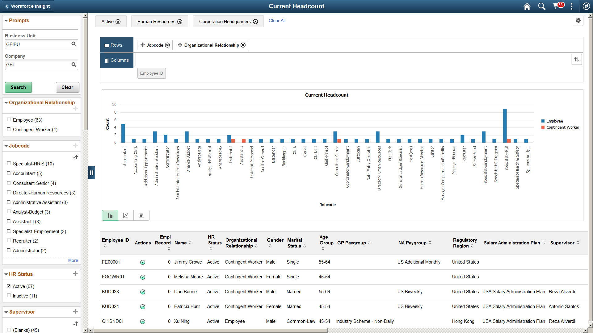
This example illustrates a 2D bar chart pivot grid where filters and chart axis options are engaged when using a large form factor device. The Active status, Human Resources department, and Corporation Headquarters location have been selected as filters. The rows, or X-axis, is driven by Jobcode and is using the Organizational Relationship series.
Note: Throughout the remainder of these topics, the page illustrations show the individual content pages without the context of the prompt and filter sections in left panel.
Regardless of the transaction, the pivot grid pages share these common characteristics and page controls:
Prompts and Filters
These sections/pages are common to both large and small form factor devices.
Term |
Definition |
|---|---|
Prompts |
Specify the parameters used to define the chart’s data set. |
Filters |
Displays the filter categories and values eligible for this pivot grid. Select the check box values that you want to use to filter and change the data to be displayed in the chart. Note: Filters can be added or removed by clicking the Options Menu button in the top right corner of the page and selecting the Update Filters menu item to access the Update Filters Page. |
(Desktop or Tablet)
When using a large form factor device, like a desktop or tablet, the page displays a left collapsible panel to display prompts and filters.
Term |
Definition |
|---|---|
|
Click to show or hide the prompts and filters on the left panel. With a large form factor device, when you select filter values, they appear across the top of the main content page. To remove filters, you can deselect a filter from the left panel, individually remove them from the top of the page by clicking the Delete Selected (x) icon next to the item, or click the Clear All link to the right of the filter items. |
|
Click to drag a filter category to the Rows region above the model and change how the X-axis of the model is presented. You can include up to two filter categories: the first filter category is the x-axis and the second filter category represents the series (legend). A filter category cannot be dragged if the Drag icon appears inactive (in lighter gray color). If a filter is active, orange dotted lines appear as the borders of the filter box when you drag it. |
 Hide Filters or Show Filters
  Drag
icon
Drag
icon(Smartphone)
When using a small form factor device, like a smartphone, and you select a pivot grid tile, the system first displays the <pivot grid> - Search page where you will specify the prompts that the system should use to retrieve the pivot grid page and data.
This example illustrates the <pivot grid> - Search page when using a smartphone. This example shows the prompt fields for the Headcount Movement pivot grid.
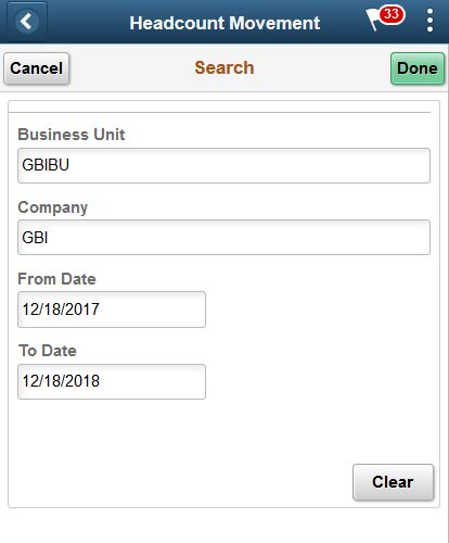
Note: The field prompts will vary by pivot grid.
When using a smartphone, this page displays the same prompt data fields as the Prompts section (for a desktop or tablet, this section is found on the left panel).
Term |
Definition |
|---|---|
Cancel |
Click to access the pivot grid without saving changes, if any. |
Done |
Click to save any prompt values you entered on this page. The system will then take you to the pivot grid page. |
Clear |
Click this button to remove all prompt values on the page. Note: All prompt fields must contain a value to retrieve data for the pivot grid. |
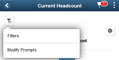
Note: You can return to the content on this page (Prompts page) to change parameter values by clicking the Filters and Prompts button from the pivot grid page, and then selecting Modify Prompts.
Content Area
These page elements are common to both large and small form factor devices unless otherwise noted.
Although these menu items are generally available to all pivot grids, the actions and values you set within these options are specific to the pivot grid you have accessed. Changes to the options are specific to the current pivot grid instance you are viewing unless you save your changes.
Term |
Definition |
|---|---|
|
Click this button (gear icon) in the top right-hand corner of a pivot grid page to access the Options Menu drop-down list. Select from the following items to take actions towards the pivot grid model.
|
|
Click to display data in the chart type represented by the icon. Available chart types include vertical bar (default value), line, pie, and horizontal bar. These options may vary by pivot grid. |
 (gear icon) Options Menu
  (pivot grid chart types)
 (Desktop or Tablet)
When using a large form factor device, like a desktop or tablet, content area displays these additional page elements.
Term |
Definition |
|---|---|
Rows |
Displays the X-axis (maximum of 2) for the model that are used as its X-axis and series. If two filters are selected, the first one becomes the X-axis and the second one becomes the series (legend). Note: Drop and drag filter categories to this section or use the Chart Options Page to identify the X-axis and series. |
Columns |
Displays all the facts for the model that you can select as its Y-axis. Note: Use the Chart Options Page to identify the Y-axis. |
Pause over an individual graphic item, such as a bar or pie slice, to view the details and count. Click to access the drilldown Actions menu and choose from these options:
Term |
Definition |
|---|---|
Detailed View |
Displays a grid with the detailed data. For example, if a bar on a bar chart represents the number of vacant approved positions, click Detailed View to display a grid with information about each of the included approved positions. |
Drilldown To |
Displays the drilldown options defined for the chart. Click a drilldown option to redraw the chart based on the selected type of data. |
(Smartphone)
When using a small form factor device, like a smartphone, the main content area displays these additional page elements.
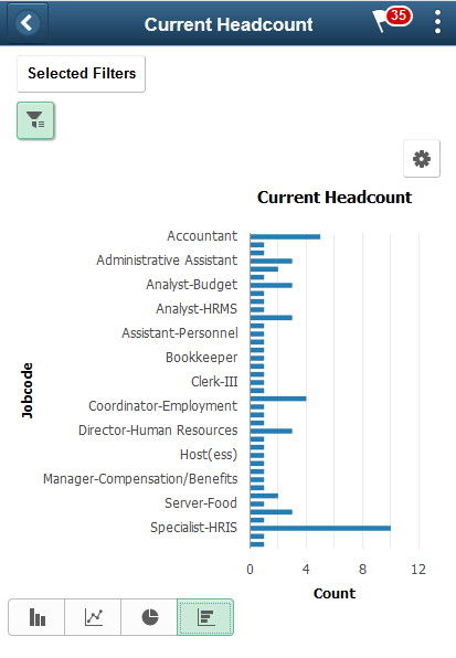
This example illustrates a horizontal pivot grid where filters and chart axis options are engaged when using a smartphone. The Active status, Human Resources department, and Corporation Headquarters location have been selected as filter values. The rows, or X-axis, is driven by Jobcode.
Term |
Definition |
|---|---|
Selected Filters |
This button is available when you have filters selected. Click to show a drop-down list of which filters have been applied to this pivot grid model. Click the Delete Selected (x) icon next to a filter item to remove a filter. |
|
Click this button to select one of the following Filters and Prompts option items:
|
 Filters and Prompts button
This example illustrates the Filters and Prompts menu options when using a smartphone.
Term |
Definition |
|---|---|
Filters |
Select this item from the Filters and Prompts menu to display the Filters page. Use the available filters to change the data to be displayed in the pivot grid model. Note: You can add or remove filters by clicking the Options Menu button in the top right corner of the page and selecting the Update Filters menu item to access the Update Filters Page. |
Modify Prompts |
Select this item from the Filters and Prompts menu to display the Prompts page. Use the Prompts page and view or change the parameters used to define the chart’s data set. |
Use the Refresh Analytics Data page (RUN_CNTL_HR_PG) to run the process to extract and populate data for the analytics reports.
Navigation:
This example illustrates the Refresh Analytics Data page.
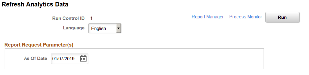
Run the HR_PG_WF_DIV application engine process to load job, personal, and diversity data for each employee (one row for each employee) as of the specified date. This process with populate the following analytic pivot grid reports:
Highest Eduction Level (Highest Education Page)
Diversity Overview (Diversity Overview Page)
Diversity Analysis (Diversity Analysis Page)
Note: You must run this process to populate the extract tables for these pivot grids. They are delivered without data and thus will return empty pivot grids if you have not run this process.
Administrators use the Workforce Insight tile to access a collection of frequently-used analytic reports for workforce administration.
Navigation:
The Workforce Insight tile is delivered as part of the Workforce Administrator Homepage, but the location can change if you change the delivered home pages or if administrators personalize their home pages.
This example illustrates the Workforce Insight tile.
Click the Workforce Insight tile to access the Workforce Insight Dashboard, which displays dynamic tiles for each analytic, with each tile showing a different analytic chart.
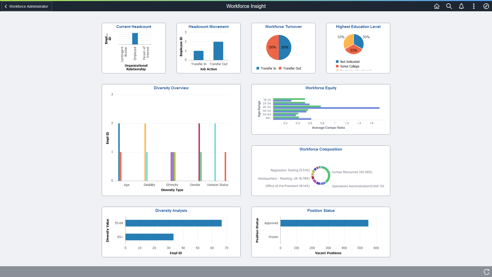
Use the Workforce Insight dashboard (PT_LANDINGPAGE) to select from a collection of frequently used administrator analytic reports.
Navigation:
Select the Workforce Insight Tile, which is delivered as part of the Workforce Administrator home page, but the location can change if you change the delivered home pages or if administrators personalize their home pages.
This example illustrates the Workforce Insight dashboard.
This example illustrates the Workforce Insight dashboard on a smartphone.
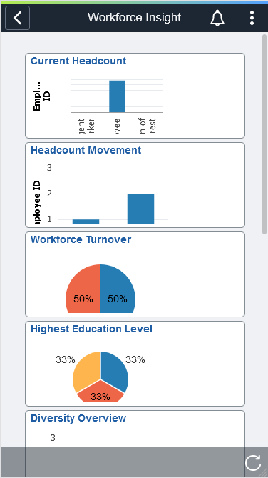
The Workforce Insight dashboard is a collection of analytical reports that enables administrators to view workforce data using these tiles:
Each dashboard tile displays real-time data as analytical charts.
(Desktop) Pause over individual graphic items, such as a bar or pie, to view the details and count.
Click the tile to access the corresponding pivot grid page.
Use the Current Headcount tile to view the distribution of the organizational population by employees, contingent workers, and persons of interest based upon the current job effective dated rows.
Navigation:
From the Workforce Administrator homepage, click the Workforce Insight Tile to access the dashboard.
This example illustrates the Current Headcount tile.
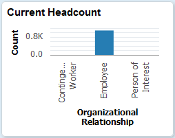
The tile displays the bar graphic by default, but can be overwritten by clicking the tile to access the Current Headcount Page, making filter and option changes, and saving the chart.
(Desktop) When using a desktop, pause over a graph item to view the details and count.
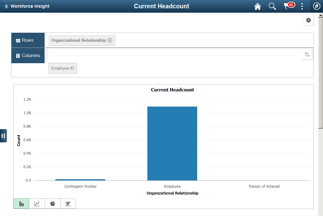
Use the Current Headcount pivot grid page (PTPG_PGVIEWER) to view the distribution of the organizational population by employees, contingent workers, and persons of interest based upon the current job effective dated rows
Navigation:
Click the Current Headcount Tile from the Workforce Insight dashboard.
This example illustrates the Current Headcount pivot chart
This example illustrates the Current Headcount grid that appears below the pivot grid chart when using a large form factor device.
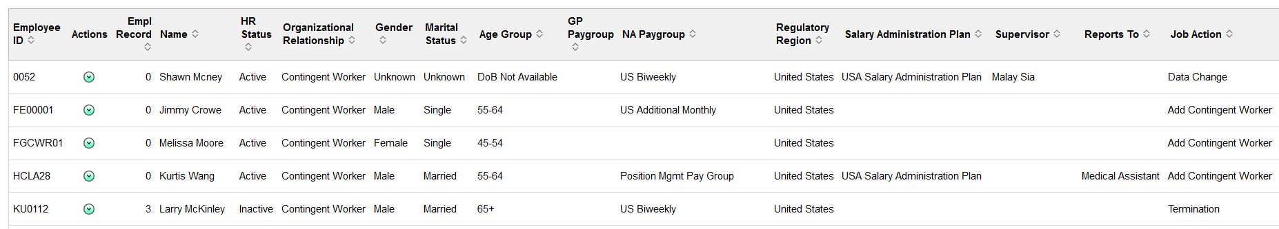
This example illustrates the Current Headcount grid that appears below the pivot grid chart when using a large form factor device.
From the pivot grid page, you have the option to change prompts, filters, change other options, and perform drilldowns. For information on common page elements, see Pivot Grid Page Layout and Common Elements.
(Desktop) When using a desktop, pause over a graph item to view the details and count.
Chart Content and Layout
The following information lists the delivered fields from which you can select values for this pivot grid:
Field or Control |
Description |
|---|---|
Prompts |
Enter the following parameters to define the chart’s data.
|
Filters |
Select values from the following filter categories to narrow your report results.
|
Detailed View |
(Desktop) Select this option to display the grid to view a list of employees that make up the results for the bar or pie piece. |
Drilldown To |
(Desktop) Select this option to analyze report data by these delivered categories:
|
Use the Headcount Movement tile to analyze the headcount movement within your organization by job actions, such as hires or terminations, over a period of time.
Navigation:
From the Workforce Administrator homepage, click the Workforce Insight Tile to access the dashboard.
This example illustrates the Headcount Movement tile.
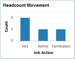
The tile displays the bar graphic by default, but can be overwritten by clicking the tile to access the Headcount Movement Page, making filter and option changes, and saving the chart.
(Desktop) When using a desktop, pause over a graph item to view the details and count.
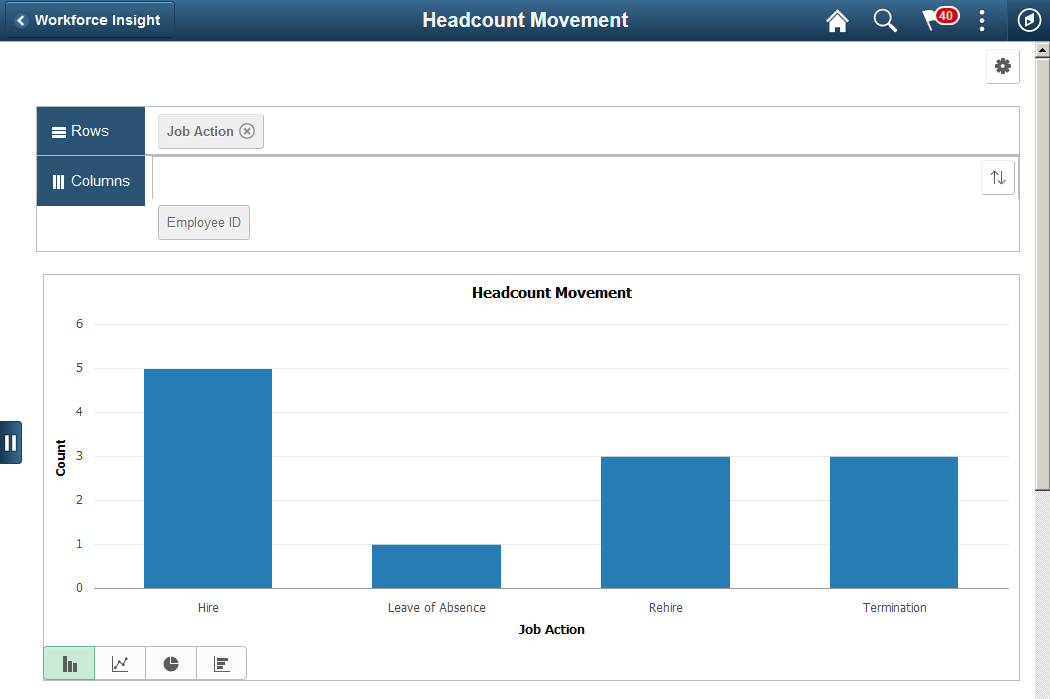
Use the Headcount Movement page (PTPG_NUI_VWR) to analyze the headcount movement within your organization by job actions, such as hires or terminations, over a period of time.
Navigation:
Click the Headcount Movement Tile from the Workforce Insight dashboard.
This example illustrates the Headcount Movement pivot chart.
This example illustrates the Headcount Movement grid that appears below the pivot grid chart when using a large form factor device.
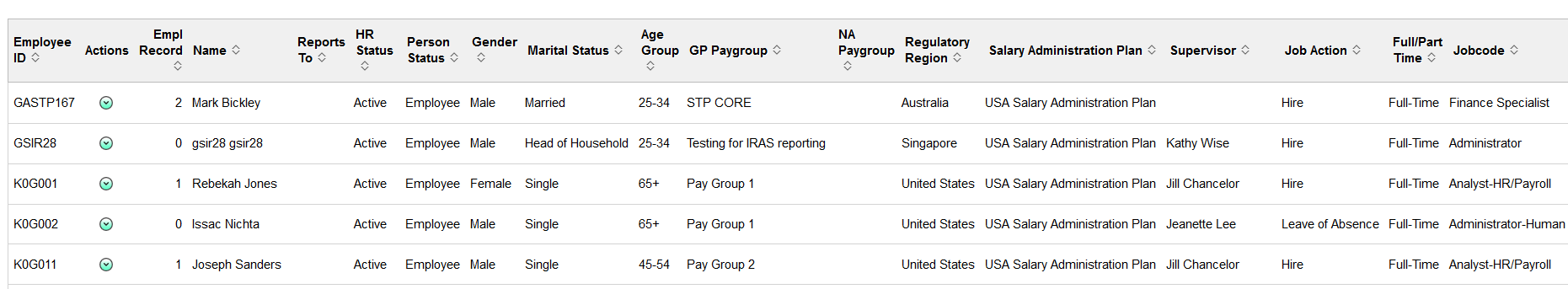
This example illustrates the Headcount Movement grid that appears below the pivot grid chart when using a large form factor device.
From the pivot grid page, you have the option to change prompts, filters, change other options, and perform drilldowns. For information on common page elements, see Pivot Grid Page Layout and Common Elements.
(Desktop) When using a desktop, pause over a graph item to view the details and count.
Chart Content and Layout
The following information lists the delivered fields from which you can select values for this pivot grid:
Field or Control |
Description |
|---|---|
Prompts |
Enter the following parameters to define the chart’s data.
|
Filters |
Select values from the following filter categories to narrow your report results.
|
Detailed View |
(Desktop or Tablet) Select this option to display the grid to view a list of employees that make up the results for the bar or pie piece. |
Drilldown To |
(Desktop or Tablet) Select this option to analyze report data by these delivered categories:
|
Use the Workforce Turnover tile to identify areas within the organization with the highest turnover.
Navigation:
From the Workforce Administrator homepage, click the Workforce Insight Tile to access the dashboard.
This example illustrates the Workforce Turnover tile.
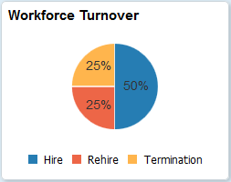
The tile displays the pie graphic by default, but can be overwritten by clicking the tile to access the Workforce Turnover Page, making filter and option changes, and saving the chart.
(Desktop) When using a desktop, pause over a graph item to view the details and count.
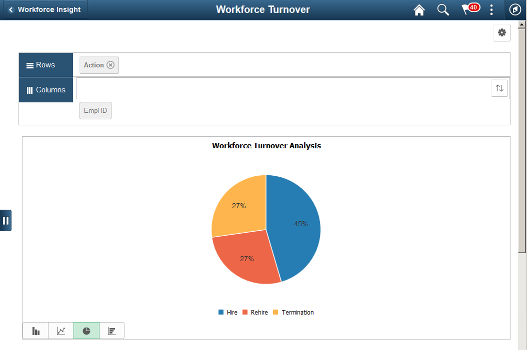
Use the Workforce Turnover page (PTPG_NUI_VWR) to identify areas within the organization with the highest turnover.
Navigation:
Click the Workforce Turnover Tile from the Workforce Insight dashboard.
This example illustrates the Workforce Turnover pivot chart.
This example illustrates the Workforce Turnover grid that appears below the pivot grid chart when using a large form factor device.
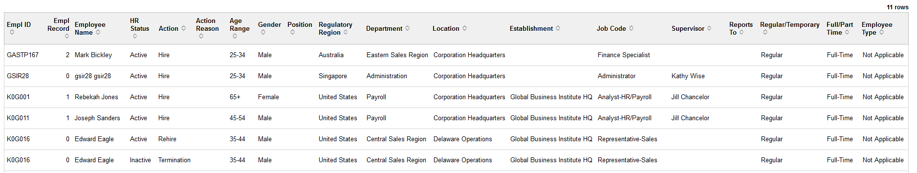
From the pivot grid page, you have the option to change prompts, filters, change other options, and perform drilldowns. For information on common page elements, see Pivot Grid Page Layout and Common Elements.
(Desktop) When using a desktop, pause over a graph item to view the details and count.
Chart Content and Layout
The following information lists the delivered fields from which you can select values for this pivot grid:
Field or Control |
Description |
|---|---|
Prompts |
Enter the following parameters to define the chart’s data.
|
Filters |
Select values from the following filter categories to narrow your report results.
|
Detailed View |
(Desktop or Tablet) Select this option to display the grid to view a list of employees that make up the results for the bar or pie piece. |
Drilldown To |
(Desktop or Tablet) Select this option to analyze report data by these delivered categories:
|
Use the Highest Education tile to view the highest level of education completed by your workforce.
Navigation:
From the Workforce Administrator homepage, click the Workforce Insight Tile to access the dashboard.
This example illustrates the Highest Education tile.
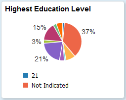
The tile displays the pie graphic by default, but can be overwritten by clicking the tile to access the Highest Education Page, making filter and option changes, and saving the chart.
(Desktop) When using a desktop, pause over a graph item to view the details and count.
Important! You must run the HR_PG_WF_DIV application engine process to populate the extract table for this pivot grid. Data for this pivot grid is delivered without data and will return an empty pivot grids if you have not run this process. See the Refresh Analytics Data Page for more information.
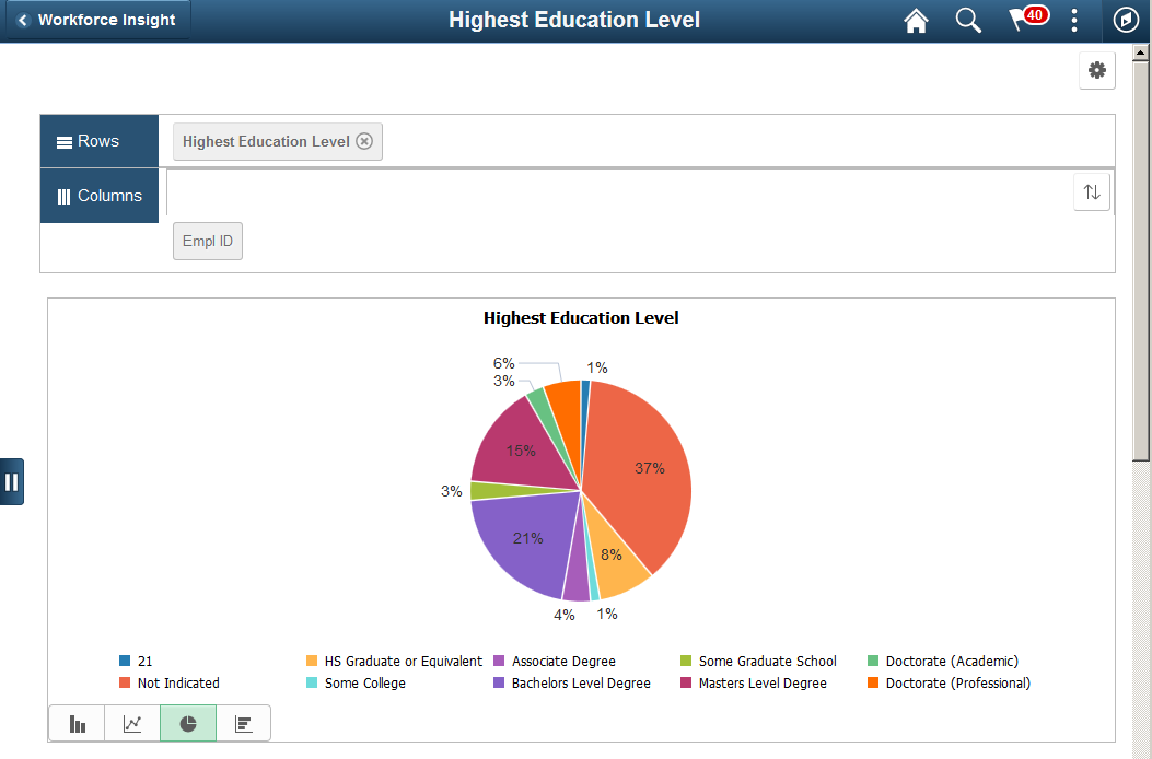
Use the Highest Education page (PTPG_NUI_VWR) to view the highest level of education completed by your workforce.
Navigation:
Click the Highest Education Tile from the Workforce Insight dashboard.
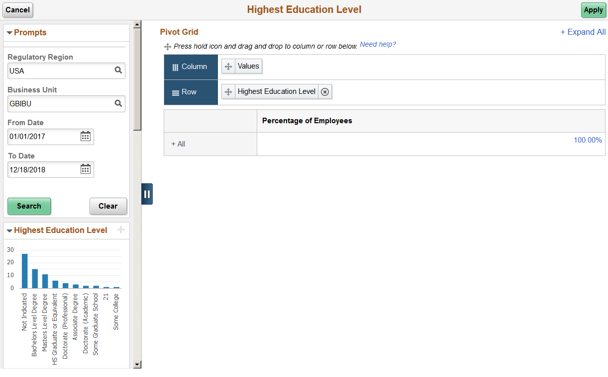
This example illustrates the Highest Education pivot chart.
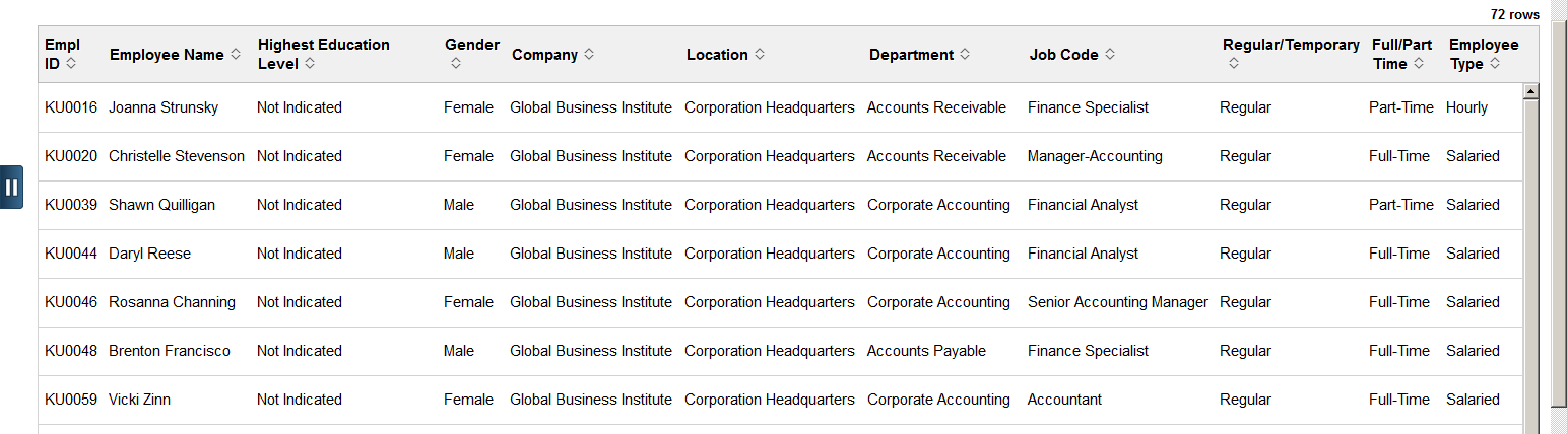
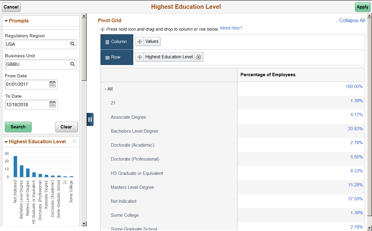
This example illustrates the Highest Education grid that appears below the pivot grid chart when using a large form factor device.
Important! You must run the HR_PG_WF_DIV application engine process to populate the extract table for this pivot grid. Data for this pivot grid is delivered without data and will return an empty pivot grids if you have not run this process. See the Refresh Analytics Data Page for more information.
From the pivot grid page, you have the option to change prompts, filters, change other options, and perform drilldowns. For information on common page elements, see Pivot Grid Page Layout and Common Elements.
(Desktop) When using a desktop, pause over a graph item to view the details and count.
Chart Content and Layout
The following information lists the delivered fields from which you can select values for this pivot grid:
Field or Control |
Description |
|---|---|
Prompts |
Enter the following parameters to define the chart’s data.
|
Filters |
Select values from the following filter categories to narrow your report results.
|
Detailed View |
(Desktop or Tablet) Select this option to display the grid to view a list of employees that make up the results for the bar or pie piece. |
Drilldown To |
(Desktop or Tablet) Select this option to analyze report data by these delivered categories:
|
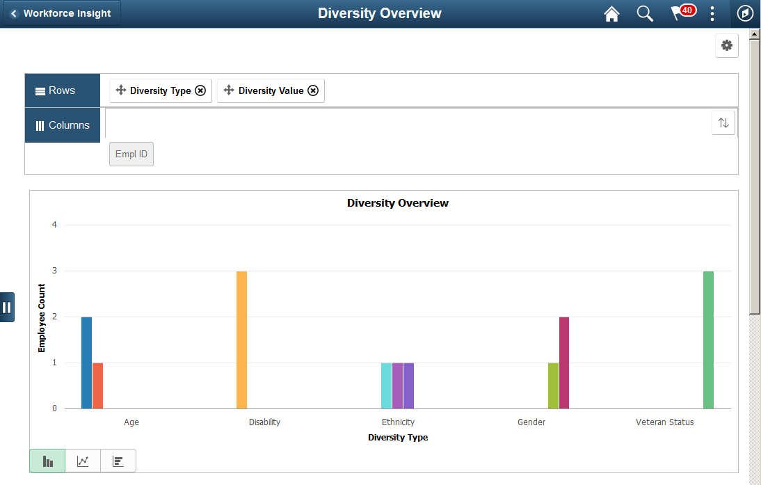
Use the Diversity Overview tile to view the workforce by several diversity types at once (age, disability, ethnicity, gender, and veteran status).
Navigation:
From the Workforce Administrator homepage, click the Workforce Insight Tile to access the dashboard.
This example illustrates the Diversity Overview tile.
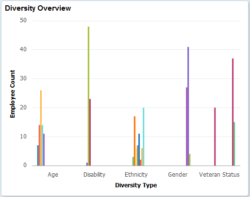
The tile displays the bar graphic by default, but can be overwritten by clicking the tile to access the Diversity Overview Page, making filter and option changes, and saving the chart.
(Desktop) When using a desktop, pause over a graph item to view the details and count.
Important! You must run the HR_PG_WF_DIV application engine process to populate the extract table for this pivot grid. Data for this pivot grid is delivered without data and will return an empty pivot grids if you have not run this process. See the Refresh Analytics Data Page for more information.
Use the Diversity Overview page (PTPG_NUI_VWR) to view the workforce by several diversity types at once (age, disability, ethnicity, gender, and veteran status).
Navigation:
Click the Diversity Overview Tile from the Workforce Insight dashboard.
This example illustrates the Diversity Overview pivot chart.
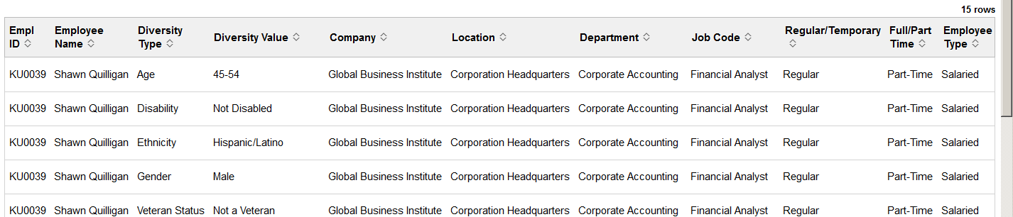
This example illustrates the Diversity Overview grid that appears below the pivot grid chart when using a large form factor device.
Important! You must run the HR_PG_WF_DIV application engine process to populate the extract table for this pivot grid. Data for this pivot grid is delivered without data and will return an empty pivot grids if you have not run this process. See the Refresh Analytics Data Page for more information.
From the pivot grid page, you have the option to change prompts, filters, change other options, and perform drilldowns. For information on common page elements, see Pivot Grid Page Layout and Common Elements.
(Desktop) When using a desktop, pause over a graph item to view the details and count.
Chart Content and Layout
The following information lists the delivered fields from which you can select values for this pivot grid:
Field or Control |
Description |
|---|---|
Prompts |
Enter the following parameters to define the chart’s data.
|
Filters |
Select values from the following filter categories to narrow your report results.
|
Detailed View |
(Desktop or Tablet) Select this option to display the grid to view a list of employees that make up the results for the bar or pie piece. |
Drilldown To and Drilldown Intersection To |
(Desktop or Tablet) Select this option to analyze report data by these delivered categories:
|
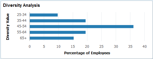
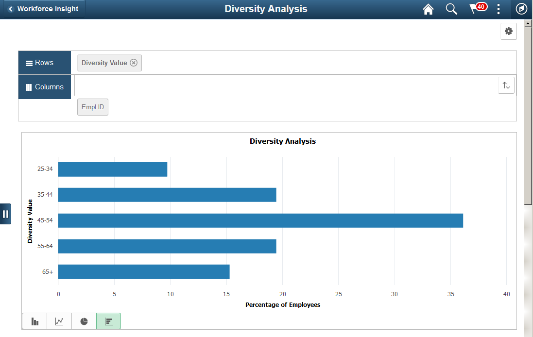
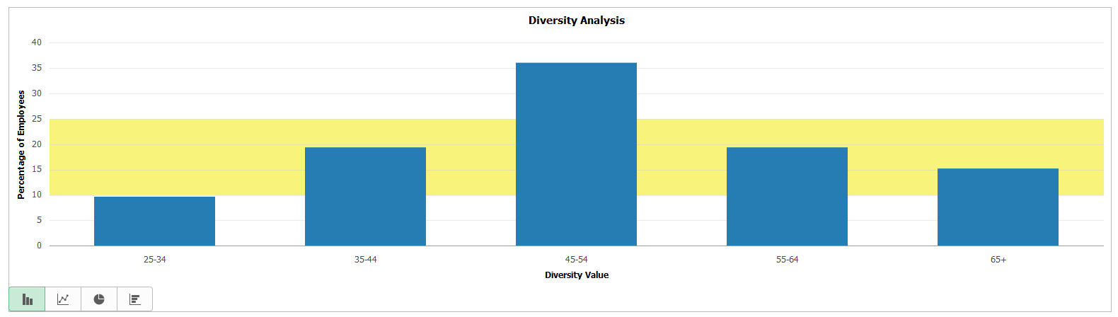
Use the Diversity Analysis tile to review the employee distribution percentage for one diversity type at a time.
Navigation:
From the Workforce Administrator homepage, click the Workforce Insight Tile to access the dashboard.
This example illustrates the Diversity Analysis tile.
The tile displays the bar graphic by default, but can be overwritten by clicking the tile to access the Diversity Analysis Page, making filter and option changes, and saving the chart.
(Desktop) When using a desktop, pause over a graph item to view the details and count.
Important! You must run the HR_PG_WF_DIV application engine process to populate the extract table for this pivot grid. Data for this pivot grid is delivered without data and will return an empty pivot grids if you have not run this process. See the Refresh Analytics Data Page for more information.
Use the Diversity Analysis page (PTPG_NUI_VWR) to review the employee distribution percentage for one diversity type at a time.
Navigation:
Click the Diversity Analysis Tile from the Workforce Insight dashboard.
This example illustrates the Diversity Analysis pivot chart.
This example illustrates the Diversity Analysis grid that appears below the pivot grid chart when using a large form factor device.
Important! You must run the HR_PG_WF_DIV application engine process to populate the extract table for this pivot grid. Data for this pivot grid is delivered without data and will return an empty pivot grids if you have not run this process. See the Refresh Analytics Data Page for more information.
From the pivot grid page, you have the option to change prompts, filters, change other options, and perform drilldowns. For information on common page elements, see Pivot Grid Page Layout and Common Elements.
(Desktop) When using a desktop, pause over a graph item to view the details and count.
Chart Content and Layout
The following information lists the delivered fields from which you can select values for this pivot grid:
Field or Control |
Description |
|---|---|
Prompts |
Enter the following parameters to define the chart’s data.
|
Filters |
Select values from the following filter categories to narrow your report results.
|
Detailed View |
(Desktop or Tablet) Select this option to display the grid to view a list of employees that make up the results for the bar or pie piece. |
Drilldown To |
(Desktop or Tablet) Select this option to analyze report data by these delivered categories:
|
Use the Position Status tile to view vacant positions within the organization by approved or frozen status.
Navigation:
From the Workforce Administrator homepage, click the Workforce Insight Tile to access the dashboard.
This example illustrates the Position Status tile.
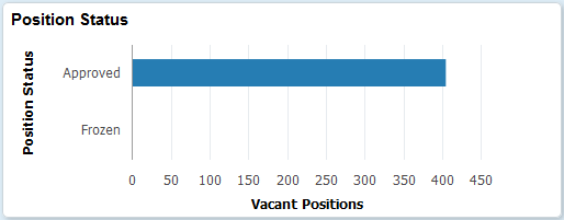
The tile displays the bar graphic by default, but can be overwritten by clicking the tile to access the pivot gridPosition Status Page, making filter and option changes, and saving the chart.
(Desktop) When using a desktop, pause over a graph item to view the details and count.
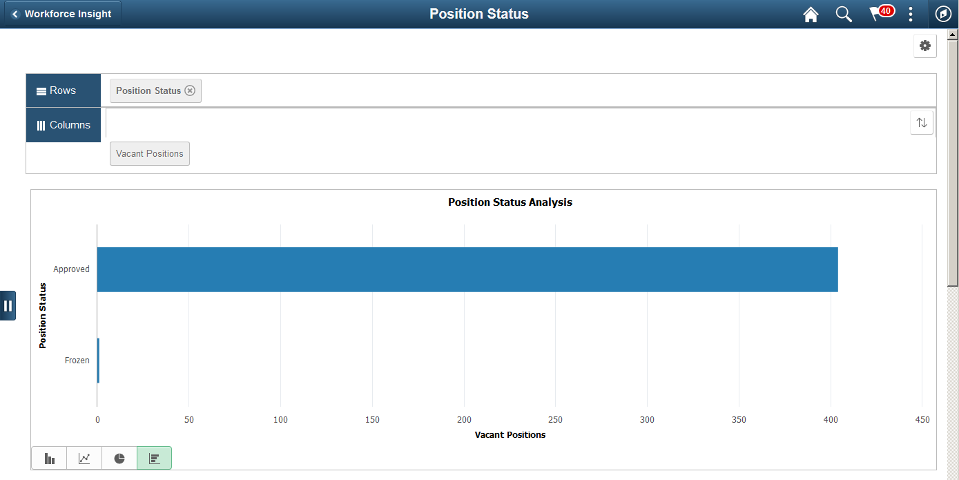
Use the Position Status page (PTPG_NUI_VWR) to view vacant positions within the organization by approved or frozen status.
Navigation:
Click the Position Status Tile from the Workforce Insight dashboard.
This example illustrates the Position Status pivot chart.
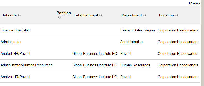
This example illustrates the Position Status grid that appears below the pivot grid chart when using a large form factor device.
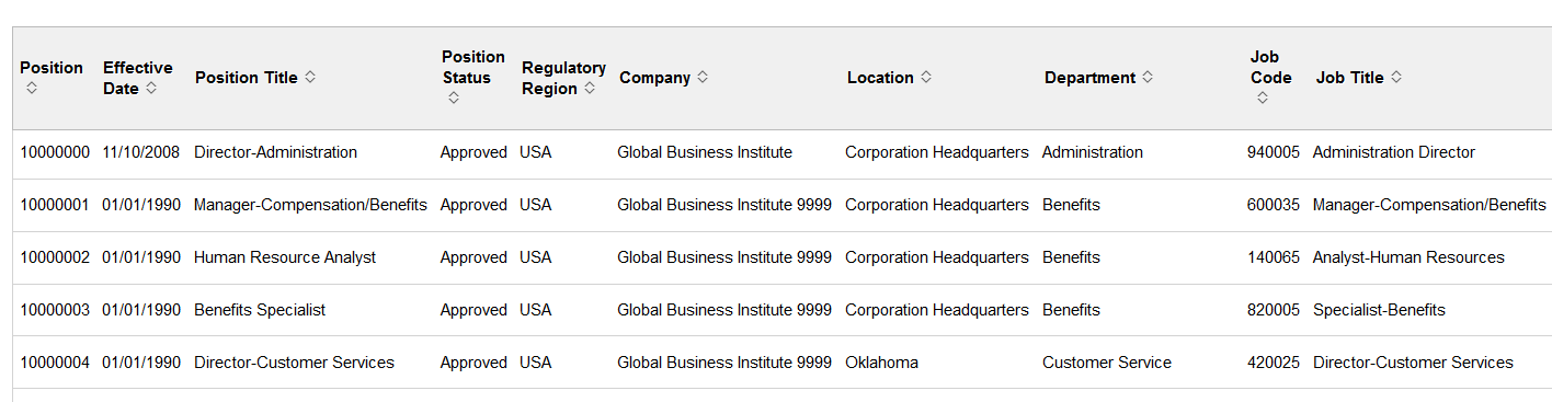
This example illustrates the Position Status grid that appears below the pivot grid chart when using a large form factor device.
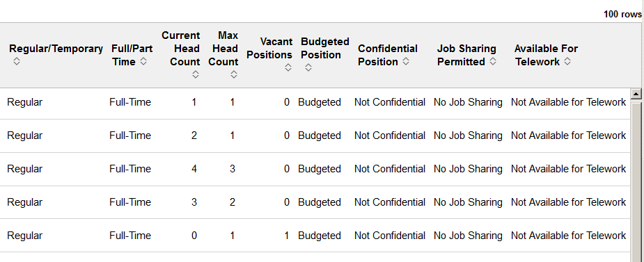
From the pivot grid page, you have the option to change prompts, filters, change other options, and perform drilldowns. For information on common page elements, see Pivot Grid Page Layout and Common Elements.
(Desktop) When using a desktop, pause over a graph item to view the details and count.
Chart Content and Layout
The following information lists the delivered fields from which you can select values for this pivot grid:
Field or Control |
Description |
|---|---|
Prompts |
Enter the following parameters to define the chart’s data.
|
Filters |
Select values from the following filter categories to narrow your report results.
|
Detailed View |
(Desktop or Tablet) Select this option to display the grid to view a list of employees that make up the results for the bar or pie piece. |
Drilldown To |
(Desktop or Tablet) Select this option to analyze report data by these delivered categories:
|
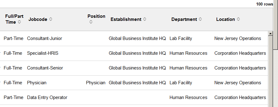
When using a large form factor devise, use the View Grid - <Pivot Grid> page (PTPG_GRIDVIEWERNUI) to view a summary of data counts and select specific values to view the details in grid format.
Note: The page title will vary according to the pivot grid you have accessed.
Navigation:
Select the View Grid item from the Options Menu (gear icon ) drop-down button in the top right-hand side of the pivot grid.
Note: The View Grid options menu item is not available for smartphones.
This example illustrates the default view of the fields and controls on the View Grid - <Pivot Grid> page.
This example illustrates the fields and controls on the View Grid - <Pivot Grid> page when the values have been expanded.
To expand the data on the page, click the +Expand All link at the top of the page or click the +All link in the results table.
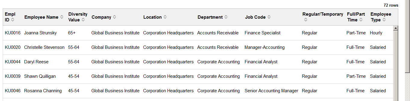
Click a value link to access the <Pivot Grid> (Detail) Page to view additional information.
You can change how data is presented in the grid by dragging and dropping segment data to a different axis. Click the Apply button to return to the pivot grid page to view the changes in the chart.
Use the <Pivot Grid> (Detail) page (PTPG_NUI_DETAIL) to view details of specific data in the grid format.
Note: The page title will vary according to the pivot grid you have accessed.
Navigation:
Click any of the value links available from (Desktop or Tablet) View Grid - <Pivot Grid> Page.
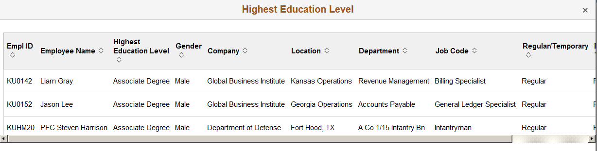
This example illustrates the Highest Eduction Level (Detail) page for the Associates degree.
Use the Update Filters page (PTPG_NUI_FACETUPD) to add or remove filters to be available for use in the pivot grid model.
Navigation:
Select the Update Filters item from the Options Menu (gear icon ) drop-down button in the top right-hand side of the pivot grid.
This example illustrates the fields and controls on the Update Filters page.
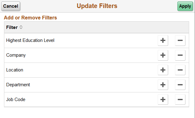
When a filter is added, it is displayed as a filter in the left panel or on the Filters page.
Use the Chart Options page (PTPG_NUI_CHTOPT) to define the display settings for the chart titles and axes.
Navigation:
Select the Chart Options item from the Options Menu(gear icon) drop-down button in the top right-hand side of the pivot grid.
This example illustrates the fields and controls on the Chart Options page.
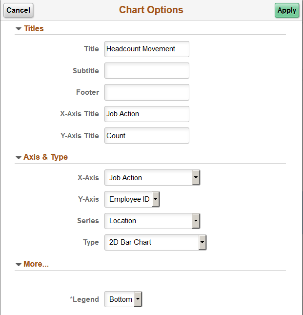
Note: Options on this page may vary by pivot grid.
Use this page to change the chart title, chart type, data to be displayed on the x axis, or data to be displayed on the y axis. Changes you make here are good for the current session of viewing the pivot grid unless you save your changes via the Options Menu, Save or Save As menu items.
For example, if you want to view a headcount profile by full time/part time status, select Full/Part Time from the X Axis drop-down list and click OK. The chart will refresh and display the full/part time label and data on the X axis.
More...
This section is available when a series or pie chart type is selected.
Field or Control |
Description |
|---|---|
Legend |
Identify where the legend of the chart should appear. Valid values are:
|
Exploded Pie |
This option is available when you have selected a pie chart type. Select this check box to detach the pieces of a pie graphic. |
Use the Threshold Personalization page (PTPG_NUI_FACETUPD) to configure the threshold levels and options for a pivot grid.
Navigation:
Select the Threshold Options item from the Options Menu (gear icon ) drop-down button in the top right-hand side of the pivot grid.
Note: Setting threshold options is not available from a smartphone.
This example illustrates the fields and controls on the Threshold Personalization page.
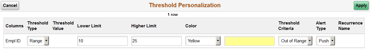
Use this page to determine threshold limits and enable notifications. This is helpful in determining when the workforce is nearing or outside a specified limit. You can also use the PeopleTools Personalized Analytics Notification functionality to alert administrators when reaching threshold limits. For example, you can set up a pivot grid to notify the HR administrator when the organization’s veteran status falls below the recommended threshold. Through notifications and graphic representation, the administrator can easily see they are nearing a threshold and can take action, if necessary.
Note: Oracle PeopleSoft delivers Notification Composer Framework to manage the setup and administration of all notifications in one central location.
Once you have adopted the Notification Composer feature, you must use it to create new notifications and manage your existing notifications.
Notifications delivered with HCM Image 47 or later must use Notification Composer.
For more information about Notification Composer Framework, see Understanding Notification Composer.
Field or Control |
Description |
|---|---|
Threshold Type |
Select a threshold type. Values include Distinct and Range. |
Threshold Value |
This field is available when you select the Distinct threshold type. Enter the exact number that identifies the threshold limit. |
Lower Limit and Higher Limit |
These fields are available when you select the Range threshold type. Enter the range of numbers that identifies the threshold limit. |
Color |
Indicate the color that should display on the pivot grid that marks the threshold line. This appears on the graph for easy identification of threshold limits. |
Threshold Criteria |
Select how the system should notify the administrator. These options are available when you select the Distinct threshold type:
These options are available when you select the Range threshold type:
|
Alert Type |
Indicate the notification type you want to use to alert the administrator. Options include:
Note: Pivot grids use the Personalized Analytics Notification framework for sending alerts, which is available with PeopleTools 8.57 or higher. |
This example show a pivot grid where the threshold was set between 10 and 25 percent of the employees.
For more information on notifications, see the PeopleTools Fluid User Interface Developer’s Guide, “Working with Push Notification Framework” documentation.