Adding Blocks to the Attribute Form
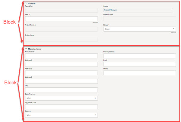
Use the following instructions to add content to the attribute/detail form. The blocks of fields you design for the form will appear in Unifier similar to the following example.
To add blocks to an attribute form:
- Go to the Company Workspace tab and switch to Admin mode.
- In the left Navigator, select uDesigner.
- Open the attribute form as shown in the table below.
A designer window opens.
Note: You can add editable data element (Editable) and editable required data element (Editable (Required)) in the hidden block. This is applicable to all types of BP forms, including attribute forms.
To open this form: | Do this: |
|---|---|
Shell attribute form Asset Class Cost Manager forms | 1 Click the name of the manager in the left Navigator. 2 Double-click the name of the attribute form in the right pane. 3 Click Detail Form in the navigator. 4 Double-click the name of the form in right pane. |
Resource attribute form | 1 Click Resource Manager in the left Navigator. 2 Double-click Resource Attributes in the right pane. 3 Click Detail Form in left navigator. 4 Double-click the name of the form in right pane. |
Role attribute form | 1 Click Resource Manager in the left Navigator. 2 Double-click Role Attributes in the right pane. 3 Click Detail Form in left navigator. 4 Double-click the name of the form in right pane. |
Schedule Activity attribute form
| 1 Click Schedule Manager in the left Navigator 2 Double-click Activity Detail in the right pane. 3 Click Detail Form in the navigator. 4 Double-click the name of the form in right pane. |
Schedule Resource Assignment form | 1 Click Schedule Manager in the left Navigator. 2 Double-click Resource Assignment in the right pane. 3 Click Detail Form in the navigator. 4 Double-click the name of the form in right pane. |
Code-based manager Code and Records-based manager | 1 Click Configurable Modules in the left Navigator. 2 In the right pane, double-click the name of the manager. 3 In the right pane, double-click the name of the form. |
- In the TabName field, enter a name. This is the title that will appear on the form.
- Specify the blocks you want on the form as follows:
- On the Designer window, click the Blocks button. The Form Blocks window opens.
- To add a block to the form, click the Add button. The Block Properties window opens.
- Use the information in the second table below to complete the fields in this window.
- After defining the block properties, click OK to return to the Design window. Next, you can add fields to the form (for more information, see Adding Fields to the Form).
In this field: | Do this: |
|---|---|
Name | Enter a name for the block (for internal purposes only). |
Description | Enter a description for the block. This description will appear on the form if you choose to make it visible. |
Label | Enter the name for the block. This is the name that will appear on the form if you choose to make it visible. |
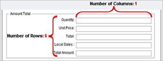
Number of Columns | Enter the number of columns you want on the form. Maximum is 4; default is 2. |
Number of Rows | Enter the number of fields that will appear in this block of the form. Each field will occupy one row. Maximum is 19 fields (rows); default is 5. After you have specified the number of rows, you cannot modify the block properties, but you can manually delete or insert rows in the Designer window.
|
Show Border | Select the check box to enclose the block in a border on the form. This will visibly distinguish the fields in this block from other fields on the form. Note: Instead of using a border, you can also use empty fields to create spaces between rows. |
Show Label | Select the check box if you want the block label you entered to appear on the form. |
Show Description | Select the check box if you want the description you entered to appear on the form. |
Hidden | Select the check box if you do not want to display the block on the form in Unifier. Use this feature to hide fields that are only used in formulas, or to hide deployed obsolete data elements from user view. If blocks are marked as hidden, the block label in the Designer window is grayed out with a pre-assigned value of "Hidden<Block Name: Hidden>." You can add fields with formulas to a hidden block. However, you cannot make the fields in a hidden block "required," and you cannot add a validation rule to the fields. Note: If you need to edit a hidden block, you must deselect this check box to "un-hide" the block and click OK. Then make your changes and hide the block again. |
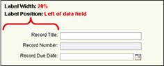
Label Width | Enter the width of the block label as a percentage of the form width. Default is 20 percent. |
Label Position | Specify where the label should appear on the form—to the left or right of the field. Default is left.
You may need to adjust the label width, label position, and number of columns to get the fields to look the way you want. These three attributes affect the way the text is justified and where the red asterisk for a required field appears. |
Notes | (Optional) Use the Notes field to enter details about the design of the attribute form. This can be helpful to others in understanding the information this block is intended to contain and what that information might be used for. Note: This field will not be visible on the log. |
Last Published Saturday, June 6, 2026