Adding Fields to the Form
After you have created the blocks for the form, you can insert fields in the blocks.
To insert fields, you will be choosing data elements from the following lists:
- Custom Data Elements
- Standard Data Elements (Not applicable for Folder Properties or Document Properties in the Document Manager
- Linked Elements
You can also auto-populate these fields from outside elements (see Auto-Populating Fields).
To add custom or standard elements to the form:
The Standard elements are not available for:
Note: The standard elements do not support reverse auto-population (RAP).
- Planning items
- Planning sheets
- Asset classes
- Folder properties
- Document properties
- Shells
- In the Upper Form (or Detail Form) Design window, select an empty cell, and then do one of the following:
- To add a custom data element, click the Custom button.
- To add a standard data element, click the Standard button.
- To add a linked data element, click Linked. See Adding Link Elements to a Form.
One of the following windows opens:
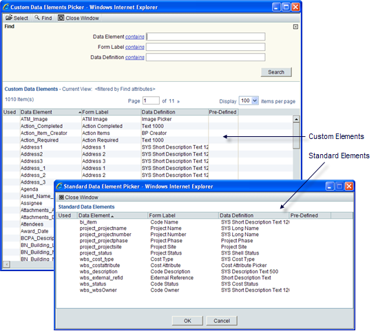
- Highlight a data element from the list.
- From the toolbar, click Select. uDesigner adds the data element to the selected cell on the form and enters a check mark on the picker window in the Used column beside the data element.
To add multiple data elements at once, press the Ctrl key and click the element names.
Tip: Be sure there are enough empty cells to accommodate all the elements you have chosen. If you are short on cells, click the Insert Row button on the Designer window toolbar to add cells to the form. Then select the data elements.
The Data Element Picker window remains open, but uDesigner brings the Form Designer window to the front.
- To add more elements to the form, select another cell on the Form Designer window and repeat step 2.
- When you have added all the fields to the form, click Close Window to close the element picker.
- To exit the designer window, click Close Window.
To find a specific data element:
The list of data elements designed for your company can be large. To quickly display the element you want to use, you can use the Find feature at the top of the window. You can search for a data element by the element name, its form label, or its data definition. You can narrow each of these search options by using operators on the fields, such as "contains" or "is empty."
Note: Only the Custom Data Elements window includes a Find feature; the Standard Data Elements window does not.
- In any of the search fields—Data Element, Form Label, or Data Definition—click the underlined operator and choose the operator you want to use to narrow the search.
- If you have chosen any operator except "is empty" or "is not empty," enter the text the operator should look for.
- Click Search (or press the Enter key on your keyboard). uDesigner will list all the elements that meet the search criteria you entered.
How this Find Window Works
When you open the Custom Data Elements window, uDesigner assumes you will want to search for elements and displays the Find feature at the top of the window. You can close the Find area of the window at any time by clicking the x in the upper-right corner, and reopen it by clicking the Find button.
When you use the Find feature, uDesigner displays the elements it finds. If you close the Find area thereafter, the list will return to normal, showing all data elements. If you open the Find feature again, it will clear the list, assuming that you are going to enter more search criteria.
To sort the list:
The list of data elements shows:
- The name of the data element
- The label of the element that appears on the form
- The data definition on which the data element is built
- Whether the element was shipped with Unifier (Pre-Defined), or was created by your administrator
To make finding a data element easier, you can sort the list by any of the columns. For example, if you are more familiar with the elements by their form labels, you can sort the list alphabetically by the Form Label column; or if you are looking for a picker, you might sort the list alphabetically by the Data Definition column.
To sort the list by a column order, click the column heading. uDesigner displays the list in alphabetical order by that column. To see the list in reverse-alphabetical order, click the column heading a second time.
To move data elements:
After you have added elements to the fields on the form, you can drag and drop the elements from one location to another and one block to another block. To do so, position your cursor over the name of the field, right-click, and drag the field to its new location.
Note: You cannot move an element into a cell that is already occupied by another element. To make room for rearranging elements, insert an extra row. When you are through moving elements around, delete the extra row.
To preview the form:
After you have defined the form, you can preview it to see how it will look in Unifier. On the open form in the Designer window, click Preview. uDesigner displays the form in a new window.
Note: The layout and the interface seen in the preview depends on the availability of the Standard View for the selected business process. If the Standard View is not supported, them the preview will be seen in the Classic View.
To preview the log:
The Preview option is available both in Standard and Picker logs.
Enhancing the Field's Behavior
After you have added a field to a form, you can enhance the behavior of the field by:
- Adding a Note to a Field
- Making Fields Required, Editable, or Read-Only
- Adding Formulas to Fields
- Validating Field Values
- Auto-Populating Fields
- Erasing or Resetting Field Values During a Workflow
- Adding a Reference Process to Auto-Populate Data
- Adding a Reference Process to Auto-Populate Data
- Linking Elements in Shell Hierarchies for Easy Restructuring
- Viewing Details About Form Fields
- Making a Field a Hyperlink
Adding More Functions to the Form
For some business processes, you must add additional pieces to the form for users to use in collaborating on a task. For example, you might need to organize business process line items, by creating multiple tabs for the forms to make it easier to locate business details. You might also need to add a reference process or an email notification to the form. In addition, you can auto-create records from certain forms.
Similar to the Action form, you can add email notification data element to a non workflow BP View form. The user can select the fields, from a View form, to include in the email notification.
Users who receive email notification (based on events triggered) will see the data elements based on email notification elements setup in uDesigner which is across all view forms for Workflow BPs. For Non-workflow BPs, the email notification received will show all the data elements based on email notification elements setup across all upper forms in uDesigner.
Similar to the BP View Form, you can create multiple View forms in a shell type, similar to non-workflow business process.
Note: In uDesigner, you can only have one Action form for a shell type.
You can create multiple View forms manually or by using the Copy option.
To create View forms:
- Go to the Company Workspace tab and switch to Admin mode.
- In the left Navigator, select uDesigner, and then select Shell Manager.
- Open the applicable BP.
- In the left Navigator, select Upper Forms.
- Select the applicable shell.
- In the left Navigator, select Detail Form.
- From the toolbar, click one of the following:
- New: To create multiple View forms.
- Copy: To copy existing forms and create View forms.
Note: You can create both Action and View forms in any order, but the design must have only one Action form.
When creating a new View form manually, in the Form Design window, General tab:
- If an Action form exists for the shell design, the View Form option will be automatically selected, and the Action Form option is disabled.
- If an Action form does not exist for shell design, when creating a new form, you will have the option to select the new form an Action form or a View form.
When creating a new View form by way of Copy, , in the Form Design window, General tab:
- If an Action form exists for the shell design, the copied version will have the View Form option automatically selected and disabled.
- If an Action form does not exist for the shell design, the copied version will have both the Action Form and the View Form options enabled, and you can select one of the form options.
You can create multiple View forms and a single Action form in shell design, and the system does not place any restrictions regarding the sequence of the created forms.
After your design is deployed, deleting a View form will remove the form the View Forms tab, in the Shell Details window.
Custom data elements that you add to a View form must be present in Action form; otherwise, the shell design cannot be completed.
SYS Rich Text type Data Element
The data elements of SYS Rich Text type are allowed to be placed on the upper forms of all types of BPs. You can put a maximum of five data elements, of the SYS Rich Text type, within the BP design. There are no limits for the number of columns in a block that contains the SYS Rich Text type data element, within the BP form.
The following table explains the expected behavior when you place the SYS Rich Text type data element on a BP:
BP component | Any impact? | Expected behavior |
|---|---|---|
Data Picker Configuration | Yes | DE of SYS Rich Text should not be available in setting query conditions for the data picker |
Data Elements Configuration | Yes | Unique: DEs of SYS Rich Text type should not be available to be added as 'Unique' Data Elements on a BP. Auto-Sequence: Not applicable. |
Integration (in the BP properties) | Yes | Input XML: If the Rich Text DE is set to input/both in integration setup within the BP, it should show up in the input xml file with proper tags. When the user does an input into Unifier using this XML, the input for the SYS Rich Text DE can be plain text or in HTML. The DE will be supported in REST calls only. The DE will not be supported in SOAP services. Output XML: If the Rich Text DE is set to output/both in integration setup within the BP, it should show up in the output xml file with proper tags. Note: When data will be extracted via xml, the value of SYS Rich Text DE will be in HTML. Input CSV Template: If the Rich Text DE is set to input/both in integration setup within the BP, it should show up the input CSV Template. When creating data via the csv template, user can input the SYS Rich Text DE value as plain text or HTML. Note: In both SOAP and CSV import/Export of Rich Text type DEs, only HTML format of content will be supported (JSON will stay unsupported). |
Templates | Yes. The DE should be allowed to be placed on the Form Templates. | When blocks are added to a BP form by copying from Template, the DE should get copied over correctly. When related forms are updated using the template, the DE should get pushed to blocks correctly. |
Upper Forms | Toolbar: Yes | Link Elements: This DE should not be allowed to be set as a Linked Data Element on BP forms. Tooltip: DEs of this type should be available for adding a tooltip. Note: The remaining options on the toolbar are not applicable for this DE. |
Upper Forms | Action Form: Yes View Form: Yes | This DE should be allowed to be placed on the upper forms of all types of BPs. Access: The user has the ability to mark SYS Rich Text DEs in all three access types (Editable, Required, and Read-only). Email Notification Elements: This DE cannot be added as an Email Notification element. Formula: This DE cannot create formulas in source or in destination. Auto-populate: This DE cannot be auto-populated (AP), as per matching DD. The user cannot set a constant value in this DE. Reverse-Auto-populate: This DE cannot be reverse auto-populated (RAP) as per matching DD. Reset: The user can reset this DE. Add Note: The user can add note to this type of DE. Mobile: The user can add this DE to mobile DEs. Note: The remaining properties are not impacted by this DE. |
Detail Form | Not applicable | Not applicable |
Query Items | Not applicable | Not applicable |
Item Logs | Not applicable | Not applicable |
Workflows | No | This DE is not available to be used as a Trigger Element or Action Name (or in any other place) within a Workflow. |
Log (Standard) | Yes | Layout: This DE cannot be placed in the Layout tab. Sort Order: Not applicable. Find: This DE cannot be added for "Find." |
Log (Picker) | Yes | Same as Log (Standard), above. Note: This DE cannot be added in the Group By tab. |
Reference Process | Yes | General tab: This DE cannot be a Source element in this tab. (This applies to both the 'Source Element' drop-downs in this tab.) Query tab: Yes Note: This DE cannot be used to create queries. |
Integration (setting of DEs inside the BP) | Yes | Upper: This DE cannot be added in integration and set as Input, Output, or both. Detail: Not applicable. |
Auto-creation Processes | Yes | Upper: The DEs of SYS Rich Text type cannot be included in the Display Element drop-down in the auto-creation configuration for BP creators Detail: Not applicable. |
Bid Comparison Sheet (Applies to RFB type BPs only.) | Yes | This DE cannot be added to the sheet from the Bidder form or as a custom element. |
In This Section
Last Published Saturday, June 6, 2026