Analyzing Maintenance Management Using PeopleSoft Insights
PeopleSoft Maintenance Management delivers two Insights dashboards that help users with business intelligence analytics. These dashboards are Work Order Labor Assignments and Work Order Asset Maintenance History.
|
Page Name |
Definition Name |
Usage |
|---|---|---|
|
Analyze technician and shop labor assignments, and unassigned work order tasks. |
||
|
Analyze labor time and cost associated with maintaining different asset types. |
To access Maintenance Management Insights Dashboards, add these tiles to any Fluid homepage:
This example illustrates the Work Order Labor tile

This example illustrates the Work Order Asset Maintenance tile
For more information about how to add a tile to a PeopleSoft Fluid Home page, see:
‘Working with the Fluid User Interface’ in the PeopleTools Accessibility Guide.
‘Working with Fluid Homepages and Dashboards’ in the PeopleTools Applications User’s Guide.
For more information about PeopleSoft delivered Insights dashboards, definitions, privileges, and roles, see Understanding PeopleSoft Insights Using PeopleSoft Search Framework
Use the Work Order Labor Assignments dashboard to analyze technician and shop labor assignments, and unassigned work order tasks.
Navigation:
This example illustrates the fields and controls on the Work Order Labor Assignments dashboard.

This example illustrates the fields and controls on the Work Order Labor Assignments dashboard.

This example illustrates the fields and controls on the Work Order Labor Assignments dashboard.
The visualizations and data displayed on the Work Order Labor Assignments dashboard can be filtered based on the delivered filters, such as Work Order Business Unit, Asset Management Business Unit, Work Order Type, and Technician. Multiple filter values can be selected. For example, you can select multiple business units from the Work Order Business Unit filter. Data can also be filtered by selecting any categorical data within a visualization (for example, an individual bar in a bar graph).
The following visualizations are part of this dashboard:
Future Workload by Technician/Criticality: Provides a view of technicians with the highest number of scheduled labor hours. The descending horizontal stacked bar chart evaluates the part-to-whole comparison of scheduled labor hours by asset criticality. This visualization only reflects work order task assignments with a required end date in the future. It does not include work order task assignments with a required end date in the past.
The horizontal axis represents scheduled labor hours, and the vertical axis lists technicians. The date dimension for scheduled labor hours is the work order task required end date within the timeframe selected.
This visualization can help answer which technicians have the highest scheduled labor hours and how much of their time is spent working on the most critical assets.
Technician Past Performance: Provides a comparison of technician scheduled hours and actual hours for work order tasks with a required end date in the past. This visualization does not include work orders with a required end date in the future.
The multi-series horizontal bar chart has technician names along the vertical axis and labor hours along the horizontal axis.
This visualization can help answer whether actual hours exceed scheduled hours, or if certain technicians are scheduled for more hours than others.
Task Status by Due Date: Provides a view of task status by required due date. Each vertical bar in the graph represents a task status type (for example, Work in Progress).
This visualization can help determine whether a work order task status aligns with required end dates. It can also help identify past due tasks that have not advanced beyond a certain status.
Unassigned Tasks by Shop/Asset Location: Provides an analysis of the shops with the highest number of unassigned work order tasks, by asset location and area ID.
This visualization can help determine the shops with the highest number of unassigned work order tasks, or the asset locations (and area IDs) with unassigned work order tasks
Overdue PMs by Technician (Overdue Preventive Maintenance by Technician): Provides a view of technicians (including unassigned) with the highest number of overdue preventive maintenance work order tasks with a required end date within the timeframe selected.
When you use this visualization in combination with the Work Order Task Details table, you can determine asset criticality, scheduled labor hours, and whether any time has been recorded for the preventive maintenance work order tasks.
Overdue Unassigned PMs by Shop (Overdue Unassigned Preventive Maintenance by Shop): Provides an analysis of preventive maintenance not yet assigned (not yet started). This visualization displays shops with overdue preventive maintenance work order tasks with a required end date within the timeframe selected.
When you use this visualization in combination with the Work Order Task Details table, you can determine the criticality of the assets associated with the preventive maintenance as well as the work order priority.
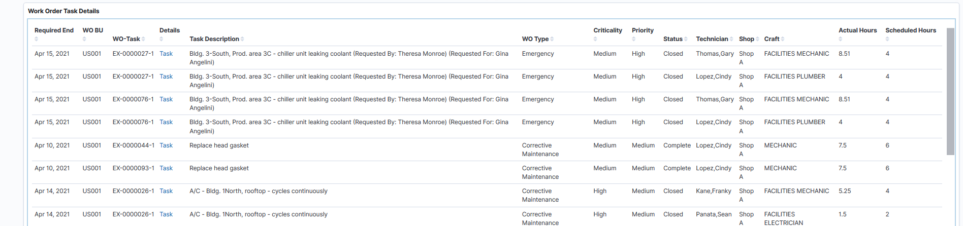
Work Order Task Details: Displays a list of work order tasks making up the data shown in the visualizations. Use the Task link to access the Work Order Page and view further details about the work order or modify information as needed.
Each visualization can be viewed separately in full screen. You can also drill down for more information using the Inspect option. That data can be downloaded as a CSV file.
Use the Work Order Asset Maintenance History dashboard to analyze labor time and cost associated with maintaining different asset types.
Navigation:
This example illustrates the fields and controls on the Work Order Asset Maintenance History dashboard

This example illustrates the fields and controls on the Work Order Asset Maintenance History dashboard.
This example illustrates the fields and controls on the Work Order Asset Maintenance History dashboard.

The visualizations and data displayed on the Work Order Asset Maintenance History dashboard can be filtered based on the delivered filters, such as Work Order Business Unit, Asset Management Business Unit, Work Order Type, and Maintenance Type. Multiple filter values can be selected. For example, you can select multiple business units from the Work Order Business Unit filter. Data can also be filtered by selecting any categorical data within a visualization (for example, an individual bar in a bar graph). In addition, you can search for available filters or add additional filters.
The following visualizations are part of this dashboard:
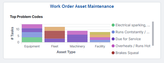
Top 5 Problem Codes by Asset Type: Provides a view of the top five problem codes by asset types with the most work orders, filtered by required end date within the timeframe selected.
The stacked bar chart represents the number of work order tasks associated with each of the top 5 problem codes. The horizontal axis represents asset types.
Most Costly Assets to Maintain: Provides an analysis of the ten most costly assets to maintain for the selected timeframe.
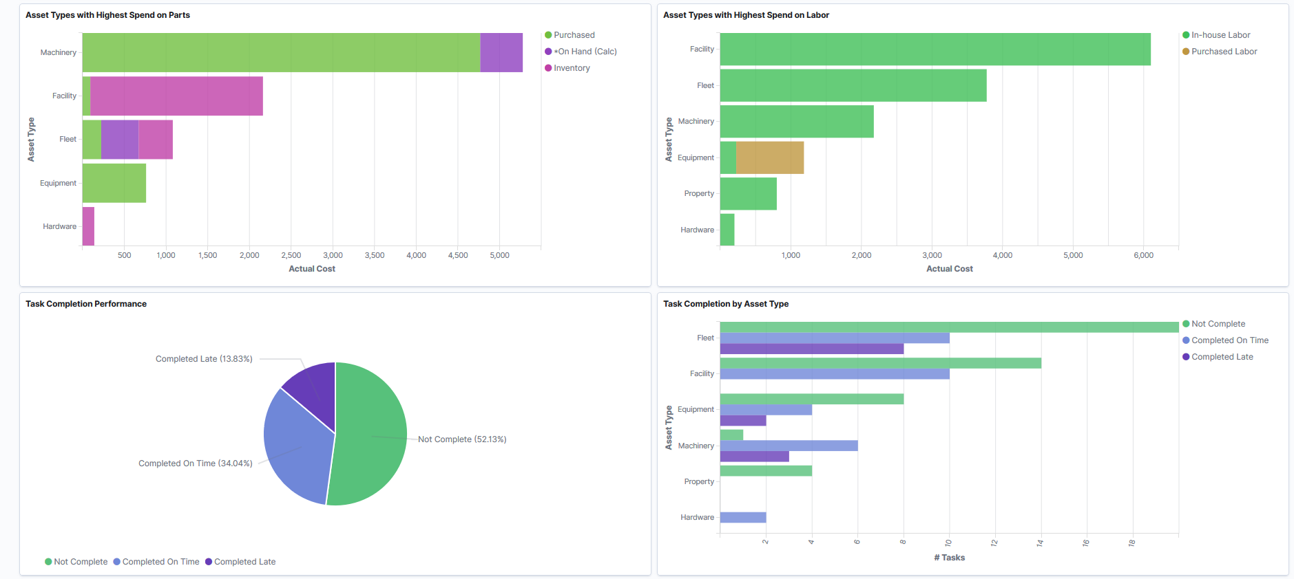
Asset Types with Highest Spend on Parts: Provides an analysis of the top ten asset types with the highest spend on parts.
The horizontal stacked bar chart allows you to evaluate the proportion of inventory, procurement (purchased), and on-hand parts used for work order tasks. The vertical axis lists the asset types, while the horizontal axis represents actual cost.
Note: The cost of on-hand parts is calculated based on the unit cost on the work order schedule and the used quantity recorded as actuals.
Asset Types with Highest Spend on Labor: Provides an analysis of the top ten asset types with the highest spend on labor. This includes both in-house labor and contracted labor.
The horizontal stacked bar chart displays asset types along the vertical axis and actual cost along the horizontal axis. The stacked bars allow you to evaluate the part-to-whole comparison of in-house and contracted labor for the asset types with the highest spend on labor. The time dimension used is the work order task required end date.
Task Completion Performance: Provides insight into the work order completion status. This pie chart displays the percentage of work order tasks completed on time, completed late, and not completed. The time dimension used is the work order task required end date.
Task Completion by Asset Type: Provides an analysis of the top ten asset types with the highest number of work order tasks with required end dates within the timeframe selected.
The multi-series horizontal bar chart displays one bar for each of the completion statuses—completed on time, completed late, and not completed. The vertical axis lists the asset types and the horizontal axis displays the number of tasks. The chart displays in descending order based on asset types with the most tasks.
Work Order Task Asset Detail: Displays a list of work order task assets making up the data shown in the visualizations. Use the Asset link to access the Define Asset Operational Information - Asset Information Page and view further details about the asset or modify information as needed.
Each visualization can be viewed separately in full screen. You can also drill down for more information using the Inspect option. That data can be downloaded as a CSV file.