Using Control Charts
This topic discusses how to use Control charts.
|
Page Name |
Definition Name |
Usage |
|---|---|---|
|
None |
View process performance trends over a specific time period or number of subgroups sampled. Control charts help you distinguish between natural and unnatural process variation and the effectiveness of corrective actions taken. |
|
|
None |
Change graph settings and display characteristics. |
|
|
None |
Select a control procedure and apply it to the current control chart. |
Use the Control Chart panel to view process performance trends over a specific time period or number of subgroups sampled.
Control charts help you distinguish between natural and unnatural process variation and the effectiveness of corrective actions taken.
Navigation:
Click the Control Chart button.
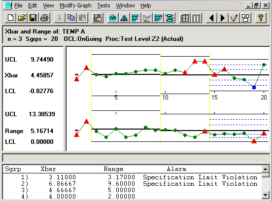
This example illustrates the fields and controls on the Control Chart panel. You can find definitions for the fields and controls later on this page.
Control charts are comprised of multiple graph panes (sections) that display information about a subset. To resize the sections:
Place the cursor on the thick bar between the sections.
Drag the edge of the section to the new size.
You can also select an individual point and view the details, including subgroup calculations, trace data, and cause and corrective action information. When you click points in the chart section, a yellow vertical bar highlights the points, while corresponding values for the points appear in the detail section. To move this bar:
Drag it.
Use the Left Arrow and Right Arrow keys on the keyboard.
To remove the yellow highlight bar, drag it to the far left or far right of the chart.
To select multiple subgroup points:
Hold the Shift key down.
Drag the mouse over the points to remove or restore.
The points that you select are enclosed in red boxes in the chart section, and the summary list appears in the detail section.
To deselect the points, repeat steps 1 and 2, or use the Restore button. These subgroups are discounted from any local control limit recalculations or test violations when you click the Redraw button.
Note: When you use the control chart to apply tests, deselect points, or change control limits, the results are local to the active window; the dataset is not altered.
Title Section
This section displays the label of the chart being applied; for example, X-bar and Range charts. The title section also displays the subset for which the data is being displayed; for example, Temp A.
Field or Control |
Description |
|---|---|
N |
Displays the subgroup size used for this control chart. |
Sgrps (subgroups) |
Displays the number of subgroups or plotted points displayed in this chart. |
OCL (operating control limit) |
Displays the status of control limit promotion or calculation. Note: The status values correspond to the standard None, Preliminary, Monitoring, and Ongoing limit status values. Modified status indicates that the control limits were calculated dynamically for this graph window and not extracted from the database. |
Proc (control procedure) |
Displays the control procedure in effect. It also indicates whether the alarms indicated on the chart were: (Tested): Tests and alarms were performed locally to this graph and not necessarily present in the database. (Actual): Alarms associated with the subgroups were extracted from the database. |
Chart Section
This section displays the main body of the graph. For example, if you selected the X-bar and range charts, you would see two graphs displayed on the control chart, one for the X-bar and one for the range chart. Each point on the graph represents an individual subgroup.
Alarms or out-of-control points are indicated by red triangles. Green circles represent all others. A blue square indicates that the subgroup readings were edited in the database using data-entry panels.
Note: Points with cause and action information associated with them are indicated by an over-bar.
You can see the subgroup values for each point on the chart by finding its number in the detail section of the control chart.
Control Limit Description Section
This section displays the values and appropriate labels for the upper control limit (UCL), mean (CL), and lower control limit (LCL) for each graph. These limits may be have been extracted from the database, calculated, or set local to the graph.
Separator Section
This section is blank, unless you select a point in the graph section; then it displays detailed information about the point.
Detail Section
This section displays a list of subgroup summary information if a point has not been selected on the graph. This list includes the subgroup plot point values and alarm descriptions.
If you select an individual point on the graph, use this area to see detail information, such as traceability fields, probable causes, and corrective actions for that subgroup. If the dataset has been extracted from the Quality database, the Subgroup Status field also appears. The field indicates if a subgroup has been edited or changed in the database. A status of 800 indicates that one or more sample values have been changed for the subgroup, and this point is designated as a blue square on the chart. A status of 200 indicates that the subgroup has not been edited.
Use the Modify Control Chart dialog box to change graph settings and display characteristics.
Navigation:
Display a control chart.
You can change a chart by resizing the sections to adjust the amount of display information, by changing the control limits, and by choosing whether to display the control limit labels, alarm indicators, varying control limits, and test zones. Changes you make to the control chart affect only the active chart. If you open a second chart window, the changes are not in effect.
Field or Control |
Description |
|---|---|
Fit Points to Window |
Select to size the graph to fit inside the chart section of the window. Eliminates the horizontal scroll bar. |
Display Ctl Limit Labels (display control limit labels) |
Select to display labels in the description section of the control chart. This is useful if you have limited space and it is more important to display the graph than the labels. |
Display Alarm Indicators |
Select to display red triangle alarm indicators, representing subgroup points that are out of limits. |
Display varying limits |
Select to display historical control limits associated with a dataset in a step-wise fashion on the control chart. The system evaluates the chart based on the most current control limits. If the chart's time period includes prior limit calculations and you select this option, the system displays the limits as expanding or contracting segments against a fixed scale. Note: This option applies only to datasets extracted from the Quality database. |
Display test zones |
Select to display positive and negative sigma lines in the main body of the control chart. |
Control Limits |
Select to reset limits for the UCL, CL, or LCL. There is a column to set limits for each graph in the active section of the control chart. |
Maintain Current Limits |
Select if you don't want the current control limits to be recalculated while you are working with this control chart. Note: The limits are recalculated when you click the Redraw button. |
Use the Control Procedures dialog box to select a control procedure and apply it to the current control chart.
Navigation:
Display a control chart.
Select a different control procedure to run against current datasets.
You can select a control procedure from the list and apply it to the current chart. Each procedure contains one or more control tests that are executed against the chart to test alarm conditions. The procedures and tests were set up when you defined quality methods.
To run tests, select a control procedure. The tests run immediately, and the results appear in the lower portion of the panel. The first number represents the number of chart-based alarms, or alarms not generated from specification violations. The number in parentheses is the number of alarms generated from specification violations.
For example:
3 (3) Subgroups Alarmed on X Chart
6 (3) Subgroups Alarmed on MRange Chart
The example indicates that three alarms were generated from non-specification violations, and three alarms were generated from specification violations on the X-Bar graph of the control chart.
Because each subgroup on the chart can have more than one alarm condition, the total number of alarms can exceed the number of points on the chart. The number of specification-related alarms is the same for the second MRange chart.
Use the configuration panels associated with the Selector panel in the Quality application client to change elements related to a subset, such as the subgroup size and default control procedure.