Monitoring Environments
The Monitoring page is available on managed environments that contain a search framework, database system, and middle tier.
Monitoring must be enabled to use Auto Scaling. See Setting Up Auto Scaling.
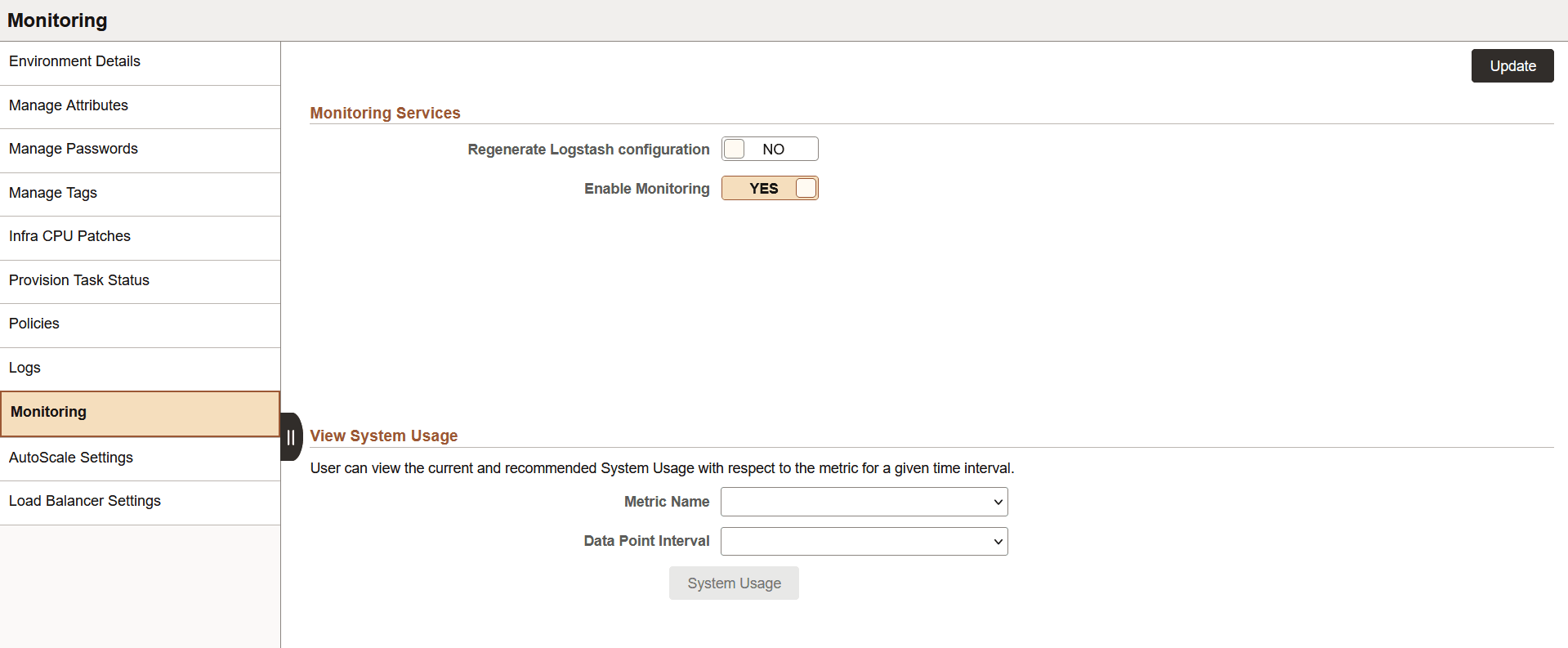
Use the Monitoring page to enable or disable monitoring for the environment.
The monitoring graph is displayed when:
Monitoring is enabled for the environment.
OCI or JMX metrics are being collected.
Data Science is used in the environment for prediction.
This example illustrates the fields and control on the Monitoring page. You can find definitions for the fields and controls later on this page.
|
Field or Control |
Description |
|---|---|
|
Regenerate Logstash configuration |
Select YES to regenerate Logstash configuration. The default value is NO. |
|
Enable Monitoring |
Select YES to enable monitoring. The default value is NO. |
|
Metric Name |
Select the metric name for plotting against the System Usage. The available metrics are:
|
|
Data Point Interval |
Select the data point interval to plot the number of nodes in the environment. Plots are available for Public Load Balancer and Private Load Balancer. Data Point intervals available are:
|
|
System Usage |
Click this button to view the jet chart graph showing the system usage. You can view the current and recommended system usage with respect to a metric at the selected data point interval in the monitoring graph. |
Monitoring System Usage
The monitoring graph displays the following information:
Maximum mid tier nodes currently present in the environment
Maximum predicted mid tier nodes that should be present in the environment based on model predictions
This data is displayed for private as well as public load balancers. The y-axis in the upper section represents the metric selected. The y-axis in the lower section represents the number of current, recommended, and forecasted mid-tier nodes in the system. The x-axis represents the date time points. The size of the circles indicating data points is directly proportional to the severity of the anomalous situation.
Note: The system usage chart displays daily and weekly forecasting data only for Http Requests metric and Middle Tier nodes. Forecasting is not applicable for any other metric.
This example illustrates the jet chart showing the number of incoming Http requests and the number of current and recommended mid tier nodes for private load balancer.
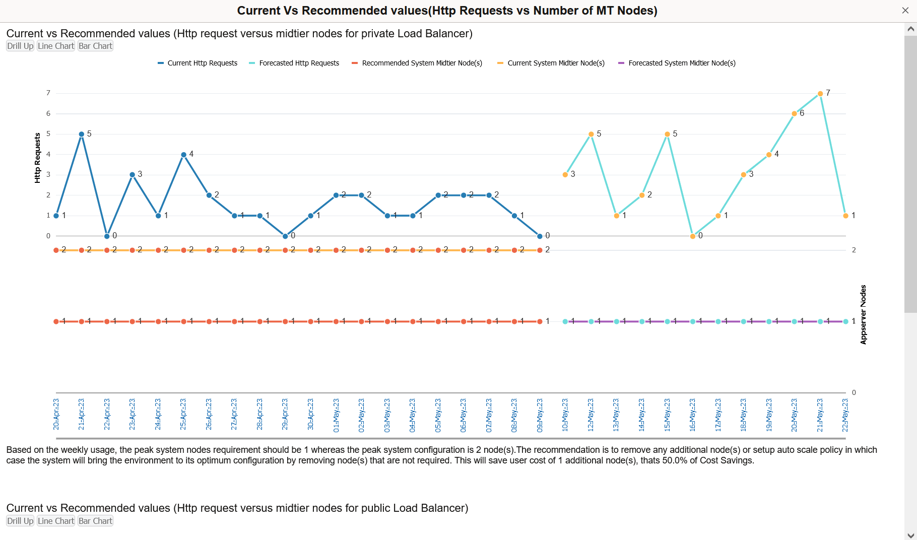
Upward and downward mouse scroll actions can be used respectively to zoom in and out the data values.
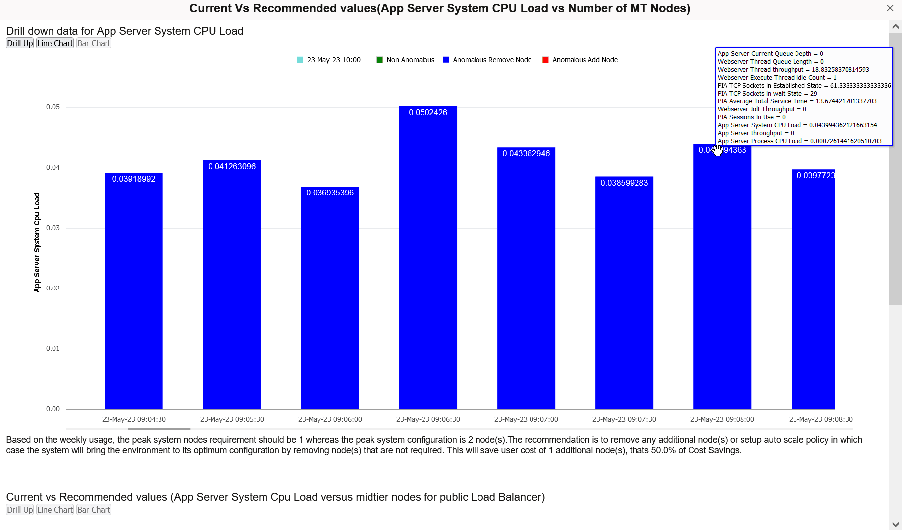
When the hourly or bi-hourly data point interval is selected, you can drill down the chart by clicking the data point interval link below the graph. In this view, the Non Anomalous nodes, Anomalous Remove nodes, and Anomalous Add nodes are represented in green, blue and red respectively. A line chart is displayed by default. You can also view it as a bar chart. On hovering above the bars on a bar chart for a particular metric, the chart displays values of the other metrics. You can go back to the original view by selecting the Drill Up option.
This example illustrates the hourly drill down chart App Server System CPU Load metric as a line chart.

This example illustrates the hourly drill down chart App Server System CPU Load metric as a bar chart.
You can also find recommendations at the end of the graph to optimize the usage of nodes based on weekly statistics. Data Interval is used to divide the time into multiple date time points.
Weekly Notifications for Environment Settings
Cloud Manager sends you recommendations for environments on weekly basis, based on their weekly usage. These recommendations are sent as push notifications. You can also get this notification through email by configuring the Notification Topic OCID. See Configuring Cloud Manager Settings for OCI.
The following snippet contains sample text from an email with the recommendations for environment settings.
Please find list of Environment(s) and their setting recommendation based on Usage:
- <Environmentname>:
public_lb:
https://objectstorage.us-ashburn-1.oraclecloud.com/p/xxxxx/n/tenancyABC/b/xxxxx/o/1656048898406-330880_20221029_061223_1667023943.jpg
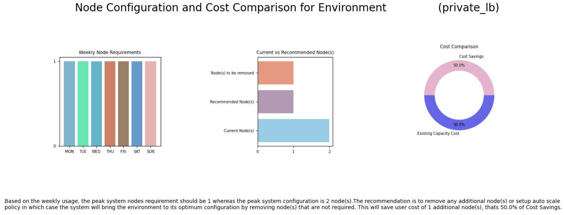
private_lb: Based on the weekly usage, the peak system nodes requirement should be 1 whereas the peak system configuration is 3 node(s).
The recommendation is to remove any additional node(s) or setup auto scale policy in which case the system will bring the environment to its optimum configuration by removing node(s) that are not required.
This will save user cost of 2 additional node(s), thats 66.66667% of Cost Savings.
https://objectstorage.us-ashburn-1.oraclecloud.com/p/xxxxx/n/tenancyABC/b/xxxxx/o/1656048898406-330880_20221029_061221_1667023941.jpg
You can also find push notifications by clicking on the Alerts section under Notification panel on the home page. On clicking the push notification for a particular environment, you can find the Jet Chart containing details related to the weekly node usage, weekly node requirements, and cost comparison for current and predicted node configuration.
This example illustrates the weekly recommendation chart that appears on clicking the notification specific to an environment on the Alerts section under Notification panel on the home page.