Configuring Display Templates for Components
To create new display templates for a display template family, use the Display Template Family (RDT_TMPL_FAMILY) component.
To configure display templates for components, use the (RDT_TMPL_COMP) component.
This section discusses how to create new display template and add new components to a display template family.
Important! The association between a display template and its component is controlled by delivered metadata that you can access in the Display Template Definition component. The options on any specific display template are controlled by delivered metadata that you can access in the Display Template System Data component. (This architecture is the reason that customizations to the underlying component are not automatically reflected in the display template.) Making a modification to this delivered metadata is considered a customization and therefore is not supported by PeopleSoft.
|
Page Name |
Definition Name |
Usage |
|---|---|---|
|
RDT_TMPL_FAMILY |
Create new display templates for a display template family. |
|
|
RDT_TMPL_COMPONENT |
Add new components to a display template family. |
|
|
RDT_TMPL_PAGE |
Enable pages and general options as well as control the appearance and behavior of the specified component. |
|
|
RDT_TMPL_SECTN |
Select page sections that can be configured by display templates. This includes enabling or disabling fields as well as modifying labels. Click the Show Section Details link to review fields that are defined for sections and then configure them. |
|
|
RDT_TMPL_STB |
Modify the list of subtabs that are available for displaying page sections. This includes changing the order as well as the labels of the subtabs, selecting a default subtab to display, and entering the drop-down list box values for the subtabs to appear in the Go To field of the toolbar. |
|
|
RDT_TMPL_EMB |
Modify the list of embedded tabs that are available for display in the embedded tab section. This includes changing the order as well as the labels of the embedded tabs and selecting a default tab to display. |
|
|
RDT_TMPL_LABEL_SEC RDT_TMPL_LABEL_EMB |
Specify the label text by creating a new label or choosing a label from the existing message catalog entries or field labels. |
Use the Display Template - Family page (RDT_TMPL_FAMILY) to create new display templates for a display template family.
Navigation
Set Up CRM, Common Definitions, Component Configuration, Display Templates, Display Template Family, Family
Image: Display Template - Family page
This example illustrates the fields and controls on the Display Template - Family page.
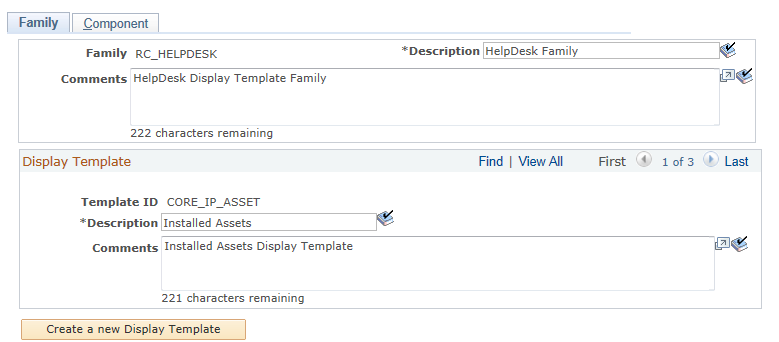
This page displays the description and any comments for the template family. While you cannot add new families to the CRM database, you may update the description and the comments for the family and any display templates associated with the family. The header section shows descriptive information for the family and any comments that were added.
|
Field or Control |
Definition |
|---|---|
| Description |
Displays the description for the template family. You can edit the description it at any time. You can enter a maximum of 30 characters and also use spell check. This is the description that most users will see when selecting or viewing a display template family. |
| Comments |
Displays any comments that were entered for the display template family. You can edit the information displayed in this field at any time. You can enter a maximum of 254 characters and also use spell check. This field is used to help the administrator understand the purpose of the family. Other users do not typically see these comments. |
Display Template
This section displays existing display template fields. Display templates are presented in a scroll area. This enables you to create additional display templates for a family. Once you create a display template, however, you cannot delete it.
|
Field or Control |
Definition |
|---|---|
| Template ID |
Displays the ID of the template that you entered when you created a new display template. If you are creating an additional display template, you can enter a maximum of 30 characters. |
| Description |
Displays the description for the template. You can edit the description it at any time. You can enter a maximum of 30 characters and also use spell check. |
| Comments |
Displays any comments for existing templates. You can edit the information displayed in this field at any time. You can enter a maximum of 254 characters and also use spell check. |
| Create a new Display Template |
Click to create a new display template and associate it with the display template family. The system displays a new set of fields so you can enter the template ID, description, and any comments for the new display template you are creating. When you click Save, the system checks that the display template you are creating is not being used by another display template family. Note: To complete the creation of a new display template, you must associate it with a component on the Component page. To add the new display template to a component, add a new row to the section where the component is listed and then select the new display template from the Display Template ID drop-down list box. Click Save. |
Use the Display Template - Component page (RDT_TMPL_COMPONENT) to add new components to a display template family.
Navigation
Set Up CRM, Common Definitions, Component Configuration, Display Templates, Display Template Family, Component
Image: Display Template - Component page
This example illustrates the fields and controls on the Display Template - Component page.
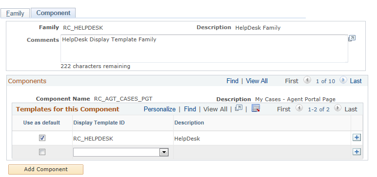
The top portion of this page shows the display template family and description. In the Components section there is a scroll area that shows which components belong to the display template family. This section shows only those components that have been set up with display template system data.
To associate a new display template ID with the component, add a new row in the Components section and select the display template from the Display Template ID drop-down list box. The system displays only those templates that are defined for the family. You must select one display template as the default template for each component in the family.
Use the Display Template page (RDT_TMPL_PAGE) to enable pages and general options as well as control the appearance and behavior of the specified component.
Navigation
Set Up CRM, Common Definitions, Component Configuration, Display Templates, Display Template Details
Image: Display Template page (1 of 2)
This example illustrates the fields and controls on the Display Template page (1 of 2).
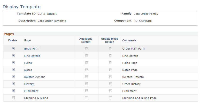
Image: Display Template page (2 of 2)
This example illustrates the fields and controls on the Display Template page (2 of 2).
You can review a list of system-delivered display templates in the Display Template Details component. Select a display template from the list and use it to configure the corresponding component.
Pages
This grid lists the pages that are configurable for the component.
|
Field or Control |
Definition |
|---|---|
| Page |
Click to access the Display Template - Page Definition page to configure the sections and fields of the selected page. The names of pages that are not enabled are in plain text. |
| Add Mode Default |
Select to show the corresponding page by default when you create a transaction for the component. This is optional, and you can select only one page to be the default. If you don't identify a default page, the system displays the page that is specified for the component in Application Designer. If users who access the component have no permission to the default page, the system displays the first page in the component that they have permission to access. |
| Update Mode Default |
Select to show the corresponding page by default when you open an existing transaction for the component. This is optional, and you can select only one page to be the default. The display logic that is used for the add mode applies to the update mode as well. |
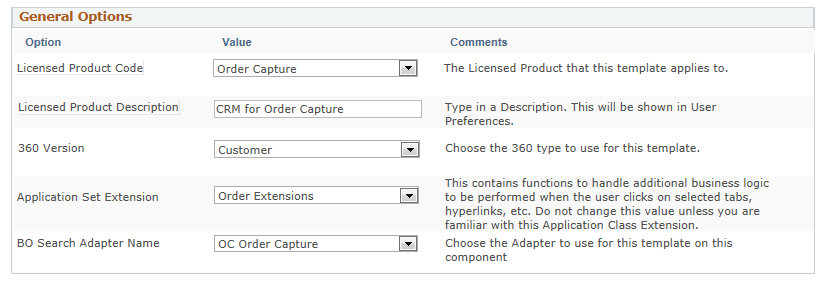
General Options
This grid presents the features and functionality that are enabled in the data definition of the component system. The list varies depending on the number of feature options that are enabled for a given component. Typically, you select a value for each listed option. For example, select the configurable search ID from the Value drop-down list box if you plan to use configurable search for a given display template and component combination; or select the appropriate application class extension if the system should perform some application-specific logic when a certain user event takes place. This grid does not appear if IT administrators have not enabled any general options in the component's system data to be configured through display templates.
In addition to some of the common options that are applicable to all components, such as the 360 degree version and BO search adapter, this grid also includes options that are specific to certain components. For example, these general options are specific to the Installed Product component:
Site Without Customer: Select Yes to allow installed products to be created for sites with or without parent customers. If this option is enabled, and the site you select for a new installed product happens to be a standalone site (that is, not associated with a customer), the system automatically changes the value of the customer to Anonymous User on the installed product. Now, if you want to select another site, the site search presents all the sites that are not associated with customers under the same setID.
Select No to not allow installed products to be created for sites without customers. An error message appears if you select in an installed product a site that does not have a parent customer.
This option is not applicable to installed assets, therefore, it is unavailable to the delivered CORE_IP_ASSET template for installed assets, which is created under the RC_HELPDESK family code and RF_INST_PRODUCT component.
Asset Integration: Select Yes to enable asset integration with PeopleSoft Financials. If this option is enabled, these field must be enabled in the display template: Serial ID, Asset Type, and Asset Subtype.
This option is only applicable to installed assets, and it is available to the delivered CORE_IP_ASSET template for installed assets, which is created under the RC_HELPDESK family code and RF_INST_PRODUCT component.
Similarly, for the Case component, you can select which toolbar should be used on the case, as well as which application usage should be used to filter the task templates to display on the case.
Use the Display Template - Page Definition page (RDT_TMPL_SECTN) to select page sections that can be configured by display templates.
This includes enabling or disabling fields as well as modifying labels. Click the Show Section Details link to review fields that are defined for sections and then configure them.
Navigation
Click a page link in the Pages grid on the Display Template page.
Image: Display Template - Page Definition page (1 of 5)
This example illustrates the fields and controls on the Display Template - Page Definition page (1 of 5).
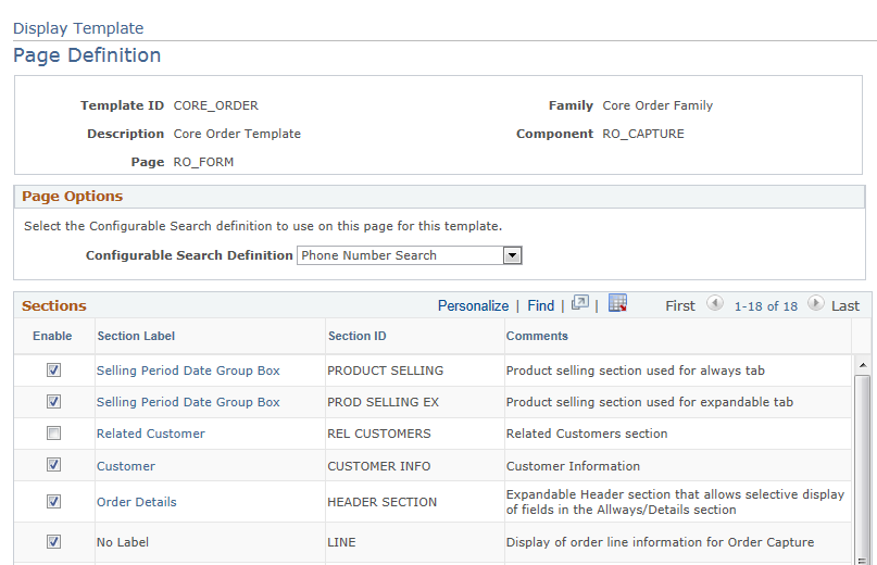
Image: Display Template - Page Definition page (2 of 5)
This example illustrates the fields and controls on the Display Template - Page Definition page (2 of 5).
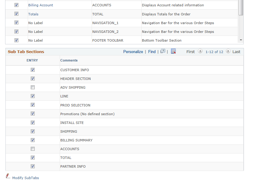
Image: Display Template - Page Definition page (setup for an expandable section for the RO_FORM component) (3 of 5)
This example illustrates the fields and controls on the Display Template - Page Definition page (setup for an expandable section for the RO_FORM component) (3 of 5).
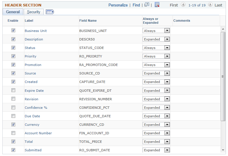
Image: Display Template - Page Definition page (setup for a standard section for the RO_FORM component) (4 of 5)
This example illustrates the fields and controls on the Display Template - Page Definition page (setup for a standard section for the RO_FORM component) (4 of 5).
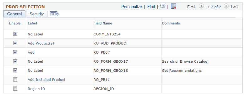
Image: Display Template - Page Definition page (setup for an embedded tab section for the RF_INST_PRODUCT component) (5 of 5)
This example illustrates the fields and controls on the Display Template - Page Definition page (setup for an embedded tab section for the RF_INST_PRODUCT component) (5 of 5).
Note that the last sample page shows an example of an embedded tab section in another component for display purposes. It is not the continuation of the page that is shown in the first four sample pages.
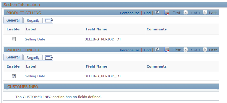
Sections
This grid lists all the sections of the component that are available to be configured by display templates, except for the subtab section (if applicable). Use the Enable check box to show or hide a component section at runtime. Clicking the section label link enables you to change the section label. You can select the label from existing field labels or message catalog entries (you can also create new message catalog entries).
Sub Tab Sections
This grid lists all fields that are defined in the subtab section. Each page can have the maximum of one subtab section. The subtab section is rendered by the page's toolbar. Columns on the left-hand side with check boxes represent the subtabs (links) that are enabled within that subtab section. A maximum of 10 subtabs can be in a subtab section as component system data, which means that you can potentially have 10 columns in this grid if they are all enabled in this display template.
For any page field (typically group boxes, sometimes actual fields) that is displayed in the grid, select the subtab in which it resides. A field can appear in many tabs or none at all. This grid does not appear if no subtab section is defined for the page.
At runtime, each subtab of a subtab section appears as a link underneath the associated page name. If the Go To field is available, you can navigate to different subtabs in different pages.
|
Field or Control |
Definition |
|---|---|
| Label |
Click to access the Display Template - Page SubTab Definition page to modify the corresponding element with an existing field label or text from the message catalog. You can create new message catalog entries to suit your needs. |
| Modify SubTabs |
Click to access the Display Template - Page SubTab Definition page and update the current subtab definition, such as enabling or disabling subtabs in the subtab section. |
Expandable Sections
This grid shows a list of fields that are specified for the expandable section as component system data (refer to the third sample page).
|
Field or Control |
Definition |
|---|---|
| Always or Expanded |
Specify for each enabled field whether it is always displayed at the top half of the section, displayed only when you click the link to expand the bottom half of the section, or not displayed at all. Update the label as appropriate. Note: If the label reads No Label, you cannot modify the label. |
Standard Sections and Fields Without Group Box Sections
You can select which fields to appear in a Standard Group Box or Standard Group Box with Grid section and change their field labels. The grid indicates the order in which the fields are displayed. You also can apply field-level security by referencing functional option code as necessary. This applies to fields without a group box sections as well.
Embedded Tab Sections
This grid shows a list of fields that are specified for the embedded tab section as component system data. Columns on the left-hand side with check boxes represent the tabs that are enabled within that embedded tab section in the Display Template - Section Embedded Tab Definition page. As with subtab sections, you can have a maximum of 10 tabs in an embedded tab section as component system data, which means that you can potentially have 10 columns in this grid if they are all enabled in this display template.
You can select a page field to be placed in more than one embedded tab, and update the page field label if applicable.
|
Field or Control |
Definition |
|---|---|
| Modify Embedded Tabs |
Click to access the Display Template - Section Embedded Tab Definition page to update the embedded tab configuration. |
Additional Fields
|
Field or Control |
Definition |
|---|---|
| Preview Page |
If this link is enabled, click to view the component that is presented using the current display template in a new browser window. The component is displayed in the add mode with no data. Note: The display template framework supports the page preview functionality only on templates that have enabled the CREF setup option in the General Option section of their display template system data. Transfers must be within the employee portal. |
| Show Section Details |
Click to expand the area and configure sections that are enabled for the selected page, as listed in the Sections grid. |
Use the Display Template - Page SubTab Definition page (RDT_TMPL_STB) to modify the list of subtabs that are available for displaying page sections.
This includes changing the order as well as the labels of the subtabs, selecting a default subtab to display, and entering the drop-down list box values for the subtabs to appear in the Go To field of the toolbar.
Navigation
Click the Modify SubTabs link on the Display Template - Page Definition page. This link is available only to pages that have subtab sections.
Image: Display Template - Page SubTab Definition page
This example illustrates the fields and controls on the Display Template - Page SubTab Definition page.
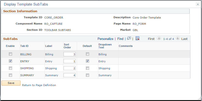
SubTabs
|
Field or Control |
Definition |
|---|---|
| Enable |
Select to enable the subtab for the page. |
| Label |
Click to configure the label of the subtab. |
| Default |
Select a subtab as the default value to show from the Go To drop-down list box when you access the corresponding component at runtime. |
| Dropdown Text |
Displays the name of the subtab as shown in the Go To drop-down list box at runtime. You can replace it with an existing field label or text from the message catalog. Note: The Go To navigation must be enabled in the toolbar to see the subtab drop-down text that is specified here. |
Use the Display Template - Section Embedded Tab Definition page (RDT_TMPL_EMB) to modify the list of embedded tabs that are available for display in the embedded tab section.
This includes changing the order as well as the labels of the embedded tabs and selecting a default tab to display.
Navigation
Click the Modify Embedded Tabs link on the Display Template - Page Definition page. This link is available only for pages that have embedded tab sections.
Image: Display Template - Section Embedded Tab Definition page
This example illustrates the fields and controls on the Display Template - Section Embedded Tab Definition page.
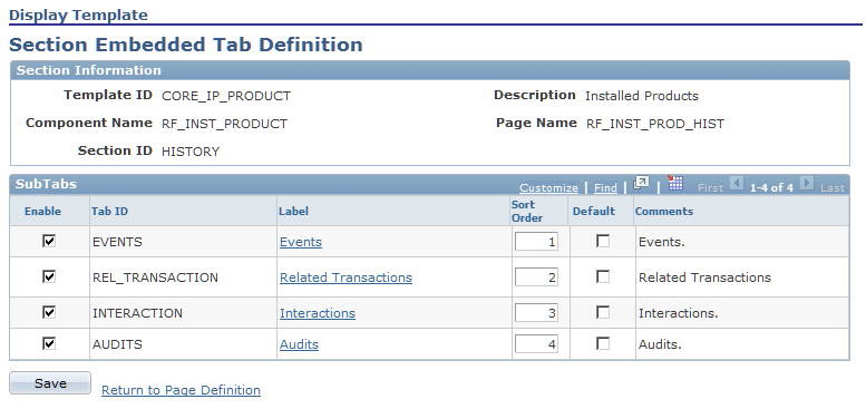
This grid lists the tabs of the selected embedded tab section that are configurable through display templates. Select one among the enabled tabs to be the default tab that shows whenever the embedded section is presented in the component. You can rearrange the tab order and update the tab label if applicable.
Use the Display Template - Label Definition page (RDT_TMPL_LABEL_SEC) to specify the label text by creating a new label or choosing a label from the existing message catalog entries or field labels.
Navigation
Click the section label link, field label link, or tab label link on the Display Template - Page Definition page, Display Template - Page SubTab Definition page, or Display Template - Section Embedded Tab Definition page.
Image: Display Template - Label Definition page
This example illustrates the fields and controls on the Display Template - Label Definition page.
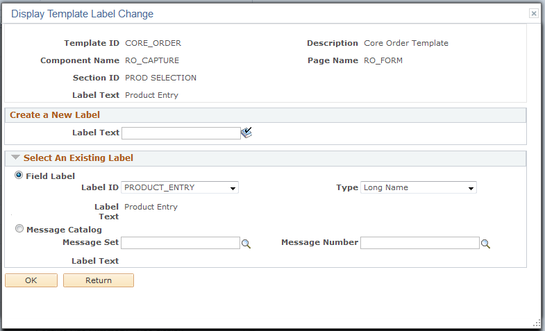
Create a New Label
Enter up to a 100 characters to create a new label, then click OK.. The system changes the label link on the section page to match the new text. This field is spell-check enabled.
Select An Existing Label
Select the source of the label text: either Field Label or Message Catalog. For the Field Label option, select the label ID and type. For the Message Catalog option, select the message set and message number. Click OK when you are finished.
Note: If No Label appears in a section or field label as the label value, the corresponding page field does not have a specific name when it was defined in Application Designer and therefore the label is not editable in display templates. For example, frames do not always have labels.
Access a component that is configured by display templates.
The page samples shown here illustrate how the four types of sections appear when they are rendered by the system. These sections include:
Subtab sections
Expandable sections
Standard sections
Embedded sections
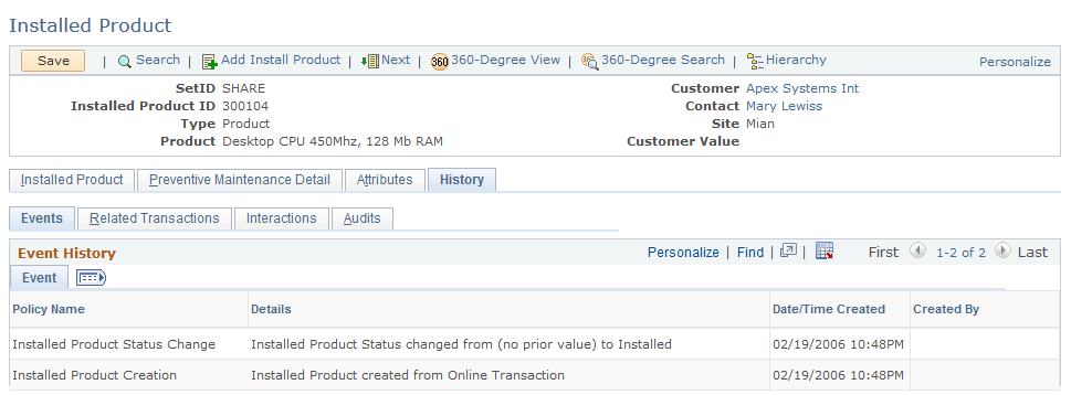
Image: Example of a subtab section in the Order - History page (RO_HISTORY)
This illustration provides an example of a subtab section in the Order - History page (RO_HISTORY).
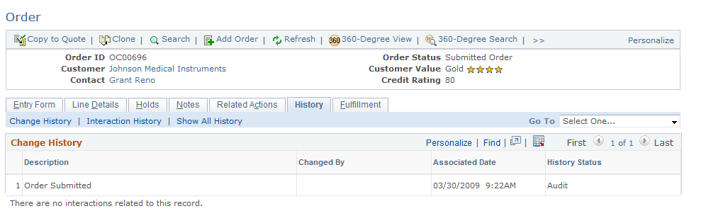
Image: Example of an expandable section (Order Details) in the Order - Entry Form page (RO_FORM)
This illustration provides an example of an expandable section (Order Details) in the Order - Entry Form page (RO_FORM).
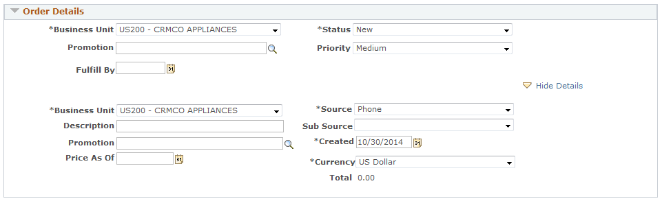
Image: Example of a standard section (Product Entry) in the Order - Entry Form page (RO_FORM)
This illustration provides an example of a standard section (Product Entry) in the Order - Entry Form page (RO_FORM).

Image: Example of an embedded section in the Installed Product - History page (RF_INST_PROD_HIST)
This illustration provides an example of an embedded section in the Installed Product - History page (RF_INST_PROD_HIST).